


![]() Special Olympics Logo PNG
Special Olympics Logo PNG
The Special Olympics logo embodies the organization’s values, like inclusivity, equality, respect, and sportsmanship. It symbolizes solidarity, friendship, equal rights, and mutual support, which are vital for people with intellectual disabilities. The emblem motivates athletes to overcome challenges and reach their goals, not just in competitions but also in daily life.
The history of the Special Olympics began in the summer of 1962 when Eunice Kennedy Shriver, sister of U.S. President John F. Kennedy, established a day camp in Maryland to provide sports opportunities for people with intellectual disabilities, inspired by her sister Rosemary’s challenges. Initially named “Shriver Camp,” this initiative evolved rapidly, leading to the first international Special Olympic Games in 1968 in Chicago, featuring athletes from the United States and Canada. The event emphasized courage and participation, epitomized by the athletes’ oath: “Let me win. But if I cannot win, let me be brave.” Over subsequent decades, the movement expanded globally, introducing the Winter Games, launching programs like “Unified Sports,” which integrate athletes with and without disabilities, and providing free medical screenings through the Healthy Athletes initiative. Officially recognized by the International Olympic Committee and associated with the United Nations, the organization has hosted Games worldwide, from Europe to Asia and the Middle East, steadily growing into a global movement with millions of participants, continuously promoting inclusion and empowerment for individuals with intellectual disabilities.
Meaning and History
![]()
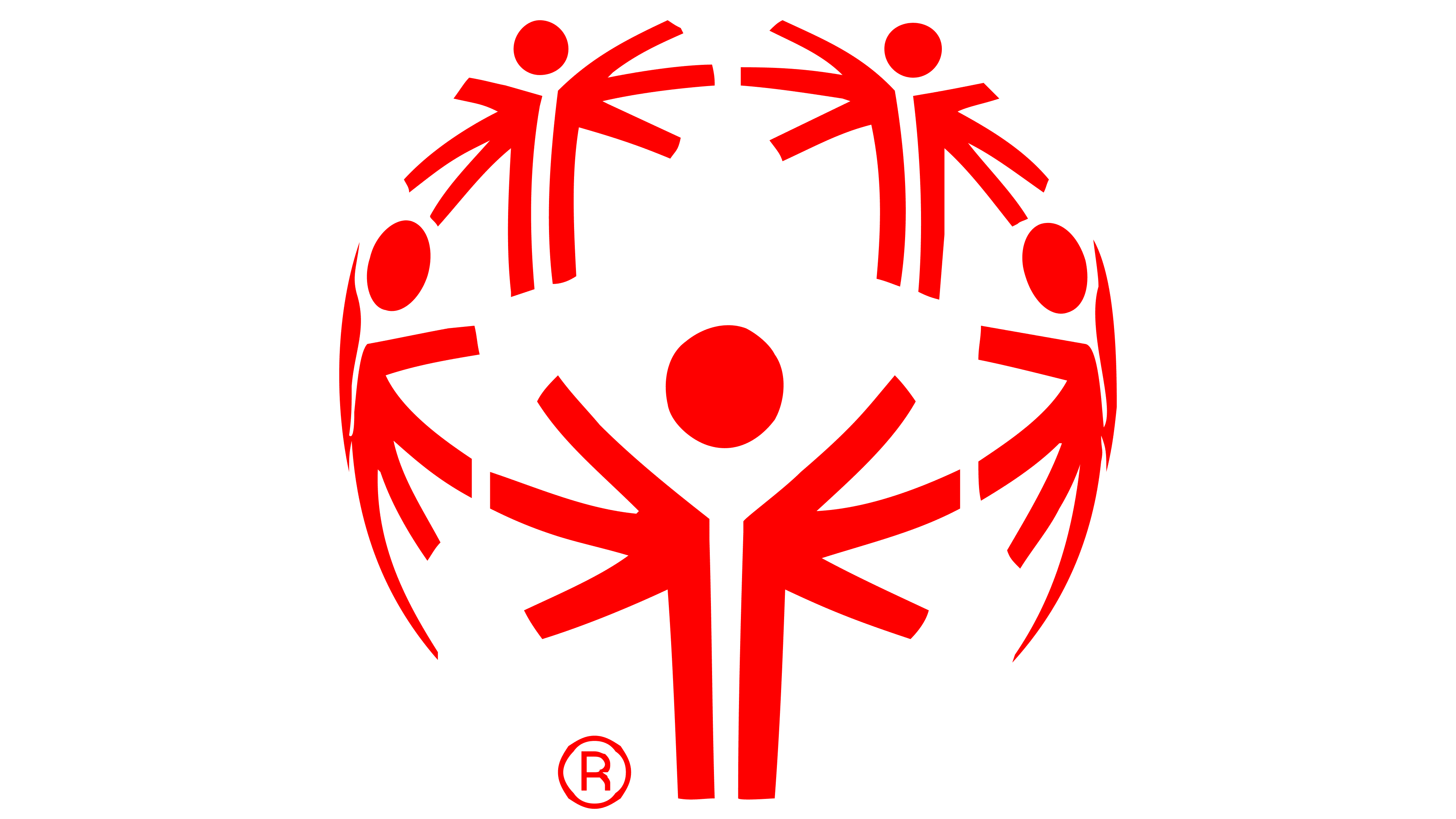
The idea for the Special Olympics logo came from the sculpture “Joy and Happiness to All the Children of the World.” This piece was created by the Georgian monumental artist Zurab Tsereteli, who also made it into Russia’s list of the country’s biggest billionaires. He’s been criticized for his love of kitsch, and his giant, gold-plated sculptures are often described as monotonous and in bad taste. Zurab’s main issue is his penchant for hyperbole; he leans towards excessive opulence in his daily life and art. Yet this doesn’t stop him from flaunting and gifting his monuments to various countries, including the U.S.
The bronze sculpture “Joy and Happiness to All the Children of the World” was gifted to The College at Brockport in 1979 when the school hosted the Special Olympics. This installation consists of five massive 30-foot figures shaped like six-armed beings arranged in a circle around a 50-foot fountain. According to Zurab, the six-armed people represent children reaching upward. Water jets shower an uneven sphere, which the artist intended to symbolize Earth. The figures, for their part, stand for the five continents. Each figure features nude athletes styled in the manner of Greek bas-reliefs.
What is the Special Olympics?
Special Olympics is an organization that organizes sports competitions for individuals with intellectual disabilities. Founded in 1968, it’s headquartered in the District of Columbia. Its mission is to support participants, help them unlock their potential, and integrate into society. For children under eight, a separate Young Athletes program has been established.
1968 – today
![]()
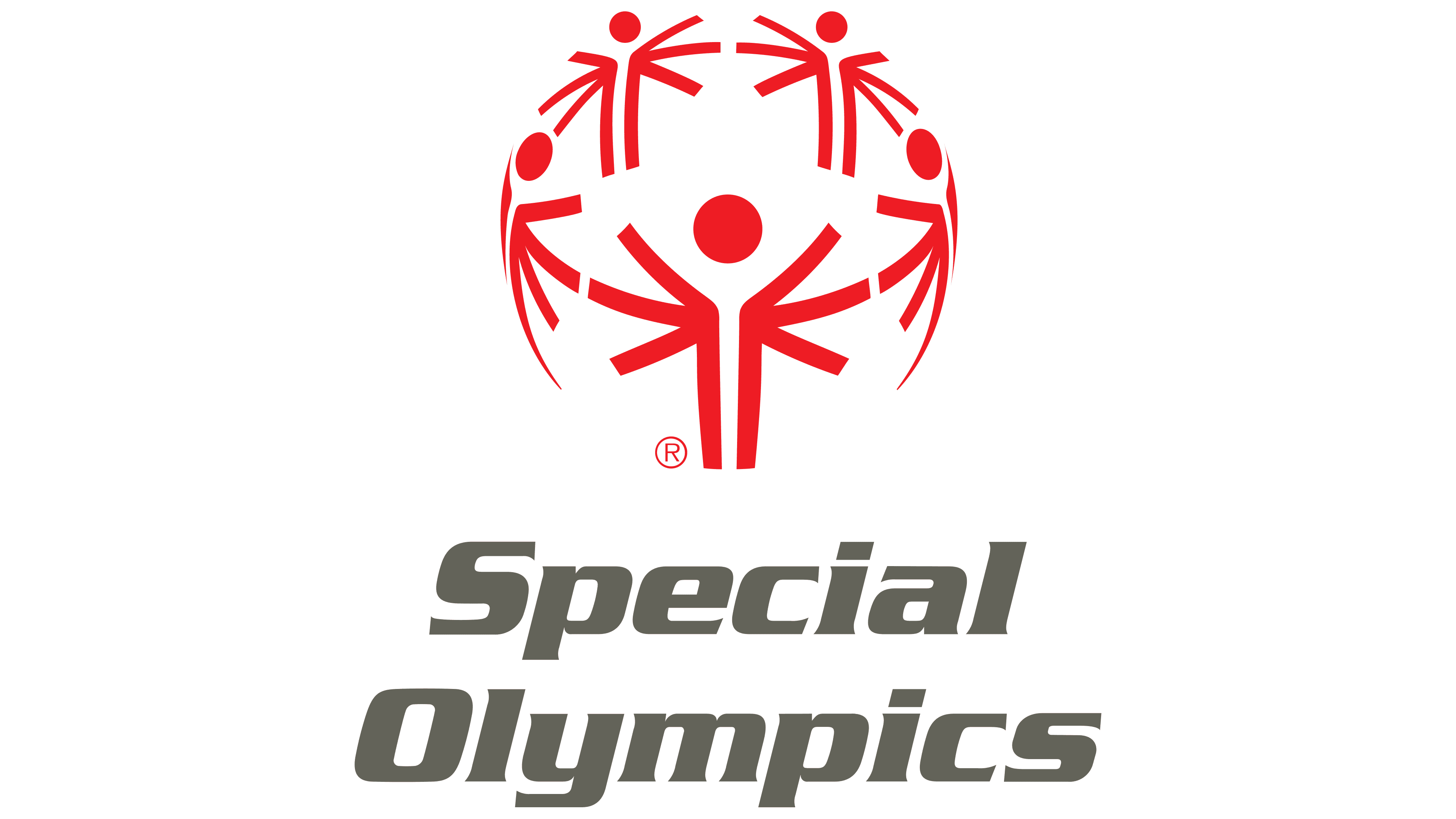
This isn’t the original version of the logo; it emerged no earlier than 1979 when the “Joy and Happiness to All the Children of the World” sculpture was erected. Also, the design underwent several changes before it got its modern look. The main element of the emblem is a sphere composed of five red figures, each with six arms (short lines), a torso (two vertical stripes), and a head (a circle).
Abstract human silhouettes create a sense of activity and movement, which is crucial for a sports organization and its participants with intellectual disabilities. The spherical shape of the sign represents the planet, implying the global nature of the Special Olympics competitions. Why does each figure have six arms? In contemporary interpretation, this reflects the past, present, and future.
- Arms hanging down signify self-doubt, as some groups could not realize their potential before the organization’s creation.
- Arms extended at shoulder height represent equality. Thanks to Special Olympics, individuals with disabilities are among those with similar health issues. They can compete on equal terms.
- Arms raised above the head symbolize the joy of overcoming obstacles and participating in competitions.
To the design’s left is a two-tier gray “Special Olympics” inscription styled dynamically.
Font and Colors
The typeface in the Special Olympics logo features an energetic italic style with confident lines and sharp, slightly pointed forms. The lettering resembles Serpentine Std Bold Oblique, conveying modernity, dynamism, and the organization’s emotional character.
The red emblem expresses optimism and vitality, reflecting the spirit of the organization that brings together athletes from around the world. The shade Special Olympics Red (#FF0000) is specifically chosen for the symbol, representing competitive energy and the strength of team spirit.
The organization’s name is in Special Olympics Grey (#636359). This gray tone softens the text’s appearance, adding a sense of stability and calm. Paired with the red symbol, it creates a harmonious combination that conveys a sense of unity, support, and the thrill of sport that is important to athletes and spectators.