


St. Johns Red Storm Logo PNG
St. John’s promotes the Red Storm as “New York’s Team,” connecting the logo to the city beyond campus. The basketball team’s appearances at Madison Square Garden give that claim a tangible foundation. The logo accompanies the team into an arena where college basketball has a place in New York’s sporting life.
St. John’s University, founded in Brooklyn in 1907, launched its athletics history with basketball in the early 1920s. Initially named the “Redmen,” the program gained prominence under coach James “Buck” Freeman (1927–1936). By 1939, St. John’s had become a nationally competitive team and participated in its first NIT tournament.
In the 1940s, coach Joe Lapchick led St. John’s to NIT championships in 1943 and 1944 and to the NCAA Tournament semifinals in 1947. Moving home games to Madison Square Garden during the 1950s further elevated the program’s visibility. The team secured another NIT title in 1952 and reached the NCAA finals in 1959.
St. John’s joined the Big East Conference as a founding member in 1979, coinciding with coach Lou Carnesecca’s successful tenure. The 1980s featured an elite roster that included future NBA stars Chris Mullin and Mark Jackson, and the team won the Big East Tournament in 1983 and reached the Final Four in 1985.
In 1994, the university adopted the name “Red Storm.” Although the 2000s were challenging, the team captured the NIT title in 2002 and returned to NCAA play in 2011. The program saw coaching transitions from 2015 to 2023, with NCAA appearances including the 2019 season.
The Red Storm, historically notable for over 1,800 victories, maintains a respected place among NCAA Division I basketball programs.
Meaning and History
What is the St. Johns Red Storm?
These are St. John’s University’s athletic forces competing in NCAA Division I as part of the Big East Conference. The home courts of these red-and-white teams include Madison Square Garden and Carnesecca Arena, where basketball takes center stage and maintains their strong reputation in New York City’s sports culture. With mascot Johnny Thunderbird adding energy to the events, the university’s teams compete in 17 sports, and the baseball and fencing teams have earned national recognition.
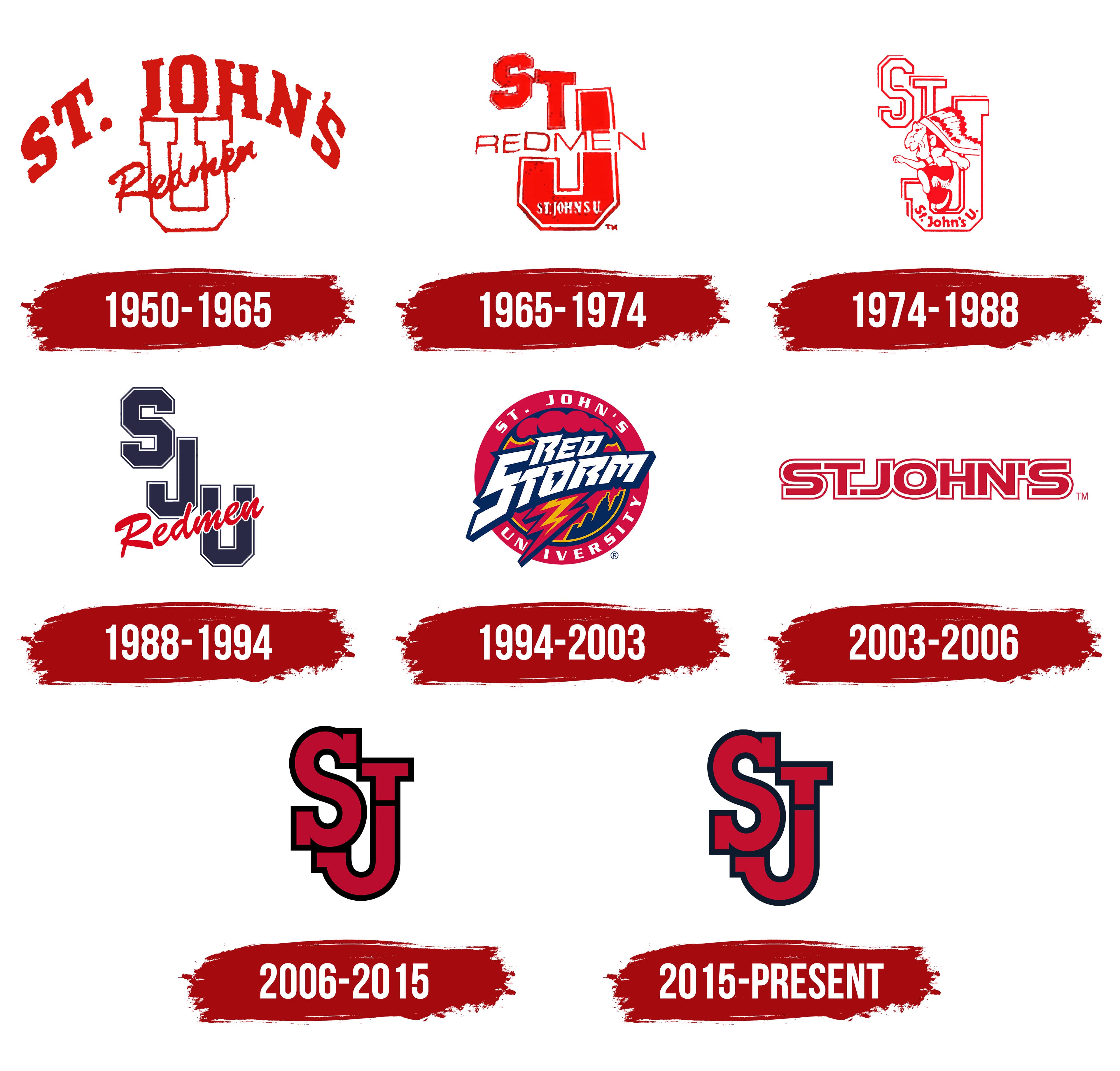
1950 – 1965
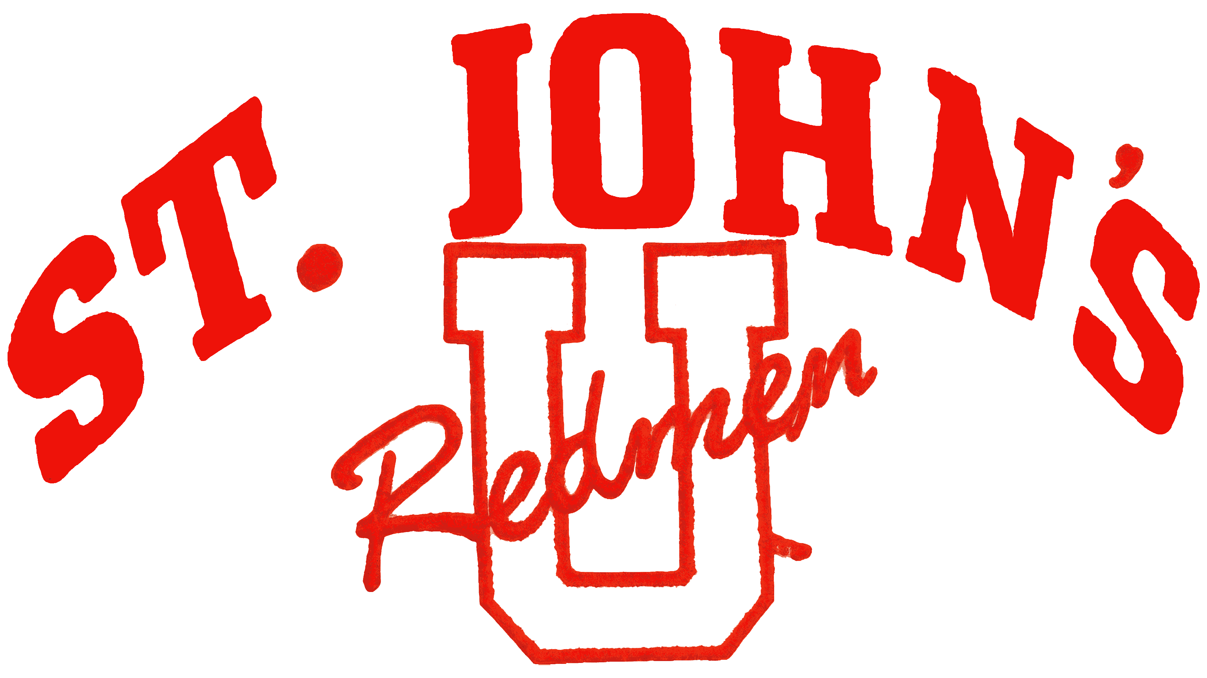
From 1950 to 1965, the teams at St. John’s University in New York, now known as the St. John’s Red Storm, competed as the Redmen. On the athletic logo of the era, “Redmen” appeared in script across a large “U,” as if someone had signed the letter. The red script recalled the football uniforms that gave the teams their nickname.
The St. John’s name dates to 1870, when the Vincentians opened a college in Brooklyn and named it for St. John the Baptist. The college later became a university. In the early years of intercollegiate competition, its athletes were known as the Johnnies, a nickname derived from St. John’s. The Redmen name came from the sports pages. In the 1920s, the football team took the field dressed in red from head to toe, prompting a reporter to call the players “red men.”
The association with Native American imagery came later. In 1928, a group of fans devised a war chant, and students brought a wooden Native American figure to Ebbets Field. It had previously stood outside a tobacco shop. The students named it Chief Blackjack. St. John’s beat Catholic University 22–0 that day, and the victory helped the new mascot catch on. As one participant later acknowledged, the students had taken the figure without permission, then returned it to pay its owners. Over time, Chief Blackjack became part of the university’s athletic imagery.
The 1950–1965 logo combined the school name, an initial, and the team nickname. A large white “U” for “University” formed the base of the design. A red outline traced the letter, which had flat tops and beveled lower corners. Above it, “ST. JOHN’S” formed a semicircle in bold red serif capitals. The word “Redmen” crossed the middle of the “U” in connected, right-slanting script. The three lettering styles shared the university’s red-and-white colors.
1965 – 1974
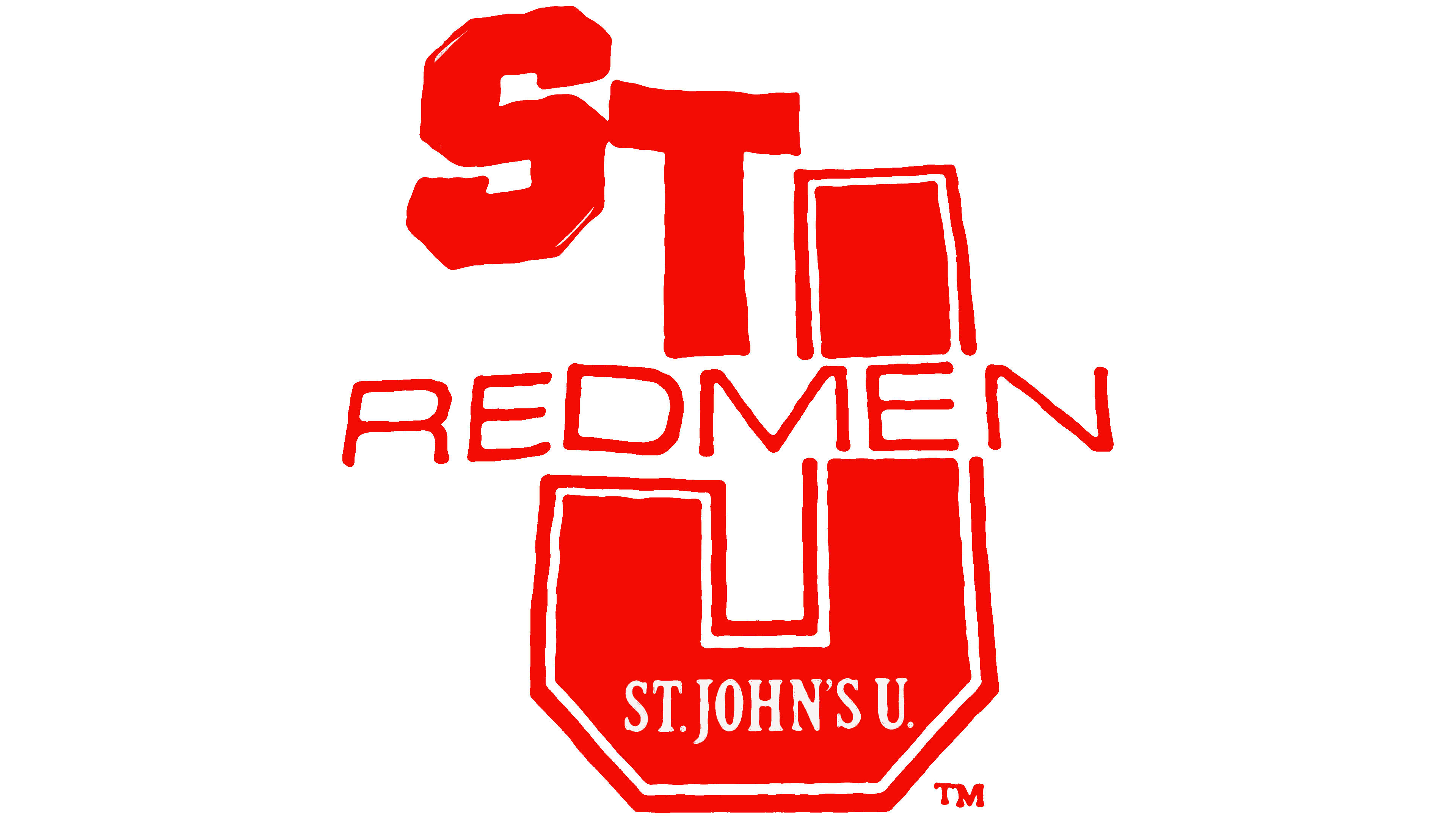
In 1965, an STJ monogram replaced the prominent St. John’s lettering on the Redmen logo. The team used the monogram through 1974. The “S” and “T” were staggered at the upper left, beside a much larger red “J” on the right. The hook of the “J” formed the base of the logo. White gaps separated the red shapes, and fine red lines traced their outer edges.
The team nickname still ran across the middle of the monogram. Tall, upright sans serif capitals spelling “REDMEN” replaced the script. The school name moved to the bottom, where “ST. JOHN’S U” appeared in small white letters against the red curve of the “J.”
1974 – 1988
The team mascot first appeared on a St. John’s logo in 1974. A caricature of a Native American warrior in a feathered headdress stood in front of the large “J” in the STJ monogram, with one leg raised and one arm extended. Several versions existed. In one, the figure held a basketball. In another, he held an arrow and a hatchet. The figure referred to the team’s Redmen nickname.
The staggered capitals retained their varsity lettering style. The most obvious change was the letter color. White replaced the red fill, and a double red outline gave the strokes depth. The words “St. John’s U” followed the lower curve of the “J.” St. John’s used the logo with the warrior and outlined initials through 1988.
1988 – 1994
From 1988 to 1994, the St. John’s athletic logo paired an SJU monogram with the word “Redmen.” The university dropped the Native American figure. The contrast between the block initials and the script nickname recalled the 1950s logo, with its block “U” and red script.
The SJU initials stepped down diagonally from left to right. The “S” sat at the upper left, the “J” just below and to its right, and the “U” at the lower right. The even navy strokes, beveled corners, and white trim just inside the outline resembled varsity lettering on college athletic apparel. The red “Redmen” script crossed the lower part of the monogram on the opposite diagonal, rising from left to right and overlapping the “U.” Against the angular initials, its flowing strokes looked like a handwritten signature.
1994 – 2003
According to the St. John’s University athletics timeline, the university introduced Red Storm as its new team name in August 1994, along with a logo and mascot for the 1994–95 season. Although the Redmen nickname had originated with the color of the football uniforms, it had come to be associated with Native American imagery. The university retired the name because of its derogatory associations. Red Storm kept the reference to the school color and supplied the subject for the new logo.
From 1994 to 2003, the St. John’s logo depicted a thunderstorm over New York City. A four-color illustration replaced the monogram’s limited color scheme. Inside a red circle, red storm clouds hung over a navy skyline. Red and navy lines outlined a yellow lightning bolt. The university name ran around the circle in white capitals, with “ST. JOHN’S” along the upper arc and “UNIVERSITY” along the bottom.
“RED STORM” ran across the circle on two lines. The white letters leaned to the right, with heavy strokes, sharp angles, and deep notches. A thick navy shadow set the words apart from the stormy sky. The elongated letter tips and the lightning bolt extended beyond the circle. New York designer Sean Kane created the Red Storm’s current primary logo.
The storm theme also inspired the new mascot, a horse named Thunder. The pounding hooves of a running herd evoked the sound of rolling thunder. On a secondary logo, the horse reared behind the words “RED STORM,” surrounded by lightning bolts. The costumed Thunder succeeded the previous mascot and represented the team into the early 2000s.
2003 – 2006

In 2003, a wordmark reading “ST. JOHN’S” replaced the storm over the city as the primary athletic logo. Through 2006, the school name stood alone on a single line. The university dropped the circle, clouds, lightning bolt, skyline, and “RED STORM” lettering. The mascot did not appear in the new logo either. Around the same time, St. John’s began phasing out the initials SJU. Saint Joseph’s University in Philadelphia also used them, and spelling out “ST. JOHN’S” helped distinguish the two schools.
Large red sans serif capitals sat close together to form a long horizontal wordmark. The curves of the “S” and “O” alternated with the straight and diagonal strokes of the “T,” “H,” and “N.” A narrow white border separated the red letters from their red outer outline.
2006 – 2015
When the athletic department set out to create a common logo for all St. John’s teams, it looked to the school’s earlier marks. The teams already used the initials STJ, and the abbreviation had a long history in the baseball program. Nike used those three letters as the basis for a monogram. The project was part of a broader update to the university’s visual identity that had begun in 2001. Students, alumni, coaches, and athletes discussed the STJ monogram and 30 other proposals. The university unveiled the monogram on August 23, 2006.
From 2006 to 2015, the teams used a compact vertical logo in place of the long horizontal wordmark. Three red letters with a shared, heavy black outline replaced the names St. John’s and Red Storm. On the left, a large “S” partially overlapped the “J,” whose hook formed the bottom of the monogram. A smaller “T” sat at the upper right. Its stem lined up with the upright stroke of the “J,” with a horizontal black line marking the junction. The angular stroke ends, and the straight crossbar of the “T” contrasts with the curves of the “S” and “J.”
In 2009, the teams introduced a costumed Thunderbird mascot. In legend, the Thunderbird could summon thunder and lightning, giving it a natural connection to the Red Storm name. Students and fans cast more than 11,000 votes in the mascot poll. Olympus Inc. made the costume, and the bird made its public debut on September 18 at the university’s soccer games. Students later named it Johnny in a nod to the team’s early nickname, the Johnnies. The Thunderbird joined the school’s athletic imagery, while the STJ monogram remained the primary logo.
2015 – today
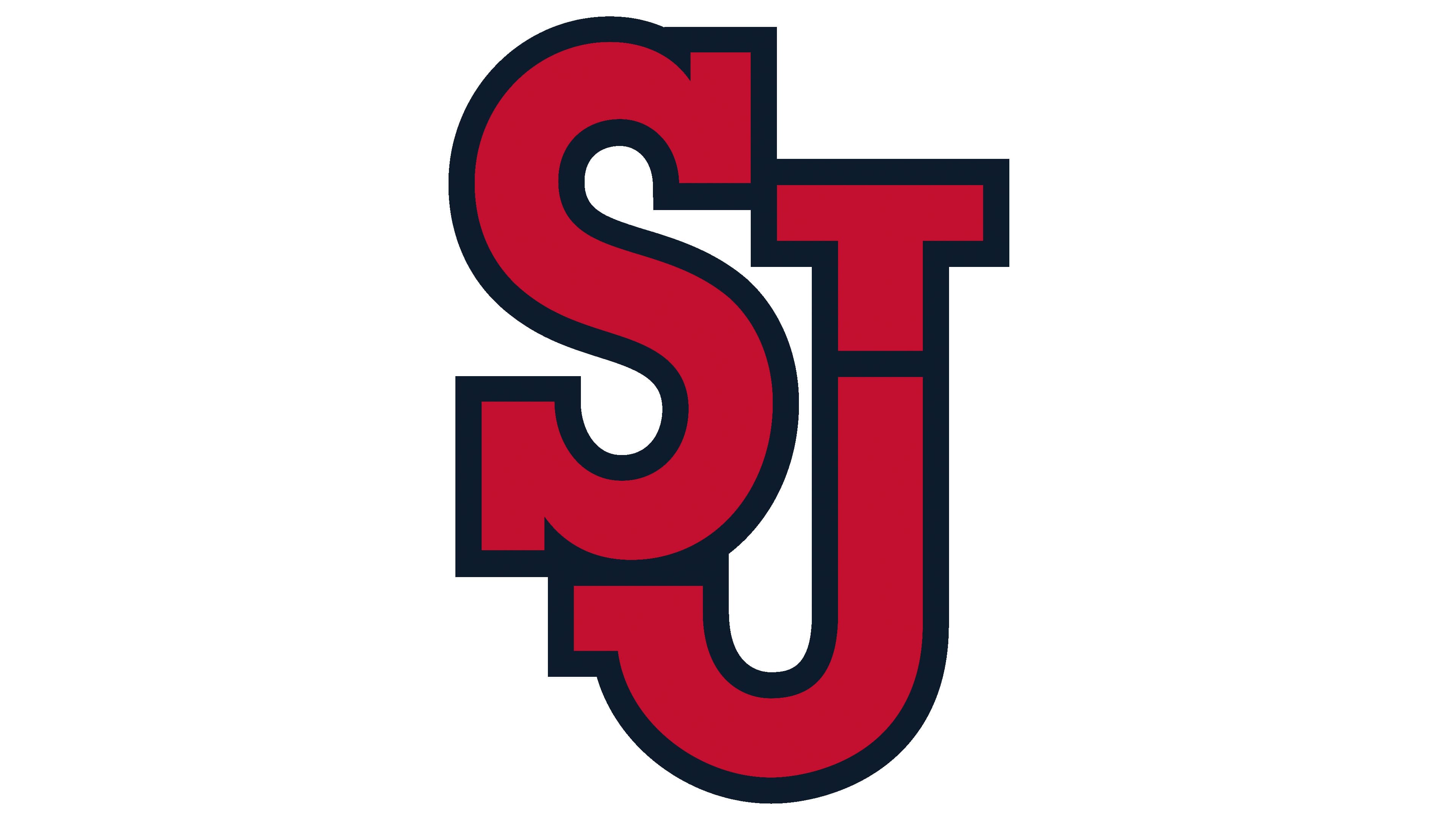
St. John’s updated its athletic logo in 2015. The STJ monogram retained its shape and red lettering, but navy replaced black in the outline. The athletic wordmarks made the same switch from black to navy. The two primary colors are St. John’s Red, Pantone 200 C, and SJU Blue, Pantone 296. White and silver-gray serve as supporting colors.
In the St. John’s wordmark, the large capital “S” and “J” echo the shapes of the same letters in the monogram. The university name occupies the top line, with “RED STORM” below. The basketball team also uses an arched “ST. JOHN’S” wordmark that recalls the lettering on early university logos. The navy-outlined STJ monogram remains the primary athletic mark.
In January 2024, Nike unveiled a special basketball uniform inspired by the 1994–95 design for the January 20 game against Marquette at Madison Square Garden. The red-and-yellow “St. John’s” lettering returned to the chest. Felipe López had worn a jersey with that lettering on the cover of the November 28, 1994, issue of Sports Illustrated. The side panels echoed the New York City skyline from the earlier Red Storm logo, and the shorts featured Thunder surrounded by lightning bolts.