


 Georgia State Panthers Logo PNG
The Georgia State Panthers logo resembles a child’s carnival mask. Despite its simple, cartoonish style, the panther symbolizes danger. It hisses menacingly, showing sharp fangs and pressing its ears back. Its appearance conveys: do not attack me, or I will retaliate. Through this image, sports teams demonstrate their readiness for tough competition.
Georgia State University began in 1913 as an evening college in downtown Atlanta. Early teams in the 1940s were called Owls. From 1947 to 1963, they used Ramblers. In 1963, a student vote introduced Panthers as the school’s mascot, and the school entered NCAA Division I.
Basketball gained traction under Bob Reinhart. After a 2:26 season, the team won the 1990–91 TAAC tournament and reached the NCAA Tournament for the first time. As a No. 16 seed, Georgia State faced Arkansas under Nolan Richardson, with players traveling by MARTA instead of charter flights.
In 1997, Charles “Lefty” Driesell became head coach. In 2000–01, the team won 29 games, ranked among national leaders, and returned to the NCAA Tournament with a first-round win. Driesell later finished his career with 786 victories and was inducted into the Naismith Memorial Basketball Hall of Fame.
In 2009, the university launched a football program. The first game in 2010 ended 41:7 against Shorter Hawks. By 2013, Georgia State moved into FBS, competing in the Colonial Athletic Association in football, while other teams joined the Sun Belt Conference.
In March 2015, Ron Hunter coached from a stool after an Achilles injury, as his son, R.J. Hunter, hit a late three-pointer to beat Baylor 57:56. The Boston Celtics later drafted him. In 2016, Turner Field, the former home of the Atlanta Braves, was converted into Center Parc Stadium.
Meaning and History
What are the Georgia State Panthers?
The Georgia State Panthers are the athletics program of Georgia State University in Atlanta. It includes 15 student teams that founded the Sun Belt Conference. Almost all its representatives compete in NCAA Division I.
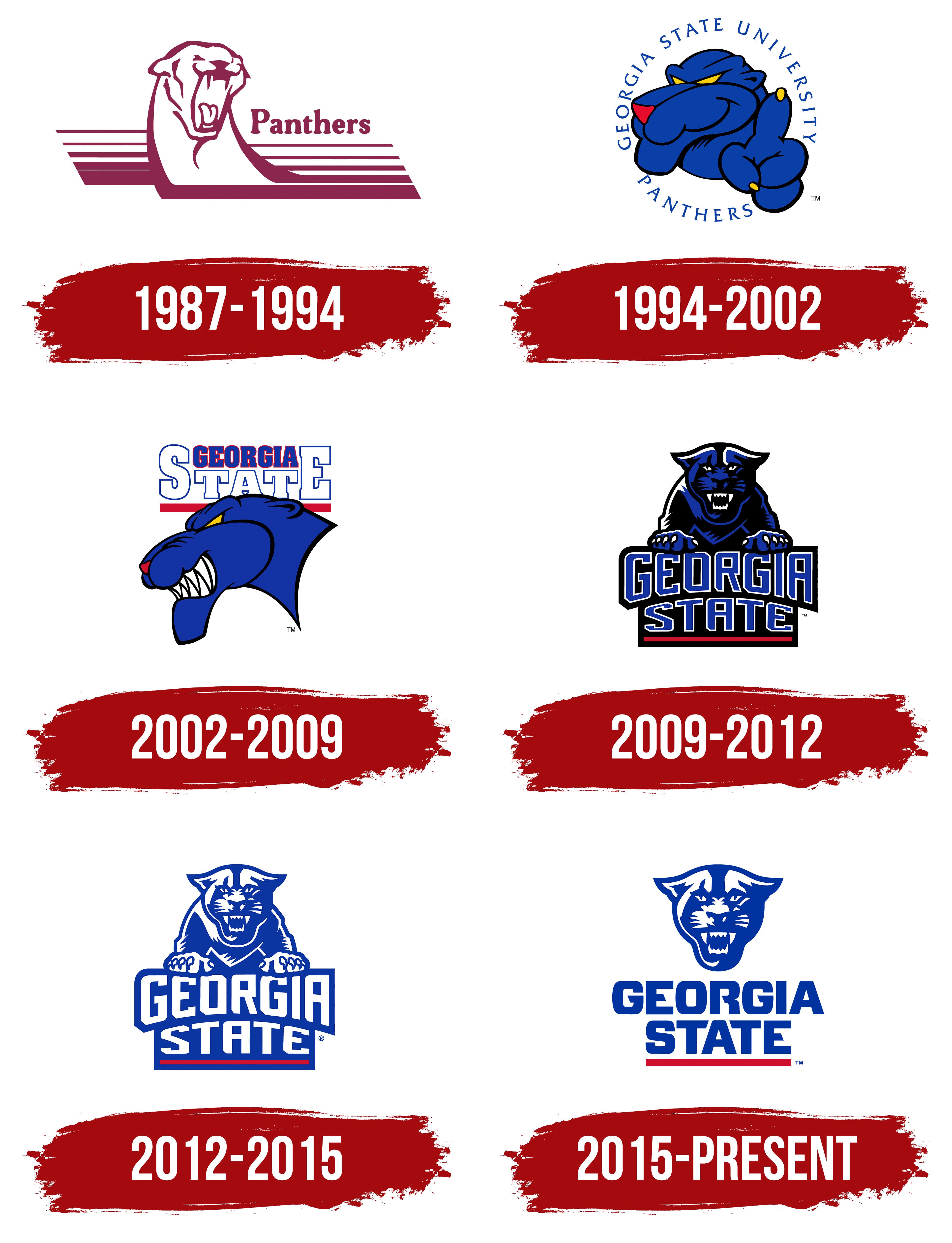
1987 – 1994
The maroon Georgia State Panthers emblem of the 1980s represented the team through their nickname and a panther’s head. The athletic name had emerged decades earlier, replacing names tied to the institution’s history.
The teams represent Georgia State University in Atlanta. Georgia State identifies the state university, Panthers supplies the animal nickname, and GSU abbreviates Georgia State University. The teams were previously called the Owls, a nocturnal bird that reflected the institution’s origins as an evening school. Ramblers followed later. In 1955, students voted for Panthers over suggestions including Bears, Eagles, Lions, and Penguins. By the start of NCAA competition in 1963, the new name was already part of campus life.
An owl also appeared in Georgia State’s early imagery. It sat on a branch surrounded by stars, inside a ring bearing the name Georgia Evening College. The nighttime setting referenced the class schedule. Changes to the institution’s name led to revisions to its lettering and official emblems. At the same time, the panther gradually became the athletic mascot. Academic and athletic identities developed separately. The university name connected them, though seals, official marks, and team illustrations served different purposes.
In the 1980s logo, the panther’s long neck rose above an extended base of horizontal bands. Thin lines at the top gave way to solid maroon areas below. The head faced almost forward, turned slightly to one side, with its mouth open. White spaces defined the forehead, cheeks, nose, fangs, and the inside of the mouth. Panthers appeared to the right in bold serif lettering, with an uppercase “P” followed by lowercase letters. The team nickname was the emblem’s only text.
Maroon also appeared in the costume of the mascot Urbie. His name came from “urban,” connecting the character to the downtown Atlanta campus. In 1993, a blue Pounce, developed by Real Characters, Inc., replaced him. An October 27 newspaper article accompanied the new panther’s introduction and announced T-shirts featuring his image. Pounce refers to a predator’s leap toward its prey. The illustrated character and costumed mascot shared the name, which survived later updates.
1994 – 2002
From 1994 to 2002, Georgia State’s athletic identity developed alongside a new academic emblem. Pounce continued to represent the teams, now with rounded cartoon forms and a raised paw. For university-wide use, designer Cynthia Mitchell created interlocking “G” and “S” initials resembling a flame in 1994.
The academic design combined references to the lamp of knowledge and the phoenix associated with Atlanta’s rebirth. The university needed an emblem suitable for single-color printing, embroidery, engraving, and other applications. The flame-shaped initials met those requirements and were used separately from the athletic character. The city’s themes of fire and rebirth later informed the explanation of the red line in the athletic wordmarks.
A blue face with a red nose dominated the Pounce logo. Narrow yellow eyes looked out beneath heavy brow folds, and the mouth remained closed. A paw rose on the right, with one finger extended and yellow claws. Black lines separated the cheeks, chin, ear, and fingers. Vivid blue, red, and yellow accents, rounded contours, and a humanlike gesture distinguished the panther from its earlier maroon version.
GEORGIA STATE UNIVERSITY and PANTHERS surrounded the character in an interrupted ring. Thin, widely spaced uppercase letters connected the full university name to the team nickname, leaving open space around the illustration.
2002 – 2009
Georgia State’s 2002 logo changed the arrangement of the name and character. Two lines above the panther’s head replaced the circular lettering. Large white STATE letters with blue outlines and rectangular serifs dominated the text. The outer “S” and “E” rose above the interior letters, leaving room for a smaller GEORGIA between them. A red band ran beneath the name, partially covered by the head.
A snarling, left-facing profile replaced the rounded face and raised paw. The mouth opened, exposing long white teeth. The chin extended downward, and the neck ended in a sharp point. The blue fill, yellow eye, red nose, and black outline remained.
The primary emblem stayed in use until 2009. Secondary marks included standalone panther heads with different expressions, including a closed-mouth version.
2009 – 2012
Preparations for Georgia State’s first football season prompted a review of the identity across all teams. The athletic department and the university’s Creative Services office developed a coordinated collection of illustrations, lettermarks, and wordmarks. President Mark Becker and athletic director Cheryl Levick unveiled it on September 2, 2009, at Countdown to Touchdown. A football helmet was presented alongside the new logos.
The collection accommodated different sports. Athletics administrator James Greenwell explained that the range of marks reflected the teams’ needs. Alongside a two-line Georgia State wordmark came a slanted GSU abbreviation, a version with three staggered initials, and a script Panthers wordmark intended in part for baseball and softball. In spring 2010, the baseball team wore uniforms and caps bearing GSU. The softball team wore white jerseys with blue script Panthers lettering outlined in black.
The primary 2009–2012 emblem paired the panther with the name. The animal faced the viewer, with its head, chest, and two front paws above the words. White claws rested on the top edge of the lettering. Small ears angled outward, the eyes narrowed, and the mouth opened. Black filled large areas of the head and body, while blue defined contours and selected surfaces. White highlighted the muzzle, teeth, eyes, and claws. The dark base beneath GEORGIA STATE ended in a red band, and a shared outer outline united the character and text.
TJ Harley, founder of Harley Creative and former creative director of Collegiate Licensing Company, created the two-line Georgia State wordmark. Tall, angular GEORGIA letters were paired with a horizontally extended STATE below. The lower edge of GEORGIA curved upward to make room for the second line. The tightly spaced letters featured clipped corners and straight-edged interior openings. In the standalone wordmark, white lettering sat on a shaped blue background with a light outline and a red line below.
The red band also appeared beneath GSU on football helmets. Its official interpretation connected the athletic identity to the fire in Atlanta’s emblem, the city’s destruction, and its subsequent rebirth.
An updated Pounce debuted on December 22, 2009, at a basketball game against Georgia Southern. The blue costumed panther featured white fangs, whiskers, and prominent brows. The mascot’s appearance changed alongside the athletic emblems, while the name adopted in 1993 remained.
2012 – 2015
In the early 2010s, Georgia State retained the primary logo’s structure while reducing its colors. Blue replaced the black areas. The panther still faced forward, with its chest and paws above the name. White openings separated the eyes, nose, cheeks, teeth, shoulders, and fingers.
GEORGIA STATE became white lettering on a blue background. The red band remained beneath the lower line. A standalone panther head accompanied the full emblem. This compact version later became part of the primary logo.
2015 – today
Georgia State’s 2015 update separated the panther’s head from the name and began bringing team equipment under a consistent standard. The chest, front paws, and shield-shaped background were removed from the primary logo. White space opened between the illustration and the two-line GEORGIA STATE name. The animal and wordmark could also appear independently.
Heavy, upright sans-serif letters replaced the earlier outlined, curved wordmark. The name now formed two straight lines with a red band below. The blue head sat above the text, with adjustments to the left nostril and the white line beneath the teeth. Blue, white, and red remained.
Secondary versions included standalone GEORGIA STATE, PANTHERS, and GSU wordmarks in blue. The two-line name and abbreviation could be accompanied by the red band. The new marks began appearing on uniforms across the athletic program. A university account of Scott Bowen’s work after joining equipment operations in fall 2015 identified logo implementation and equipment consistency as a specific responsibility.
The primary blue is Pantone 286, with the hex code #0039A6. White serves as a background, defines interior spaces, and appears in reversed-color versions. Pantone 186 red remains an accent in the band beneath the lettering.