


 Saint Joseph’s Hawks Logo PNG
The St. Joseph’s Hawks logo represents the athletic teams of Saint Joseph’s University in Philadelphia. Teams across the university’s sports programs compete as the Hawks, with the school’s basketball tradition giving the name added meaning. The motto “The Hawk Will Never Die” expresses the fans’ enduring loyalty and support.
St. Joseph’s University, founded in Philadelphia in 1851, launched its athletics program in the early 1900s. The Hawk became the mascot, representing strength and resilience, reinforced by the motto “The Hawk Will Never Die.” Basketball began in 1891 and gained regional prominence in the 1930s under Coach Bill Ferguson.
In 1948, the Hawks made their debut in the National Invitation Tournament (NIT), and in 1949, they opened the Alumni Memorial Fieldhouse as their home arena. Coach Jack Ramsay guided the team to its first NCAA Tournament appearance in 1956, and by 1961, the Hawks reached the NCAA Final Four.
Throughout the 1970s, St. Joseph’s regularly competed in Philadelphia’s Big Five and won the Middle Atlantic Conference championship in 1974. Joining the Atlantic 10 Conference in 1982 marked a shift toward stronger competition, leading to an Elite Eight appearance in the 1986 NCAA Tournament.
Under Phil Martelli’s coaching tenure, which began in 1997, the Hawks flourished, notably in 2004 when the team, led by Jameer Nelson, went undefeated in the regular season and advanced to the Elite Eight. In 2005, the university opened the Hagan Arena, replacing the Alumni Memorial Fieldhouse.
From 2010 to 2023, the program remained competitive, winning Atlantic 10 tournament titles in 2014 and 2016 and qualifying for the NCAA Tournament each time. St. Joseph’s remains closely tied to Philadelphia basketball culture, sustaining its reputation in the Atlantic 10 Conference.
Meaning and History
What is St. Joseph’s Hawks?
This athletic community, representing Saint Joseph’s University, actively competes in NCAA Division I within the Atlantic 10 Conference. At Michael J. Hagan Arena in Philadelphia, these athletes in crimson-and-gray uniforms created one of college basketball’s most famous traditions. Their mascot, the Hawk, flaps its wings continuously throughout the games, symbolizing the school’s motto: “The Hawk will never die.” These athletes compete in 20 sports, but basketball remains their most distinctive feature, gathering a loyal fan base and sustaining intense rivalries in Philadelphia’s legendary Big 5 basketball history.
1982 – 1991
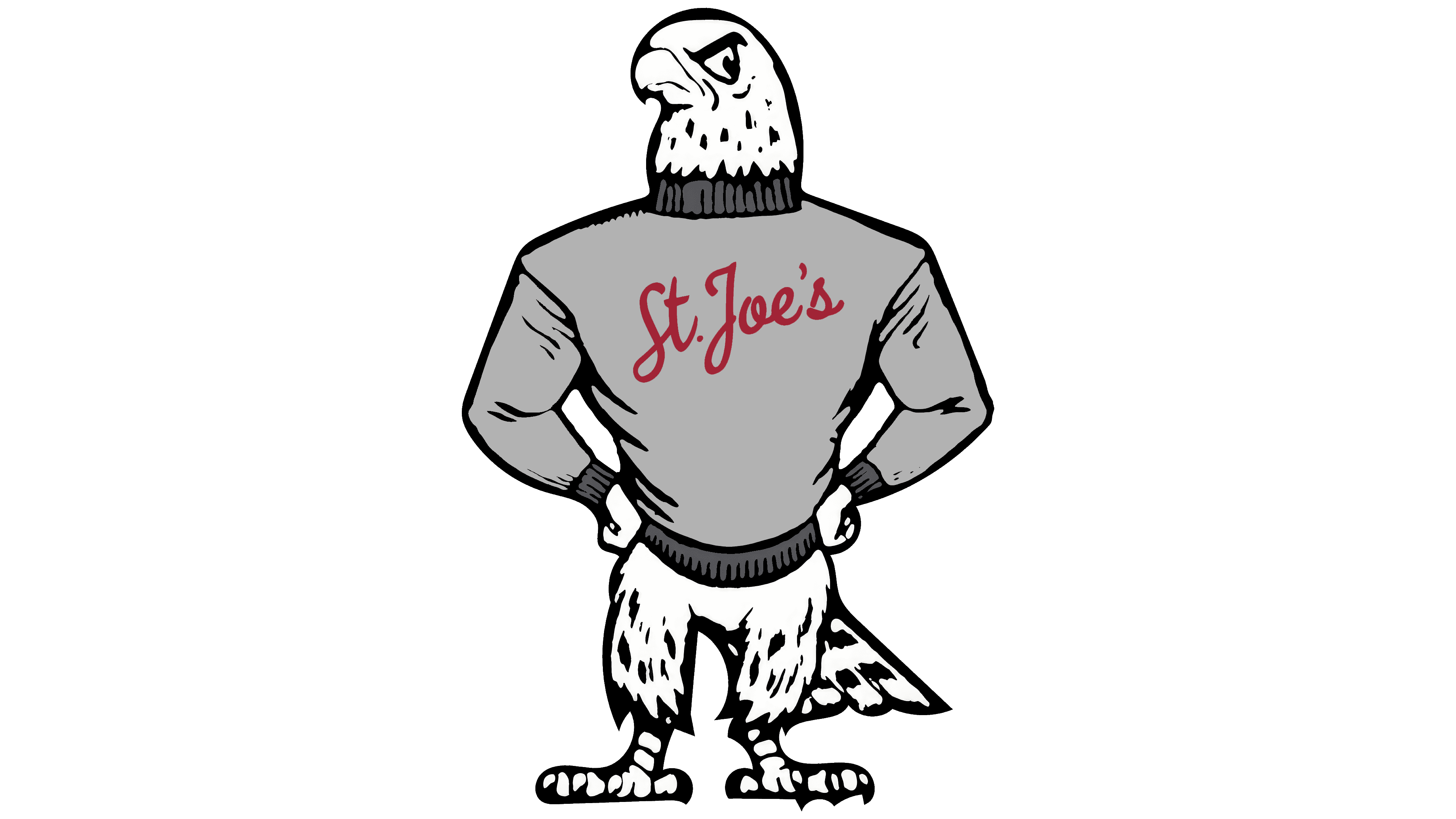
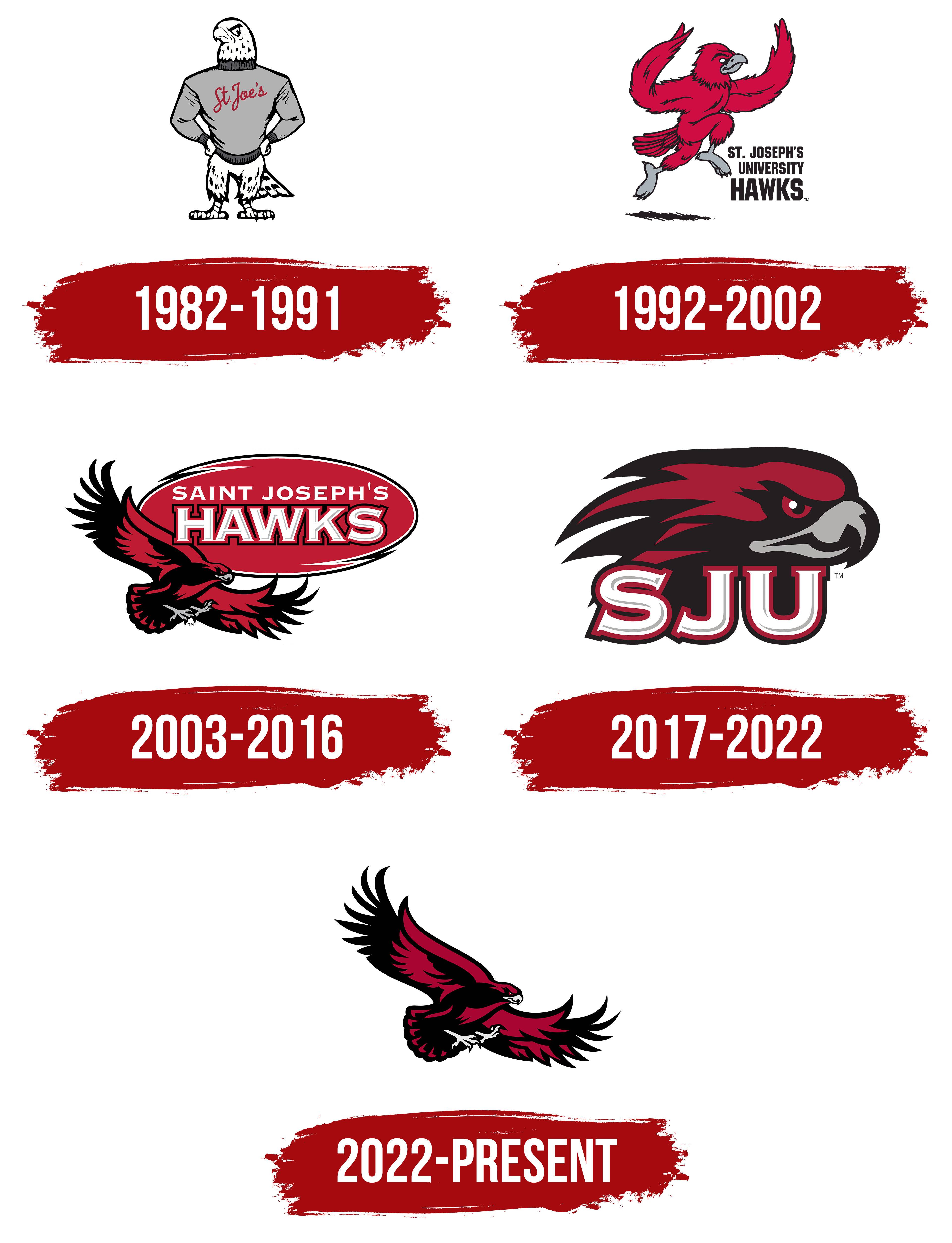
Beginning in 1982, the Saint Joseph’s University athletic teams used a logo featuring a hawk in a gray sweater. The hawk stands facing left, hands on hips and taloned feet planted apart. A striped tail peeks out from one side of the sweater. Short black strokes mark the folds in the sleeves and the flecks in the bird’s pale plumage. Across the chest, “St. Joe’s,” the familiar short form of the university’s name, appears in flowing script. The lettering ranges from red to burgundy. Some versions show the hawk in a crimson sweater or with the lowercase initials “sju” on its chest.
The two parts of the name Saint Joseph’s Hawks have different origins. Saint Joseph’s takes its name from the university, which the Jesuits founded in Philadelphia in 1851. The Hawks nickname dates to 1929, when student yearbook editor Charlie Dunn announced a contest to choose a symbol for the school’s teams. Hawks narrowly beat Grenadiers in the final vote. John Gallagher, a catcher on the university’s baseball team, submitted the winning name and received a sweater bearing the Saint Joseph’s monogram. To students, the hawk embodied the fighting spirit of the players who took the field in crimson and gray. Its flight also brought to mind the long passes that had made the school’s football team famous.
Saint Joseph’s dropped football after the 1939 season, and the hawk’s story continued on the basketball court. During the 1954–55 season, student Jim Brennan wanted to bring a live hawk to games. He later proposed having a hawk costume made, and the student council raised $120 to pay for it. Brennan first took the court in costume on December 3, 1955, before a game against the University of Rhode Island at the Palestra in Philadelphia.
Over time, the Hawk developed a tradition of flapping its wings from tipoff to the final buzzer and tracing figure eights on the court during timeouts. That game-long ritual echoes the fans’ chant, “The Hawk Will Never Die!” Decades later, Bobby Gallagher wore the costume, following in his grandfather’s footsteps. This baseball player had given the Hawks their name.
1992 – 2002
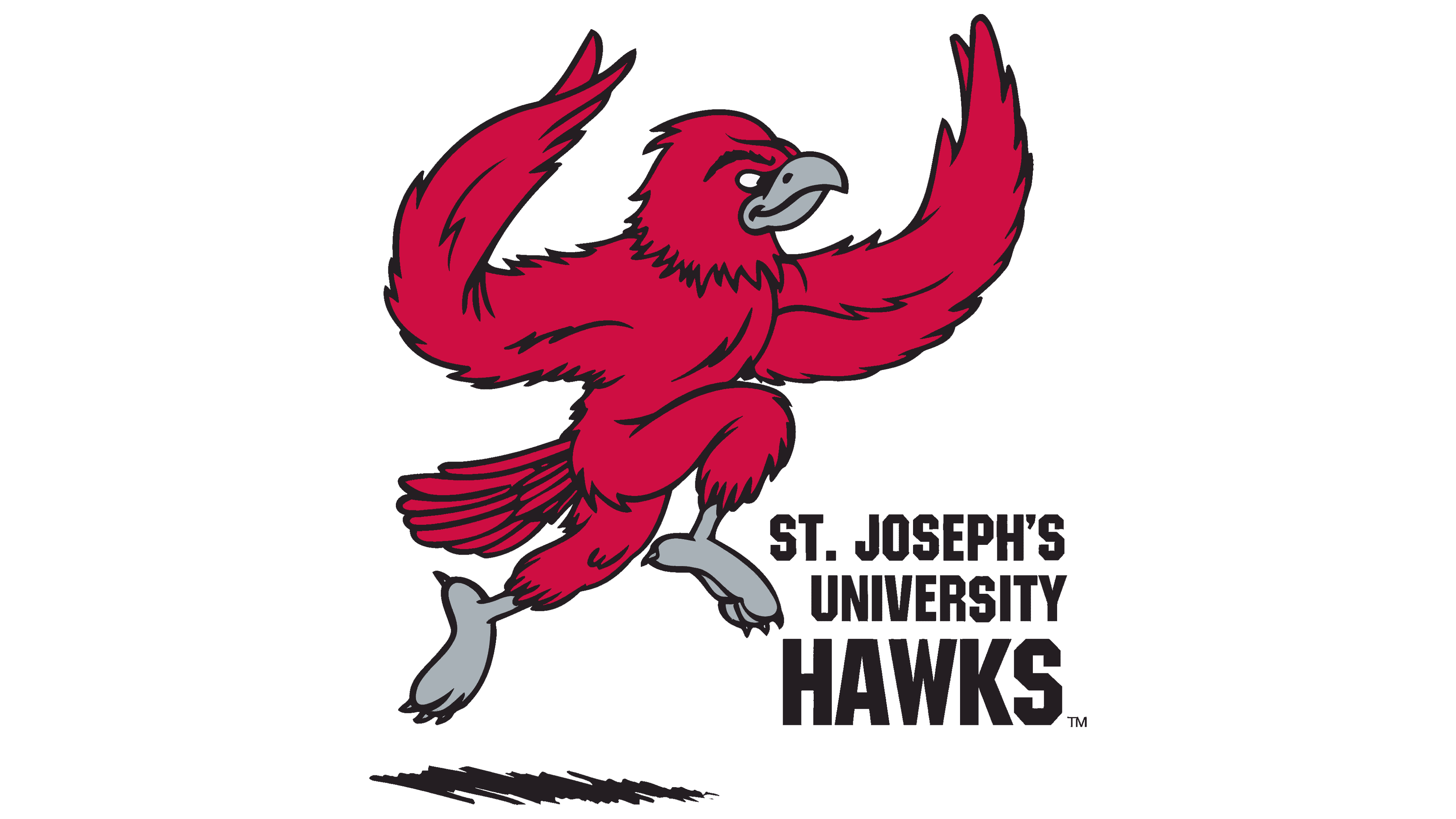
The 1992 Saint Joseph’s logo showed the hawk running to the right with its wings raised. One foot was drawn up in front of its chest while the other stretched back. A short black shadow appeared beneath its feet. The bird’s colors changed as well. Its plumage was crimson, its beak and feet were gray, and fine black lines outlined its feathers.
The lettering moved from the sweater to the right of the bird. Three lines of bold, narrow sans serif capitals replaced the script nickname. “ST. JOSEPH’S” occupied the top line, with “UNIVERSITY” beneath it. The team nickname, “HAWKS,” appeared in larger letters across the bottom. The running hawk represented Saint Joseph’s athletics through 2002.
2003 – 2016
To unveil the new Saint Joseph’s logo on October 17, 2002, a flying hawk appeared on the court at Alumni Memorial Fieldhouse. Its wings extended beyond the center circle. The university showed the new logos to the press that afternoon. That evening, students and alumni saw the hawk on the court at Midnight Madness, the event marking the start of basketball season.
The redesign came shortly after Saint Joseph’s 150th anniversary. The university wanted its athletic logos to more closely resemble its other emblems while keeping the hawk fans knew. A more contemporary rendering replaced the cartoon bird of the 1990s as the university prepared to promote its teams nationwide. From 2002 to 2018, its primary athletic logo featured a hawk in flight against a crimson oval.
The hawk stretched its head to the right and tucked its feet beneath its body. One wing rose on the left, while the other extended to the right beneath the team name. Long, pointed flight feathers fanned outward. The plumage was mostly black with patches of crimson, and white and black outlines defined the bird’s silhouette. The illustration also included touches of gray.
The wide oval had a black-and-white border and held two lines of lettering. “SAINT JOSEPH’S” appeared in small white capitals at the top. Below it, “HAWKS” spanned nearly the full width of the oval. Heavy serifs, layered outlines, and a shadow gave the letters depth. The set included two other logos. One paired the hawk’s head with the full university name inside a circle. The other placed the flying bird above a stand-alone “HAWKS” wordmark.
2017 – 2022
In 2017, Saint Joseph’s adopted the hawk’s head above the initials SJU as its primary athletic logo. Fans had known the design since 2002, when it debuted as a secondary mark. It served as the primary logo through 2022. The earlier logo had included an oval frame and the full university name.
The hawk faces right in profile, with long crimson and black feathers sweeping left from the back of its head. It has a red eye and a hooked gray beak. Three large serif letters form the base of the logo. Crimson and black outlines frame the light-colored letter faces, and gray shadows add depth.
2022 – today
In 2023, the flying hawk from the 2002 Saint Joseph’s logo returned as the primary symbol for the school’s teams. The university retained the bird and dropped the oval and lettering. The Flying Hawk logo shows the full bird in flight. The hawk’s head in profile above the SJU initials remains a secondary mark.
Broad areas of color with angular edges define the Flying Hawk. The illustration has less anatomical detail than earlier versions. Long black feathers line the upper edge of the raised wing, while the other wing extends to the right. The pale talons stand out against the dark body, reaching forward as if the hawk were about to strike in midair.
The red “St. Joe’s” script also survives from the early logos. Once worn across the illustrated hawk’s sweater, it now appears on its own. The fans’ chant, “THE HAWK WILL NEVER DIE,” has lettering of its own. Uneven brushstrokes form the words, a sweeping flourish runs beneath them, and a small hawk flies overhead.