Standard Life: Brand overview
Established in 1825 in Edinburgh, Scotland, Standard Life was one of the pioneers of life insurance in the world. During the company’s formative years, its services focused on meeting the needs of Scotland’s growing urban population by offering life insurance to reduce burial costs.
In the 1880s, the company’s portfolio of services expanded to include asset management and pensions. An indication of Standard Life’s prominence was the insurance of famous infrastructure projects, notably the Forth Bridge. By 1925, the centenary of the company’s founding, Standard Life opened its corporate headquarters, Standard Life House, on Lothian Road in Edinburgh. This move further cemented the company’s position as a reliable financial mainstay.
The post-war era favored Standard Life’s growth, as many Scots gravitated toward life insurance and pension plans. This growth culminated in the 1960s, and Standard Life became the leading insurer in Scotland. 2006 was a major turning point as Standard Life transformed from a unit trust company to a public company, gaining a place on the London Stock Exchange.
Over the following decade, the company, while maintaining its base in Edinburgh, expanded its global footprint and delved deeper into asset management. However, 2018 saw a turning point when Phoenix Group acquired Standard Life in a £3.2 billion deal that saw Standard Life become a subsidiary of Phoenix while retaining the iconic brand name.
In its current form, Standard Life offers a wide range of insurance, savings, and investment solutions. The company serves customers in the UK and Europe and boasts a trusted base of over 4.5 million customers.
Meaning and History
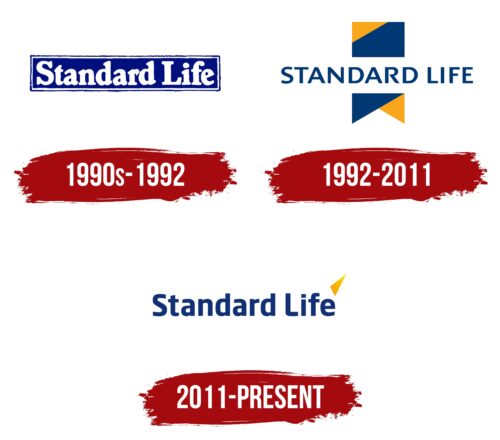
1990s – 1992
1992 – 2011
2011 – today
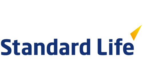
Standard Life’s minimalistic logo shows that the UK-based company is serious about life insurance, savings, and pensions. The logo consists mainly of the company’s name, which takes up almost the entire space. The text is colored blue and is mostly in lowercase letters, without serifs. The letters are bold and consist of smoothly curved glyphs that look like hand-drawn letters. To the right above the letter “e” is a yellow triangle with the sharp end pointing upward.
The blue color of the text is calming, reminiscent of the ocean or the sky on a good day, which gives a sense of peace. The yellow triangle is like a little flag saying, “Hey, look over here, we’re moving up!”. It’s simple yet eye-catching. It gives the feeling that the company is stable but also strives to progress.
Standard Life color codes
| Cool Black | Hex color: | #113174 |
|---|---|---|
| RGB: | 17 49 116 | |
| CMYK: | 85 58 0 55 | |
| Pantone: | PMS 288 C |
| Selective Yellow | Hex color: | #f9b900 |
|---|---|---|
| RGB: | 249 185 0 | |
| CMYK: | 0 26 100 2 | |
| Pantone: | PMS 7549 C |
