Founded in 2005, STOP THE TRAFFIK has been a leader in the global fight against human trafficking. 2008, the organization presented 1.5 million signatures to the UN, influencing the UK Modern Slavery Act 2015. Focusing on prevention and education, STOP THE TRAFFIK tackles the financial and structural roots of human trafficking.
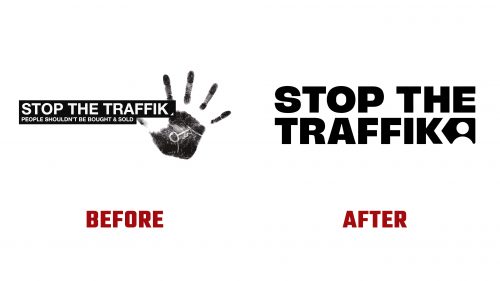
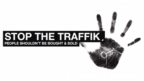
STOP THE TRAFFIK has introduced a new logo and brand identity designed by Fold7Design. The old logo, featuring a hand signaling “stop,” was urgent but cluttered. The new logo takes a softer approach to engage a wider audience.
The new logo centers around a backwards-pointing arrow integrated into the “K” in “TRAFFIK.” This arrow, which points against the conventional direction, symbolizes the organization’s focus on prevention. Rounded corners and soft edges make the logo more approachable.
The new typography is friendly and filled with personality, aiming to make the brand more relatable. While a more solemn sans-serif could have been used, the chosen typeface ensures clarity and accessibility.
The primary colors are black and yellow, reminiscent of Amnesty International. These colors signal a humanitarian crisis and draw immediate attention to the mission.
A key element of the new identity is the “Stop Arrow,” replacing the distressed handprint with an avatar. This symbol focuses on people and hints at a modern, data-driven approach. The arrow is a universal branding device, adaptable across projects, partners, campaigns, and products.
The visual identity includes powerful black-and-white collages depicting human trafficking. Paint dabs obscure faces, symbolizing the dehumanizing effect of trafficking while preserving anonymity and dignity. These images are compelling, especially animated with a parallax-3D effect to emphasize the global issue.
The identity system uses the Stop Arrow to maintain a consistent brand presence. Monochrome imagery and collages are striking against pastel backgrounds, creating a sobering yet appealing visual narrative. Full-color photography, used sparingly, feels less integrated.
Typographic choices include a large monospace font. While functional, a more traditional typeface might better complement the impactful collages. The overall design remains solid and serviceable for the organization’s needs.
Fold7Design worked closely with STOP THE TRAFFIK to create a modern, appealing brand identity that reinforces the organization’s mission and values. The result is a bold, versatile visual system that engages and respects serious issues.
The new identity aims to support STOP THE TRAFFIK’s evolving mission and expand its reach. By creating a more approachable and adaptable brand, the organization seeks to enhance its effectiveness in preventing human trafficking and supporting victims. The redesigned logo and visual identity are crucial in communicating this mission and ensuring that STOP THE TRAFFIK remains a powerful force in the global fight against human trafficking.


