The treble clef, symbolizing elegance and impeccable taste, shows the store’s delicate approach to fashion issues. The Stradivarius logo is a great example of analogy, helping the user to draw a parallel between two facets of beauty.
Stradivarius: Brand overview
| Founded: | 1994 |
| Founder: | Inditex group |
| Headquarters: | Sallent (Barcelona), Spain |
| Website: | stradivarius.com |
Meaning and History
The brand was named in honor of the legendary Antonio Stradivari, a master of bowed instruments. His name is a sign of perfection in the music world, a mark of great taste and impeccability. The owners of the company transferred this symbolism to fashionable goods.
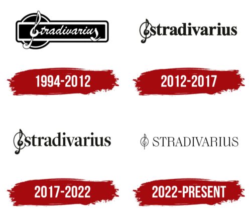
Since its inception, the brand has had several emblems. Each of them has a name and a treble clef at the beginning of a word. In one version, they are placed in a rectangular frame; in another, they are located on a white background; in the third, they are in italics.
What is Stradivarius?
Stradivarius is a Spanish fashion brand founded as a family business. It was founded in Barcelona in 1994 and became part of the Inditex group five years later. Now the brand owns about 950 stores in 62 countries.
1994 – 2012
The logo consists of two parts – graphic and text. It features the word “Stradivarius” in its original design – with a treble clef instead of the capital letter “S.” The last “s” also has a unique design: it looks like one of the elements of musical notation. The rest of the characters are italic, handwritten. The brand name is enclosed in a horizontal rectangle with rounded corners and a double border. Below it is a disc of the same color (black).
2012 – 2017
The designers separated the treble clef and the “S,” which greatly improved the word’s readability but did not change the brand’s concept. They also introduced a new font – the classic typeface, with wide lowercase letters. This option is still in use in some older stores.
2017 – 2022
The redesign took place in connection with the launch of a line of menswear. The adjustments were minor: the developers reduced the characters’ thickness, so now they are not bold, but bold. The treble clef’s oval is connected to the top and bottom of the letter “s.”
2022 – today
After the redesign, the Stradivarius logo retained an element that has been present in it for over 30 years. This is a treble clef. But the developers have updated it, adding sophistication, sophistication, and weightlessness. The stripes are now soft and stylized, and the “S” overlay is gone. That is, now the musical icon and the first letter of the name of the fashion brand do not touch – they are located at a distance from each other. This shift made the inscription cleaner and more legible. The remaining key is thin and graceful. Because the lines are narrow, it looks very light, balancing in the center of the vertical oval.
The wordmark has also been modified. The typography was developed by the ExtreType studio, offering a simplified design style. Now the author’s font has two families: one with serifs, the other without. The letters have been uppercase and made more airy. The designers achieved this effect by reducing the thickness of the glyphs. The capital “R” is played very interestingly: the lower end of the right leg is cut off. The new emblem added dynamism, rhythm, and modernity to the visual identity of the clothing manufacturer.
Stradivarius: Interesting Facts
Stradivarius, a popular trendy clothing brand for women and young people, started in Barcelona, Spain, in 1994.
- Starting Out: Founded in Barcelona in 1994, Stradivarius initially focused on women’s fashion. Its success caught the attention of the Inditex Group, which bought it in 1999. Inditex is a major player in fashion, owning other brands like Zara and Bershka.
- Joining Inditex: Becoming part of Inditex in 1999 was a game-changer for Stradivarius. This meant that the brand could grow worldwide using Inditex’s network.
- Family Feel: Even as it grew, Stradivarius kept a family business vibe, which is common for Inditex brands. This influences how they operate, focusing on being close to customers and offering trendy clothes at good prices.
- Worldwide Expansion: Stradivarius now operates in over 60 countries with over 900 stores, showing its global appeal.
- More Than Clothes: The brand has added accessories, footwear, and bags to its lineup, allowing shoppers to get a full outfit in one place.
- Eco-friendly Fashion: Stradivarius is working towards making all its items from sustainable, organic, or recycled materials, reflecting Inditex’s environmental goals.
- For the Young and Stylish: The brand targets young people who want the latest trends without spending a lot. It keeps its collection fresh to stay up-to-date with fashion trends.
- Selling Everywhere: Stradivarius sells its products online and in stores, making shopping convenient no matter where customers are.
- Working with Influencers: The brand collaborates with influencers and artists for special collections and campaigns, helping it stay connected with its audience.
- Loving Music and Culture: Stradivarius supports music and cultural events that match the interests of its young customers and help strengthen the brand’s image.
Stradivarius has become a significant name in fast fashion, attracting young shoppers worldwide with its stylish, affordable clothes and commitment to being eco-friendly. Its mix of online and physical stores, along with its engagement in music and culture, keeps it in tune with its customers’ lifestyles.
Font and Colors
The debut version is developed based on a rectangular geometric shape with rounded corners and double edging. In the center is the handwritten inscription “Stradivarius.” Instead of the first letter, a treble clef was used, which successfully repeats the “S” shape. This allowed the company to emphasize its connection with the world of music. The last “s” is also interestingly played: it looks like a musical note.
Subsequent logos emphasize the austere style. The font is classic, lowercase, with serifs. The letters are bold, printed, thickened. This design has rejuvenated the brand and made it timeless, emphasizing the relationship between the past and the present.
The corporate colors are monochrome: white is exquisitely complemented by black. They are harmoniously combined and do not overwhelm each other.
FAQ
Is Stradivarius a luxury brand?
Despite its name evoking the renowned and valuable violins from the 17th and 18th centuries, Stradivarius is not a luxury brand. Instead, it is part of the fast fashion industry, providing trendy and affordable clothing and accessories. The brand targets young, fashion-conscious customers, offering reasonably priced latest styles.
Zara, owned by the Spanish retail giant Inditex, also owns Zara and focuses on “cheap chic” fashion. This means the brand aims to offer fashionable items that follow current trends but are much more affordable than high-end designer brands. The collections are frequently updated, ensuring customers have access to the newest styles. The brand’s strong online presence makes it easy for customers to browse and purchase items from their collections.
Who is the CEO of Stradivarius?
As of April 1, 2022, Óscar García Maceiras is the CEO of Inditex, the parent company of Stradivarius. Marta Ortega Pérez serves as the chairwoman of Inditex. Inditex owns several popular brands, including Zara, Bershka, Pull&Bear, and Stradivarius.
Marta Ortega Pérez, as chairwoman, oversees the direction of Inditex and its brands, including Stradivarius. Óscar García Maceiras, as CEO, manages the company’s overall operations and ensures the brand’s goals are met.
What does the Stradivarius logo mean?
The logo symbolizes the virtuosity, perfection, and impeccable quality of the brand’s products. It was inspired by Antonio Stradivari, the renowned violin maker known for his exceptional craftsmanship.
Stradivari’s violins are masterpieces celebrated for their superior sound and design. By adopting his name, the brand aims to reflect the same commitment to excellence in its fashion products. The logo embodies this heritage, highlighting the brand’s dedication to creating high-quality, stylish items that stand out in the market.
What is the Stradivarius logo?
The logo features the brand name, inspired by the famous violin maker Antonio Stradivari. This connection highlights the brand’s commitment to craftsmanship and quality, like Stradivari’s renowned violins.
Next to the brand name, there is a musical key symbol. This element emphasizes the brand’s association with music and artistry. It honors its namesake and reinforces the brand’s dedication to sophistication and elegance.
The logo communicates the brand’s values and identity, linking the timeless appeal of Stradivari’s violins with the brand’s contemporary fashion offerings.
What is the font of the Stradivarius logo?
The modern logo uses a classic lowercase serif typeface with bold letters, giving it a strong and elegant look.
In earlier versions, the logo featured a cursive typeface that mimicked handwriting. The initial “S” was designed to look like a treble clef, emphasizing the brand’s connection to music and its namesake, Antonio Stradivari.
The shift from a cursive, handwritten style to a bold, serif typeface shows the brand’s growth and desire to maintain a timeless yet contemporary image.


