Sun Life Financial: Brand overview
In 1865, in the heart of Montreal, Matthew Hamilton Gault spearheaded the creation of the Sun Insurance Company of Montreal, laying the foundation for what later became Sun Life Financial. Originally conceived to meet Canada’s insurance needs, the company soon expanded beyond the country’s borders. By the end of the nineteenth century, Sun Life was planting its flag on the international stage: its services extended to England and then to Asia, Latin America, and the United States.
The growth trajectory in the early twentieth century was multifaceted. Sun Life expanded its core insurance offerings and ventured into investment management. 1919 marked a significant year in the company’s history when it merged with the Life Association of Canada to become Sun Life Assurance Company of Canada.
The following decades were marked by Sun Life’s relentless pursuit of global expansion, capturing markets in North America, Asia, and Europe. At the dawn of the new millennium, the company underwent structural changes. In 2000, it segmented its operations into three main divisions: Sun Life Financial, Clarica, and MFS. This metamorphosis was emphasized in 2002 when the combined company was named Sun Life Financial Inc.
Today, Sun Life is a global force in the financial sector, providing a suite of services, including insurance, wealth management, and investments. The company manages $1.3 trillion in assets and remains a dominant player on the global stage.
Meaning and History
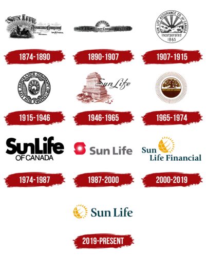
1874 – 1890
1890 – 1907
1907 – 1915
1915 – 1946
1946 – 1965
1965 – 1974
1974 – 1987
1987 – 2000
2000 – 2019
2019 – today
The main feature of the logo is the sun, ready to light up the world. To emphasize this idea, the designers combined two celestial bodies (the Sun and the Earth) and created a symbol that has quite a lot of meaning. It is deep and basic, as it implies a comfortable life all year round without any risks. On the left is a yellow circle with grid lines resembling lines of latitude and longitude. On the right is a sun with made-up rays of triangular shape with a slight bend at the ends. Next to it, the name of the insurance company is written in Latin script with slanted serifs.
This logo is reminiscent of a warm embrace. The yellow sun brings thoughts of happy sunny days, and the Earth grid shows that the insurance company has the whole world in its plans. The rays seem to be waving to you, saying, “Come in, it’s cozy here!”. The font of the company name is stylish but not obtrusive. The logo carries a serious meaning, but at the same time, it is friendly and attractive.
Sun Life Financial color codes
| School Bus Yellow | Hex color: | #f0a701 |
|---|---|---|
| RGB: | 240 167 1 | |
| CMYK: | 0 30 100 6 | |
| Pantone: | PMS 137 C |
| Peacock Blue | Hex color: | #023b49 |
|---|---|---|
| RGB: | 2 59 73 | |
| CMYK: | 97 19 0 71 | |
| Pantone: | PMS 548 C |

