The Supra logo is stylish and memorable. The emblem highlights the product’s exceptional features: superior materials, well-thought-out design, and durability. The symbol instills confidence bestowed by wearing the brand’s footwear.
Supra: Brand overview
| Founded: | 2006 |
| Founder: | Angel Cabada |
| Headquarters: | United States |
| Website: | supra-korea.com |
Initiated in 2006 in Los Angeles by Angel Cabada, a one-time pro skateboarder, Supra burst onto the skateboarding and hip-hop scenes with its eclectic footwear that blended laid-back Californian vibes with urban edge. The company started its journey with significant contributions from notable skateboarders like Chad Muska and Erik Ellington, and their inaugural shoe model was the Supra Vaider.
As the late 2000s approached, the brand diversified its offerings, stepping beyond its skateboarding roots to incorporate general street fashion. Its collaboration with mainstream celebrities, including pop star Justin Bieber, contributed to its rising fame. One shoe, the Skytop, emerged as an enduring symbol of the brand’s unique aesthetic.
2015, the brand underwent a significant change when K-Swiss Global Brands purchased it. Yet another transition occurred in 2020 when F&F, a Korean fashion retailer, acquired the worldwide trademark rights to Supra.
Fast forward to 2023, and Supra is transforming. Now positioned as a high-end lifestyle brand, it seeks to intertwine elements from varied realms such as fashion, music, technology, and street culture. What began as a skate-centric label has blossomed into a multifaceted lifestyle brand, maintaining its popularity from its early days while embracing modern-day digital culture and trends.
Meaning and History
The footwear emblem has remained consistent. Over 17 years and a long list of owners, the symbol has changed only once. A distinguishing feature of the logo is a crown symbol, indicating the brand offers the best product in the niche of skateboard footwear. Like the name, the emblem was conceived by the company’s founder, Angel Cabada.
What is Supra?
A brand born in America as a business product for professional skateboarders, it grew in partnership with other athlete brands under the umbrella of One Distribution. Shoe lines were developed by celebrities like Stevie Williams, Ellington, Jim Greco, and Penny. In 2015, the brand changed hands until it was bought by fashion firm F & F and relaunched in Korea in 2021.
Old
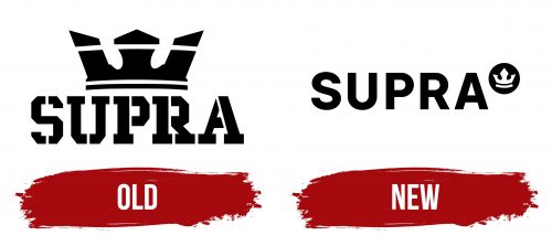
The brand’s first logo featured a prominent three-petal crown with the composite capital letters of Supra below it. The royal symbol was very ostentatious for the brand yet purposeful.
The footwear produced by the company was initially designed for skateboard royalty, with Angel Cabada collaborating with five professional skateboarders. Among them were hammer-style skateboard legends Jim Greco and Erik Ellington and versatile athlete Chad Muska, who had been associated with companies like Maple, Toy Machine, Shorty’s, and C1RCA. Cabada was not new to the scene; he had previously founded KR3W and produced skateboarding apparel with TSA Clothing.
Given their status as skateboarding elites, they knew exactly what kind of shoes professionals would require. Consequently, the royal brand Supra was born. The decision to incorporate a crown into the logo followed naturally.
The logo indicated that Supra is characterized by:
- Star developers
- Premium quality – Soft leather, durable textiles, vulcanized soles.
- Maximum comfort – Shoes fit well and allow for free movement.
- Practicality and safety – High arches securely lock the foot in place, reducing the risk of injury.
- Style – The shoe design stood out from other manufacturers, rendering the product unique.
The sharp edges of the three-petaled crown on the circle alluded to the era of French royalty. The two lines in the design mimic the tracks left by a skateboard, signifying dominance. The symbol indicates that the footwear is fit for street royalty.
Interestingly, the stripes emulate the three-petal Adidas Originals logo. The resemblance to the globally recognized brand triggers the desired associations among viewers.
The emblem caught the attention of many celebrities who were friends with Angel Cabada. Praise came from Justin Bieber, David and Victoria Beckham, Kanye West, and Jay-Z. The crown, therefore, represented the approval of the best and the famous, signaling to customers that they share footwear choices with their idols.
Cabada asserted that he chose the crown symbol because it signifies supreme authority. No one stands higher in any room than the one wearing a crown. Likewise, the brand’s footwear is the best option available. All important figures in skateboarding will surely wear Supra.
The brand name in the logo is written in black capital letters of uniform width. The design appears to be composed of individual skateboards, making the symbol distinct. The tracks from the wheels seem to outline the lettering. Cabada spent six months selecting the brand name. The word in Latin means ‘above’ and speaks to exceeding known boundaries. This name embodied the founder’s ambition to offer the best footwear.
New
In 2015, the brand changed ownership to K-Swiss Global Brands, Xtep, and F & F Co. The sneakers expanded beyond the realm of sports. Stores opened outside of America, resulting in an updated visual identity.
The new logo has undergone only slight changes compared to its predecessor. The crown, as part of the style, remains. It is enclosed in a black circle. This stamp on the footwear guarantees quality and comfort. The symbol emphasizes the new owners’ aspiration to maintain the image of the best skateboard footwear. The graphic indicates that the brand’s footwear will maintain its uniqueness and individuality regardless of the owner.
The name is in uppercase letters but with a new, more flexible, and smooth font. The inscription shows versatility. Now, the sneakers are suitable for everyday wear and sports activities, and the price is accessible for enthusiasts.
Font and Colors
Black is the primary color of the emblem. It represents streets, roads, intense training, and dangerous stunts. The shade symbolizes practicality and indicates dominance. The founder saw no competitors for his products.
The font resembles Genera Semi Bold with light and flexible letters reminiscent of smooth ramp curves.
Supra color codes
| Black | Hex color: | #000000 |
|---|---|---|
| RGB: | 0 0 0 | |
| CMYK: | 0 0 0 100 | |
| Pantone: | PMS Process Black C |


