


![]() Syracuse University Logo PNG
Syracuse University Logo PNG
The Syracuse University logo helps identify the educational institution across various media platforms, including documents, websites, and social media. It doesn’t carry explicit symbolic meanings but conveys information about the university’s name and traditional colors, making the emblem recognizable.
Meaning and History
![]()
Syracuse University is located on a picturesque slope in the very heart of New York State. Its ancient architecture and ivy-covered walls remind us that construction began in 1870. However, the SU wordmark does not offer any obvious nods to the venerable history of the educational institution. The logo has repeatedly been criticized for its excessive “corporate” feel, as it doesn’t contain any symbolic elements – only the university’s name, which is represented in various documents and graphic materials. Nevertheless, credit should be given to the Sherman font. It was designed long ago by the American artist Frederic W. Goudy and continues to be used today, serving as an important part of the university’s cultural heritage.
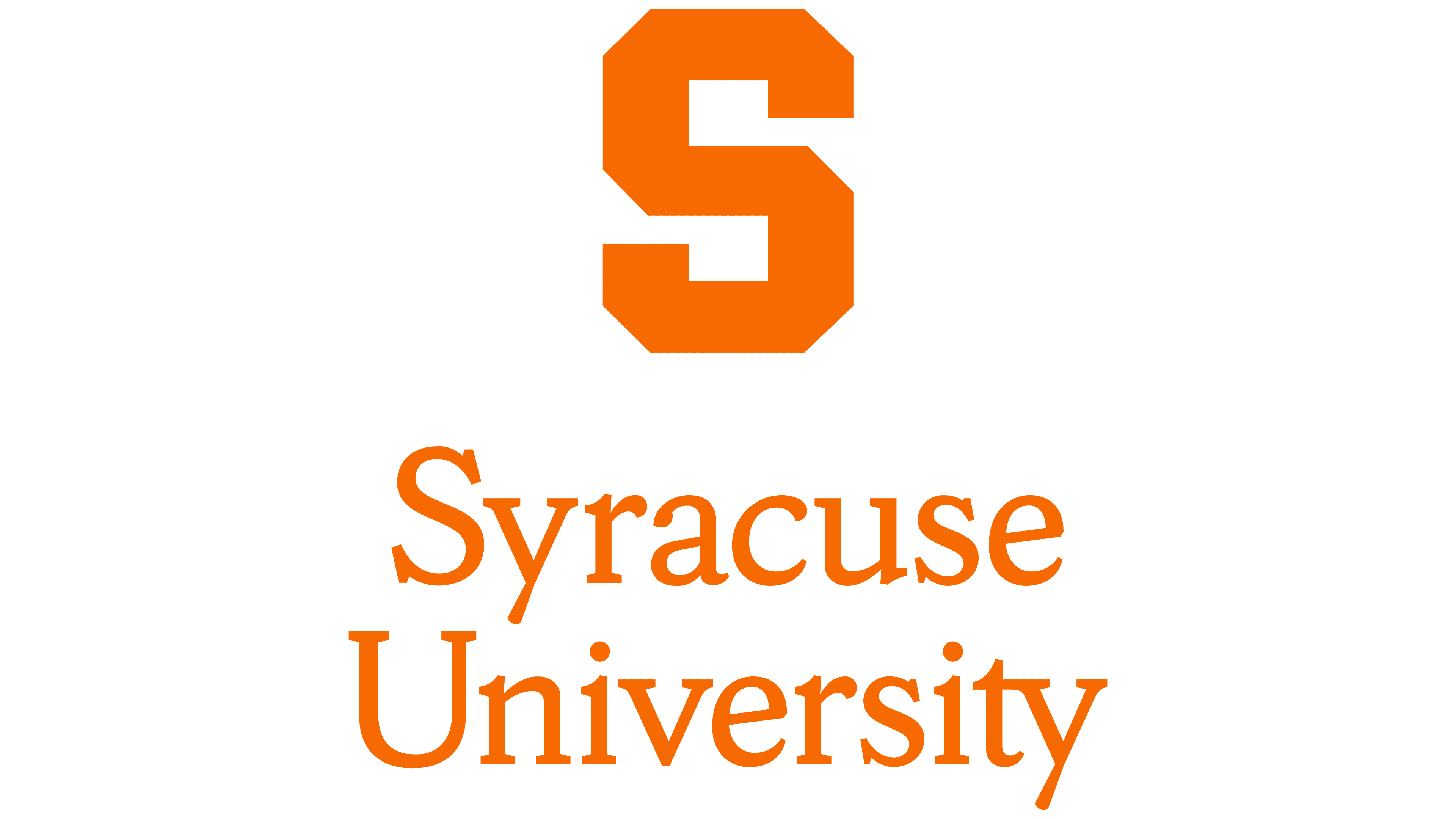
The SU branding guide also states that, in addition to the wordmark, the logo includes Block S, an orange letter with many angles. In its standard form, it has no contour. This symbol not only represents sports teams but is also part of the educational institution’s official emblem.
The modern visual identity of the university was created by the New York-based design firm Pentagram. The specialists thought out a complex brand system, including diverse graphic symbols, seals, colors, and fonts, reflecting the educational institution’s concept. The development team includes Jesse Reed, Michael Bierut, Ben Feller, and Chester Jenkins.
What is Syracuse University?
Syracuse University is a private educational institution that combines teaching activities with scientific research. It was founded in the American state of New York in 1870. Since then, it has significantly expanded the list of bachelor’s, master’s, and doctoral programs in various fields of knowledge. The university is famous not only for its high-quality education but also for its successful sports team, the Syracuse Orange, in honor of its official color.
The logo enhances recognition of Syracuse University and can be used in most contexts, unlike the seal, which has limited use. One of its elements is the wordmark – the university’s full name in orange letters. Both a single-tier and a two-tier arrangement of the inscription are acceptable, depending on available space.
The phrase “Syracuse University” must be typed in the proprietary font from the Sherman family. Its creator is the well-known American typographer Frederic W. Goudy, who drew over 110 typefaces, many of which have become classics. When the Pentagram firm took on updating the SU logo, designer Chester Jenkins slightly modified the font to give it a modern look.
The Seal
![]()
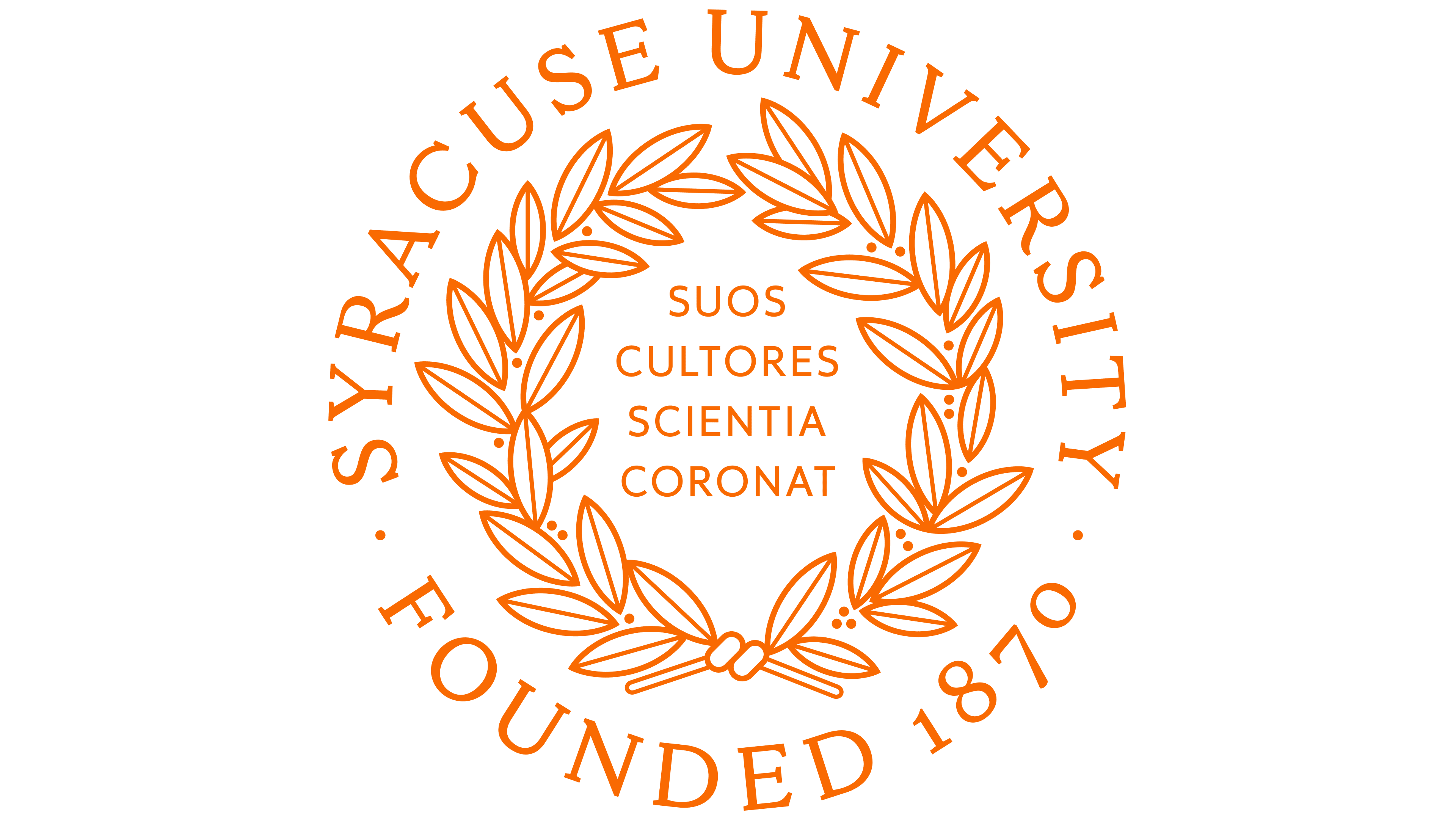
The university refers to its seal as the Heritage Logo, the oldest element of its visual identity (archives indicate that the initial version was adopted as early as 1871). It is used on special occasions, such as academic ceremonies, award presentations, and diploma presentations. The seal comprises four elements.
- “Suos Cultores Scientia Coronat,” a motto that translates into English as “Knowledge crowns those who seek her.” The designers placed the Latin phrase at the center to remind everyone about the importance of acquiring new knowledge and never ceasing to learn.
- The laurel wreath is an ancient symbol of victory and glory. In the university context, it’s associated with academic achievements, sports, and research. Two branches with 37 leaves frame the motto and separate it from the other inscriptions.
- The phrase “SYRACUSE UNIVERSITY” is a recognizable sign that identifies the educational institution. The name is written at the top in an arch form.
- “FOUNDED 1870” marks the beginning of SU’s history. This inscription is at the bottom and curved as an inverted arch.
The composition is adorned with many small black dots. Some of them complement the laurel wreath, and others separate the university’s name and founding year.
As far as we know, the seal used to look different. The current version was released after a rebranding by the Pentagram firm. Designers redrew the leaves using modern graphic tools and updated the fonts to match the SU typography system.
Font and Colors
The official typeface of this New York State University is Sherman. The entire visual identity of the educational institution is built on it. Frederic W. Goudy created the original version of the font, and almost a hundred years later, Chester Jenkins refined the design, presenting two versions of Sherman: serif and sans-serif.
The color orange also holds significant historical importance. It’s used both by the educational institution itself and its sports teams. That’s why the wordmark is colored in the iconic Syracuse University Orange (#F76900; PMS 158C).