Tam Son, a leading luxury brand in Vietnam, has introduced a refined brand identity created by Rice Studios. This rebranding captures Tam Son’s commitment to luxury, craftsmanship, and exclusivity while broadening its appeal.
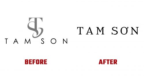
The centerpiece of the rebranding is a sophisticated new logo. It features a chiseled serif wordmark using Alias’ Sabre font, customized to enhance its unique character. The old logo, with thin Futura typography and an awkward “TS” monogram, has been replaced with a more elegant and modern design. The new wordmark transitions from a regular “O” to the Vietnamese “Ơ,” with the curl flattened to match the serifs, adding a culturally relevant and visually pleasing element.
The new logo allows for versatile arrangements. With three letters in each word, it achieves symmetry and balance, making it adaptable for various configurations. It can be stacked or separated, maintaining equal visual weight and harmony, ensuring impact whether on a shopping bag, business card, or digital platform.
The color palette is rich and sophisticated, aligning with the luxury brands Tam Son represents. The primary colors are deep and muted, adding a sense of exclusivity and refinement. These colors are used consistently across all brand materials, creating a cohesive and recognizable visual language.
The new identity includes a sans serif typeface for secondary text and the serif wordmark, adding a modern touch while maintaining formality appropriate for a luxury brand. The visual language extends beyond the logo, featuring clean lines and precise forms that reflect Tam Son’s dedication to quality and craftsmanship. Space and alignment create a sense of order and elegance, essential for a luxury brand.
The “Discover Inspiration” tagline invites a broader audience to engage with Tam Son’s offerings. This tagline encapsulates the brand’s mission to curate premium experiences, guiding customers through luxury, craft, and culture journeys. Rice Studios ensured the new identity appealed to existing high-net-worth customers and new patrons without alienating the former.
Visual elements like the chiseled serif on shopping bags highlight the brand’s luxurious nature. The new identity’s applications, whether in real life or rendered images, convey sophistication and attention to detail, reinforcing Tam Son’s position as a purveyor of high-end products and experiences.
The rebranding signifies a positive evolution from Tam Son’s previous identity. It aligns the company more closely with the prestigious brands it represents, ensuring the visual identity reflects the quality and exclusivity of its offerings. The elegant design, combined with culturally relevant details, positions Tam Son as a leader in the luxury market.


