In the fast-paced digital age, technology company logos and names have become ubiquitous symbols of modernity and progress. With constant innovation by cutting-edge technology companies and the emergence of new startups, a plethora of vibrant, compelling, and memorable brand identities have emerged.
For most businesses, the essence of branding is of paramount importance. This is especially true for technology companies, for whom the core brand values are about connecting with customers, engaging stakeholders, and potential talent.
Regardless of the industry, having an original name and logo can greatly enhance a company’s prospects. Such branding elements help to carve out a niche for a company amongst the myriad of competitors and convey important messages about the company’s ethos, character, and essence.
In the technology sector, the importance of an original name and logo becomes even more significant. Given the dense saturation of the market, where research suggests that around 305 million technology startups emerge each year, creating an exceptional corporate identity is essential to being in the spotlight.
The focus of our research is on some iconic brand identities of tech companies. This article aims to be a beacon for aspiring startups and provide important insights for those involved in brand strategy and development.
An introduction to tech company logos
Technology company logos and names are almost ubiquitous in today’s digital age. Even for those who aren’t immersed in the world of technology, several iconic symbols are likely to come to mind. It’s hard to find someone unfamiliar with the distinctive design of Amazon’s smiling arrow, Google’s playful color palette, or the graceful silhouette of Apple’s overbite fruit.
While each corporate identity remains unique to the company it symbolizes, some common design principles unite them. One that stands out among many tech logos is modernism and elegance. They often don’t clutter space, prioritizing clarity and instant recognition over complexity.
Such names and logos serve multiple functions. Beyond simple identification, they form an emotional connection with the target audience, embodying the very essence and spirit of the brand. They are used by companies to convey a variety of messages, from corporate values to distinctive personality traits.
While company names have a stable foundation, logos show a surprising amount of variability in this area. They are not static but are striking elements that evolve to reflect the brand’s journey, milestones, and aspirations.
Further study of the logos of well-known technology companies revealed several common features:
- Shapes. There is a significant tendency for technology companies to have geometric elements predominate in their logos: squares, rectangles, triangles, and circles. The use of such shapes offers a double benefit: it allows you to create a minimalistic and modern image while forming an emotional connection with the viewer. These geometric shapes are not chosen by chance. They often carry deep meanings that can be linked to a company’s ethics. For example, circles symbolize integrity and endless possibilities, while triangles symbolize growth and forward movement. Squares and rectangles, with their straight lines and sharp corners, evoke a sense of stability and reliability. In this day and age, when visual identity can significantly influence perception, these design choices are paramount for companies looking to make an impression in a competitive marketplace.
- Colors. There is a noticeable trend in the technology sector to use bright and eye-catching colors in logos. A common palette includes shades such as black, white, and silver, each associated with strength, modernity, and cutting edge. At the same time, traditional color schemes do not limit companies in choosing brighter and bolder shades. Experiments with bold colors can symbolize the brand’s willingness to innovate and think outside the box.
- Versatility. Awareness of the importance of logo versatility is prevalent in technology companies. Logos must be designed to remain clear and readable across multiple platforms, from traditional print to digital displays to compact smartphone screens. The need for a smooth transition from one format to another has driven the trend toward simplified and adaptable design. When a logo is simple and uncluttered, it is recognizable whether it is on a billboard, a computer monitor, or an app icon on a mobile device.
The most famous technology company logos and names
Delving into the realm of renowned technological corporations, it becomes evident that their logos and names carry significant weight and meaning. These emblems are more than identifiers; they represent a brand’s ethos, vision, and legacy. While the tech sector brims with impressive logos, this discussion will center on those brands that have achieved widespread recognition and have become household names.
The prominence of these brands can be attributed to various factors, not just their innovative products or services. A clear, memorable logo is crucial in etching a brand’s image into public consciousness. As these brands expand their reach globally, the universality of their logos allows them to transcend linguistic and cultural barriers. At the same time, there might be myriad technological logos that are artistically commendable, those that achieve instant recognition and resonate with a broad audience that truly stands out in the annals of tech history.
Adobe
Adobe, a renowned graphic design company, dates back to 1982, originally founded as Adobe Systems Incorporated. Since then, this Silicon Valley-based company has been at the forefront of developing advanced software solutions for content creation and publishing.
The origin of the name “Adobe” has less to do with technological advances and more to do with geographical significance. The company got its name from Adobe Creek, located in Los Altos, which flowed near the residence of its co-founder, John Warnock. It’s a subtle allusion to the natural surroundings that may have served as a serene backdrop for many an innovative brainstorming session.
Upon encountering Adobe’s visual identity, one is immediately struck by the striking emblem, which echoes notions of innovation, enthusiasm, and artistic flair. The dominant element of the emblem is a bold red square with the stylized letter “A.” This image, reminiscent of a computer cursor, suggests that the brand is digitally oriented. The symbol is accompanied by a clear sans-serif font, which is a typed company name which further emphasizes the modern and rational nature of the brand Adobe.
Alexa
Amazon Alexa, a notable extension of Amazon’s vast empire, is the epitome of the brand’s advancements in artificial intelligence and voice control technology. Created as the technology behind the Amazon Echo and Echo Dot, Alexa has transformed how consumers interact with their devices, infusing homes with a sense of futurism and convenience.
Alexa is not just a product but a reflection of Amazon’s desire to push technological boundaries. This aspiration is also evident in the brand’s visuals. While one of the logos is completely in line with Amazon’s core brand identity, replacing “Amazon” with “Alexa,” the other stands out from the rest with its design elements. The logo features a pure white speech bubble against a blue cloud, suggesting that Alexa is voice-driven and cloud-based.
The use of blue in the branding is not accidental. This hue is associated with a sense of reliability, security, and professionalism. For users, this choice of color confirms that Alexa is a reliable assistant, always ready to help and able to protect their privacy.
The simplicity of the design complements the sophisticated technology behind Alexa. By combining these design elements, despite being a sub-brand, Alexa’s identity remains connected to the parent company while still being individualized.
Amazon
The Amazon logo, a universally recognized symbol of e-commerce excellence, has a prominent place in the digital space. Originally launched as “Kadabra,” Amazon has since evolved into a commercial powerhouse and a brand firmly embedded in the global socio-economic fabric.
Amazon’s logo may seem unassuming in its design. The arrow stretching from the letter “a” to the letter “z” is not just a decorative element. It symbolizes Amazon’s extensive product range, emphasizing its claim to sell products “from A to Z.” At the same time, the arrow resembles a smile, hinting at customer satisfaction and happiness. The implied smile also denotes the brand’s customer-centric approach, emphasizing a pleasant shopping experience for users.
The genius of Amazon’s branding lies in its ability to intertwine simplicity with deep meaning. With this careful combination of logos, Amazon has managed to carve out a unique niche for itself in the bustling world of e-commerce.
Apple
When studying famous tech giants, it’s impossible not to notice one brand that towers above the rest: Apple. This multinational tech giant has had a significant impact on the world’s perception of computer and telecommunications technology.
Steve Wozniak laid the foundation for the company in 1976, which has become an innovator in the technology industry. Since its inception, Apple has steadily followed the path of innovation, constantly pushing boundaries and setting new standards.
The choice of the name “Apple” was not arbitrary. It carries deep symbolic meaning. Not only does it allude to themes of growth, prosperity, and innovation, but it also reflects the deep roots of history. These include the biblical story of Adam and Eve and the legendary tale of Isaac Newton’s revelation under the apple tree.
The Apple emblem, despite the deceptive simplicity of the design, is universally recognizable. The silhouette of an apple accompanied by a distinctive bite mark conveys more than just brand identity. This intentional design choice subtly encourages the observer to participate in life, encouraging them to seize opportunities and “savor the essence of life.” Apple’s branding, in both the name and logo, reflects the company’s mission to continually challenge the status quo and encourage people to move toward a future filled with possibilities.
eBay
In the mid-1990s, a platform emerged that redefined online commerce. Appearing in 1995 as AuctionWeb, eBay ushered in a revolutionary approach to digital commerce. As a peer-to-peer trading platform, it not only facilitated the selling and buying of goods but also connected people across continents. This multi-million dollar enterprise, with a presence in over 32 countries, is a testament to the enormous potential of online marketplaces.
The name “eBay” goes back to Echo Bay Technology Group, which served as a source of inspiration. The company chose a colorful and memorable logo. This choice was made deliberately to reflect the brand’s innovative spirit and its departure from traditional retail norms.
The color palette chosen for the logo symbolizes the vast number of products and services offered on the platform and reflects the diversity of sellers and buyers. The clean, unadorned typography emphasizes the company’s modern ethos, suggesting a thorough and user-friendly approach. eBay’s branding perfectly captures its essence, presenting it as an innovative yet accessible center for global commerce.
Evernote
Evernote, which has established itself as a leading note-taking and task management application, has taken its rightful place among technology tools. Its customizable software is suitable for many operating systems, making it popular with a wide variety of users.
The name “Evernote” is more than just a catchy phrase; it encapsulates the very essence of the company’s mission: to help users constantly record and retrieve information. This commitment to memory and organization is reflected in the symbolic choice of the logo.
The logo seamlessly blends the image of an elephant – the universal symbol of unrivaled memory – and a carefully crafted word mark with serifs. In contrast, the choice of a green hue for the elephant speaks to liveliness, innovation, and the pursuit of creative ideas. The elephant’s ear, folded in a subtle stroke, resembles a neatly turned page of a book.
Firefox
Mozilla Firefox, often abbreviated to “Firefox,” is a testament to innovation in open-source web browsers. Created by the Mozilla Foundation, it debuted in 2004, challenging the status quo and offering an alternative to the then-dominant Windows browser.
Its path to its current name is a story marked by evolution. It was originally called “Phoenix,” but due to trademark difficulties, this name had to be revised. Subsequently, the name “Firebird” was chosen, but it too proved difficult. Only after much deliberation was chosen the name “Firefox” – the Chinese designation for a red panda.
The Firefox emblem embodies several symbolic elements. Central to the design is the image of a fox, whose contours gracefully envelope a circular shape, symbolizing the globe. This circular image emphasizes the browser’s globality and versatility.
In the technology arena, some emblems have achieved almost legendary status, and among them, the Google logo undoubtedly stands out. Recognized and revered around the world, this symbol and the brand it represents have become almost synonymous with the digital age. The widespread recognition of the Google name seamlessly complements its prominence.
If one delves deeper into the origin story of the name “Google,” one finds a story of unintentional good fortune. Originally, the name Googol, a term from math that refers to a one followed by 100 zeros, an unintentional misspelling resulted in the iconic name “Google.” Even if the name was unintentional, it reflected the company’s ambition to cover a vast amount of information with its search capabilities.
The Google logo is a masterclass in simplicity and impact. Executed in a clean sans-serif font, it conveys power without excessive embellishments. Beyond the font, the logo’s color palette is more than just an aesthetic choice. Each hue corresponds to a specific component of Google’s multifaceted platform and suite of services.
Grammarly
Grammarly, a company created in the United States, is a cloud-based writing assistant. This tool, carefully designed for writers, editors, and all those who strive for flawless writing, checks content for possible grammar, punctuation, and spelling errors. It also detects possible plagiarism, guaranteeing the originality of the content. By providing context-sensitive suggestions and corrections, it enhances the overall quality of what is written.
The company’s terminology is original and clear. The inclusion of the word “Grammar” in the name emphasizes its commitment to improving linguistic accuracy.
The Grammarly logo is a bright green circle with a stylized “G” in the center. Interestingly, at the base of this letter is an upward pointing arrow, which symbolizes growth, development, and constant movement towards excellence in writing. Accompanying the emblem is the brand name, written in a modern sans-serif font and entirely in lower case. This design choice further emphasizes the accessibility of the brand.
IBM
The abbreviation IBM stands for International Business Machines Corporation. This global technology giant, represented in more than 175 countries, has carved out a niche for itself in the technology sector. IBM’s portfolio includes hardware, software, hosting, and various consulting solutions.
The IBM logo has undergone several transformations to reflect the company’s evolution and its response to change. The current version of the logo is a bright design, skillfully executed to attract the attention of viewers and emphasize the innovative spirit of the organization. The presence of horizontal lines in the logo introduces a visual element of intrigue and differentiates it from the usual word marks.
The choice of blue as the main color for the emblem is made intentionally. This hue is often associated with reliability, stability, and professionalism – values that IBM is clearly committed to communicating to its global customers.
Choosing the abbreviation “IBM” instead of its full form was a strategic move to make the name concise and easily recognizable in today’s marketplace.
Microsoft
In today’s digital age, few names are as synonymous with technological advancement as Microsoft, standing alongside prominent giants like Google. Known for pioneering innovation, Microsoft has been at the forefront of shaping the world with its products, be it ubiquitous operating systems or high-end gaming hardware.
Tracing the origin of the name “Microsoft” reveals an intriguing story. Its roots can be traced back to a correspondence between technology giants Bill Gates and Paul Allen. During this correspondence, Gates successfully coined the word “Micro-Soft” to describe their joint venture, which later became a recognized brand.
The Microsoft emblem is elegance and modernity. Muted gray tones sans serif font is combined with a bright multicolored square. This geometric element is not only reminiscent of the revolutionary product, Windows but also embodies many aspects of the vast Microsoft Corporation.
The different shades of the square are not just an aesthetic choice but have a deeper meaning. Each shade symbolizes a unique element in the vast Microsoft universe, reflecting the company’s diverse endeavors and contributions.
PayPal
PayPal, the global financial technology giant, has become a familiar name to digitally-oriented businesses and individual consumers. However, the company didn’t start out with such an easily recognizable name – its original name was Confinity. The deliberate rebranding to “PayPal” emphasized the platform’s focus on user-friendly peer-to-peer payment solutions.
PayPal used thoughtful design elements that reflected its brand values. The logo, dominated by the color blue, is associated with well-established psychological associations. The color blue is commonly associated with trust and authority, making it appropriate for a company whose services are based on trust and reliability.
PayPal’s logo includes a particularly eye-catching design element: two intersecting “P’s” next to the brand name. This design nuance is intended to reflect the brand’s mission to grow the community by simplifying and facilitating financial transactions. It serves as a symbol that subtly reflects the company’s commitment to user-centricity, emphasizing that ease of use and security are at the forefront of PayPal’s offerings.
The choice of design and branding elements are not just aesthetic: they are integral to PayPal’s identity as a leader in digital payments and its ongoing efforts to provide universally accessible and secure financial services.
Salesforce
Since its founding in 1999, Salesforce has been at the forefront of the technology world, especially with its innovative customer relationship management (CRM) solutions. With a presence across multiple industries, Salesforce celebrated a significant milestone by becoming the first cloud-based enterprise to surpass the $1 billion annual revenue bar.
The Salesforce emblem is a thoughtful combination of design and meaning. Dominating the brand name, the letter “f” in small italics symbolizes the company’s constant journey of progress and evolution. The blue cloud emphasizes the company’s commitment to cloud solutions and innovative vision.
Slack
Since its introduction in 2013, Slack has quickly become a staple tool for many professionals looking for an effective project management solution. Its innovative technology stands out among many collaboration platforms. The intriguing name “Slack” is not just a random term but an acronym that reflects its core value: “A searchable log of all conversations and knowledge.” This emphasizes the platform’s capabilities and ensures the name is memorable.
The company’s visual style combines a crisp sans-serif font with exciting geometric graphics. These graphics, reminiscent of dashes and quotation marks, serve as a visual metaphor for communication and dialog, which is appropriate for a tool designed to facilitate conversations.
Further enriching the logo’s narrative is the palette of varied colors. This choice isn’t just aesthetic – it reflects Slack’s mission to bring together professionals from different fields. Slack’s logo reflects the company’s commitment to becoming a hub for collaboration and collective productivity, offering a platform where different threads of conversation can seamlessly intertwine.
Spotify
For lovers of tunes and harmonies, Spotify is not unusual. Launched in 2006, this streaming platform has seen a steady and undeniable growth in popularity. It is prominent on the world stage as one of the leading streaming platforms, with a user base approaching half a billion.
The brand name “Spotify” is an original combination of the terms “Spot” and “Identify.” This choice of name is not just a coincidence but an indication of its intrinsic functionality – to navigate users through the vast music space, helping them find and discover new listening experiences.
The Spotify logo combines color and design designed to captivate at first sight. Its vibrant green hue is distinctive and memorable, instantly recognizable across apps and platforms. The emblem consists of two main elements.
On the right is the brand name, elegantly typed in an uncomplicated sans-serif font that reflects a sense of modernism while still being readable. This is a subtle hint that the brand is committed to user-friendly interfaces and easy user experience.
The left side of the emblem features three abstract white lines on a green background, curving gracefully in the center. This design choice is not random but symbolizes the essence of Spotify’s offering – music. These lines, reminiscent of sound waves, capture the essence of sound, rhythms, and beats, demonstrating the brand’s fundamental role in music streaming.
Square
Among financial solutions designed for businesses, Square takes center stage, developed by Block Inc. Originally conceived as a means of streamlining credit card payments and related transactions for small and medium-sized businesses, Square has significantly expanded its reach. While sales systems remain the company’s core offering, Square’s portfolio has diversified to include a range of ancillary services, including Website development tools.
Square’s nomenclature was not chosen by accident. It is a metaphorical embodiment of simplicity, sustainability, and reliability. These qualities are fundamental to organizations operating in the financial sector. This conceptual alignment is artistically reflected in the visual elements chosen for the brand’s logo.
The logo is a thoughtful embodiment of the brand’s ethical principles in the form of a design that converges around a triangle. The unique arrangement of squares is not only a literal interpretation of the name but is also subtly reminiscent of a credit card chip.
Yahoo
In the technology industry, the evolution of branding and design is inevitable. Yahoo is a classic testament to this trend. The Yahoo logo has undergone many changes since its inception but still retains the essence and features that define the brand. Founded in the United States, Yahoo has become a leader in web services, carving out a niche for itself with its powerful search engine, effective email programs, and dynamic advertising tools.
The brand “Yahoo” was not chosen by accident; it exudes cheerfulness and humor. While the word “Yahoo” is usually associated with fun and playfulness, some enthusiasts argue that it is a complex acronym that stands for “Yet Another Hierarchical Officious Oracle.” Regardless of whether this is actually true, the name reflects the energetic spirit of the brand.
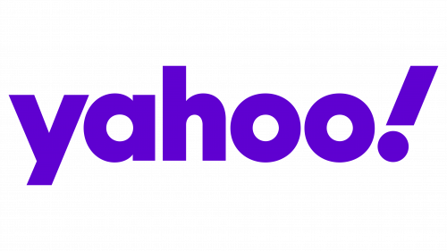
Turning to the modern aesthetic of the Yahoo logo, there is a bright purple hue that emphasizes the brand’s name, rendered in a sleek sans-serif font. The minimalistic style of typography sets the mood for modernity and dynamism, which is further emphasized by the emblematic exclamation mark in italics. This sign not only complements the design but also symbolically indicates the lively character of the brand.
Tips for designing a tech logo
The quintessential technology logo involves visual representation, distinctiveness, and meaningful engagement complexities. There isn’t a single blueprint that can serve as the go-to formula for all organizations. Instead, each enterprise must embark on a tailored journey to establish its unique identity, influenced by specific goals, market dynamics, and desired consumer perceptions.
Analyzing existing examples sheds light on the pivotal elements that come into play when sculpting a compelling visual identity. Several cardinal principles can be gleaned, providing foundational guidance for organizations venturing into the intricate domain of logo design.
Choose shapes carefully
The influence of geometric forms and symbols on consumer perceptions should not be underestimated. Basic shapes, in particular, carry implicit meanings that can shape how people think about a business or product within technology. For instance, a square is generally associated with qualities such as steadiness and solidity, conveying an image of reliability and tradition. On the other hand, a circle is typically linked to ideas like unity and interconnectedness, suggesting an inclusive and community-oriented focus.
It’s crucial to grasp the emotive undertones accompanying each shape incorporated into a design. By doing so, one can craft a more effective and resonant visual message, which can, in turn, significantly influence customer engagement and satisfaction.
Experiment with color
When observing the branding strategies of many technology companies, it becomes evident that there is a bold approach to color utilization. Vibrant and distinctive hues are a compelling tool to differentiate one’s brand from others in a crowded market. It’s essential to be mindful of the intrinsic connotations each shade holds.
The hue of blue, for instance. This particular shade is often linked to attributes such as dependability and credibility. Its inclusion in a brand’s visual identity can invoke feelings of assurance among potential customers. So, when deliberating on color choices, it’s beneficial to weigh the inherent psychological implications to ensure alignment with a brand’s intended message and values.
Pick fonts carefully
In technology companies, using serif fonts is not the norm. Those who opt for such typefaces often aim to project a sense of elegance or a long-standing tradition. Many tech brands lean towards the cleaner lines of sans-serif fonts, valuing their adaptability across various screen types and sizes.
The primary concern should be the clarity of the chosen typeface. Ensuring that every character remains legible, regardless of the size of the logo or branding material, is paramount. It is essential that customers can effortlessly discern the text, promoting seamless communication and brand recognition.
Convey meaning
Navigating the intricate task of conveying a technology company’s full scope and mission solely through its name and logo might seem daunting. However, well-designed branding elements can offer insights into the company’s essence, core beliefs, and forward-looking aspirations. Consider brands such as Evernote and Apple. Through their symbolic representations, they intuitively encapsulate their brand’s essence, allowing audiences to grasp their ethos at a glance.
When crafting such branding elements, it’s essential to ponder the emotional resonance they might evoke in potential customers. The goal is to design a visually appealing emblem and encapsulate a narrative and ethos that resonates with the intended audience, forging a lasting connection.
Stay simple
Recently, there has been a noticeable trend towards minimalism in the design of tech logos. One of the primary reasons behind this shift is for brands to maintain a consistent appearance across diverse devices and platforms. An intricate logo might lose its details when resized or viewed on different screens. Embracing simplicity in design not only ensures versatility but also enhances adaptability. It’s essential to strike a balance where the design remains straightforward, eliminating the risk of losing its essence when scaled or adapted. Crafting a logo that retains its core visual appeal, regardless of where it’s displayed, is a strategy many modern tech companies are adopting wisely.
Producing unforgettable tech logos
Today’s world is teeming with exceptional logos and names representing technology companies. As the tech sector expands at an unprecedented rate, there’s a continuous influx of innovative designs, offering a wealth of inspiration for those on the lookout.
For organizations on the quest to pinpoint the perfect logo that encapsulates their essence, seeking external expertise can be immensely beneficial. Engaging with a seasoned logo designer can open doors to insights and recommendations tailored to ensure the organization’s distinct identity and mission are eloquently communicated through its branding. Some professionals specialize not just in logo creation but also in the art of naming. Collaborating with such experts can significantly enhance an organization’s branding journey, ensuring its name and logo are cohesive and resonant.
