The Texas Tech logo conveys the message: “Students grow and develop with the university.” The institution provides an opportunity to rise above oneself, to become smarter and more educated. The idea of nurturing, caring, and mentoring is visible in the signs of the emblem.
Texas Tech: Brand overview
| Founded: | February 10, 1923 |
| Headquarters: | Lubbock, Texas, United States |
| Website: | ttu.edu |
Meaning and History
Texas Technological College founded this institution of higher education. This is what it was called until 1963, and as a result, it became the largest institution, which, according to data for 2020, 40 322 students studied. In general, he has already been awarded over 200 thousand academic degrees. Until that time, the university had come a long way of formation.
The call to open a college in West Texas came in the late 19th century when settlers arrived. After much deliberation, the authorities approved the relevant decision, and Governor Pat Neff signed the required bill. So in 1923, Texas Technological College officially appeared, but a place for it has not yet been chosen. Then the representatives of the administration began to go around town after town until they arrived at Lubbock. They were very surprised that the population lined the streets to support the opening of their college. As a result, this particular settlement was approved by a general vote.
The construction of the buildings started in 1924, and in 1925 the educational institution had already opened its doors for the first students. Their total number was 914 people, distributed in four basic schools: humanities, engineering, agriculture, and home economics. At first, Texas Tech developed and grew slowly. Gradually, dormitories, educational buildings, a library, cobbled sidewalks, a swimming pool, a golf course, and other important facilities appeared. Personal symbols, which played an important role in the life of the university, were not forgotten either. It has become so successful that it has never changed for many years.
The seal has a classic structure: a rondel divided by lines into several circular zones. The central place is given to a pentagonal shield with an eagle sitting at the top. The raptor’s wings are spread out as if it is preparing for takeoff. The bird’s head with a sharp hooked beak is turned to the left. The shield area is geometrically divided into four parts, which have an irregular trapezoidal shape. In the lower right corner, there is a burning lamp; in the left – a key. Above is a five-pointed star (on the right) and an open book (on the left). Between them is a white cross with acorns. The shield is outlined with a black stripe.
Behind the central part is a wide red ring. At the bottom, there is a star on it, and at the top is the inscription “Seal of Texas Tech University,” which is made in capital letters. All characters are printed, white, with small serifs. The edge has a solid frame consisting of three stripes: two black (along the outer and inner edges) and one white (in the middle between them).
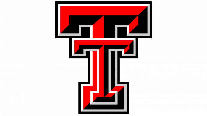
The university also has a graphic logo made up of two “T” s. They are taken from the words “Texas Tech,” that is, it is an abbreviation of the university’s name. The size of the symbols is different: in front, there is a smaller letter, and behind it is a larger one. The first is thin, the second is wide, so the leg of each sign is visible. Double edging is made along the edge to clear all elements and do not merge into a single whole. Moreover, “T” is aligned to look like one letter with a double crossbar at the top, which resembles a retro telephone receiver.
In the center of both the large and small signs, there is a division into two colors: one side is painted in red, the other in black, creating a three-dimensional effect. Moreover, some shadows do not go straight but obliquely. On the right is the full name of the university in two lines and separated by a gray line. The words are bold at the top, thin at the bottom, with very wide spacing between letters.
Texas Tech Red Raiders Logos
The university’s sports department consists of 17 Texas Tech Red Raiders across eleven disciplines. The most successful among them are football, basketball, baseball. In total, the club has won about 70 conference championships and four national championships. The athletes’ emblem looks the same as the main university logo.
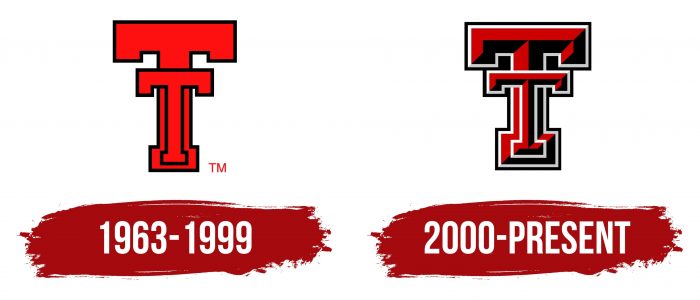
1963 – 1999
The opening variation consists of two “T” s superimposed on each other. Both letters are large but of different sizes: the character in the foreground is smaller than the background, so they are visible. The icon is flat, red, with a black border along the contour. This icon was first used on sports uniforms when the technical college officially became a university. The double T was invented by the first coach of the Texas Tech Red Raiders football team.
2000 – today
After the redesign, the emblem became three-dimensional: it gained volume and color variety. The developers achieved the 3D effect by combining a radically opposite palette: half of each letter is red, the other is black. There is a double edging along the edge, consisting of thin lines – white and black. The leg of the first letter is higher than that of the second, and the upper crossbar coincides with the lower line of its head. It runs exactly under the large serifs that resemble large rectangles.
Texas Tech: Interesting Facts
Texas Tech University (TTU), set in Lubbock, Texas, is known for its wide range of programs, strong research efforts, and lively campus environment. Founded in 1923 as Texas Technological College, it’s grown greatly in size and offerings.
- Wind Science Leader: TTU is at the forefront of wind research, studying tornadoes, hurricanes, and wind hazards through its National Wind Institute.
- Unique Mascot: Since 1954, the Masked Rider has been Texas Tech’s mascot. He leads the team on a black horse at football games, symbolizing the university’s spirit.
- Huge Campus: With over 1,800 acres, Texas Tech’s campus is among the largest in the U.S., noted for its Spanish Renaissance architecture and stunning visual appeal.
- Art Collection: The university boasts the country’s top public art collection, including sculptures, murals, and more, adding to the campus’s cultural vibe.
- Research Excellence: Texas Tech is classified as an “R1: Doctoral University” for its high research activity and notable contributions in various fields, such as engineering and environmental sciences.
- STEM Focus: TTU is dedicated to STEM education, offering top-notch facilities and programs, especially in engineering and computer science.
- Distinguished Alumni: Its alumni include influential figures like Ed Whitacre (former CEO of General Motors and AT&T), WNBA MVP Sheryl Swoopes, and CBS News correspondent Scott Pelley.
- Athletic Success: Known as the Red Raiders, Texas Tech’s teams compete in the Big 12 Conference and have excelled in sports, with the men’s basketball team reaching the NCAA Championship game in 2019.
- Cultural Contributor: Beyond academics, Texas Tech enhances West Texas’s cultural and educational scene with events, performances, and programs.
- Global Education: With campuses like Costa Rica and Seville, Spain, Texas Tech offers students chances to learn and engage globally.
Texas Tech University combines a commitment to research, education, and community involvement with deep traditions and a vibrant campus life, making it a standout institution in Texas and beyond.
Font and Colors
The identity of the higher education institution and its sports department is identical – it consists of two “T” s. This is an abbreviation of the name of the university, formed from the phrase Texas Tech. It is called that – Double T. It is believed that such a logo was proposed by the first football coach of the university team – Ewing Young “Big’un” Freeland. He decorated the uniform of athletes with it. The difference between the early and late versions is the 3D effect, the beveled shadows at the bottom, and the white finish. The great importance of the sign was emphasized by the graduates of 1931 at one of the memorable meetings: they presented the university with a bench in the form of a double “T.” It is installed in the courtyard of the administrative building.
The text is used in print and the logo of the university. Designers opted for a classic typeface called Charter, which they made the main one. In other cases, Helvetica Neue is used. This font is considered optional.
The color palette of the university and its teams is proprietary. It includes black (# 000) as well as several shades of red and gray: Texas Tech Red Scarlet (# C00) and TTU Dark Red (# 900), TTU Light Gray (#CCC), and TTU Gray (# 808285).
Texas Tech color codes
| Red Scarlet | Hex color: | #cc0000 |
|---|---|---|
| RGB: | 204 0 0 | |
| CMYK: | 0 100 100 20 | |
| Pantone: | PMS 485 C |
| Dark Red | Hex color: | #990000 |
|---|---|---|
| RGB: | 153 0 0 | |
| CMYK: | 0 100 100 40 | |
| Pantone: | PMS 7621 C |
| Light Gray | Hex color: | #cccccc |
|---|---|---|
| RGB: | 204 204 204 | |
| CMYK: | 0 0 0 20 | |
| Pantone: | PMS 420 C |
| Gray | Hex color: | #808285 |
|---|---|---|
| RGB: | 128 130 133 | |
| CMYK: | 4 2 0 48 | |
| Pantone: | PMS Cool Gray 8 C |
| Black | Hex color: | #000000 |
|---|---|---|
| RGB: | 0 0 0 | |
| CMYK: | 0 0 0 100 | |
| Pantone: | PMS Process Black C |
