


![]() The Autism Society of America Logo PNG
The Autism Society of America Logo PNG
The idea of teamwork and mutual support inspires the Autism Society of America logo. Many separate puzzle families have created a single system to fight for their children’s rights. The emblem calls to join their fight.
The Autism Society of America grew out of a fight against the 1950s “refrigerator mother” theory, promoted by Bruno Bettelheim and others, which blamed emotionally distant mothers for autism. Bernard Rimland, a research psychologist whose son Mark was diagnosed with autism at about age two, challenged that view in his 1964 book Infantile Autism, arguing that autism had biochemical roots rather than parental causes.
In 1965, Rimland, nurse and activist Ruth C. Sullivan, psychologist Ivar Lovaas, and other parents founded the National Society for Autistic Children. Leo Kanner, who had first described autism in scientific literature, joined the professional advisory board. Rimland left in 1967 to create the Autism Research Institute in San Diego, while Sullivan became the organization’s first elected president in 1968.
In the early 1970s, the society launched a national autism awareness campaign, which Congress later recognized in 1984. In 1976, it began a brain tissue research project, among the early systematic neurobiological studies of autism. The group later became the Autism Society of America, reflecting the need for lifelong support beyond childhood.
In 1988, Rimland advised the film Rain Man, and Dustin Hoffman met Rimland’s son while preparing for the role. That same year, Temple Grandin became the first autistic person elected to ASA’s board. The group created a research foundation in 1996 and introduced the autism awareness ribbon in 1999. In 2006, ASA helped advance the Combating Autism Act, while Autism Speaks emerged with a more media-driven fundraising model.
Meaning and History
![]()
The original name of this organization was the National Society for Autistic Children. However, over time, it was changed to the current version. This is done to show that such children grow into adults. ASA also dispels myths about people with autism, promotes socialization, manages issues, and provides psychological support.
A key figure among the founders was the Norwegian-American scientist, professor at the University of California, clinical psychologist Ole Ivar Lovaas. He has researched the behavioral patterns of children with autism to teach them through positive reinforcement, prompting, and behavior modeling, with incredible results. During his lifetime, he received several high awards for his work.
The second most important figure is the American psychologist, lecturer, and researcher Bernard Rimland. But he became the creator of the erroneous theory of human developmental disorders. He argued that autism is not a psychological but a physiological disorder that can be cured with a “vaccine.” Although he founded the ASA, he left the organization and established the Autism Research Institute in 1967.
![]()
The first head of the Autism Society of America was Ruth Christ Sullivan, a public figure and advocate for educating people with autism. She is a member of a permanent honorary council and previously served as the executive director of the Mental Health Autism Services Center. This is her brainchild, which she opened in 1979 in Huntington (West Virginia).
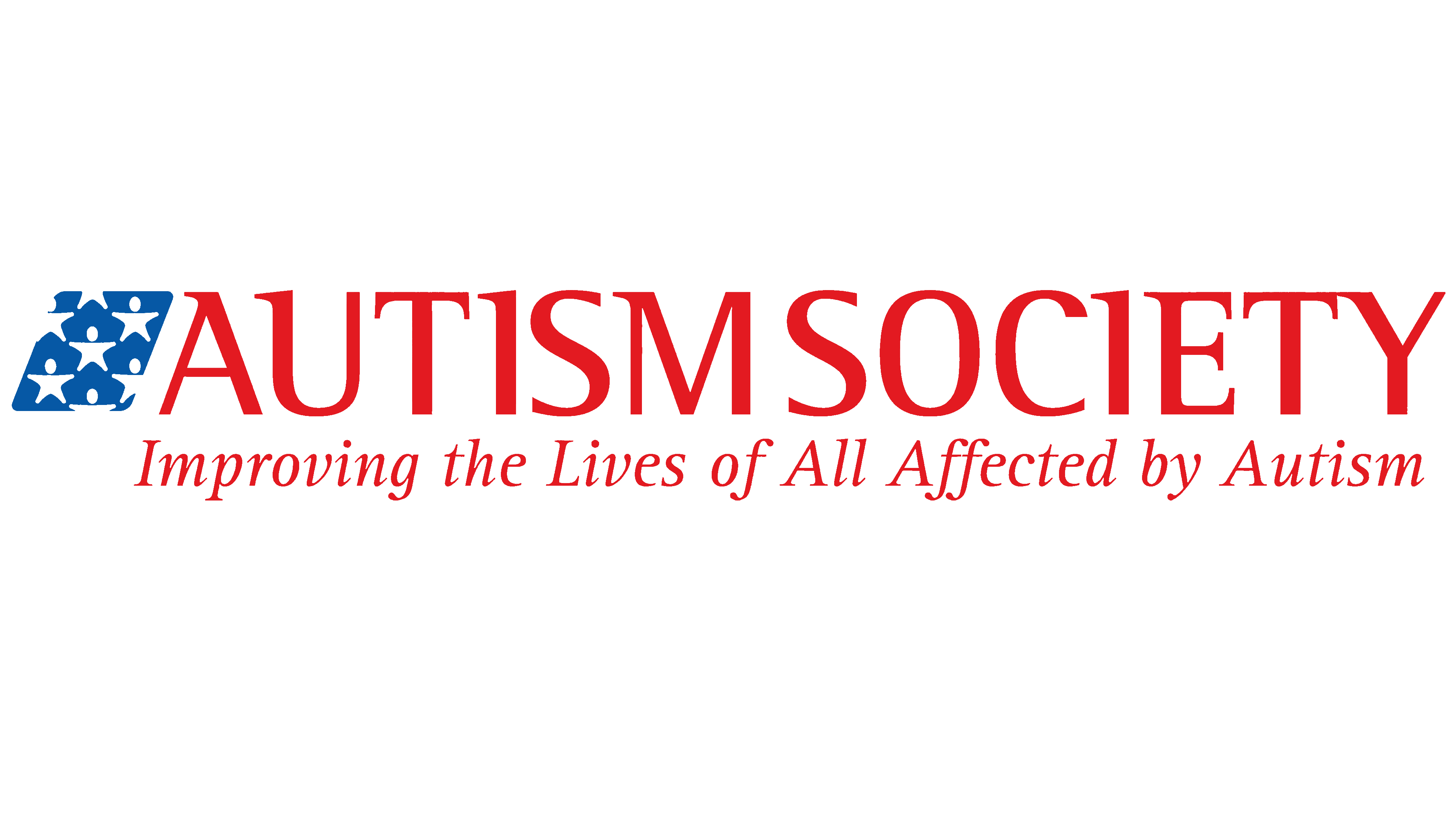
By creating the ASA together, they helped expand knowledge about autism. The founders demonstrated to society that people with this diagnosis also grow and develop, but only in their areas. The main thing for them is the right psychological environment and support. A similar principle is reflected in the organization’s logo: despite the bright colors, it is executed in a loyal style. The sign of personal identity consists of two parts that are ideologically interconnected.
The symbol of socially significant service is made in the colors of the US national flag: it uses blue, white, and red in two shades – crimson and scarlet. Blue is a vertical rhombus tilted to the right. It depicts people with their arms outstretched, ready to embrace the whole world. But they cannot fully do this because they are static “stars.” To this end, the designers gave them the shape of small stars, indicating a deep symbolism. This is an allegory in which every person with autism is an individual worth looking at because he, like a star, shines from within, but unfortunately, not everyone sees his light.
Nearby, on the same visual line, is the society’s abbreviation “ASA.” Although it consists of familiar letters, the inscription has a somewhat non-standard form. The boundaries between them seem to be erased: the first “A” has a too-long leg, smoothly turning into the neighboring “S,” and that, in turn, is closely merged with the last “A,” so their lower parts form one whole. In general, this is, again, symbolism, indicating an inability to navigate society correctly. This concept is confirmed by the puzzle pieces that form the word. At the bottom is the organization’s full name in a serif font.
There is another version of the emblem, with almost the same elements but arranged differently. It shows a blue rhombus with white men-stars and a fragment of the social service’s name, “Autism Society.” The phrase is written in large letters with the same serifs at the top, pointing to the right. Below them is a call to action: “Improving the Lives of All Affected by Autism.” It is in italics.
There are also alternative icons associated with the official emblems. These are small icons composed of four puzzles in different colors: yellow, blue, red, and green. They are linked together by grooves, forming bright figures. One stands on a plane and has the shape of a square. The other is located on the tip and looks like a rhombus. The third is supplemented by a gray inscription “Autism Awareness” that spans two lines at the bottom.
Font and Colors
The primary logo uses a classic-style typeface, thin and even, with sharp serifs. Italics dominate the additional emblem. But on the top line, the inscription is in the usual design, with straight letters. The only thing that distinguishes them from traditional ones is the presence of needle-like serifs at the top that point leftward.
The standard palette resembles the colors of the American flag: red, blue, and white. In alternative versions, there are yellow and green hues of the neon and pastel spectrum in addition to them.