Video game logos have evolved over time into iconic symbols that are more than just a visual representation of the game. They embody the very essence of gameplay, resonating with players and even those outside the gaming community. These logos often become cultural references, symbols of an era, and an integral part of the visual world of the entertainment industry.
Creating a game logo is an art that requires a deep understanding of the game and its audience. It must convey the mood and theme of the game, match the stylistic and cultural trends of the time, and stand out in a competitive market. From the retro aesthetics of early arcade games to the sleek, exciting designs of modern games, logos have taken a leading role in signaling the evolution of the industry. They serve as a good source of inspiration for designers and creatives of various disciplines, showing how visual branding can become a self-valued experience.
From classic, generation-defining logos to modern ones that reflect the cutting-edge technology and storylines of today’s games, these logos exemplify the dynamic and vibrant world of gaming. This selection celebrates the artistic genius, cultural influence, and relevance that make these logos memorable and inspiring.
Donkey Kong logo
In 1981, Nintendo, led by designer Shigeru Miyamoto, introduced Donkey Kong, a game that forever shaped the platform game genre. As one of the first video games with a visual story, Donkey Kong invited players into an adventurous world of construction sites, where they controlled a character later known as Mario, overcoming obstacles and dodging barrels thrown by a feisty gorilla. Although Universal Studios challenged the game’s copyright due to its resemblance to King Kong, the case was unsuccessful, and Donkey Kong quickly became a beloved classic.
The Donkey Kong logo, especially the one associated with the first three Donkey Kong Country games and their remakes for the Game Boy Advance developed by Rareware, captures the essence of this groundbreaking game in the best possible way. It’s a delightful blend of fun, color, and whimsy that fits perfectly with the innovative shift from the familiar space wars theme to a more engaging and lighthearted combination of chaotic comedic action and endearing characters.
Donkey Kong’s logo design features a cartoonish atmosphere, playful fonts, and bold colors that echo the energetic nature of the game. Unlike many logos from that era, it doesn’t have elegant or futuristic motifs. Instead, it emphasizes the fun and adventurous spirit of the game.
The success of the Donkey Kong logo demonstrates the importance of matching the game’s branding with its content. The logo is more than just a name; it serves as a visual introduction to the world of the game.
Doom logo
Doom, a groundbreaking video game released in 1993, marked a significant turning point in the gaming industry. It featured players as fearless space marines battling demonic forces and the undead, setting a precedent for a wave of subsequent first-person shooters. With groundbreaking 3D graphics and unrivaled immersion, Doom became not just a game but the catalyst for an entire genre.
The original Doom logo, created by renowned sci-fi artist Don Ivan Punchatz, symbolically captures the essence of the game. Masterfully combining mechanical and organic elements, it conveys the dark, chaotic nature of the game, throwing the player into a dystopian hellish world where survival hangs in the balance.
The logo design is bold and non-apologetic. The sharp metallic edges of the letters echo the high-tech weapons and armored vehicles used by the game’s protagonist. At the same time, the distorted, jagged sides of the logo point to the grotesque, otherworldly creatures he must battle. This combination embodies a cruel, unforgiving environment where man and machine must confront a terrifying, unearthly threat.
The color scheme, usually a rich crimson on a black background, reinforces the sense of foreboding and horror that permeates the game. Red tones recall the violence and bloodshed that are major components of gameplay while contrasting darkness symbolizes the unknown, lurking terrors of the infernal realm.
Punchatz’s art style brought a unique twist to the logo, combining classic sci-fi elements with modern elements that fit the game’s innovative spirit. It was a logo that didn’t just represent the content of the game; it resonated with the emotions the game sought to evoke in players. The Doom logo became synonymous with an adrenaline-fueled, pulse-pounding experience that gamers had never seen before.
In the broader context of gaming history, the Doom logo is also a symbol of a significant shift in video game culture; at a time when games were seen as light, family entertainment, Doom’s intense violence, and horror shocked and delighted. It appealed to an older audience looking for more mature and challenging content, expanding the demographic reach of video games.
Fortnite logo
In 2017, a new phenomenon swept the gaming world with the release of Fortnite, a dynamic battle royale-style survival game that captured the imagination of players around the world. What set Fortnite apart was its addictive gameplay, with up to 100 players fighting for the right to be the last one standing, as well as its accessibility. The free-to-play game, available on all platforms, bridged the gap between casual and “serious” games and attracted a diverse audience, especially school-aged players. Much of Fortnite’s branding success can be attributed to its logo, a design that is as vibrant and eye-catching as the game itself.
The Fortnite logo makes a lasting impression with its large letters arranged seemingly randomly from one another. Unlike logos that strive for symmetry and perfection, the Fortnite logo takes a more casual and relaxed approach. The characters in the logo are not aligned on a rigid grid but rather seem to dance and jostle in an informal manner. This design decision reflects the energetic and frenetic nature of the game, where strategy meets chaos in an ever-shrinking battle arena.
The playful typography echoes the youthful and upbeat spirit of the game, creating a sense of non-seriousness and intimidation. It invites players to join a world where fun reigns, and every match is a new, unpredictable experience. The letters, though offset, are bold and crisp, epitomizing the energetic and dynamic gameplay that has become Fortnite’s trademark.
The color scheme of the logo also plays an important role in shaping the identity of the game. The bright, contrasting colors reflect the game’s vibrant visual aesthetic and the variety of characters, skins, and landscapes in the Fortnite universe. It’s a palette that appeals to a young audience filled with energy and optimism.
The influence of the Fortnite logo goes beyond the direct representation of the game. Its design has become influential in the gaming community, inspiring other gamer logos and becoming a recognizable symbol of modern gaming culture. The influence of the logo shows that it successfully reflects the trends and feelings of modern gaming culture.
Grand Theft Auto logo
In 1997, the world of video games witnessed the birth of a franchise that challenged conventional wisdom and pushed boundaries: Grand Theft Auto (GTA). The game was revolutionary not only for its addictive and highly developed sandbox but also for the way it reflected modern culture, including elements often considered taboo in mainstream media.
GTA was infamous for featuring adult themes such as crude language, violence, nudity, and explicit content. However, these elements were not just scandalous showcases; they were integrated into a dynamic, open-world structure that allowed players to freely explore and interact within the game universe without being restricted to specific missions or linear paths.
The original Grand Theft Auto logo was in the form of a garish and garish flame, which reflected the exaggerated character traits and lifestyle presented in the game. It was a visual image that screamed rebelliousness, excess, and audacity, which was completely in keeping with the spirit of the game.
As the GTA series matured and evolved, its branding underwent significant changes. In 2001, a new logo was introduced, reflecting a more sophisticated and nuanced understanding of the game’s identity. Gone were the overly flashy and garish colors, replaced by a design that exuded confidence, wit, and some restraint.
The simplicity and elegance of the updated logo suggest that the franchise has become a household name and no longer needs a shocking effect to attract attention. It’s a sign of self-confidence, symbolizing a game that knows its audience and its place in the cultural landscape.
The bold, clean lines and stylized typography of the modern GTA logo indicate that the game has become synonymous with innovation and controversy. It echoes the edgy urban environments and multifaceted narrative that defines the atmosphere of GTA.
The visual style of Grand Theft Auto, the fourth best-selling franchise of all time, serves not only as a promotional tool but also reaffirms the game’s enduring influence and its unique blend of story, freedom, and social commentary.
The transformation of the GTA logo over time reflects the evolution of the game. From its beginnings to its current status as a trendsetter and thought leader, the logo tells a story of growth, self-awareness, and artistic maturity.
Minecraft logo
In 2011, with the official release of Minecraft, the gaming world was introduced to a new and transformative concept. Based on a block-based universe similar to the digital incarnation of Lego, Minecraft provided players with a unique opportunity to engage their imagination and creativity. It became a game and a canvas on which both children and adults could build, explore, and innovate. Minecraft’s unique aesthetic and dynamics are brilliantly captured in its logo, a design that is as distinctive and inventive as the game itself.
At first glance, the Minecraft logo may seem simple, with its blocky letters and geometric shapes, but it is these characteristics that capture the essence of the game. Each element of the logo is designed to echo the visual language of the Minecraft world, where blocks are both the building material and the main visual motif.
The use of bold, square-shaped letters immediately suggests a connection to the fundamental building blocks of the game. The font echoes the architecture of the game, in which any creation, whether a small shelter or a huge castle, begins with the placement of individual blocks. It’s a logo that doesn’t just reflect the name of the game but embodies its core mechanics.
One subtle yet ingenious aspect of the Minecraft logo is the integration of a creeper’s face into the letter “A.” Creepers, known for their stealth and explosive attacks, have become iconic foes in the Minecraft universe. The inclusion of this face not only gives the logo a playful character but also serves as a nod to the loyal players who immediately recognize this signature element of the game.
But the logo not only reflects the game’s features, it also symbolizes the culture that has grown up around Minecraft. The game has transcended traditional gaming boundaries to become a platform for learning, collaboration, and community building. The logo’s clear and functional design reflects these values, creating an image of accessibility and invitation.
Pac-Man logo
In 1980, Namco released a unique arcade game called Pac-Man in Japan. Renamed Pac-Man for international release, the game was a maze in which the character navigated through dots and avoided ghostly opponents. This new concept was different from the prevalent arcade games of the time, which were predominantly male-oriented and often violent.
Toru Iwatani created the Pac-Man character and game with the goal of appealing to a wider audience. Iwatani sought to create a non-violent, attractive game that would appeal to women as well. His focus on topics such as nutrition, inspired by overheard conversations of teenage girls, gave the game a universal appeal. Pac-Man was an innovation in the world of gaming as it broke barriers and reached an audience that included girls, women, and couples, something no other game at the time had been able to achieve.
The Pac-Man logo reflects the uniqueness of the game. Unlike the logos of other early video games such as Space Invaders, Asteroids, and Defenders, which tended to mimic the style of superhero comic books and were aimed primarily at young boys, the Pac-Man logo used a more accessible and inclusive design. Its cartoon style and characters were designed to appeal to both genders, making it accessible to a wider range of players.
What makes the Pac-Man logo particularly original is the clever integration of game elements into the design. The “C” in the Pac-Man logo cleverly fits the iconic shape of the main character, giving an immediate visual cue to the content of the game. Adding dots and creative squiggles to the other letters gives the logo extra personality and reinforces the theme of the game. The logo tells a story and invites players into the colorful and exciting world of Pac-Man.
The success of the Pac-Man game goes beyond the game itself. With its innovative design and universal appeal, the logo has contributed greatly to the game’s widespread popularity. It has come to symbolize the game and the shift in the gaming industry towards inclusivity and creativity.
Sonic the Hedgehog logo
Sonic the Hedgehog, everyone’s favorite blue blur, has swept through our gaming lives since his debut in 1991. Created by Sega as a competitor to Nintendo’s famous Mario, the first Sonic game featured an exciting and speedy character rolling in a ball through tangled, winding pipes. This game wasn’t just a hit; it became a phenomenon that united players around the world. The recent release of the movie in theaters has only increased Sonic’s appeal.
But what about the logo that represents the famous hedgehog? The 1999 design resonated with fans and has remained unchanged ever since. At first glance, the logo may not seem to say much about the character or the game, but upon closer inspection, subtleties begin to emerge.
The signature blue outline of the word “Sonic” immediately brings to mind the character’s unique coloring. However, the true charm of the logo lies in the small details woven into its design. Take, for example, the letter “O” in the word “Sonic”: it is not a regular circle but a sharply slanted one. This tilt reflects the shape of the character as he performs the “Spin Dash” movement, the iconic maneuver in the game where Sonic picks up speed without stopping in place. A similar effect is seen in the letter “C,” a small but significant addition that gives the logo depth.
To the uninitiated, these details may seem like small things, but they are an elegant nod to the game’s mechanics and Sonic’s personality. They allow fans to feel a connection to the game that goes beyond mere aesthetics, allowing them to realize and appreciate the depth of the logo, even if only on a subconscious level.
The Sonic The Hedgehog logo design speaks to the energy and speed that is the essence of the game. The clarity of the letters and the dynamism of their arrangement reflect Sonic’s agility and speed, which are the main characteristics of the character. The color scheme, dominated by bright blue and energetic white, further reinforces this theme.
In a broader sense, the logo’s sustained success reflects Sonic’s influence on the gaming industry. It symbolizes a time when mascots played an important role in defining gaming brands, and Sonic’s rivalry with Mario represented an important era in gaming history. It is a logo that tells the story not only of a character but also of a time, a trend, and a cultural phenomenon.
Street Fighter logo
Street Fighter, Capcom’s iconic game, burst onto the scene in 1987, revitalizing the realm of video game violence that had been momentarily eclipsed by family games like Pac-Man and Super Mario. It wasn’t just a game but the birth of an entire genre that established one-on-one combat as a staple of gaming culture. The game has sold 44 million copies worldwide, is one of the top-grossing franchises, and continues to attract fans with its ever-evolving sequels.
The Street Fighter logo is a visual representation of the essence of the game, telling players exactly what they can expect. Unlike logos that retain subtlety, the Street Fighter logo revels in a blatant expression of fiery, kinetic energy. The heavy metal-inspired lettering conveys this tangible force, creating an atmosphere that screams the ruthless strikes that define the game. Fans of the franchise will immediately recall the signature battle cry, “Hadouken!!!”.
However, the logo design is more than just energy; it’s carefully crafted to echo the overall theme of the game. The bold, jagged letters, often depicted against a fiery background, reflect the intense, adrenaline-filled battles in the game. Every curve, every facet, and every element of the logo emphasizes its combative nature – from the confrontational stance of the letters to the strategic use of color and shadow.
An unabashed commitment to the core message of the game distinguishes the Street Fighter logo. It doesn’t try to be something it isn’t. On the contrary, it wears its identity proudly, ensuring that even those unfamiliar with the game can understand what the game is about by looking at the emblem. The emblem speaks directly to the hearts of those who crave intense action, skillful combat, and the triumphant feeling of defeating an opponent.
When you think about the broader cultural impact, the Street Fighter logo symbolizes an era when video games were becoming increasingly complex, engaging, and artistically expressive. It symbolizes the industry’s shift towards games that can be both entertaining and challenging, appealing to different demographics and tastes.
Super-Mario logo
The Super Mario logo is an emblem that echoes the very essence of one of the most recognizable and enduring video game characters. Appearing first as an unnamed character in Donkey Kong, Mario became the star of his platform game Super Mario Bros. in 1985 on the Nintendo Entertainment System console. This iconic game sent players on a thrilling trek through the Mushroom Kingdom to rescue Princess Toadstool from the villainous Bowser. The game, which sold more than 40 million copies, became a bestseller and cemented Mario’s status as a cultural icon that continues to inspire new creations, including an upcoming animated movie.
The Super Mario logo is not just a symbol but a visual representation of the game’s energetic and whimsical universe. Bold, colorful, and filled with chaotic energy, the logo reflects the anarchic fun characteristic of the Super Mario series of games. Its design, while clear and legible, creates a sense of movement, infusing the cartoonish letters with a unique vitality that reflects the dynamics of the game.
What’s particularly striking about the Super Mario logo is its ability to reflect the character of Mario himself. Like the Italian plumber known for his adventurous spirit and determination, the logo exudes a recognizable confidence. Bright colors and stylized font convey the excitement and joy of the game, instantly arousing the interest of both experienced players and beginners.
The logo details deserve a special mention, with each letter creatively molded to convey the playful nature of the game. Overlapping letters, unconventional shapes, and bold curves are all carefully crafted to represent Mario’s fantasy world. Each element of the logo harmonizes with each other to create a visual cue synonymous with the brand.
Beyond its aesthetic appeal, the Super Mario logo is a testament to thoughtful design, where form and content merge to represent the heart of the game. It not only invites players into the magical world of the Mushroom Kingdom but also serves as a nostalgic reminder of the many adventures, challenges, and triumphs Mario has brought to gamers across generations.
Wipeout logo
The Wipeout series logo is an iconic symbol that represents more than just the game itself. When Wipeout was introduced to the gaming community on the original PlayStation console in the late 1990s, it immediately attracted attention with its futuristic racing theme. A large part of the game’s success and recognition is due to its unique logo design.
What makes the Wipeout logo distinctive is the clever use of typography and symbolism reminiscent of the numbers on an LCD stopwatch. While this may seem a bit nostalgic today, especially since the game’s action takes place in 2052, it fits perfectly with the futuristic aesthetic of that era. A soundtrack featuring music from famous artists such as Orbital and Chemical Brothers complemented the game, giving players a glimpse into a future conceived in 1995.
The genius of the original Wipeout logo lies in its minimalistic yet creative design. The logo was constructed entirely from parts of a cut-up number 8 from the Eurostile font, with the parts arranged differently to spell out the game’s name. Additional changes were made to ensure the clarity and integrity of the design. The attention to detail was so meticulous that even the dot at the top of the letter “i” was formed from the negative space of Aldo Novarese’s original font.
One interesting aspect of the logo that often went unnoticed by fans at the time was the inclusion of time indicators – minutes and seconds (‘ and “). These little dashes give the stopwatch theme an added authenticity but still fit quite subtly into the overall design.
The Wipeout logo is a testament to innovative design and how a typeface can be manipulated to convey a certain mood or theme. It captures the essence of the game and the era of its creation, creating a visual identity that is still recognized and admired today. In video game branding, the Wipeout logo remains a classic example of how simplicity, creativity, and attention to detail can create an enduring symbol.
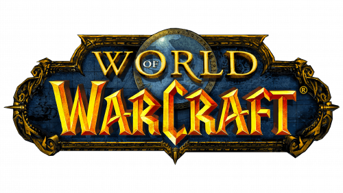
World of Warcraft logo
In 2004, a monster appeared on the gaming landscape that defined the future of online gaming: the World of Warcraft (WoW). As the centerpiece of the world of massively multiplayer online role-playing games (MMORPGs), WoW marked a paradigm shift, transforming gaming from an isolated hobby into a collective, globally interconnected experience.
In a vast fantasy universe saturated with legends and mythology reminiscent of literary epics like Lord of the Rings, the world of WoW is filled with magical creatures, brave heroes, and intricate plots. The World of Warcraft logo epitomizes this fantasy atmosphere perfectly.
Designed in an ornate, pseudo-medieval style, the WoW logo draws inspiration from the artwork that adorns the covers of fantasy novels, board games, and movie posters. The bold, archaic typeface intertwined with delicate filigree evokes a sense of ancient grandeur, reflecting the epic scale of the game and its timeless theme.
The choice of metallic colors and textural tones gives the logo depth and weight, echoing the game’s immersive environment. Whether it’s gleaming gold or deep royal blue, the color palette emphasizes the logo’s connection to a majestic and mysterious world.
One of the distinguishing features of the WoW logo is its remarkable consistency over time. Despite the game’s many expansions and the changing landscape of the gaming industry, the core design remains largely unchanged, save for a few subtle color adjustments. This stability is not just an aesthetic choice; it reflects the enduring appeal of World of Warcraft.
