Entertainment logos play a crucial role in our cultural world, constantly evolving and adapting. Initially, these logos were often characterized by a simple, predominantly typographic design. Classic examples are the Disney and MGM logos, which have left an indelible mark on the history of the entertainment industry.
In the modern era, technological advances and sophisticated branding and marketing strategies have led to more complex and animated logos. A prime example is the Marvel logo. It uses computer animation to depict a flipping page of a book featuring a collection of iconic works. This dynamic representation increases brand recognition and gives the logo a sense of life and movement.
Animation and modern graphic design have become increasingly common in recent years, giving entertainment logos a new level of vitality. These innovative solutions help to convey the essence of the brand and make it more interesting to viewers.
Below is a selection of some of the most striking logos in the entertainment industry. These logos are vibrant symbols of their respective brands and have transcended their industries to become some of the most memorable logos ever created.
20th Century Studios
The iconic 20th Century Studios logo originates from the merger of two companies in 1935 under the leadership of William Fox and the duo of Joseph Schenck and Darryl F. Zanuck. This logo has always resonated deeply: its impressive structure and dramatic on-screen animation embody what can be considered the quintessential American spirit. Its impact is even greater when the visuals are combined with its famous fanfare. In 2020, the brand underwent a name change, dropping “Fox” and becoming simply “20th Century,” but the strength of the logo remained, retaining its presence and recognizability, minus the “Fox.”
CNN
The CNN logo, created on June 1, 1980, is still unchanged today, a testament to its timeless design. Created by Anthony Guy Bost, the logo is a model of minimalist elegance. It subtly integrates a hidden meaning: the white line between the letters symbolizes the cable, which is an apt visual metaphor for a cable news network. The design is reminiscent of the simplicity and fluidity of the Canadian National logo, in which each letter flows seamlessly into the next, thus demonstrating an organic fusion of form and function.
Disney
Created in 1956, the Disney logo has since evolved into one of the most recognizable symbols in the world. It uses a stylized version of Walt Disney’s signature, emphasizing the personality of the man behind the magic. Notably, the design of the “D” symbol in the logo uses the golden ratio, a mathematical principle often associated with aesthetically pleasing design, on three separate occasions.
DreamWorks
The DreamWorks logo is one of the most recognizable in the entertainment industry. In its early days, the logo was fairly simple: the company name was written in white letters on a sharply outlined black background. This variant was used until 1997, when the studio began producing animated films, including such hits as “Shrek” and “Ant-Man”.
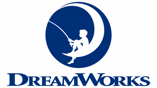
Between 2004 and 2006, the logo underwent changes suggested by Dennis Murren, a well-known director and visual effects supervisor. The new version of the logo, designed by artist Robert Hunt, featured a boy sitting on a crescent moon and fishing. This image of a boy symbolizes the limitless potential and purity of childhood, echoing DreamWorks’ ethics.
An indelible impression of the logo is its effortless simplicity. Silhouettes are widely used to create compelling visuals, and the DreamWorks logo is a testament to their effectiveness.
Paramount
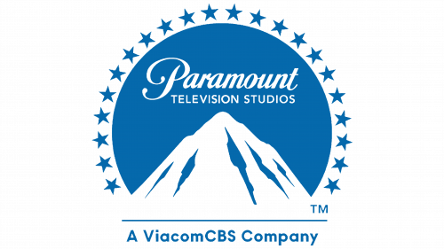
Paramount, now a subsidiary of Viacom, is considered the oldest operating movie studio in Hollywood. Its emblem is a vivid illustration of a mountain surrounded by 24 stars.
As the story goes, the emblem was designed by William Wadsworth Hodkinson, who drew inspiration from Mount Ben Lomond, located in Utah. The surrounding stars have symbolic meaning, each denoting one of the 24 actors who joined the studio in the year of its founding (1914).
In 1957, the logo underwent a revision that reduced the level of detail to minimalist. The latest version was introduced in 2002 when shooting stars forming an arch over a mountain peak were added to the logo.
The strength of the Paramount logo lies in its understated design, mirroring the simplicity of the DreamWorks logo. This simplicity, combined with a rich historical narrative, accounts for its timeless appeal.
Pixar
Pixar, known for its sophisticated and fluid animation, captures this essence in its logo, which is shown at the beginning of its films. Regular viewers and fans of the company are familiar with the animation featuring Luxo Jr, the company’s symbolic mascot. In the animation, the lamp is depicted in realistic motion, playfully bouncing and eventually replacing the letter “i” in the logo with his body. Luxo Jr.’s depiction of the lamp received immediate worldwide recognition, making the Pixar logo unique and unforgettable.
Reuters
Although Reuters is not categorized as an entertainment organization compared to the others listed, it certainly provides information that intrigues and captivates audiences around the world. The company was founded in London in 1851 by Paul Julius Reuters, an immigrant from Aachen, Germany. Reuters opened the agency’s first office to transmit stock market news to Paris, using the innovative technology of the newly laid telegraph cable.
By 1858, Reuters had become the primary information provider for all major London newspapers. The company’s original logo, reminiscent of a heraldic coat of arms, was a vertical oval. The typeface used was a sans-serif font, indicating an early adoption of modernist branding trends.
Reuters’ visual style has undergone many transformations over its history. The current logo, recognizable today, was developed in 2008 under the creative direction of the international brand consulting company Interbrand. The exact interpretation of the symbol remains elusive and open to interpretation. Some speculate that it may represent a bird’s eye view of a spiral staircase.
The Reuters logo deserves a place in this collection primarily because of its compelling imagery. In addition, the elusive nature of the symbolism creates intrigue and curiosity, encouraging viewers to delve deeper into the brand.
Universal
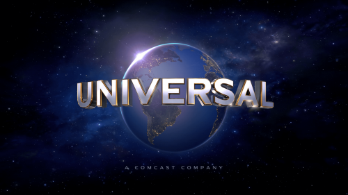
Since its appearance in 1912, the Universal logo has undergone many transformations. The original version was a simple one-color design. Over time, it turned into a detailed black-and-white halftone illustration. However, the essence of the logo remained strict and straightforward, using the eternal appeal of black and white color.
The colorful cinematic logo familiar to viewers today appeared between 1954 and 1963, undergoing many changes. One notable feature of the animated logo is the use of a mirrored glow that surrounds the planet and creates a shimmering illusion. This and the unique concept make it stand out from the crowd. Universal’s logo is distinctly spectacular and grandiose, making it unforgettable for viewers.
