


In the 1930s, the world faced challenges such as the Great Depression and the looming threat of World War II. Despite these difficulties, the decade was marked by technological advances and innovations. For example, movies introduced sound effects, which attracted large audiences. Radio broadcasts also became part of everyday life. Consumer products such as vacuum cleaners, home telephones, and new chocolate products appeared in homes. Notable inventions such as sliced bread, duct tape, and nylon stockings appeared.
With technological advancements and consumer growth, the importance of logos has increased dramatically. Brands and organizations began to realize the importance of visual communication. Logos became increasingly distinct, memorable, and impressive. They ranged from commanding to whimsical, reflecting the decade’s dual nature: both rigorous and transformative.
It was an era that truly appreciated the importance of a strong visual identity. Logos helped both commercial and government organizations communicate effectively with audiences. Whether bold and direct or lighthearted and playful, these visual elements became crucial in shaping public perception and messaging.
For those interested in the evolution of design, the 1930s provided a rich collection of iconic logos. These visuals have been celebrated over the years and serve as an interesting point of comparison with logos from subsequent decades, such as the 1940s, 1950s, and 1960s.
Warner Brothers Logo
![]()
Warner Bros. boasts a globally recognizable logo that has remained virtually unchanged for nearly a hundred years. The shield shape was popular among brands during their inception, but has since fallen out of use. Despite changing trends, the simple initials “WB” in the Warner Bros. shield have survived and thrived. The creative inspiration for the logo was renowned graphic designer Saul Bass. The original design underwent only minor changes, retaining its bold and straightforward look. Interestingly, the family behind the brand originally had the surname Vonskolazer. They emigrated from Poland to the United States, where they changed their surname to Warner, a name that has become synonymous with the entertainment industry.
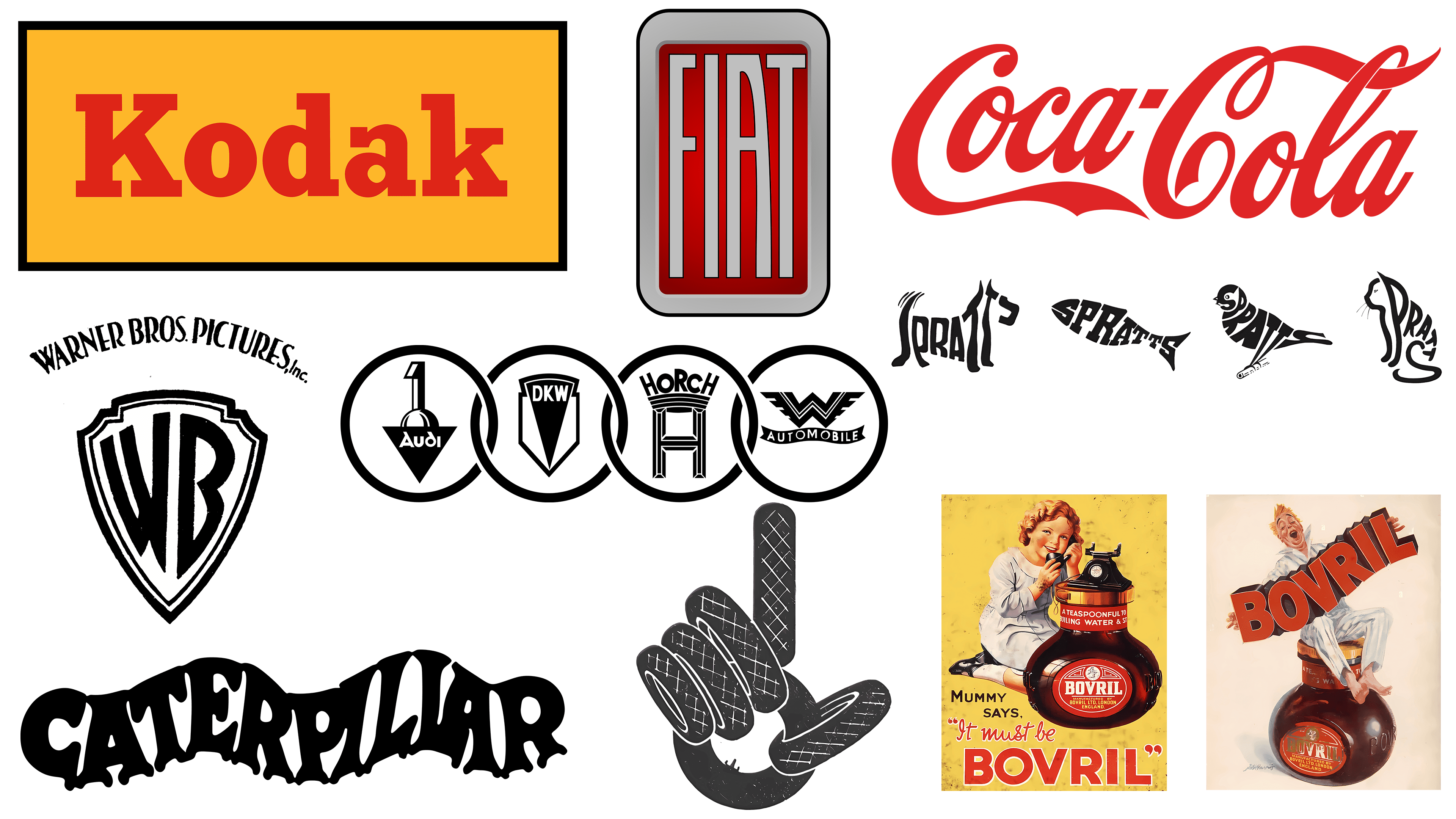
Kodak Logo
![]()
The Kodak logo, created in 1935, demonstrates how simplicity can speak volumes. Its eye-catching design uses only typeface and color, specifically red and yellow. Unlike its predecessor, which included the full name “Eastman Kodak Company” and even a monogram, the 1935 logo was shortened to simply “Kodak.” This allowed the brand name to assert itself, making it a brand name in its own right. Kodak’s choice of bold serif fonts and bright colors made the logo instantly recognizable. This is in keeping with the company’s historic mission, founded by George Eastman in 1888, to make photography accessible to everyone. The logo perfectly reflects the brand’s commitment to simplicity and accessibility, making it a symbol in its own right.
Coca-Cola Logo
![]()
The Coca-Cola logo is a prime example of timeless design. First designed in the late 1800s, the corporate font remains virtually unchanged today. While many companies undertake numerous redesigns to stay relevant, Coca-Cola defies this urge. The unchanging design ensures that it is recognized worldwide. Interestingly, the name “Coca-Cola” was suggested by Frank Mason Robinson, an accountant for John Stitt Pemberton, the inventor of Coca-Cola. Robinson believed that alliteration in the name would be effective for advertising and that it played a significant role in the initial logo design. With this enduring image, the Coca-Cola logo has survived several generations and remains a worldwide favorite.
Caterpillar Logo
![]()
The Caterpillar logo has an intriguing history, marked by thoughtful designs that fit perfectly with the brand’s style. The first logo, created in 1925, was a playful company name that featured features reminiscent of the insect it was named after. The logo was significantly redesigned in 1931, but it retained elements reminiscent of its namesake. The letter “C” was stylized to resemble a caterpillar’s rounded head, and the other letters were designed to resemble graceful paws. The wavy design mimics the continuous caterpillar system used in the company’s heavy equipment. The logo has undergone many changes over the years, but the 1931 design stands out for its creativity and consistency with the company’s core products.
Audi Logo
![]()
The Audi emblem, introduced in 1932, consists of four crossed rings. These rings symbolize the cooperation of four automobile manufacturers: Audi, DKW, Horch, and Wanderer. This alliance, originally known as Auto Union AG, was created as a survival tactic during the Great Depression. The emblem is still recognizable today and symbolizes the unbreakable unity of the founding companies. Sometimes, the emblem appears alongside the brand name, which is derived from the name of the company’s founder, August Horch. The name “Horch” means “listen” in German, and its Latin equivalent is “Audi”. These rings remain iconic, second only to the Olympic rings in worldwide recognition.
Spratt’s Logo
![]()
British pet food brand Spratt’s used a flexible, playful logo designed by Max Field-Bush in 1936. In this design, the brand name was depicted as figures resembling popular pets. Used in various promotional materials such as signs and posters, these visually appealing logos became known as calligrams. The name Spratt’s still adorns the exteriors of the former factories, which have now been converted into housing and are known as Spratt’s Complex in Poplar, London.
Bovril Logo
![]()
Originally conceived by Scottish butcher John Lawson Johnston in the 1870s as a nutritional product for the French army, Bovril began its life as Johnston’s Fluid Beef. This product, a savory meat extract, was usually mixed with hot water to make a drink or spread on toast. For many years, Bovril was advertised as a healthful and strength-boosting elixir. During both World Wars, advertisements claimed that the drink was rich in nutrition and was even therapeutic for illnesses such as the flu. The Bovril logo of the 1930s is bold and simple, in marked contrast to the more elaborate logos of companies such as Pepsi or Caterpillar.
Ministry of Supply Logo
![]()
The logo for the Ministry of Supply’s ‘Save Tires and Save Rubber’ campaign remains a striking example of historic graphic design. Established in 1939, the Ministry of Supply was a specialized British government agency responsible for supplying the British armed forces with everything they needed, including explosives, ammunition, and weapons. One of its special campaigns aimed to remind the public of the importance of conserving rubber during the war. Citizens were encouraged to turn in unused rubber products, which were then used for military purposes.
The design techniques used were manual labor-based, which makes the campaign particularly unique. Before the advent of digital technology, artists had to rely on their skills with pencil, ink, and paper. Blueprints were drawn by hand, elements were carefully cut out and placed on layouts, and grids were used to align and ensure each element was the perfect size. This intricate process was essential to ensure the final printed version was as spectacular as possible. The campaign used graphic bars shaped like a hand to achieve instant recognition and memorability.
Fiat Logo
![]()
Throughout the 1930s, the Fiat logo underwent several notable changes. Each of these versions was unique but shared a common design element: elongated, condensed Art Deco-inspired letterforms. In this decade, Fiat, which stands for Fabbrica Italiana di Automobili Torino, decided to simplify its brand image. The luxurious foliage frame that had previously adorned the logo was replaced with a simpler yet no less memorable red badge.
The badge had several shapes, each adapting the Fiat acronym in its own way. What makes this series of transformations intriguing is the brand’s flexibility in changing the logo design without losing its core identity. The styling decisions made in the 1930s were so strong that they continue to influence the brand’s current logo design. This demonstrates the company’s resilience and adaptability in an era of change.