


The 1960s were a time of significant social and cultural shifts, marked by colorful, experimental designs across various fields, including logos. This era, known for its social movements, artistic innovations, and bold fashion statements, gave rise to unique logos that reflected the dynamic spirit of the time.
Designers of the 1960s departed from traditional norms, drawing inspiration from art movements such as pop art, op art, minimalism, and conceptual art. This creative explosion resulted in logos that were symbols of corporate identity and works of art. They often featured psychedelic symbols, playful motifs, and abstract icons, reflecting the essence of a decade characterized by change and creativity.
Logos from the 1960s often used abstract techniques, marking a departure from the straightforward, literal representations of the past. They show psychedelic tendencies, reflecting the era’s fascination with expanding consciousness and bright, unconventional aesthetics. Emotion and humor became integral to logo design, reflecting the decade’s atmosphere of freedom, rebellion, and joy.
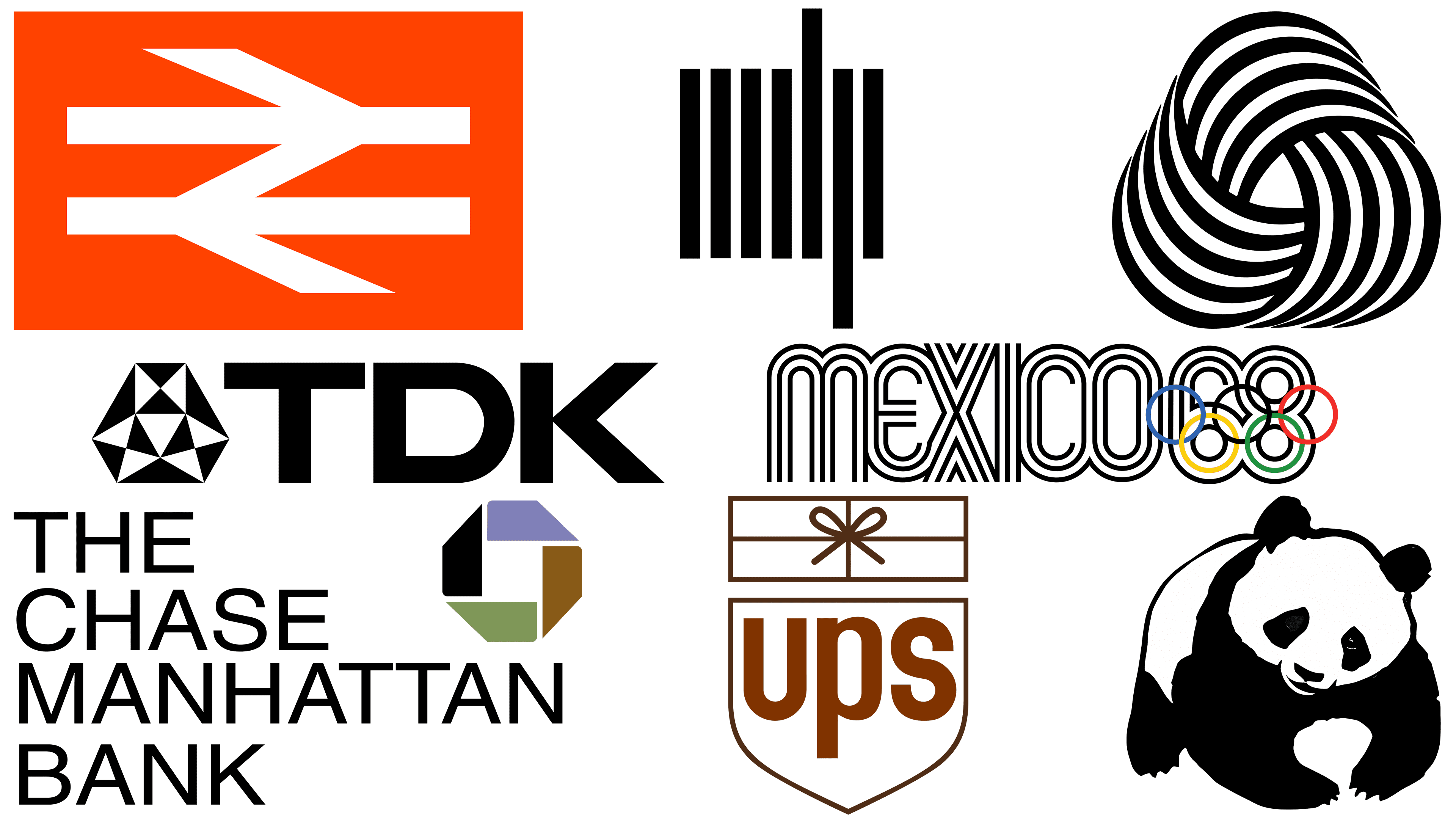
UPS
![]()
Paul Rand, a renowned graphic designer, was known for using humor in his designs, as seen in his UPS logo. His approach to graphic design emphasized that humor can be a powerful tool, adding depth and engagement to visual messages. Rand believed that a humorous approach to design should not be dismissed as trivial or unworthy.
The UPS logo, designed by Rand, is a prime example of his philosophy. In this logo, Rand took a traditional symbol, the aesculapius, which is often associated with medieval heraldry and, therefore, may seem overly serious or pompous in a modern context. He then took an unexpected turn by placing a package on top of this classic symbol. This design choice modernized the symbol and brought a sense of humor to the logo. The combination of old and new, serious and playful, made the UPS logo memorable and distinctive.
Rand’s work, including the UPS logo, illustrates how humor can be used effectively in graphic design to create a more appealing and easily understood visual message. His ability to combine traditional elements with modern humor sets his designs apart and continues to influence designers today.
WWF
![]()
Even before the World Wildlife Fund (WWF) was created in 1961, a giant panda named Chi Chi was introduced to the London Zoo and quickly became a visitor favorite. Chi-Chi’s popularity and appeal inspired the creation of the WWF logo, which depicts a friendly yet sharp panda. This logo has become a powerful symbol that epitomizes WWF’s mission to conserve wildlife and restore natural habitats around the world.
Interestingly, the logo was designed in 1961, not by a professional design agency but by Sir Peter Scott, a renowned conservationist and one of the founders of WWF. His goal was to create a symbol that could overcome language barriers and be easily printed, even on low-budget materials. The panda emblem has achieved this and much more. It has effectively won the hearts and minds of people for over six decades, undergoing only minor changes.
Sir Peter Scott’s choice of the panda as the WWF logo was strategic. He wanted it to be a beautiful, endangered animal, widely loved for its attractive qualities. Choosing a black-and-white animal was also practical as it reduced printing costs. The WWF panda logo is a testament to the fact that a simple yet meaningful design can convey an important message and attract people’s support.
TDK
![]()
Audio cassettes were introduced in the 1960s and revolutionized music listening by providing unprecedented portability. Their popularity surged in the 1980s but began to decline in the 1990s with the advent of CDs. Despite this decline, cassettes have enjoyed periodic revivals, especially in underground music circles, due to their ease of use for creating mixtapes, low cost, and retro appeal.
Logo designs like the TDK logo have played no small part in the enduring appeal of cassettes. The TDK logo, known for its simplicity and balance, features geometric shapes that represent electronic computers and magnetic materials. This design resonated with consumers, evoking nostalgia and a connection to the cassette tape era.
The TDK logo, designed by Yusaku Kamekura in 1967, is particularly appealing because it suggests Japanese technological excellence and high sound quality. This perception influenced consumer choices, demonstrating the power of logo design to shape brand identity and consumer preferences. Even years later, the logo remains iconic, symbolizing a combination of technological innovation and nostalgia for a bygone era of music consumption.
Mexico 1968
![]()
The logo for the 1968 Olympic Games in Mexico, designed by Lance Wyman, is a memorable example of how design can reflect the cultural heritage and spirit of an event. Wyman collaborated with Pedro Ramirez Vazquez, head of the Mexico City organizing committee and renowned architect, to create a logo that seamlessly combined optical art, geometric patterns, and a unique three-line font. The design drew on Mexican culture, with color and patterns paying homage to the country’s rich heritage.
The duo’s work went beyond the logo to include an innovative pictogram system for each sporting event, further reinforcing the visual identity of the Olympic Games. The design influence was widespread, with psychedelic patterns and compelling graphics appearing on a variety of items throughout the city, from clothing and memorabilia to public spaces such as sidewalks and plazas.
The visual style of the 1968 Olympics was not just aesthetically pleasing; it reflected the optimism of the era and the belief that sport was a unifying force. The dynamic stripes emanating from the logo’s words created a sense of engagement and energy, inviting viewers into the world of the Olympic Games. This design represents not just a sporting event but a modernist utopian vision of uniting nations through sport.
British Rail
![]()
In the early 1960s, British Rail, undergoing a period of modernization, sought a design that would symbolize progress and appeal to future passengers. The result was the ‘double arrow’ logo, designed in 1964 by Gerry Barney, a lettering artist from the Design Research Unit (DRU). This logo represented two-way arrows on parallel lines representing railroad tracks. It was a precursor to other well-known transportation pictograms, including the Swiss Railroad logo.
The simplicity and clarity of the double arrow logo made it a universal symbol, easily recognizable and adaptable. Its sustainability as a design is evidenced by its continued use at different stages of British Rail’s history, including privatization in the 1990s and the renationalization of the railway infrastructure in 2002. Today, the logo still appears on tickets, stations, street signs, and trains.
This logo complements the iconic London Underground logo, and its resemblance to the British flag makes it a clever and apt representative of the national rail service. Its continued presence in the British transport landscape speaks to effective design and the enduring appeal of simple symbolic imagery to represent public services.
MIT Press
![]()
The MIT Press logo, which has become a symbol of modernist design, was created by Muriel Cooper. The design was originally proposed to Paul Rand, a well-known design figure, but he recommended that Cooper take it on. Cooper, who worked as a designer in the 1950s and became the first female director of the MIT Press in 1967, was running her own graphics studio when she created this iconic logo.
Cooper was known for her meticulous approach to design, always striving to create a unified aesthetic across all of her projects. Her attention to detail was evident when she created the MIT Press colophon in 1965. The logo, consisting of seven vertical stripes, artfully depicts the strokes in the letters “MITP” while evoking the image of several books. Since then, this original design has become a familiar sight on the bookshelves of architecture and art lovers worldwide.
Moreover, Cooper’s logo design was ahead of its time, featuring elements hinting at the digital age, which she also contributed to while working at the MIT Media Lab. The logo’s resemblance to a barcode was a visionary hint at the future of digital technology. Cooper’s work on the MIT Press logo is a testament to her forward-thinking approach to design, combining functionality with forward-thinking creativity.
Chase Bank
![]()
The octagonal Chase Bank logo, designed by Chermayeff & Geismar in 1961, marked a significant shift in corporate branding with its simplicity and abstract design. At the time, American corporations did not often use abstract symbols as logos, and this minimalist blue octagonal mark was a bold departure from the norm. At first, some Chase Bank executives were hesitant to adopt an abstract logo, but this design eventually changed their minds.
The octagonal logo, while abstract, is not without meaning. It was inspired by traditional Chinese coins, which often had a square hole in the center. The design of the Chase logo, a square enclosed in an octagon, is suggestive of a bank vault. This image was meant to convey a sense of security and trust – essential qualities of a banking institution.
Over time, the logo gained widespread acceptance and approval, even from those who initially opposed it. It was a symbol of the bank’s identity, proudly worn by executives on tie pins and cufflinks. The Chase Bank logo is an example of how thoughtful design can create a lasting and meaningful corporate identity.
Woolmark
![]()
The Woolmark logo, now a globally recognized symbol of pure wool and quality standards, has an intriguing backstory. In 1964, it won a competition held by the International Wool Secretariat (IWS), but its true creator, Franco Grignani, was not initially recognized. Grignani, an Italian designer and member of the competition’s international jury, was unimpressed with the entries and decided to submit his own design under the pseudonym Francesco Saroglia. It was not until the 1980s that Grignani was officially recognized as the creator of the logo.
The Woolmark logo design is a masterful piece of optical art. The swirling, mesmerizing pattern draws the eye without the use of color. The elegance and simplicity of the logo have enabled it to appear on more than 5 billion products worldwide, making it one of the most recognizable symbols in the fashion and textile industry.
The Woolmark logo is often noted for its aesthetic appeal and historical significance. It epitomizes the design ethos of the 1960s, combining fashionable op-art twists with an elegant style reminiscent of artists such as Bridget Riley and M.C. Escher. This logo is a testament to the artistic ambition of the era and proves that branding can be both subtle and impressive. The Woolmark logo is a mark of quality and a symbol of comfort, sustainability, and the enduring power of good design.