


The 1970s were a decade rife with controversy, an echo of an era defined by both social upheaval and technological advancement. Political instability and labor strikes were frequent headlines, in sharp contrast to the growing popularity of color television and the disco revolution. The decade was marked by pivotal moments in history, such as the tragic death of Elvis Presley and the tumultuous events of the Vietnam War. At the same time, technological marvels such as the Concorde jet took to the skies, and cultural icons such as David Bowie captured the world’s imagination. Individual style and interior decor were characterized by unique elements, such as shaggy-pile carpets and platform shoes, creating a vivid picture of an era somewhere between austerity and indulgence.
This dichotomy extended to graphic design, reflecting the versatility of the 1970s. This period was marked by branding and logos that were as varied as they were impactful. Brands of this time used bold color schemes combined with fonts that exuded flow and movement, resulting in many bright and vibrant logos and emblems. The fascination with color and ornamentation was balanced by an equally strong desire for simplicity and minimalism. Many designers of the era opted for clean lines and straightforward design, striving for an understated but powerful form of visual communication.
Experts in the field often look to this decade to analyze its rich contributions to logo design. Logos from this era defy easy categorization, reflecting a complex mix of aesthetic preferences and cultural influences. While many industry professionals have their own lists of favorite logos from this time, there is no universally accepted ranking, highlighting the subjective nature of design.
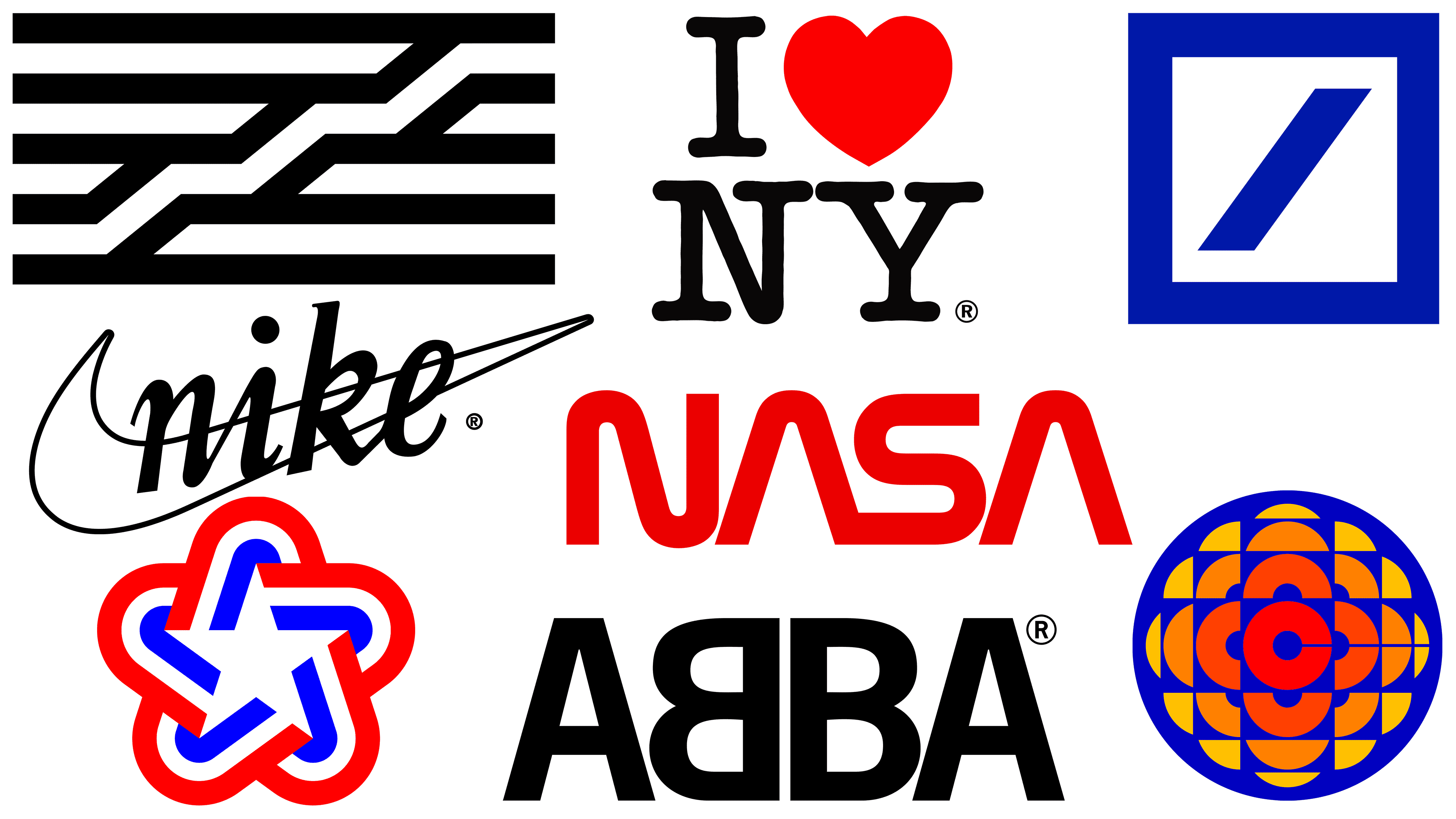
Deutsche Bank Logo
![]()
The Deutsche Bank logo, created in 1974, captures the essence of simplicity and directness. It features a blue square crossed by a diagonal line, a minimalist design created through a competitive selection process. The bank, which today ranks among the world’s leading financial institutions, invited eight designers from modest studios to develop a new corporate identity. The winning project is characterized by understatement yet is full of meaning.
Marina Willer, a renowned graphic designer and filmmaker, believes the Deutsche Bank logo is attractive because of its streamlined design and its straightforward conveyance of the concept of growth. Like the Deutsche Bank logo, other symbols, such as the British Rail icon, have a reputation for being simple, clear, and expressive.
Anton Stankowski, the creator of this elegant yet simple symbol, embodied the ideas of constructivist art in it. His design, dubbed “slash in a square,” eloquently reflects the bank’s ethos of stable and consistent growth. This design innovation was a forward-thinking move in a sector traditionally considered conservative and risk-prone. Symbolizing both security and growth, the Deutsche Bank logo positioned the bank as a pioneer in the financial sector.
The longevity of the Deutsche Bank logo is a testament to its success: it will celebrate its 50th anniversary in 2024. Over the years, it has served as a reference point and source of inspiration for designers seeking to embody minimalism and meaning in corporate identity. His influence is a testament to design’s ability to translate complex business ideals into simple graphic form.
The Deutsche Bank logo has not lost its relevance and continues to influence current trends and design philosophy. Its enduring relevance is an example of how well-crafted design, based on simplicity and infused with meaning, can transcend time and trends, consistently resonating both in the industry it represents and around the world.
Nike Logo
![]()
The Nike Swoosh, a design element as iconic as it is simple, debuted in 1971. The emblem, created by design student Caroline Davidson, initially drew skepticism from Phil Knight, the company’s co-founder. Despite its humble beginnings and initial doubts from company executives, this simple curve has become one of the most recognizable symbols worldwide.
Financially, Swoosh entered the logo world with restraint. Davidson received $35 for her work, which translates to about $260 in today’s currency. Over the years, the value of this design has increased exponentially. Recognizing Davidson’s pivotal role in shaping the company’s brand identity, Nike subsequently granted her shares in the company, the value of which has since grown to $1 million.
Simultaneously with the Swoosh’s introduction, the company changed its name from Blue Ribbon Sports to Nike. Named after the Greek goddess of victory, the brand found its new name fitting for the emblem, which is believed to represent the goddess’s wing. In its early years, the Swoosh emblem often appeared next to the Nike name in lowercase letters, a common tactic to promote brand recognition.
The Swoosh epitomizes the power of minimalist design. It is a versatile symbol that can adapt to different platforms without losing its core characteristics. From athletic shoes to sportswear and accessories, the emblem fits effortlessly into a variety of product lines. Its adaptability has stood the test of time and enhanced the brand’s reputation in various markets and industries.
There is an unspoken lesson encapsulated in the trajectory of the Nike Swoosh. It demonstrates the underappreciated importance of design in building a brand reputation. From a simple curve on paper to an image ingrained in the global consciousness, the Swoosh exemplifies how thoughtful design can take a brand from obscure to world-renowned. This iconic curve transcends language barriers and cultural differences, carrying a universal message of triumph and aspiration. It has become not just a logo but an integral part of global pop culture, continuing to shape and define the brand it represents.
Canadian Broadcasting Corporation Logo
![]()
The Canadian Broadcasting Corporation (CBC) logo, created in 1974 by Burton Kramer, is a seminal example of 1970s graphic design. This emblem is a prime example of how geometric elements can be used to create a visually appealing object. At the center of the emblem is the letter “C,” which serves as the nucleus for a series of radiating geometric shapes that create an effect reminiscent of a kaleidoscope or a multi-faceted gemstone.
The design has garnered national attention, earning nicknames such as “gemstone” and, in its animated version, “exploding pizza.” While many logos undergo changes and transformations over time, the CBC logo has retained its core identity. Although the original “C” no longer appears in modern versions, the logo is still evocative and leaves a lasting impression. The adaptability of the design is a testament to its enduring appeal and relevance beyond the time period in which it appeared.
The geometric elegance of the CBC logo embodies the duality of 1970s aesthetic trends, encapsulating both complexity and simplicity in its form. This level of complexity and minimalism embodies the decade’s diverse visual language. More than just a nostalgic exhibit, this design serves as a timeless source of inspiration for today’s designers, challenging them to go beyond conventional notions of logo design.
Studying logos from the 1970s provides insight into the complexity of the design ethos that defined the decade. The CBC logo clearly demonstrates how designers skillfully navigated the full range of design philosophies of that decade, from bold to restrained. Unlike many other logos of that era, the CBC logo has survived to this day, and its design principles have not lost their relevance. This timelessness speaks to the skill of its creator and to the transformative power of well-executed design.
NASA Logo
![]()
In 1975, NASA introduced a new visual style, commonly known as the “worm” logo, replacing the old “meatball” emblem. This design initiative was part of a U.S. federal design improvement program to standardize and improve the visual language of government agencies. The logo was designed by the design firm Danne & Blackburn, whose incarnation immediately became an iconic representation of NASA, with its bold, futuristic design.
The lettering in the worm logo deviated from traditional typographic forms and resembled the symbols of a yet-to-be-developed futuristic language. This cutting-edge and forward-looking aesthetic suggests that NASA is an agency unconstrained by the present, always focused on the future possibilities of space exploration. The simplicity and modernism of the design were in stark contrast to the original “meatball” logo, which was a complex design of a globe, stars, and a red chevron.
In 1992, the “worm” logo, which had perplexed many, was discontinued and replaced by the original “meatball” logo. Although the specific reasons for the logo’s discontinuation remain shrouded in secrecy, its legacy continues to thrive in design circles and among space enthusiasts. The love for the logo led to its revival, and it has since reappeared on various NASA materials, sharing space with the “meatball” logo.
The “meatball” logo evokes the pioneering spirit of the early days of space exploration and is a set of traditional symbols, each filled with meaning. In contrast, the “worm” logo represents modernity and is focused on the future development of space technology and exploration. Both logos coexist, each fulfilling a different role and reflecting different aspects of NASA’s multifaceted mission and history. Their simultaneous use gives NASA’s brand identity added depth, allowing for a better understanding of an organization that has been central to some of the most revolutionary achievements in human history.
The revival of the worm logo isn’t just nostalgia; it’s a demonstration of design’s ability to transcend time and technological advances. The return of this iconic logo provides a multifaceted view of NASA’s evolution, emphasizing the agency’s commitment to both its storied past and ambitious future. The worm and meatball emblems continue to represent the scope of NASA’s space exploration ambitions, demonstrating how effective and enduring good design can be.
Center Pompidou Logo
![]()
In 1974, the Pompidou Center in Paris adopted its visual identity through a logo designed by Jean Widmer. The location for this creative endeavor was an open-air bistro overlooking the museum. Admiring the architectural marvel, Widmer sketched the emblem on an embossed tablecloth. The emblem captures the essence of the Pompidou Center’s architecture, especially highlighting the attractive glass tube that houses the escalator visible from the outside of the building.
Jean Widmer, now in his nineties, still has vivid memories of creating this iconic symbol. According to him, this logo was one of the fastest he had ever realized. The idea popped into his head before he even got to work. Initially, Widmer proposed two designs, differing only in the number of stripes: five or six. The museum also considered enclosing the design in a black frame, but Widmer strongly objected. Although he found the five-stripe option more impressive, he eventually settled on the six-stripe option after negotiations with the museum’s management.
The logo of the Pompidou Center is not just a random set of lines; it abstractly represents the museum’s most characteristic feature. It serves as a brief visual cue for those familiar with the building’s unique exterior escalator. This deep correspondence between design and architectural form distinguishes the emblem, contributing to its longevity and relevance.
The emblem defies changing design tastes and cultural shifts, remaining an enduring symbol of the museum. It serves as a beacon for art lovers, indicating that cutting-edge contemporary art can be seen within its walls. Minimalism emphasizes its timelessness and resonates with visitors from different generations. Widmer’s design decisions, from the number of stripes to the abandonment of the black frame, have coalesced into an indelible image that has stood the test of time.
Bucking trends and capturing viewers’ imaginations for decades, the Pompidou Center logo serves as both an identifying mark for the institution and a design milestone. The logo’s simple yet striking combination of elements embodies the innovative spirit of the Centre Pompidou, making it one of the most enduring and celebrated emblems in the world of art and architecture.
Abba Logo
![]()
The logo of the band ABBA, created by Rune Söderqvist in 1976, is an enduring symbol in music and graphic design. The logo is an inverted “B” pointing towards the letter “A,” symbolizing the two couples that made up the band Agnetha, Anni-Frid, Bjorn, and Benny. This artistic choice transformed the emblem from a simple abbreviation of the band members’ names into something more elaborate and complex.
The true genius of the emblem lies in its complexity disguised as simplicity. It functions as a palindrome, meaning it reads the same, both forward and backward. This property goes beyond simple textual symmetry, becoming a visual palindrome that retains its appearance even when reflected in a mirror.
The News Gothic typeface gives the design a modernist and understated character, in keeping with the enduring appeal of ABBA’s music. The emblem first graced the cover of the “Arrival” album and has subsequently appeared on all album covers and touring sets created by Söderqvist for the band. It remains a lasting testament to the aesthetic inclinations of 1970s modernism, especially the Scandinavian design trends that preceded the worldwide popularity of brands such as IKEA.
Like any iconic logo, ABBA’s design reflects the essence of its subject. The inverted “B” serves a stylistic purpose, telling the band’s story by personifying the relationship among its members. In this way, the design goes beyond its primary function as a band identifier and becomes an element of storytelling.
The ABBA logo is an example of design ingenuity characteristic of the 1970s, from music to art. Its complex simplicity, functional symmetry, and elaborate narrative encapsulate the multi-layered nature of the band it represents. As an intersection of art and commerce, the logo has retained its significance and relevance, proving that effective design can indeed stand the test of time.
American Revolution Bicentennial Logo
![]()
In 1976, the bicentennial of the American Revolution became the center of national pride and celebration. The visual embodiment of this momentous occasion was a soft five-pointed star formed from red, white, and blue ribbons. Renowned designers Ivan Chermayev and Tom Geismar created this iconic emblem, which resonated deeply with American citizens and became ubiquitous at events, parades, and even on souvenirs. The emblem has even traveled to Mars, adorning the Viking rover, the first spacecraft to successfully land on the Red Planet.
The emblem is a powerful combination of simplicity and symbolism. Red, white, and blue are the quintessential American colors, immediately evoking the national flag. The five-pointed star, a recurring motif in American iconography, adds another familiar element. By combining these elements, the logo immediately provides a powerful visual cue that epitomizes 200 years of nationhood. This symbol was not just an aesthetic choice but a unifying visual theme that informed the nationwide celebration.
Even the arrangement of the logo elements carries meaning. The ribbons in the star convey a sense of fluidity and dynamism, symbolizing a country in constant movement toward progress. The design is directional; the stripes seem to point the country into a future filled with limitless possibilities. This is an emblem that looks into the past and the future, embodying the bicentennial celebration’s dual nature: honoring the past and aspiring to the future.
The emblem’s widespread use was facilitated by its adaptability. Its design was versatile enough to appear in a variety of media, from printed matter to digital media and even on a spaceship. This wide range of uses speaks to the emblem’s universality and its successful embodiment of the nation’s spirit at a pivotal moment.
Chermayev and Geismar’s work on the American Revolution Bicentennial logo remains a quintessential example of how design can embody complex national sentiments in a simple yet powerful visual format. It was a logo that simultaneously celebrated and aspired, simultaneously remembered and anticipated. It served as a marker of the United States’ 200th anniversary and as a symbol of a nation constantly striving for progress. Through thoughtful design and symbolic elements, the logo remains an enduring part of American visual history.
I Heart NY Logo
![]()
The iconic I Heart NY logo, designed by Milton Glaser, first appeared in 1977 at the request of the New York State Department of Commerce. Appearing as the result of a quick crayon sketch on a piece of paper, the logo has transcended its humble beginnings to become a global symbol. It can be found on numerous souvenirs, such as T-shirts and coffee mugs, and its influence has spread far beyond New York City.
Its emergence came during a period marked by social and cultural shifts. During this time, traditional typographic rules became more lenient. Glazer’s designs reflected this changing era in the best possible way. The “I Heart NY” logo embodies the desire for unity, peace, and love that characterized the era and resonated with the entire global population.
The universality of the logo is best emphasized by its imitation by global designers, making it one of the most replicated designs in history. Its simplicity and universal message of love and affinity have helped it transcend geographical and cultural boundaries. Its graphic expression of emotion made it the unintended forerunner of modern emoji and digital symbols.
Over the decades, the design’s relevance has remained unchanged. The Museum of Modern Art in Manhattan recognizes its enduring influence by displaying Glaser’s original sketch among its prized collection. This move emphasizes the significance of a design born spontaneously, yet with a major impact on culture.
After the events of September 11, 2001, the logo took on an even deeper meaning. Glazer adapted the design to read “I Heart NY More Than Ever,” reflecting New York City’s resilience and unity in times of crisis. This variation further solidified the emblem’s status as a timeless symbol, versatile enough to represent a wide range of emotions and events while maintaining its core message of love and community.