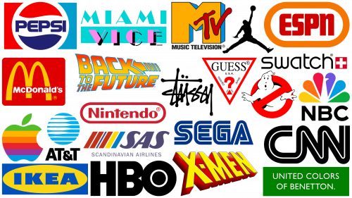
From music and television to design aesthetics and clothing styles, the 1980s continue to have a strong influence on modern pop culture. But what makes the 1980s stand out so vividly?
The key to understanding the influence of the 1980s lies in its stark contrast to the previous decade. As a child, I distinctly remember that the 1970s were marred by economic instability, resource shortages, industrial strikes, and constant power outages, mostly caused by the 1973 energy crisis. In addition to these problems, issues such as racial prejudice and the looming threat of nuclear conflict were acute in society.
The advent of the 1980s brought with it a wave of change, and while this era was not without its flaws, it was generally characterized by optimism. The world economy began to regain stability, new technological advances improved daily life, Cold War tensions began to ease, and the rise of an affluent black middle class ushered in an era of racial progress.
The peculiar cultural world of the era reflected this newfound optimism. It was a veritable explosion of colorful aesthetics, unprecedented creativity, and indulgent extravagance, which were evident everywhere, from vibrant fashion trends to irresistible synth-pop tunes.
Air Jordan Jumpman
Nike’s Air Jordan Jumpman logo, which epitomizes the revival of optimism in the 1980s, depicts basketball legend Michael Jordan in dynamic motion. However, this symbol of positive energy has been controversial since its inception.
It is generally believed that the silhouette was based on a photo shoot for Life magazine taken by then-student Jacobus Rentmeister on the eve of the 1984 Olympics. Nike was originally licensed to take the shot but later had copyright issues, forcing it to be re-shot by another photographer. The second shot became the basis for the final version of the emblem created in 1988 by Tinker Hatfield, who was inspired by a sketch idea proposed by Air Jordan creator Peter Moore.
Over objections, Rentmeister claims that Nike compensated him $15,000 for a limited two-year license, valid only in North America, to use his image on posters and billboards. However, claiming that Nike had breached the terms of that agreement, he sued the company in 2015. The court ruled in Nike’s favor, finding that Nike did not copy the photo but merely drew inspiration from it. Regardless of the legal wrangling, the logo has remained a timeless design reminiscent of a cherished era of athletic brilliance.
Apple
Apple’s 1980s logo, which today has been replaced by a more minimalist monochromatic design. This rainbow-colored version of the logo remains an iconic symbol of the era.
The logo’s bright and multicolored design differed significantly from the traditional, conservative logos common to technology companies of the time. The vibrant use of color reflected the bold and lively design trends of the 1980s. The rainbow logo appeared in 1984, coinciding with the release of the Apple II computer, the first of its kind to feature a color display.
The logo was designed by Landor & Associates and is an adaptation of a similar design created by Rob Yanoff in 1977. This design has stood the test of time and is a classic embodiment of minimalist excellence in logo design.
The emblem consists of two simple shapes – an apple and a leaf; the design is deceptively simple. The uniqueness of the emblem is given by a characteristic overbite above the apple, made to distinguish it from the cherry. The leaf follows the shape of the apple, creating a harmonious symmetry.
There is an unproven myth associated with this logo. The bite of the apple supposedly pays homage to Alan Turing, who is often referred to as the father of modern computing. Persecuted for his homosexuality, Turing tragically committed suicide by eating an apple filled with cyanide. Whether true or not, this story gives the logo a potentially poignant symbolism.
AT&T
The AT&T logo, which is a distinct emblem with a blue and white striped balloon, is easily recognizable even by those not associated with the brand. The 1980s iteration of the logo is very similar to its modern version.
The design philosophy of the 1980s was predominantly focused on standing out and providing prominence. Many companies in that era took this approach, but companies like AT&T, seeking to create an image of professionalism, took a slightly different path.
AT&T’s emblem, with its geometrically precise globe and vibrant color scheme, is a testament to this approach. The logo’s combination of bold colors and crisp geometric shapes conveyed the company’s values of stability, reliability, and professionalism, balancing the eye-catching ethos of the 1980s with a desirable brand image.
Back to the Future
Ironically, a time-travel movie set in the 1950s, Back to the Future became an iconic representative of 1980s cinema. Although the film’s sequel never achieved the dream of 2015 with nuclear-powered flying cars, the film remains a favorite due to its well-crafted script, energetic performances, and superb direction.
Back to the Future was released in 1985 when the market was facing stiff competition from popular films such as Goonies, Rocky IV, Beverly Hills Cop, Police Academy 2, Rambo, and Cocoon. Effective branding was key, and the Back to the Future movie logo hit the right note. The text style is consistent with the futuristic style, the colors are dynamic and electrifying, and the linear gradient creates a sense of forward motion, reflecting the fast-paced plot of the action comedy film.
The logo design, consisting of tightly stacked words shifted back and forth, brilliantly reflects the main theme of the movie – time travel. It grabs the viewer’s attention and creates a sense of temporal distortion as if one is transported into the past.
To the modern viewer, it may seem strange to include the movie’s logo among the best designs of the decade. However, during the era of the 1980s, when video games were still relatively niche, visual entertainment, such as television and movies, was a huge influence. Symbols from this period, such as the MTV logo, the Nintendo emblem, the NBC peacock, and the Universal globe, reflect the era’s focus on home visual entertainment, the so-called “meta-universe” of the time.
In the 1980s, screens began to represent a new creative canvas that extended to logo design. The advent of screens gave more room for creativity and opportunities to create visually exciting designs.
CNN
The original CNN logo, created in 1980 by Ted Turner, was designed in a simple monochromatic palette, reflecting the black-and-white television programming prevalent at the time.
In the 1980s, however, CNN made a subtle but significant change to its logo to reflect changing trends: color was introduced. The color was not chosen at random – it was a particular shade of red. In color psychology, red is associated with qualities such as drive, zaniness, and leadership, which are important for news reporting. The emblem change signified CNN’s attempt to project these qualities and match the energy and dynamism of the era.
ESPN
ESPN’s emblem, at first glance, may seem minimalistic and uncomplicated. However, the use of red and orange hues in its design carries significant symbolic meaning, making it one of the best logos of the 1980s. Red is often associated with strength and passion, while orange is associated with excitement, triumph, and perseverance. In addition, it is well known that the color red has the ability to speed up the heartbeat and induce hunger. Combined, these elements perfectly reflect the energetic and intense world of sports that ESPN represents. Thus, the strategic choice of color not only helps make the logo instantly recognizable but also gives it a deeper meaning and connection with the audience, making it one of the most striking designs of the 1980s.
Ghostbusters
The 1980s was the decade of the dominance of blockbuster movies. Therefore, their logos were of great importance, serving not only an advertising function but often an integral part of the movie’s plot. This is well exemplified in the classic 1984 comedy Ghostbusters. The film, which starred comedic talents such as Bill Murray, Dan Aykroyd, and Harold Ramis, not only became a massive hit but also went down in history as one of the most beloved family films.
One of the key elements that contributed to the huge success of the movie was its memorable logo. The logo was meant to serve a dual function: to serve as a promotional emblem and a branded mascot for the fictional team within the plot of the movie.
The Ghostbusters logo is a testament to the power of simplicity and directness in design. Its clear and literal depiction of a forbidden ghost embodies the film’s instantly recognizable theme. Despite its graphic simplicity, the emblem has a tremendous personality, and its successful dual role in the world of film and beyond epitomizes an ingenious design strategy.
Guess
Guess, a famous clothing brand from the United States, is known for its wide range of clothing, watches, jewelry, and shoes, as well as its iconic inverted triangle logo. The Marciano brothers were inspired to create the Guess logo by an ordinary commute when they passed a McDonald’s billboard, which played a key role in the birth of the logo. This billboard featured the catchy phrase, “Guess what’s in our new Big Mac?”. Inspired by this commonplace phrase, they named their company “Guess,” and this influence was reflected in the creation of the brand’s logo.
The Guess logo is a prime example of how everyday life can serve as a source of creative inspiration. The inverted triangle encapsulates the brand’s name in a simple yet impactful manner.
The 1980s was a period of innovative and bold logo design, and the Guess emblem was no exception. Its minimalistic style and interesting backstory allowed it to take its rightful place in the list of the best logos of that era.
HBO
The HBO logo, which has become synonymous with high-quality television content since its introduction in 1972, has maintained a consistent brand identity over the years with only minor changes. The design team took an inventive approach by incorporating a small circle in the letter “O” that symbolizes a camera lens – a subtle hint at the world of television and film production.
This understated yet creative design element captures the essence of what HBO does and helps the logo stand out, making it instantly recognizable. The clever design and continued relevance make the HBO logo one of the best logos of the 1980s.
Beyond visual branding, HBO has played an important role in shaping the entertainment industry. Its innovative programs, such as the standup series One Night Stand, have helped many performers, including Ellen DeGeneres, Bill Maher, and Martin Lawrence, become famous. The logo reflects the uniqueness of the brand and its significant impact on the entertainment world.
IKEA
Founded in Sweden, IKEA’s logo is a prime example of the 1980s design style. It embodies the nostalgia of the 1980s yet is so iconic that its recognizability remains intact today. The blue and yellow logo reflects the Swedish national flag, which is a testament to the brand’s history. These bright hues were popular in the 1980s, so the logo perfectly reflects its era.
The logo uses a bold typeface that is highly legible and visible even from a distance, which is important for a brand that focuses on large warehouse-type stores. This feature is an example of how functionality meets design, making the logo user-friendly, which is a core principle of the IKEA brand.
Although the company updated its logo in 2019, the changes were minor and consisted of slight tweaks to the shape and color tones. The fact that the IKEA logo has remained virtually unchanged since the 1980s is a testament to the timelessness of the original design. The combination of cultural heritage, attention to functional design, and striking visual features is probably the reason why the IKEA icon is one of the best logos of the 1980s.
McDonald’s
The McDonald’s logo, a globally recognized symbol, dates back to the 1940s. However, the most emblematic version of the logo appeared in 1983. The logo represents not only the brand itself but also a broader symbol of consumerism, American culture, and confident capitalism.
In 1983, McDonald’s logo introduced a crucial element that has remained to this day – a distinct red square background. In earlier versions of the logo, the brown and black hues were replaced with the bold and bright colors of red, yellow, and white.
The McDonald’s icon is a wonderful demonstration of simplicity that effectively communicates the brand’s message. It does not use intricate designs to convey a friendly and approachable brand image. Instead, it uses bright colors and simple shapes to create an easily recognizable and memorable logo, making it one of the most striking logos of the 1980s.
Miami Vice
The Miami Vice series, which became a 1980s sensation on NBC, is one of the most colorful cultural symbols of the era. Known for its embodiment of eye-catching accessories, bright colors, and neon aesthetics, it captivated viewers of the time.
The show’s logo is a vivid reflection of the 1980s era. The innovative use of two different typefaces – Broadway Regular for the upper text and Broadway Stencil for the lower text – combined with alternating thick and thin strokes gives the logo a unique flavor.
The color scheme of the logo also reflects the era: purple and aquamarine shades contrast brightly. This combination of colors accentuates the design and gives it an iconic 1980s look.
The overall design mimics a large neon sign, in keeping with the bold and dynamic nature of the series. With its unique aesthetic, vibrant colors, and distinctive typography, the logo for the TV series Miami Vice embodies the quintessential 80s look. No wonder it was among the best logos of the decade.
MTV
The television channel MTV, which stands for “music television,” was groundbreaking in the 1980s by being the first to broadcast music videos non-stop. This shift changed the music industry as it became necessary for musicians to pay as much attention to the visuals as they did to the music. Music videos began to evolve from simple band performances to short films built on storytelling, leading to the creation of such legendary works as A-ha’s “Take On Me” and Michael Jackson’s “Thriller.”
The MTV logo, created by Manhattan Design in 1981, has had a significant impact on the world of branding. This design epitomized a playful and forward-thinking approach to logo design, setting the standard for future brands.
The universal logo design allows for countless variations in color, pattern, texture, and even symbolism, allowing the brand to remain as vibrant and appealing as it was when it was created. It has also served as inspiration for modern brands such as Google and the Natural History Museum, showing the lasting impact of the innovative and adaptive logo design created in the 1980s.
The MTV logo, with its ever-changing visuals, reflected the channel’s role as both a trend hunter and trendsetter, reflecting the ever-changing landscape of entertainment. While the original expression “Memphis Design” may seem outdated today, the concept of a changing logo remains contemporary.
NBC
The NBC television logo, an example from the 1980s, features two distinctive elements that have led to it being recognized as one of the best logos of that era.
First, it is a testament to the thoughtful and creative use of negative space in logo design. Upon close examination, the abstract shape of the peacock becomes prominent in the white space framed by brightly colored “feathers.” This clever realization incorporates the emblematic bird of the TV channel and makes the logo more dynamic and visually appealing.
The second notable aspect is NBC’s bold decision to depart from the conventional rules of logo design. Usually, designers recommend using two or three colors to keep things simple and clear. However, NBC took an unconventional approach by using multiple colors. This bold use of colors was not arbitrary but a strategic choice. NBC was a pioneer in color broadcasting in the 1980s, and the multicolor logo served as a vivid reminder to audiences of that achievement.
By breaking away from conventional frameworks and intelligently utilizing negative space, NBC created a logo that is visually delightful and conveys its brand’s history and technological advancements. It was this unique combination of ingenious design that earned the NBC logo a place on the list of the best logos of the 1980s.
Nintendo
A favorite among video game enthusiasts, Nintendo originally started out as a playing card company. Despite the company’s evolution and tremendous growth, its corporate logo has maintained a consistent visual identity since 1967, undergoing only minor changes over the years.
In the 1980s, the Nintendo logo stood out with its bold and vibrant red color palette, reminiscent of the bright and flashy makeup trends that were popular at the time. Such a rich color not only attracts attention but also makes the logo instantly recognizable, which is a crucial feature of successful branding. In that era, the video game industry was just getting started, and Nintendo’s brightly colored logo helped the company stand out in a crowded market.
In 2004, the company switched from its signature red color to more muted gray tones. In 2016, however, the iconic red color returned, encased in an oblong oval that looks like a racetrack in a red box. This fusion of old and new symbolized the spirit of the company while respecting its rich history.
The unique combination of a bold color palette and the brand’s ability to adapt while staying true to its roots earned the Nintendo logo a place among the best logos of the 1980s.
Pepsi
Pepsi’s history has been characterized by a constant tug-of-war with its main competitor, The Coca-Cola Company. This dynamic became particularly evident in the 1980s when Pepsi managed to gain a significant market share. One of the key strategies that enabled this growth was the Pepsi Challenge, a blind taste-testing campaign that resulted in many consumers realizing that they preferred Pepsi over Coca-Cola. This decisive moment shook Coca-Cola’s unchallenged status, leading to the infamous launch of New Coke, which turned out to be a fiasco.
At the same time, Pepsi’s growing self-confidence was reflected in its corporate identity, which in 1987 included an updated logo. The updated logo gave Pepsi a modern and fresh look, replacing a design that had been in place for over a decade. This change was not only due to aesthetics but also to a broader strategy of constant innovation that differentiated Pepsi from its main competitor, Coca-Cola, known for its signature red color.
The logo redesign coincided with Pepsi’s attempt to connect with the younger generation. The logo, with wavy lines and bright colors, reflected the design language of the era and embodied a sense of fun and youth. This made Pepsi a brand that resonated with the vibrant pop culture of the time and was successfully associated with pop culture luminaries such as Michael Jackson and Madonna.
The Pepsi logo of the 1980s was a key moment in the brand’s history when it succeeded in consolidating its position in the market and creating a bright, youthful image that appealed to a new generation.
Scandinavian Airlines
Scandinavian Airlines’ logo, created in the 1980s, is considered one of the best of that era, and that’s not hard to understand. Its bright color scheme, clearly borrowed from the flags of Scandinavian countries, reflected the brand’s regional pride and international aspirations in the best possible way.
The design is simple yet dynamic. Instead of having the colored stripes vertically, as on the flags, they are arranged at a slant, creating a sense of forward motion. This brings to mind the image of a flying airplane, alluding to the company’s core business of air travel. The thick bands of color can also be interpreted as a stylized tail of the plane, a place where flags are often placed on planes.
The logo effectively conveys the company’s Scandinavian origins and its desire for progress. The bold and colorful style of the 1980s is evident in its design.
SEGA
Japanese gaming giant SEGA was one of the main rivals in the battle for game consoles in the 1980s. SEGA’s prominence grew after the Sega Mega Drive console, also known as the Genesis, was introduced in the United States in 1988. This console later became the platform for the world-favorite character Sonic the Hedgehog, which greatly contributed to SEGA’s rise to fame.
Its design was futuristic and progressive, reflecting the cutting-edge nature of SEGA consoles. The style of the logo subtly reflects the lines of code that were used to create advanced gaming systems.
The logo utilized a typeface created by renowned Japanese designer Teruoki Yagi, who is also the creator of the CNN logo. The accompanying typography, characterized by tightly spaced serif fonts, was typical of technology brands of the 1980s, particularly Apple. The combination of distinctive typography and modern design made the SEGA logo an iconic emblem of 1980s gaming culture.
Stüssy
The Stüssy logo illustrates how subcultures that emerged in urban environments began to influence logo design in the 1980s. Moving away from the traditionally dominant corporate influence, this era was marked by a surge of innovative and unorthodox styles based on street culture.
Stüssy, a fashion brand founded by Sean Stüssy in the early 1980s, originated from the surfing movement in Orange County, California. The unique logo was born from the handwriting of Sean Stüssy, who would write his last name on his handmade surfboards with a broad-tipped marker, borrowing the style from his uncle Ian Stüssy.
This graffiti-inspired font quickly became associated with Stüssy products, adorning T-shirts, shorts, and caps sold out of the trunk of his car in Laguna Beach, California. This unconventional approach proved extremely successful, and the brand was quickly adopted and popularized by various subcultures, including the skateboarding hip-hop and punk movements.
The Stüssy logo embodied the bold and rebellious personality that appealed to these groups. Its distinctive design symbolizes the brand’s commitment to bold creativity and a style that dares to challenge norms. However, this unconventional approach did not remain niche for long. It quickly turned from a subcultural trend into the mainstream, paving the way for future trends in logo design. The 1980s, marked by the emergence of various subcultures with a unique visual language, left a significant mark on the design world.
Swatch
Swatch, a globally recognized Swiss watch manufacturer founded in 1983, has always been known for its high-quality watches with unique designs at affordable prices. Today, its products are available in hundreds of stores around the world, testifying to its widespread popularity and recognition.
An integral part of the brand’s visual identity, the Swatch logo represents an intriguing aspect of its continued success. The logo has remained virtually unchanged since its inception, remaining a constant emblem of the company for decades.
The Swatch logo’s ability to remain relevant and appealing for such a long time, regardless of changing design trends, is largely responsible for its inclusion in the list of the best logos of the 1980s.
United Colors of Benetton
United Colors of Benetton, the renowned Italian clothing brand founded in 1965, is known for its timeless logo. The logo, in a minimalistic sans-serif uppercase font on a bright green rectangular background, represents the brand’s global reach and its vibrant, inclusive worldview.
This logo is an exemplary representative of the 1980s due to its sophisticated simplicity that is timeless. The visual balance between the minimalistic font and bold green background provides stability, elegance, and creativity, which is in keeping with the brand’s ethos. The enduring popularity of the United Colors of Benetton logo and its powerful expression of brand ethics make it one of the best logos to emerge in the 80s.
X-Men
The X-Men, a legendary team in the world of superhero comics, marked a significant milestone in their visual identity in 1987 with the unveiling of their logo. This logo became the emblem of the group’s superhero image, featuring a dynamic word mark rendered in a vibrant yellow and red palette.
The visual elements of the X-Men logo are characterized by strong straight lines and sharp angles, reflecting the firm determination and unyielding strength of the mutant heroes. The 3D style gives the logo depth and realism that matches the exciting comic book storyline.
The vibrant combination of red and yellow expresses the strength and energy inherent in the X-Men, symbolizing their commitment to justice and willingness to fight against threats. This energetic color pairing also echoes the bold and daring design aesthetic of the 1980s, embodying the spirit of the era.
The thoughtful design elements of the X-Men logo, combined with the vibrant color scheme, effectively capture the essence of the characters and the exciting storylines they find themselves in. As a result, it has stood the test of time and taken its place among the most iconic logos of the 1980s.
