


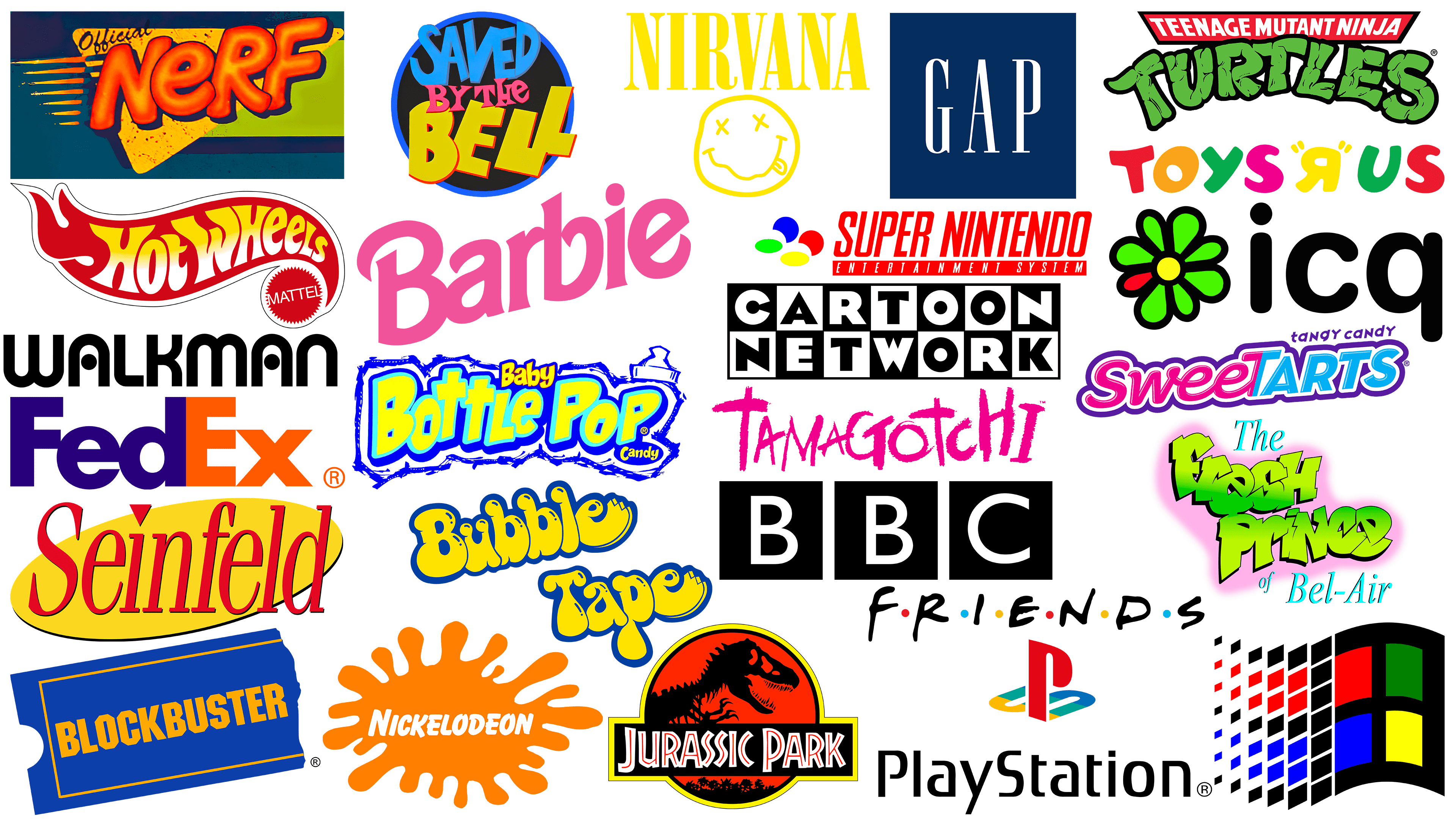
The 1990s were a time of significant change in various spheres of life, including graphic design. While the world was on the cusp of a digital revolution, the economy was entering a period of stability and growth, largely due to the end of the Cold War. This environment influenced the creation of many iconic logos that have survived to this day.
However, nostalgia can sometimes cloud our judgment, causing us to place too much importance on some aspects and overlook others. Therefore, it is important to examine 90s logos in their era, taking into account the socio-cultural factors that influenced their design.
An analysis of the best ’90s logos requires a deep understanding of the period’s design ethos. Therefore, the opinions and experiences of industry professionals from leading design agencies have been taken into account. They offer a valuable perspective that adds depth to the analysis of the logos. Each iconic logo from the 90s is unique in design history for its own reason.
Baby Bottle Pop
![]()
The logo for Baby Bottle Pop, a popular candy in the 90s, is memorable and perfectly reflects the product it represents. The logo design uses a mottled neon font that reflects the candy’s fizzy, fun feel. The word “Baby” is reduced in size to complement the overall design and to emphasize the product’s playful, childlike nature.
An important element of the logo design is the baby bottle cap, which gives the word mark a distinctive characteristic and makes it immediately recognizable. In addition, the sign is circled with a chalk-like line, giving the impression that it is hand-drawn by a child. This creative technique aligns with the brand’s target audience, adding an element of playfulness and fantasy that resonates with children.
The Baby Bottle Pop logo design conveys the product’s lively, playful spirit, creating a lasting impression. This eye-catching logo is designed with the target audience in mind and is among the best logos of the 90s.
Barbie
![]()
The logo of Barbie, a world-renowned toy brand, exemplifies its consistency and uniqueness, with the most significant changes occurring in the 90s. Founded in 1959, the brand has largely retained its iconic hot-pink color scheme, which exudes femininity.
In the 90s, the Barbie logo transformed, becoming one of the decade’s most memorable logos. The logo featured a distinctive typeface with tightly spaced letters, a combination of sharp and rounded edges, and an upward slant. These features gave the brand a modern look, setting it apart in the competitive toy market.
The modern Barbie logo still uses the brand’s signature hot pink color but shifts to cursive, keeping the brand’s elegant, feminine style. The logo has recently gained renewed attention following the announcement of a live-action film, highlighting its enduring influence and relevance.
The successful evolution of the Barbie logo in the 90s demonstrates the power of strategic branding. By retaining its primary color scheme and modernizing its typography, Barbie has remained relevant and appealing to its target audience.
BBC
![]()
The British Broadcasting Corporation (BBC), founded in 1922, has undergone numerous logo changes over the years. However, its minimalist design, introduced in 1997, still retains a modern, sustainable aesthetic appeal, an impressive achievement given the dynamism of the media industry.
The BBC’s current logo caused much controversy after its introduction. At the time, the cost of the “terrible logo” was heavily criticized. The logo is three simple black squares, each containing the white initials “B,” “B,” and “C” in the classic Gill Sans font.
One of the most important factors prompting the 1997 redesign was the switch to digital broadcasting, which revealed technical problems with the previous italicized versions of the logo. The updated design, created by renowned designer Martin Lambie-Nairn, addressed these issues and gave the brand a strong, authoritative visual uniqueness.
The lasting impact of the BBC logo, along with its ability to overcome initial controversy and technical limitations, makes it one of the most striking logos of the 90s.
Blockbuster
![]()
Blockbuster, the famous movie rental service, became a hallmark of the 90s entertainment industry. Visiting a Blockbuster store on a Friday night to pick out a movie for the weekend became a cherished tradition for many.
The Blockbuster logo holds a special place in the hearts and memories of those who lived through the 90s. It was simple in design yet stood out for its use of blue and yellow. The logo design creatively embodied the brand’s product line: the unique shape symbolized its main product, VHS cassette rentals.
The image of a VHS cassette in the logo quickly evolved from a real representation of the company’s products to a nostalgic symbol of the era when the world moved from videotapes to DVDs.
Despite rapid advances in technology and subsequent changes in media consumption habits, the Blockbuster logo remains an iconic symbol of a pivotal period in the entertainment industry. The simplicity of the design, combined with a clear representation of the brand’s product offering, makes the Blockbuster logo one of the most striking logos of the 90s.
Bubble Tape
![]()
Wrigley’s chewing gum logo, known for its ribbon-like design, is a striking embodiment of the brand’s fun and youthful style. The logo features a playful font set against a gradient purple bubble. This design echoes the chewing gum’s elongated form, emphasizing its unique shape. The elongated “e” at the end of the word “Tape” curves around the logo, reflecting the length of the iconic chewing gum.
The logo incorporates a range of bright colors, evoking youthful excitement. The careful use of color appeals to the brand’s target audience of children and teens.
The brand’s catchy tagline, “It’s six feet of chewing gum for you, not them,” further emphasizes its appeal to a young audience. The word “they” refers to adults, suggesting that this product was created for young consumers.
The inventiveness and boldness of Wrigley’s logo design, combined with the brand’s focused marketing strategy, successfully attracted the target audience’s attention and interest. The memorable slogan and visually appealing logo remain synonymous with the brand, making it one of the most iconic logos of the 90s.
Cartoon Network
![]()
Cartoon Network, which revolutionized television animation, was launched in 1992 by CNN founder Ted Turner. The logo was designed boldly and originally, as it had to stand out amongst a sea of other logos, and it accomplished this brilliantly. The logo was a black-and-white 7×2 square grid, with each letter of the brand name in Eagle Bold. This design created a visual contrast that immediately caught viewers’ attention, making it popular with the audience.
For many, this logo became an unforgettable part of childhood in the 90s. The monochrome grid of the logo contrasted sharply with the channel’s colorful animation, making it a visually appealing, easily recognizable symbol.
The Cartoon Network logo has become not just a brand marker but a symbol of fun, creativity, and the limitless possibilities of animation. Its unique, bold design reflects the channel’s commitment to creating original, entertaining content.
FedEx
![]()
The FedEx icon, created in 1994 by Lyndon Leader of Landor Associates, is known for its original use of negative space, making it one of the most recognizable logos of the ’90s and beyond. The hidden arrow between the letters “E” and “x” subtly emphasizes the company’s mission to transport goods around the world.
Once this clever design detail is noticed, it becomes an unforgettable element of the logo. However, the genius of FedEx’s branding goes beyond this hidden arrow. The original name, “Federal Express,” had a somewhat outdated connotation, suggesting a company with 19th-century roots rather than one founded in 1971. A significant contributor to the logo’s enduring appeal was its original color scheme. The vibrant combination of purple and orange sets FedEx apart in an industry where less inspiring logo designs are common.
The FedEx logo is timeless, thanks to the combination of all these elements. Its internal design reflects a thoughtful “smile in mind” concept, and the arrow intelligently signifies the brand’s core values. The strategic simplicity of the FedEx logo, clever use of negative space, and bright colors resulted in a design that symbolizes fast, reliable delivery and ranks among the best logos of the 90s.
Friends
![]()
The symbolic logo for the popular 90s sitcom Friends features a capitalized word mark separated by six bright dots, each representing one of the show’s main characters. The color of these dots matches the shades of the umbrellas that the actors hold during the iconic credits sequence, further connecting the logo to the essence of the series.
The logo’s typography appears hand-drawn in marker, giving it a casual, intimate feel. This design choice reflects the series’ playful nature and the deep, enduring relationships between its characters.
The Friends logo is more than just a name; it captures the essence of the series and its characters, making it instantly recognizable and memorable. The genius of its design lies in its simplicity and emotional resonance, which helped make it one of the most prominent logos of the 90s.
Gap
![]()
Gap, the epitome of ’90s retail fashion, held a unique position in the apparel market. Founded in 1969, it bridged the seemingly obvious gap between runway fashions and department store offerings by emphasizing “chic basics.” Gap’s strategy spread over time, leading to a global surge in popularity in the 90s.
For many, including Ellen Munroe, creative director and partner at BrandOpus, Gap is the quintessential 90s clothing brand, from jeans to hoodies. The brand’s success can be attributed to smart product positioning and its iconic logo, which was a beacon of minimalist design in that era.
First appearing in 1986, the Gap emblem, affectionately known as the “blue box,” became a fashion symbol on the bustling streets of the ’90s. Its simple design, a dark blue square with a condensed, high-contrast typeface, gave the brand’s offerings a sense of elegance.
The logo conveyed a sense of classic American self-confidence, which resonated with international consumers, including those in the British market. The logo’s timeless appeal was so profound that an attempt to change it in 2010 provoked a strong public reaction. A week later, the company was forced to revert to the iconic blue box design, which emphasizes its enduring popularity. Recognizing the Gap logo as one of the best logos of the 90s is well deserved.
Hot Wheels
![]()
The Hot Wheels logo has stood the test of time, with its fundamental design remaining unchanged. In the earliest versions, the “Hot Wheels” lettering was in a simple white font. However, in the 90s, the logo underwent changes that further strengthened its position in consumers’ minds. The brand abandoned the simple white font and introduced a customized font with a dynamic horizontal gradient.
During this period, Hot Wheels moved away from the popular 3D visual style. Instead, the company opted for a more minimalistic, flat design, emphasized by a thin black outline that made the logo more distinctive.
At the same time, the logo retained a connection to the brand’s roots by incorporating the name of Mattel’s parent company as a sub-logo. This reminded consumers of the brand’s pedigree and reputation for high-quality toys.
The Hot Wheels icon of the ’90s is remembered as one of the best of the decade for its innovative design. Its evolution reflected the brand’s essence while aligning with the design trends of the time.
ICQ
![]()
The ICQ logo, the leading platform for Internet communication in the 90s, was based on the phrase “I Seek You,” reflecting its core purpose of bringing people together. The ICQ logo, reflecting the service’s simplicity, featured a memorable design that many Internet users of that era found memorable.
The ICQ logo adopted a minimalist design, using a rounded lowercase sans-serif font. To the left of the word mark is a flower symbol. This element gives the symbol a whimsical feel and distinguishes it from other internet platforms of the time. The petals of the flower were predominantly green, except for one prominent red petal. This red petal was a witty visual representation of ICQ’s chat notifications, symbolizing the platform’s main function: instant messaging.
The combination of a simple font and the unique flower symbol has created a visually memorable logo that reflects the essence of the ICQ service. The design’s simplicity, combined with the clever use of symbols, ensured its place among the best logos of the 1990s.
Jurassic Park
![]()
The logo for Jurassic Park, one of the most groundbreaking films of the 1990s, was integral to the film’s narrative and served as an emblem of the movie itself. Jurassic Park’s groundbreaking use of CGI set new standards in the movie industry, immersing audiences in a world where dinosaurs once again inhabit. The movie logo played a crucial role in creating this exciting spectacle, becoming the official brand of the fictional dinosaur park.
The Jurassic Park logo was inspired by the cover of the original book on which the movie was based. The cover, designed by Chip Kidd, featured the skeleton of a Tyrannosaurus Rex.
The genius of the Jurassic Park emblem lies in its simplicity and its ability to convey the movie’s main theme. The emblem’s design convincingly conveys the movie’s idea of dinosaurs returning to life. The minimalist approach resulted in a logo that instantly stands out both online and on the shelf.
While the silhouette of a T. rex skeleton is not a common logo, it has become one of the most recognizable symbols of the past three decades, and the cult status of the Jurassic Park logo is a testament to the power of minimalist design in creating lasting impressions and solidifying its place among the best logos of the ’90s.
Nerf
![]()
Nerf guns, a popular toy of the 90s, were created by Parker Brothers and are now owned by Hasbro. The essence of these foam-dart-shooting toys was captured in a logo typical of the era, with its bright, bold, and somewhat flashy appearance reflecting the decade’s energy and liveliness.
Nerf, founded in 1969, produced safe foam toys for indoor use, allowing children to enjoy exciting imaginary battles without the risk of injury. By the 1990s, Nerf had become synonymous with energetic indoor play, and its foam weapons became the centerpiece of countless fun skirmishes between friends.
The logo design reflects the brand’s key attributes: it has a “squishy” look that hints at the foam from which Nerf products are made and reinforces the association with safe indoor fun. The font used in the Nerf logo has a playful, Styrofoam-like character, reinforcing its association with the brand’s product line. The color palette also features vibrant hues that enhance the logo’s appeal and make it more noticeable.
The logo design, reminiscent of the energy and exuberance of the 90s, has contributed to Nerf’s continued popularity. The combination of bright, fun elements and a hint of the product’s physicality made it one of the most striking logos of the decade.
Nickelodeon
![]()
Nickelodeon, the favorite channel of many kids growing up in the 90s, had a highly recognizable logo that resonated effectively with its core demographic, teens ages 6 to 17. The logo, with its distinctive orange overlay and sans-serif font with rounded edges, defined a generation of children’s entertainment.
The bright orange logo evoked a sense of cheerfulness, dynamism, and energy, reflecting the upbeat nature of the channel’s programs and its youthful target audience.
The use of a rounded sans-serif font gave the logo a playful, approachable character, in keeping with the channel’s spirit and appeal. Distinctive features of some symbols, such as the stylized letter “O,” added to the design’s uniqueness. A serif font, often associated with elegance and formality, would likely have seemed out of place for Nickelodeon’s young, playful audience. A simpler, rounded sans-serif font creates an informal, friendly atmosphere that fits the channel’s youthful audience.
Nickelodeon’s 90s-inspired logo, combining bright colors and playful typography, perfectly captures the channel’s essence and appeals to its target audience.
Nirvana
![]()
The 1990s marked a seismic shift in the music industry, driven primarily by the grunge revolution. The turning point in this movement was when the band Nirvana, synonymous with grunge, topped the Billboard charts with the album “Smells Like Teen Spirit,” sidelining pop icon Michael Jackson. This unexpected success of what was previously considered niche and underground demonstrated the changing landscape of the music scene.
The influence of the band Nirvana was not just limited to the music charts; their unique ethic permeated various areas of culture. Like their music, the band’s logo was disruptive and resonated with the era’s anti-establishment sentiment. The logo featured a distorted, smiling face, reportedly invented by the band’s frontman, Kurt Cobain, and served as satirical commentary on the contrived nature of mainstream pop culture.
The origin of the logo’s design stems from an eccentric face Cobain saw on a strip club sign in Seattle. Whether the anecdote is true or not, the logo design’s impact cannot be denied. Today, it can be seen on countless T-shirts around the world, sometimes worn by people unfamiliar with the band.
This iconic Nirvana badge stood out from the design trends of the time. The 1980s saw a wave of designs that ignored traditional design principles in favor of the possibilities of evolving computer technology. The result was a collection of bright, cheerful vector forms that often lacked thoughtfulness and conceptual depth. It effectively conveyed the tumultuous experiences of adolescence and reflected the emotional undertones of Nirvana’s music.
PlayStation
![]()
The 1990s were a transformative period for the video game industry when significant technological advances allowed it to reach new frontiers. Even before the advent of the Xbox, the PlayStation became the console of choice for dedicated gamers. The PlayStation emblem, which has come to symbolize this digital revolution, was masterfully created by Manabu Sakamoto in 1994.
The PlayStation logo was a unique combination of the letters “P” and “S,” originally arranged to convey a sense of depth. This design was specifically chosen to symbolize the console’s ability to support 3D gaming, which was revolutionary in an era dominated by 2D games. The letters were carefully custom-designed, and an additional green color was integrated into the brand’s original color scheme of red, blue, and yellow to give the design a dynamic feel.
The PlayStation emblem, which has remained virtually unchanged since its introduction, is widely recognized as one of the most striking logos of the early ’90s. The unconventional letter layout combined with the bold use of color created an instantly memorable logo. It promised players an exciting gameplay experience, an invitation to another world. Because of this, the logo resonated with gamers and non-gamers alike, cementing its place among the best logos of the 1990s.
Saved by the Bell
![]()
Saved by the Bell, a popular 90s sitcom, was about the hilarious adventures of six teenagers living in Pacific Palisades. The show’s logo was a vivid embodiment of its lighthearted spirit and appealed to its youthful audience.
The logo’s circular design includes a variety of fonts, each in bright, cheerful colors that convey the show’s energy and playfulness. The word “Bell,” rendered in bright yellow, evokes a gleaming handheld school bell, a symbol often associated with the bustling atmosphere of middle school.
This creative color choice echoes the play’s title and reflects its themes of youth and school. In addition, the letters were intelligently angled to the right, creating a sense of movement. The overlapping of the letters and their slanted position originally represent the effect of ringing, further strengthening the connection to the school bell.
The logo for the TV series “Saved by the Bell” effectively combined its symbolic elements, presenting them in a bright visual style. Using a variety of fonts, bright colors, and dynamic positioning effectively conveys the essence of the series, making it memorable and consistent with its theme. The perfect combination of visual appeal and symbolism earned the logo a place among the best logos of the 90s.
Seinfeld
![]()
Based on one of the most iconic sitcoms of the 90s, the Seinfeld logo subtly conveyed the show’s unique, offbeat humor, making it a sensation. The logo was designed to reflect the show’s plot, which focuses on the everyday comedic realities faced by young people in New York City.
The logo skillfully conveys a sense of sophistication while maintaining an appealing level of unconventionality through an italicized serif font. The emblem is a slanted yellow oval, which is a visual metaphor for a spotlight. This symbolic spotlight was meant to emphasize the central role of Jerry Seinfeld, the show’s main character, who wove his comedic acts into the show’s narrative.
The spotlight motif had a double meaning. It drew attention to Jerry as the central character and reflected the comedy club’s intimate setting, where he often told funny anecdotes to the audience.
The Seinfeld logo successfully captures the essence of the series, synthesizing symbolic elements with visual appeal. Also, its memorable design and distinct aesthetic earned it a place among the most memorable logos of the 1990s.
Super Nintendo
![]()
Nintendo, a pioneer in gaming, underwent several brand evolutions in the 1990s. It was a pivotal decade in the gaming industry, marked by rapid technological advances and increased market competition.
The company’s name was printed in a dynamic italic font on a rich red background. The use of red was very important, as it is associated with intensity, passion, and activity traits that perfectly reflect the Nintendo gaming experience. The italic font conveys movement and speed, further emphasizing the intensity of video games.
This bold visual choice instantly captured consumers’ attention and set the brand apart from competing products. This was especially important in the competitive gaming market of the 90s.
The logo’s success lies not only in its visual appeal but also in its accurate reflection of Nintendo’s brand values and exciting gameplay. The logo conveyed the energy and dynamism of the gaming world, embodying Nintendo’s innovative spirit. Thus, the Nintendo logo of the 90s, with its vibrant color scheme and bold typeface, is considered one of the most iconic and memorable logos of the decade.
Sweet Tarts
![]()
The popular candy brand Sweet Tarts is a prominent member of the pantheon of iconic logos of the 1990s. The brand’s signature logo is built on a playful, simmering wordmark that seamlessly combines the words “Sweet” and “Tarts.” The clever use of a two-color “T” at the junction of these words emphasizes the key selling proposition of Sweet Tarts candies: an intriguing combination of sweet and tart flavors.
Placed above the word mark, the descriptive tagline “tangy candy” adds a layer of flavor interpretation. The choice of lowercase font, except for the capital “N,” creates a sense of whimsy and fun, which is completely in keeping with the playful spirit of the brand and its young candy-loving target demographic.
Although this descriptor has been eliminated in the current version of the logo, the basic design remains unchanged, a testament to the strength of the original concept. The Sweet Tarts logo reflects the candy’s flavorful qualities and the brand’s playful style. Through clever typography and color, the intuitive logo design conveys the brand’s essence, making it one of the best logos of the 1990s.
Tamagotchi
![]()
Tamagotchi, the portable digital pet that conquered the world in the 1990s, had a bright and playful logo that epitomized the era. The logo’s hand-drawn font, reminiscent of a child’s careless chalk drawing, immediately conveys the brand’s youthful, whimsical spirit.
The logo’s typography, a purposeful combination of upper and lowercase letters, further emphasizes the brand’s appeal to children and the innovative concept of Tamagotchi, which has become a milestone in the development of digital entertainment for young people. The intentional choice of typography is a playful hint to the product’s youthful target audience and a reflection of the revolutionary digital pet trend that Tamagotchi has led.
The most striking feature of the Tamagotchi logo is the use of hot pink for the letters. This bold color choice not only creates an electrifying visual effect but also ensures the logo stands out on store shelves, attracting potential customers. As a symbol of a breakthrough product that defined the childhood of an entire generation, the Tamagotchi logo embodies the brand’s innovative spirit and youthful energy.
Teenage Mutant Ninja Turtles
![]()
The Teenage Mutant Ninja Turtles franchise left a significant mark in the 1990s, largely due to its original, spectacular logo, which highlighted the series’ unusual yet fascinating plot. The story is based on the adventures of four anthropomorphic turtles named after famous Italian Renaissance artists.
The logo features the brand’s name in bold green, echoing the turtles’ muscular shape and color. This logo was integral to the first television presentation of the Teenage Mutant Ninja Turtles. Unlike the harsher, darker versions of the logo that appeared later in the franchise’s development, the original version truly reflected the characters’ core spirit. The original Ninja Turtles logo from the 1990s, with its unique design and vibrant color palette, effortlessly captured the essence of the brand.
The Fresh Prince of Bel-Air
![]()
A memorable logo was designed for the iconic ’90s sitcom The Fresh Prince of Bel-Air, reflecting the series’ main themes and plot. The logo incorporates two different typographic styles, combining them to convey the show’s unique plot and character dynamics.
The first part of the logo is in a graffiti-inspired typeface, evoking the street culture of West Philadelphia, where the main character, Will, is from. It is an intentional representation of Will’s roots and street style. The vibrant spray paint can illuminate the word mark with a bright pink hue, further emphasizing the urban, free-spirited personality.
On the other hand, the second part of the logo uses a traditional serif font, suggesting the more refined, affluent lifestyle of Will’s relatives in Bel-Air. This typographic choice stands in stark contrast to the graffiti style and clearly symbolizes the vast socioeconomic and cultural disparity between the two environments and characters around which the series unfolds.
The Fresh Prince of Bel-Air logo is a brilliant visual statement of the show’s plot. The emblem’s captivating visuals and intellectual symbolism make it one of the most iconic logos of the 90s.
Toys R Us
![]()
The Toys’ R’ Us emblem of the 1990s is considered one of the most striking logos of that era, perfectly capturing the essence of the brand and its youthful audience. The creative, playful design approach set the brand apart in a crowded market and made it a favorite among kids worldwide.
One of the most recognizable elements of the logo is the inverted letter “R.” The logo’s bright color scheme also played an important role in its appeal and memorability. The bright hues embodied the sense of fun, adventure, and fantasy that the company’s products promoted, immediately attracting the attention of young audiences.
Although the modern version of the logo has undergone some changes, such as adding a star to the bowl of the “R” and changing the color palette, it still retains the playful layout, the childlike reverse “R”, and the fundamental essence of the original ’90s design.
Walkman
![]()
Despite its introduction in the late 1970s, the Sony Walkman remains a symbol of ’80s and ’90s youth culture thanks to its unique combination of portable music technology and innovative design.
The Walkman logo, especially in its 90s version, carries an unmistakable sense of dynamism, anticipation, and forward-lookingness. At this time, the logo dropped the more playful, cartoonish elements characteristic of the 80s and moved towards a design that reflected the decade’s cool, futuristic, sci-fi atmosphere.
The Walkman emblem, especially the ’90s version, is often described as an “amorphous W,” an abstract, fluid design that symbolizes the decade’s defining style. The connecting letters in the emblem, except for the “L,” symbolize the unprecedented freedom the Walkman afforded its users to enjoy music anywhere, anytime.
The Sony Walkman logo is a testament to the product’s impact and its pivotal role in shaping portable music culture. It is a powerful symbol of innovation, freedom, and the transformative power of technology and rightfully ranks among the most significant logos of the 90s.
Windows
![]()
In the 1990s, many people were more preoccupied with computer logos than they perhaps realized. This trend was largely due to the time users spent waiting for their desktop computers to boot up. One logo that stood out in this daily ritual was the Windows logo, which many consider one of the most memorable of the decade.
The Windows logo of the ’90s wasn’t just a symbol for users to look at while booting up. It was an ingenious design that conveyed the essence of the product and brand. The logo creates a sense of dynamic movement through the flow of pixel blocks arranged in a wave pattern. This could not be better symbolized by Windows itself, a platform that opens up many possibilities and avenues to explore.
The four-color squares of the logo contrasted with the monochrome interfaces that dominated the computer world until the 90s. They clearly indicated that the era of color operating systems had arrived, thereby adding a new level of visual interest to the user experience on their computer.
For many users, the ’90s Windows logo evokes fond memories of winning Microsoft Solitaire, a popular feature of the operating system. The cards in the game would cascade downward, freezing in a motion similar to that hinted at by the logo, creating a pleasant visual echo.
The Windows logo of the 90s was a compelling combination of ingenious design and strategic communication. That’s why it remains one of the most iconic logos of the 90s, able to resonate with users and reflect the transformative nature of the Windows platform.
Cultural Revolution and Optimism in Design in the 90s
The 90s were a period of cultural revolutions and change as people, especially the younger generation, enjoyed the benefits of a stable global economy and the relative simplicity of the pre-Internet world. From thriving music scenes that included Britpop, grunge, R&B, and garage to new movements in the visual arts led by Tracey Emin and Banksy, the 90s brought an explosion of cultural innovation. The culinary scene also evolved, with celebrity chefs opening new restaurants and introducing unique culinary combinations.
Despite these changes, most people led ordinary lives centered on work, leisure, and maintaining social connections. However, the Cultural Revolution did not ignore the daily routine. Fast fashion emerged in that era, making fashionable clothing more accessible and interesting to the average consumer. Technological advances led to the advent of multi-channel television and modern computers such as the iMac, which significantly impacted the daily lives of many people.
The broad cultural and social shifts of the 90s had a significant impact on the world of design, especially logo design. Inspired by the decade’s general optimism, graphic designers began using elements that reflected its dynamics. Bright neon colors, bold typography, graffiti influences, and handwritten fonts became prevalent. Logos began incorporating more abstract shapes and offset text, reflecting the decade’s visual energy and exuberance.
Despite these changes, however, designers stayed true to the basic principles of logo design. The best logos of the ’90s embodied the decade’s aesthetics and retained the enduring qualities of effective logo design. Many of these logos have remained relatively unchanged, standing the test of time and blending seamlessly into today’s visual culture. Because of this, they are often not exclusively associated with the 90s but are recognized for their timeless appeal, which has been a key factor in their being considered the best 90s logos.