


The iconic logos that emerged in the 2000s were shaped by an era of significant transformation, marked by the development of the Internet, the spread of digital technologies, and changes in consumer behavior. Branding during this period evolved with new paradigms, such as digital marketing and Y2K aesthetics. A palette of vibrant colors, gradients, and 3D effects defined this era, becoming the backdrop for logos that transcended the decade.
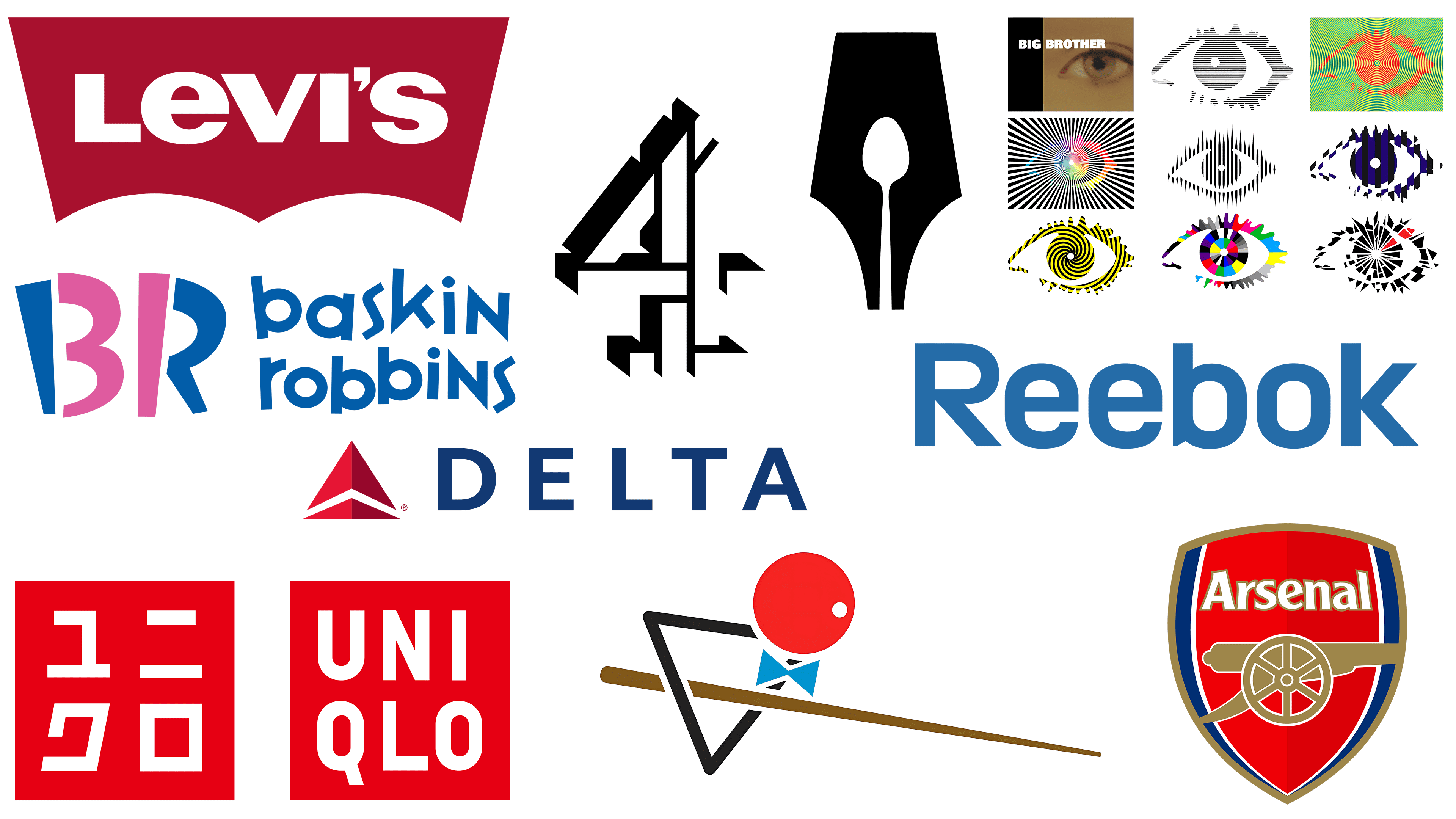
The Reebok logo
![]()
As one of the veteran sportswear brands, Reebok has undergone various changes to its visual identity, including font adjustments and the addition of emblems. One notable symbol was the “vector,” an abstract interpretation of the Union Jack. In 2004, to appeal to a younger demographic, the brand switched to the acronym “Rbk.” However, in 2008, the brand returned to its original name to celebrate its 50th anniversary.
The 2008 rebranding was a turning point for Reebok, as it brought back a font reminiscent of the late 1970s to 1990s design and removed numerous graphic elements. The rebranding demonstrated Reebok’s adaptability and deep understanding of generational trends. By prioritizing simplicity, Reebok created a more focused and flexible branding strategy that helped it stand up to high-end competitors in the sportswear industry, such as Nike.
The Levi’s logo
![]()
A prime example is Levi’s logo. Designed in 2003 by Walter Landor, this logo avoided the pitfalls of some trends, such as excessive 3D effects. The logo is based on the iconic “batwing” stitching on the back pocket of Levi’s jeans. The design’s flexibility has enabled it to be adapted across various contexts, from embroidery on clothing to 3D hanging. Its instantly recognizable silhouette and unique typography, which includes a distinct lowercase “e,” continue to be a prime example of successful branding.
An interesting aspect of the Levi’s brand is the inclusion of several design elements that have persisted for generations. One example is the red tab, a universal symbol for the company’s blue jeans. Another example is an old badge from 1892 that features the brand’s full name, Levi Strauss & Co, and an image of horses trying to rip the jeans, an element that emphasizes durability. The folded trademark “R” also originated from space constraints on small labels and has evolved into a brand hallmark.
The Baskin Robbins logo
![]()
First appearing in 1953, when Burt Baskin and his brother-in-law, Irv Robbins, merged their ice cream parlor, the Baskin-Robbins logo has undergone several changes. Introduced in 2005 as part of the company’s 60th anniversary celebration, the latest logo features a clever “31” in the monogram “BR,” a reflection of the brand’s famous “31 Flavors” slogan. The logo’s colors have also changed: while the branding in the 1990s invariably featured pink, various shades of blue have been added. The original slogan, coined by advertising agency Carson Roberts (later acquired by Ogilvy & Mather), remains a constant component of the brand’s identity.
The Arsenal logo
![]()
In 2002, Arsenal Football Club undertook a major reorganization of its logo, primarily due to copyright issues. The previous logo contained various elements that raised copyright claims, such as the Islington coat of arms. To solve this problem, the 20-20 agency took on the redesign. The cannon points to the right in the updated logo, mandated by legal requirements. The new orientation is also a reminder that the cannon briefly pointed to the right between 1922 and 1925. Fan reaction to the changes has been mixed, especially regarding the new orientation of the cannon, indicative of the club’s complex relationship with its long history.
The Channel 4 logo
![]()
The Channel 4 logo, created in 2004, was a departure from the traditional design techniques of the time. Created by Rudd Studio, it brought back elements of its 1982 original but added modern touches. It was known for its animated, fluid nature on air, briefly forming the number “four” and then disintegrating into abstract shapes. The design used negative space and shadows from the ether to create a 3D illusion. This approach was considered part of the “back to basics” movement in branding, abandoning the overly complex designs and gradients common in the early 2000s. The logo laid the foundation for a solid branding system that avoided overuse of the “Y2K Microsoft Windows 2000” aesthetic while remaining clear, modern, and memorable.
The Guild of Food Writers logo
![]()
Established in 1984, the Culinary Writers Guild is a collective of food journalism, broadcasting, and authoring professionals. The organization organizes events and forums to maintain high standards of food journalism and culinary education. The logo succinctly unifies the Guild’s dual mission by depicting a spoon and a pen in a single, ingenious mark. Original design Studio 300 Million created this symbol, ingeniously using negative space to depict a spoon as a quill pen. This sign continues to be admired in the design community and is an enduring symbol of the Guild.
The Uniqlo logo
![]()
The Uniqlo logo, created in 2006 by designer Kashiwa Sato, was another prime example of 2000s design. Timed to coincide with the brand’s entry into the European and US markets, the new logo ingeniously combined the Japanese and Western spellings of the name, placing them in two rows in a red square. This simple yet bold design addressed the brand’s communication objectives and made a strong visual impression. Notably, the color scheme echoes Japan’s national flag, distinguishing the logo from the brand’s previous logos, which used richer shades of red. The logo’s style is also reminiscent of modern Japanese name seals, bringing the design into the realm of Japanese aesthetics.
The Delta Air Lines logo
![]()
Founded nearly a century ago, Delta Air Lines has undergone over 20 logo changes. The most recent rebranding, in 2007, by creative consulting firm Lippincott Mercer, features a bold color choice. The all-red “Delta Widget” symbol goes against common branding practice, which generally avoids the color red, often associated with financial loss. The design also took a “3D but flat” approach, adding depth and dimension through a single-color transition. This avoided the use of gradients or effects that could become outdated. The rebranding was done shortly after Delta emerged from bankruptcy, further enhancing the boldness of the color scheme.
The Big Brother logo
![]()
In the 2000s, Big Brother, one of the most popular reality TV shows, captured viewers’ attention across the UK. In the program’s early years, designer and conceptual artist Daniel Eatock was brought in to create it. His creation of an expressive eye embodied the essence of the show and the constant state of surveillance in the Big Brother house.
Over the years, the eye symbol has transformed, each reflecting the tone and editorial focus of the individual series. Through these adaptations, the logo became more than just a visual identifier for the TV show. Rather, it became a cultural symbol reflecting changes in aesthetic preferences over the decade. These changes gave the logo a layered meaning and reinforced the unsettling sense of the eye as a constant observer. For the 2023 reboot of the UK Big Brother franchise, the new logo sparked a flurry of opinions, with some fans finding it overly bright and eye-catching.
The Snookerhallen logo
![]()
The Snookerhallen logo, created in 2007 for a snooker and billiards club in Stockholm, Sweden, was designed by local studio Bedow. Unique in concept, the logo incorporates game elements and has an exciting application in print, where the die-cut elements mimic the holes on the table. This innovative logo conveys the pure joy of the game it represents and has been praised for its original design.