


The 2010s were a decade marked by significant global events and technological advancements. This era saw the emergence of mobile design, with smartphones becoming ubiquitous and social media platforms such as Instagram influencing the way people interact with the world. Amidst this digital revolution, logo design trends have also undergone significant changes.
In the 2010s, brands focused on adapting to the rapid pace of information sharing and the growing importance of digital platforms. This led to a shift in logo design that emphasized clarity, simplicity, and quick recognition. Logos have become more minimalist, with a move towards flat design. This trend was characterized by simpler typography, monochrome graphics, and a preference for fewer but more expressive colors.
Logos from this decade were designed to be easily recognizable on small screens and in fast-scrolling digital channels. Designers and industry experts noted this shift: many favored logos that could cut through the online noise and make a lasting impression. These logos were not just branding tools but also symbols of how brands are adapting to an increasingly connected, digital world, reflecting the changing ways consumers interact with technology and information.
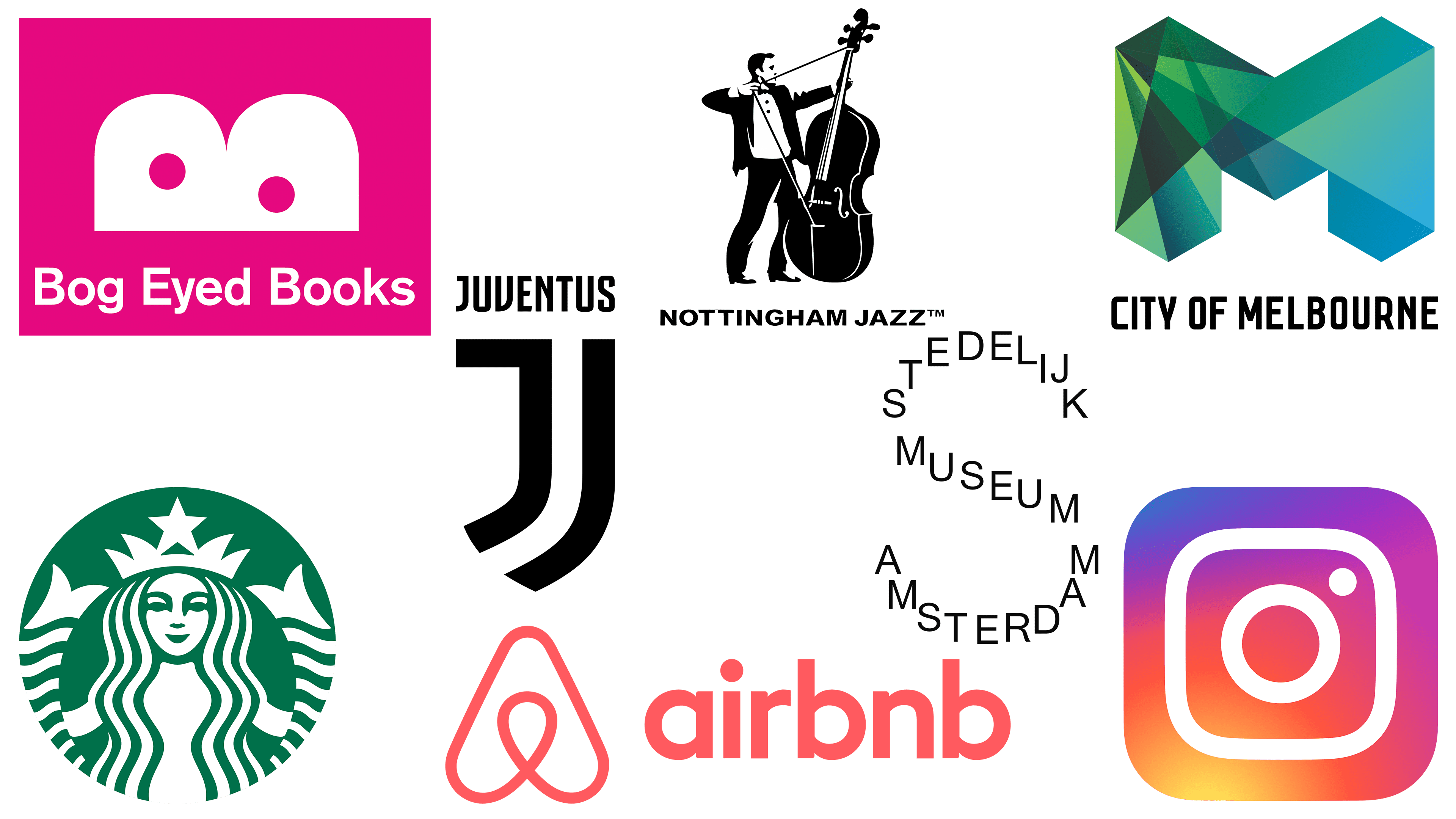
Starbucks
![]()
In 2011, Starbucks took the bold step of removing the word mark, stars, and outer ring from its logo and focusing solely on the image of a siren. This change was part of a trend among successful and culturally relevant companies to simplify their logos to achieve universal appeal and connect with a global audience. The siren, which has been associated with Starbucks since its founding in 1971, has been refined and made more symmetrical, symbolizing the appeal of coffee as described by original designer Terry Heckler.
This streamlined logo, created in collaboration with Lippincott, reflected Starbucks’ evolution and its willingness to venture into markets beyond coffee. Howard Schultz, the company’s CEO at the time, emphasized this strategic shift, saying it gave the company more freedom and flexibility.
The trend toward minimalist logos was not unique to Starbucks. Other major brands, such as McDonald’s and Twitter, have also adopted this approach, reducing their logos to basic elements. McDonald’s focused on the golden arch, while Twitter refined its logo into a bird in 2012. This shift was seen as a reaction to the trend of the previous decade, in which logos used complex digital technologies at the risk of quickly becoming obsolete.
The emergence of smartphones and the internet played no small part in this change. As brand awareness expanded, markets became increasingly saturated, forcing established companies to adapt their branding to maintain a strong position. The “less words, more brand” era marked a shift to simplicity, emphasizing the power of iconic imagery in a rapidly changing digital landscape.
Bog Eyed Books
![]()
The logo for Bog Eyed Books, a platform specializing in British comics for children, is a prime example of how a name can inspire design. The logo, created in 2017 by the agency Baxter & Bailey, captures the essence of the platform and is aimed directly at its core audience, children who love comics.
The playful nature of the logo fits perfectly with the whimsical and fantasy world of children’s comics. The logo design process shows that sometimes, the simplest ideas can be the most effective. The name “Bog Eyed Books” alone provided a clear direction for the logo and led to a design that seemed to emerge on its own.
David Airy, renowned logo designer and author, singles out the Bog Eyed Books logo as one of the best designs of the decade. He notes that often the most obvious logo ideas are easily overlooked, yet they can lead to the most appropriate and memorable designs. This logo demonstrates how simplicity combined with a slight playfulness can effectively convey the brand spirit and resonate with the target audience.
Stedelijk Museum
![]()
In 2012, the Stedelijk Museum unveiled a new logo, a striking 2010s design by Amsterdam-based studio Mevis & Van Deursen. The logo is a striking example of modernist design, originally forming the letter “S” from the full spelling of the museum’s name. This design approach is innovative and deeply meaningful, as it directly relates to the museum’s identity.
Graphic designer Jens Müller, known for his works “The Beginning of the Logo,” “Logo Modernism,” and “History of Graphic Design,” admires this logo for its simplicity and creative execution. The logo design was part of a broader corporate identity refresh, continuing the long tradition of exceptional design of the iconic Dutch museum.
The typographic logo is versatile and can be used both as large-format signage on the museum façade and in smaller applications such as posters and digital media. Its appearance was timed to coincide with the museum’s reopening after a nine-year renovation, symbolizing a new era for the institution. The redesign coincided with the museum’s opening to the public and the showcasing of its significant collection of contemporary art, including works by Picasso and Matisse. The Stedelijk Museum logo is a testament to the power of graphic design in embodying the heritage and future aspirations of a cultural institution.
Nottingham Jazz
![]()
The Nottingham Jazz logo, designed in 2011 by Dave Burden of Glad Creative, is a unique combination of creativity and thematic relevance. It stands out in an era dominated by simple geometric shapes, thanks to intricate craftsmanship and witty execution. The logo depicts the bass player as an archer – a creative hint that the band resides in Nottingham, which is famous for Robin Hood and his merry band.
During the design process, Burden himself posed as the archer, which was then skillfully integrated with an image of a double bass. This representation ties in with the band’s musical focus and cleverly incorporates an important element of Nottingham’s legendary folklore.
Senior graphic designer John Randall praises the logo for its conceptual genius and practical application. In print, the lettered bassist is depicted blowing an arrow that cleverly wraps around the back of the business card, highlighting the band member’s name and the title ‘Band Leader.’ This playful design adds a whimsical touch to the logo’s sophisticated aesthetic, making it memorable and eye-catching.
The choice of green textured paper for the logo further enhances its appeal. This choice evokes nostalgia for the green tunic traditionally associated with Robin Hood and adds thematic depth to the logo. This logo is not just a symbol of a jazz band; it is a specially designed motif that captures the essence of Nottingham’s jazz scene and brings a smile to those who encounter it.
Airbnb
![]()
The Airbnb logo, designed in 2014, is a prime example of how a brand can effectively communicate its core values and vision. Connor Edwards, Senior Designer, emphasizes that this logo perfectly captures the essence of Airbnb’s service, offering travelers warmth, personality, and a local perspective. The design transcends language and cultural barriers, making it universally recognizable and aligning with Airbnb’s goal of fostering a sense of belonging among its users worldwide.
Christine Lium, head of creative concepts and communications at the agency, also praises the logo for its ability to unify the company’s values, service, and vision into one cohesive symbol. The logo’s strength lies in its clear wording and consistent expression, successfully avoiding trend-sensitive elements.
Airbnb, founded in 2008, originally used bright blue and pink bubble fonts for its original name, Airbed & Breakfast. A 2014 redesign allowed for a new logo and name that used a salmon-orange color known as “rauch.” The logo, shaped like a rounded “A,” represents several aspects of the Airbnb ethos: it resembles a head with arms, symbolizing people; a pin, denoting a place; and an upside-down heart, symbolizing love.
Edwards emphasizes the importance of a clear rationale for the logo, especially during the launch phase. The new logo and broader brand description marked a significant shift in Airbnb’s evolution, turning the new concept into an exciting and legitimate option for travelers. It helped position Airbnb as a company that continues to grow rapidly. More than just a symbol, the Airbnb logo is a lesson in thoughtful design and strategic branding.
City of Melbourne
![]()
The City of Melbourne logo, created by design agency Landor and Fitch, is a great example of innovative logo design that remains relevant and fresh years after its creation in the 2010s. Lee Chandler, Creative Director at Sister Mary, considers it one of the best logos ever. The designers were challenged to create a unifying symbol for different organizations, appealing to a diverse audience while being adaptable for different purposes.
The logo is known for its extreme flexibility, and the many variations reflect Melbourne’s versatility. Although there are certain guidelines for the logo’s use, its design allows for a wide range of creative interpretations. Chandler notes that the logo conveys Melbourne’s fun, vibrant, and diverse character through its geometric shapes and lively color palette.
The Melbourne logo is one of the earliest and most successful examples of flexible identity design, a trend that became widespread during that era. It challenged the traditional notion that a logo should be rigid and consistent, offering a dynamic design capable of endless reinterpretations while remaining true to its original structure. This design is considered triumphant, embodying the spirit of the city and setting a precedent for modern logo design.
![]()
Instagram’s 2016 logo redesign, which moved from a retro camera icon to a neon gradient sunset symbol, sparked a flurry of responses online. The change aims to reflect Instagram’s evolution from a simple photo-sharing app to a more comprehensive storytelling platform.
Dineisha Gross, a graphic designer at Ogilvy, vividly remembers how the logo changed when she was a design student. The transition from the app’s original brown-and-tan design with a blue border to a gradient design was bold and unexpected. She admired the new design, seeing it as a reflection of Instagram’s understanding of branding and the natural evolution of logos over time.
Gross appreciated how the new logo accounts for different aspects, from consumers’ use of the product to the app’s potential for empowerment. In addition, the logo was designed to differentiate the brand from competitors. Despite the controversy surrounding Instagram’s ownership, the process of creating and presenting a new logo to the world, especially on a platform heavily used for public expression, was meaningful.
The reaction to Instagram’s logo redesign was similar to the reaction to the “I Love NY” branding. Both logos were initially criticized but have since become enduring symbols in their respective fields, proving the lasting impact of thoughtful design decisions. The Instagram logo, after almost a decade, remains a testament to the power of branding and to the importance of evolving with the times.
Juventus
![]()
The famous Juventus soccer club from Turin, Italy, known as the I Bianconeri, or “black and white,” has a rich history dating back to 1897. The iconic black-and-white stripes have been part of their symbolism since 1903, and Notts County’s team jerseys inspired their design. Bill Walsgrove, a brand strategy consultant, notes that in 2014, the club’s logo featured a charging bull, a Turin symbol that was also used on the club’s early logos and shared with local rivals Torino.
In 2017, Juventus unveiled a new crest, the result of a year-long design process led by club president Andrea Agnelli. The modern logo, designed by Interbrand, is a stylized black-and-white “J” shaped like a shield. The design had to be bold and colorful, yet versatile enough to match various new trends, both inside and outside the stadium.
The launch of the new logo was accompanied by a commercial featuring the slogan, “Life is a matter of black and white.” This minimalist and forward-looking approach to design was appreciated for its simplicity and modernity. However, it drew mixed reactions from the club’s fans. Particularly ardent fans did not want to see their club as a brand and were unwilling to part with the old crest. The redesign reflects the evolving nature of soccer clubs as brands and the challenges of balancing heritage with modern branding requirements.