


Native movie logos have undoubtedly influenced cinema history, similar to well-known symbols such as the Nike swoosh or the Coca-Cola font. The James Bond logo mesmerizes with its Art Deco style, while the Harry Potter emblem envelops the viewer in a sense of magical wonder. The Avengers symbol also radiates power.
A well-chosen logo placed on a movie poster or title screen acts like a magnet, attracting viewers’ attention. However, logos’ power and influence extend beyond the movie screen. They are incorporated into paraphernalia and even become permanent symbols on the bodies of devoted fans in the form of tattoos.
Studying the most memorable movie logos provides insight into their design intricacies and ability to resonate with audiences. Logos often use colors, fonts, and imagery that match the film’s tone, theme, and message. For example, the soft, luminescent glow often found in sci-fi movie logos suggests otherworldly adventures, while the bold, tough fonts in action movie logos suggest adrenaline rushes.
Movie logos are not only aesthetically pleasing but also often serve as shorthand for the movie’s essence or main idea. A well-designed logo speaks volumes, conveying the atmosphere, genre, and even the emotional impact of the movie it represents. An effective logo embodies the essence of the film, serving as a marketing tool and often becoming a cultural artifact.
Introducing the most iconic movie logos
Movie logos and corporate trademarks share common goals in conveying targeted messages, although they differ in style and application. Large companies carefully design corporate symbols to connect emotionally with consumers and showcase their unique selling propositions. Similarly, movie studios use logos to embody a movie’s core ideas: its theme, content, and genre.
A well-designed logo is a symbolic summary that allows you to quickly understand the essence of the movie it represents. A successful logo uses a complex combination of design elements, shapes, typography, and principles of color psychology to convey emotional and informational load in a split second. For example, the emotional resonance of visual icons such as The Wizard of Oz and Alien differs significantly, illustrating the power of design to shape audience expectations.
Many film logos have become firmly embedded in popular culture, standing the test of time and remaining as memorable as the cinematic experience they represent. A movie logo’s longevity often extends beyond the movie screen. For example, merchandising is another area where a movie logo’s powerful potential manifests. Clothing, toys, and other logo merchandise generate additional revenue and strengthen the connection between the audience and the movie.
Designers and directors collaborate to ensure that the logo reflects the movie’s artistic intent and has commercial appeal.
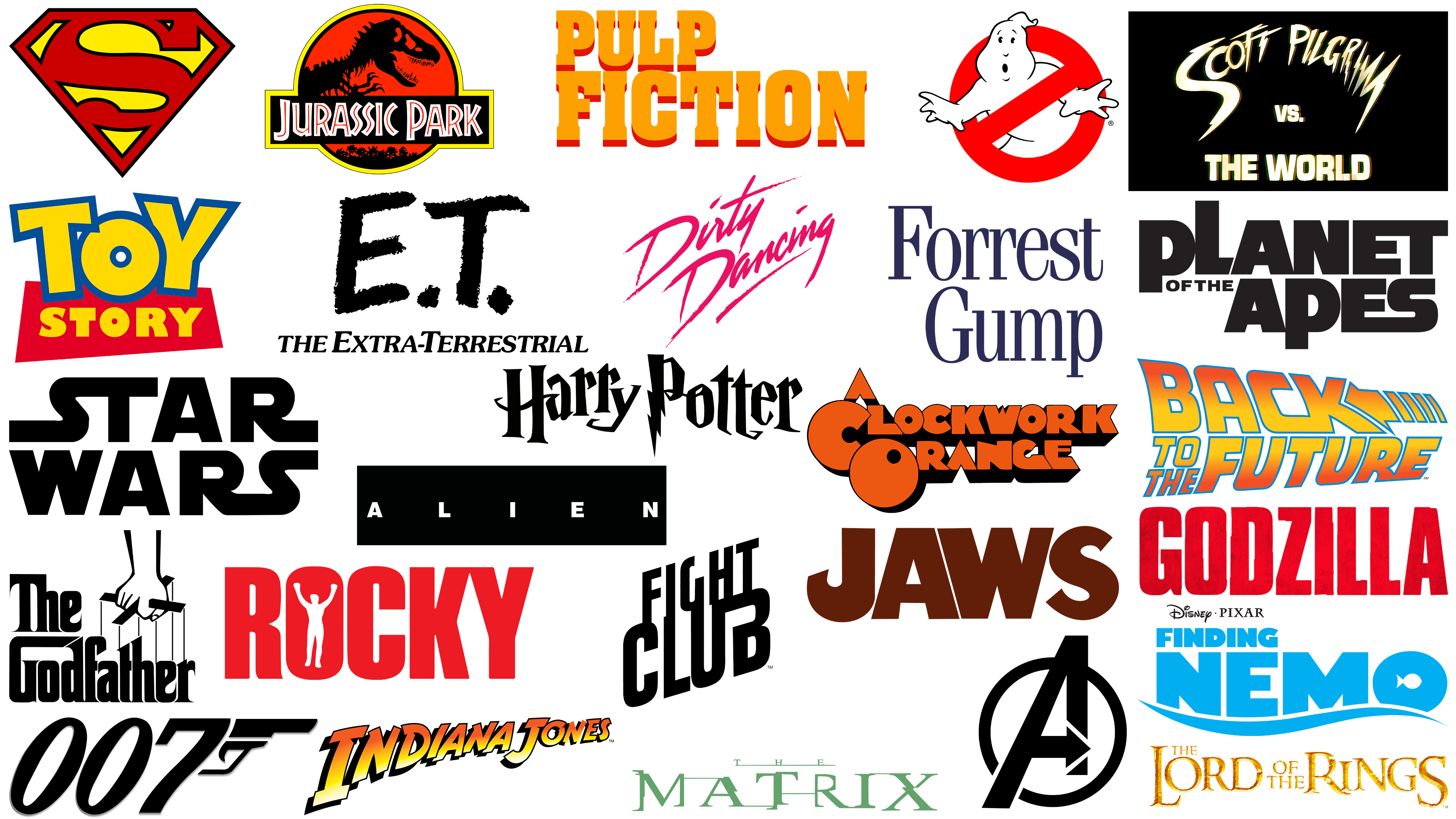
The best movie logos of all time
Defining the top movie logos of all time generates differing opinions due to varied tastes and experiences. Certain film emblems stand the test of time and embed themselves in popular culture. Such logos attain an almost mythical status, and their impact extends beyond the confines of the cinema screen, shaping merchandise, memes, and sometimes even societal norms.
A Clockwork Orange
![]()
Presented to audiences through the lens of director Stanley Kubrick and writer Anthony Burgess, A Clockwork Orange has garnered attention as a boundary-pushing dystopian film. Its content is far from the frivolous impressions one might get from a logo design, making it particularly intriguing in film and design.
The movie logo uses a distinctive typeface that, at first glance, seems appealing and cheerful. The font is bright orange with a voluminous shadow effect, giving it a cheerful, welcoming feel. This seeming affability contrasts sharply with the movie’s stark themes and imagery.
The dissonance between the logo’s optimistic look and the movie’s bleak narrative is irritating but thought-provoking. It adds another layer to the movie’s complexity, drawing the viewer in with a seemingly mismatched visual cue.
Alien
![]()
Ridley Scott’s 1979 sci-fi horror film Alien, based on a screenplay by Dan O’Brien, remains a pinnacle in cinematic history. It successfully combines horror, curiosity, and exploration to create a gripping narrative that has endured.
Recognizing the film’s unprecedented contribution to cinema, the Library of Congress celebrated Alien in 2002, declaring it a significant cultural artifact. The film received a coveted spot on the National Film Registry, cementing its legendary status.
The “Alien” logo, in its deceptive simplicity, embodies the essence of the movie. The vast negative space surrounding the typeface enhances the sense of unease and mystery. The vast emptiness seems to echo the desolation and uncertainty of space, paralleling the movie’s theme. The typography itself, with its sparse and elongated symbols, evokes a sense of eeriness, reflecting the tension and fear in the movie. The minimalism in the logo design suggests that sometimes, the understated or underwhelming can be more frightening than the explicit details.
Avengers
![]()
The Avengers emblem is prominently discussed when discussing iconic superhero symbols in cinematic history. Its continued presence is a testament to the Avengers franchise’s enormous success and cultural impact.
Each member of the Avengers ensemble has a visual representation. However, they are all united by the brightly colored round “A” logo, symbolizing unity and collective strength. More than just an alphabet, this logo embodies the essence of a purposefully moving-forward team. Over time, this logo has become more than just a symbol of heroism, teamwork, and cinematic milestones.
Back to the Future
![]()
Back to the Future holds a special place in the annals of science fiction cinema, representing both innovation and nostalgia. The film premiered in 1985 under the direction of Robert Zemeckis, and its plot, characters, and groundbreaking special effects immediately created a sensation. The film’s impact extended beyond the theater, catalyzing the creation of themed rides and interactive attractions that allow fans to delve deeper into the fantasy realm.
Its emblematic logo, a wordmark inscribed with an unusually shaped arrow, is a key element contributing to the instant recognition of this cinematic marvel. The arrow subtly yet effectively captures the essence of reversing time and returning to key moments, echoing the movie’s central theme and pointing to the left.
The carefully chosen color scheme enhances the logo’s appeal and memorability. The combination of fiery shades red, orange, and yellow, with a cold blue outline, gives the design dynamism and liveliness.
The font used in the logo plays a key role in shaping its identity. The choice of a rounded, sizzling font gives the brand symbol a distinctive vintage feel, aligning with the era in which the movie is set.
Dirty Dancing
![]()
Dirty Dancing, released in 1987, is a groundbreaking romantic drama in cinematic history. More than entertaining, it changed the perception of movies about the art and essence of dance. Despite its seemingly minimalist design, the logo associated with this movie is rich with emotion and narrative.
At first glance, the logo’s font appears to be made with a real brush. This design choice evokes a sense of raw artistic style, symbolizing the unrefined emotion and sincere interaction at the heart of the film’s plot. The film is about dance and its candid human emotions and connections.
The color palette used to create the logo enhances its resonance. The consistent use of hues such as purple and pink is not just a random choice but a conscious symbolic implication. Traditionally associated with passion, love, and romance, these hues foreshadow the heartfelt, poignant moments intertwined with the movie’s dance scenes and relationships.
E.T.
![]()
E.T. the Extra-Terrestrial remains an unforgettable name in cinematic history. Its logo undoubtedly represents the film’s profound legacy, both on its own and alongside the iconic image of a child riding a bicycle against the moon. One intriguing element of this logo is the dichotomy between the rough “E.T.” font and the more polished serif font below it.
This difference in typeface is not just an aesthetic choice but a deliberate representation of the merging of two entities. It hints at the movie’s main theme: the extraordinary connection between the otherworldly entity and the little boy, two people from completely different worlds who establish a unique bond.
The choice of color plays an important role in the logo’s symbolism. The predominantly monochrome black-and-white scheme emphasizes the contrast between E.T.’s alien origins and his earthly encounters. Alternate versions in shades of blue and white evoke the vast expanse of space and its mysteries.
The “E.T.” logo serves as a visual gateway, preparing viewers for a cinematic journey that immerses them in a world of friendship, discovery, and the ineffable bonds that unite different beings.
Fight Club
![]()
The Fight Club movie logo is a masterclass in subtlety and understatement, just like the movie itself. Released in 1999, the movie, based on Chuck Palahniuk’s novel, has firmly entered cinematic history as a cornerstone of psychological drama. The logo accompanying the movie is equally iconic, which resonates with fans and first-time viewers alike.
The logo may seem simple, with its bold font stretched across two lines. However, a closer look reveals the intricacy of the letters: their juxtaposition and overlapping create an impression of layering and interconnectedness, hinting at the movie’s complex narrative and relationships.
The typeface’s hardness and clarity create an aura of strength and assertiveness, reflecting the movie’s rough-and-tough tone. The minimalist design also evokes curiosity, encouraging the viewer to look more deeply, just as the plot continually reveals its secrets.
Finding Nemo
![]()
In 2003, the joint efforts of Pixar and Walt Disney Pictures produced the animated film “Finding Nemo,” which took its rightful place in movie history. After its debut, the film captivated audiences worldwide and set a record by becoming the highest-grossing animated film of its time. Numerous Academy Awards validated the film’s remarkable storytelling and animation.
The visual representation chosen for the Finding Nemo logo flawlessly affirms the movie’s nautical theme. Beneath the name “Nemo,” a curvilinear line resembling a wave subtly hints at the oceanic backdrop that plays a central role in the story. The design frills don’t end there. The inner part of the letter “O” in the logo is originally replaced with a stylized fish figure that organically fits the film’s water theme.
Forrest Gump
![]()
Forrest Gump, released in 1994, was an exceptional comedy-drama film. Backed by Paramount Pictures, the movie was a huge commercial success and became one of the highest-grossing films in history.
The Forrest Gump movie logo is not immediately eye-catching. Its straight serif font, combined with a purple-and-white color scheme, makes it more eye-catching than eye-catching. This choice of design elements has a purpose. The casual simplicity of the font creates a sense of authenticity and credibility in the movie’s narrative. The color palette complements this idea: white suggests purity and simplicity, while purple gives the logo a refined, serious feel.
Ghostbusters
![]()
Introduced to audiences in 1984, Ghostbusters quickly became a cinematic classic. The film’s groundbreaking nature was not limited to its creation: it spawned several sequels, animated shows, and interactive games, cementing its place in popular culture.
The inimitable “prohibition” sign in the film’s emblem is the centerpiece of its corporate identity. This particular design is chosen for more than just aesthetic reasons. It is a visual embodiment of the movie’s core message of combating and containing the supernatural. The playful illustration of a ghost wrapped around the sign sets the tone for the film, incorporating humor, adventure, and supernatural elements.
Godzilla
![]()
First appearing on the big screen in 1954, Godzilla has taken its rightful place in cinematic history. Emerging from Japanese folklore, this titanic monster, called the “kaiju,” has been the centerpiece of countless screen adaptations. Its enduring appeal is confirmed by the Guinness Book of World Records, which recognized it as the longest-running film franchise.
Godzilla’s emblem represents power and menace. The bold capital letters evoke a sense of grandeur and dominance. The subtle texture adorning some of the letters adds depth and tactile sensation, hinting at the monster’s rough, unpredictable nature. The logo’s crimson hue vividly evokes the chaos and destruction the monster leaves behind. The font size reflects Godzilla’s colossal stature, emphasizing its presence and the awe it inspires.
Harry Potter
![]()
Since its inception, the Harry Potter movie logo has taken a quintessential place in movie history. Time has done little to diminish its significance; indeed, its iconic status has only grown, and it has become firmly embedded in modern pop culture. Although the visual representation of the wordmark has changed color and texture as the franchise has evolved, the underlying design of the lettering has remained the same.
The logo, borrowed from the literary works that inspired the film adaptation, features a customized wordmark that exudes charm. This design choice makes the letters seem suspended in the air, evoking the magical world they represent.
Of all the artistic elements in the design, one stands out the most: the lightning bolt. It is organically inscribed in the letter “P” and vividly evokes the characteristic scar on Harry Potter’s forehead.
Indiana Jones
![]()
The Indiana Jones logo associated with the famous adventure movie series remains a constant in the entertainment industry even after the release of the new series. Its design elements are distinctive, conveying the spirit of adventure and the movie’s exciting narrative. The logo uses a bright color scheme that echoes the film’s energetic tone.
The font used in the logo is another important component designed to evoke interest and emotion. The text decreases in size from right to left, creating an impression of movement and dynamism. This design technique subtly conveys the relentless action and adventure that are hallmarks of the Indiana Jones film series.
Combining vibrant colors, distinctive typography, and subtle design nuances creates a memorable brand identifier that effectively communicates the franchise’s essence. Thus, the logo has become an integral part of the cultural cachet associated with Indiana Jones.
James Bond
![]()
A hallmark of the James Bond franchise is exciting opening episodes that catch the eye and immerse the viewer in a multi-sensory experience. Each part of the movie features an original song, often written by the lead artist, that becomes integral to the movie’s image. These songs are aural encapsulations of each movie’s mood, theme, and spirit, creating a complete experience for the viewer that transcends auditory and visual perception.
The logo and title cards of the franchise’s films have undergone repeated aesthetic revisions, evolving in parallel with changes in popular design styles and cinematic technology. The central “007” emblem remains unchanged. The font is intentionally slanted to create an atmosphere of dynamism and urgency, reflecting the lifestyle of the secret agents depicted in the series. The letter “7” in the emblem is shaped like a gun, serving as a concise but powerful visual cue to the espionage, danger, and action that are the essence of these films.
The James Bond films are models of brand consistency, even as the brand evolves. The constant use of original music in the visually exciting opening scenes is a prime example of how the franchise continues to update its approach while maintaining its core identity. The “007” emblem, with its slight slant and pistol-shaped “7,” is a succinct expression of this identity, embodying the speed, adventure, and constant movement visually toward the unknown that defines every part of the film.
Jaws
![]()
Among several iconic movie emblems, the Jaws logo exemplifies simplicity with deep meaning. While the design may initially appear simple, its nuances tell a more complex story.
The font, characterized by bold lettering, is not just a design choice; it is filled with meaning. The tightly spaced letters create a sense of immediacy and impending danger, reflecting the tension and suspense inherent in the movie. This design subtly conveys the lurking menace of a fearsome marine predator before the viewer is even immersed in the depths of the movie’s narrative.
The emblem’s color palette further enhances this feeling. The deliberate choice of deep red is symbolic and serves more than just aesthetic purposes. This shade, often associated with danger and bloodshed, makes it clear that this is not a fairy tale for the faint of heart or young viewers looking for fun water adventures.
Nuanced typography creates additional layers of context. For example, the stylized letter “J” resembles a fishing hook, emphasizing the film’s nautical theme. It’s a gentle but effective hint at the ocean environment and the dangers that comprise much of the thrilling action.
Jurassic Park
![]()
The Jurassic Park franchise is based on the iconic movie logo, instantly recognizable to audiences worldwide. Released in 1993, Steven Spielberg’s film won numerous awards and Academy Award nominations, prompting several successful sequels. Although new elements have been added to the logo with each subsequent movie, it has retained its core features and remains remarkably memorable.
Chip Kidd’s logo was influenced by his visit to the Museum of Natural History. The emblem is a vibrant combination of eye-catching colors, suggestive of the adrenaline-pumping adventures that await viewers. In some places, the emblem radiates a sense of danger, reflecting the series’s inherent drama and tension.
The Jurassic Park logo is distinguished by its ability to capture the franchise’s essence in a single image. The combination of color, design, and story creates an emotional and intellectual connection to the film’s theme: the rebirth of extinct creatures and the danger they pose.
The Jurassic Park franchise exemplifies how a well-designed logo can be integral to creating and maintaining brand identity across decades and series. The series keeps viewers interested by keeping the logo consistent but allowing subtle updates while maintaining the original theme and message.
Planet of the Apes
![]()
The 1968 movie Planet of the Apes is a notable science fiction film. Its origins lie in Pierre Boulle’s 1963 novel. The creative minds at 20th Century Fox adapted this literature into a visual spectacle, enhancing its appeal with an inventive logo design.
The emblem’s distinctly wordy design, carefully arranged in two lines, draws attention. The unusual placement of the words “of the” next to the letter “P ” elevates the letter “L.” This design deviation adds an unexpected twist, arousing viewers’ curiosity.
Some letters intertwine and merge, creating a fluid, intertwined visual image. This juxtaposition of letters on top of each other hints at the complex relationships and intricate story behind the movie’s plot.
The logo serves as a visual gateway, beckoning viewers to delve deeper into the story’s multifaceted themes and layers. Distinctive typography and designs capture the essence of the movie, offering a preview of the thought-provoking content that awaits.
Pulp Fiction
![]()
The movie Pulp Fiction, directed by Quentin Tarantino, is a hallmark of modern cinematography. Starring talented actors such as Samuel L. Jackson, it impressed audiences and collected numerous awards. However, the movie’s influence extends beyond its story and acting; it also includes its branding, particularly its distinctive logo.
The 1994 film’s logo transports viewers back to the 1960s and 1970s, setting the stage for the movie’s eclectic storylines. Various design elements carefully craft the retro atmosphere. The bright, eye-catching colors on the title cards immediately recall the cultural aesthetics of previous decades.
Typography is another element contributing to the logo’s nostalgic aura. A large, prominent font is used, complemented by pronounced shadows that add depth and seriousness. The composition is a visual introduction to the movie, subtly preparing the viewer for the roller coaster of interconnected stories, characters, and dialogue.
Rocky
![]()
The Rocky logo, associated with the iconic film series that debuted in 1976, is not just a visual identifier but also an emblem that embodies the spirit of the movie and its protagonist, Sylvester Stallone. Its design is based on a strict, block-style wordmark. This font choice conveys the strength and resilience of the hero, Rocky Balboa, and continues the movie’s thematic essence.
The logo variants are in black-and-white or red-and-white color schemes. Each shade was carefully chosen to evoke a certain emotion. While black and white evoke timeless classics, red and white bring energy and passion to the visuals.
Perhaps the most eye-catching part of the logo is the figure placed in the “O” of the word “Rocky.” With arms raised triumphantly, this figure serves several functions within the logo design. It represents a pivotal scene in which Rocky achieves a significant personal victory.
Scott Pilgrim Vs. The World
![]()
The movie “Scott Pilgrim vs. the World” logo immediately grabs attention and draws viewers into its unique universe. The wordmark, which seems to pulsate, implies rhythm and dynamism. It is not just a static image; it symbolizes the film’s energy and dynamics.
The logo’s font is bold and a bit rough. This design resonates with the youth, ensuring the movie connects with the target audience. All aspects of the logo, from the striking design to the bold typeface, reflect the movie’s main theme: music and youthful rebellion.
The logo design’s palpable sense of movement hints at the movie’s musical focus and reflects the fast-paced action sequences and battles.
Star Wars
![]()
The Star Wars movie, created by George Lucas in 1977, has become a multi-generational cultural phenomenon. Its influence is not limited to the narrative and characters: even Star Wars branding and design elements have achieved iconic status. Of particular note is the font of the franchise’s name, which has remained virtually unchanged since the series’ inception.
This sans-serif font incorporates distinctive elements, such as the elongated “S” and the line on the “R,” making it immediately recognizable. Despite its simplicity, the mark effectively conveys the franchise’s core themes of speed, innovation, and discovery. It conjures images of space travel, futuristic technology, and new worlds to explore while maintaining a timeless appeal.
Unlike other franchises that may change their visual elements frequently, the Star Wars font’s consistency contributes to its identity and longevity. Each time this typeface flashes across the screen, it evokes a specific set of emotions and expectations stemming from the audience’s longstanding interaction with the series. It acts as a silent but powerful signal, preparing viewers for the upcoming adventures and experiences in the Star Wars universe.
Superman
![]()
Appearing in 1948, Superman quickly became what many consider to be the quintessential American superhero. Over the years, his emblem has remained unchanged, undergoing only minor design changes in various film adaptations.
Over the 75 years of his existence, Superman’s plot and appearance have changed many times. However, one element has remained constant throughout these transformations: the symbolic “S” shield. This symbol, which takes center stage in the brand’s logo, captures the essence of the superhero and all that he stands for.
The emblem is a testament to Superman’s enduring legacy and is among the most recognizable symbols in the world.
The Godfather
![]()
In the annals of film history, The Godfather is a monumental movie, marked not only by its plot and characters but also by its groundbreaking visual elements. One such element is the movie’s logo, which has become integral to its identity. American graphic designer Neil Fujita created a unique typeface for the movie, known as The Godfather.
The movie’s title card captivates the audience with its eye-catching design. One striking element is the “puppeteer” motif, which depicts strings stretching from the last letters of the word “Godfather.” This graphic solution is a powerful metaphor that captures the essence of control, manipulation, and power themes that permeate the movie’s plot.
The Lord of the Rings
![]()
The Lord of the Rings franchise undoubtedly has one of the most memorable logos in film production. While the basic design has remained the same throughout the series, subtle additions have adapted to each specific installment.
This timeless logo carries the aura of ancient tales, enhanced by the subtle lettering and bold vintage font. This design choice is not accidental; it reflects the essence of epic movie plots. The logo evokes a sense of deep legends, enchanting magic, hidden secrets, and grandiose quests waiting to be discovered.
The intricate design details hint at the movies’ complex world-building, storylines, and deep history. In some versions, the use of earth tones and the silhouette of the legendary ring subtly evoke the narrative’s central theme.
The Matrix
![]()
The Matrix movie title card is an inventive design that seamlessly fits the movie’s theme. Released in 1999, this cinematic masterpiece carved out a unique niche in science fiction and launched an exciting series.
The logo accompanying the Matrix movies does not conform to conventional design norms. It looks like a typical serif font, but it is far from conventional. Its characters, with seemingly periodic distortions, evoke a sense of digital glitching, subtly hinting at the movie’s virtual reality. These intentional imperfections in the font convey the essence of the plot, a world where reality and simulation blur.
The dynamic design not only hints at the movie’s technological theme but also reinforces the narrative’s tense, unpredictable nature. The choice of green for the logo, reminiscent of early computer monitors, adds another level of connection to the digital world depicted in the series.
Toy Story
![]()
The Toy Story series, a joint creation of Pixar and Walt Disney Studios, epitomizes animated cinema. Since its initial release in 1995, this cinematic marvel has gone on to have sequels and a unique place in world cinema.
Every aspect of the Toy Story series, from the story to the visuals, has been meticulously crafted. One of the series’ most iconic elements is undoubtedly its animated logo. The delightful combination of primary colors sets the tone for the logo, drawing the viewer into its vibrant world. The lively, cheerful typography emphasizes its appeal, especially among younger viewers.
However, this logo fascinates not only the younger generation. Its design evokes a sense of nostalgia, making many adults think of childhood and simpler times. The emblem represents more than just a movie; it symbolizes the universality of childhood memories, adventures, and the age-old bond between toys and their owners.
Learning from famous movie logos
The importance of a spectacular logo is unrivaled in the movie industry. These carefully crafted emblems don’t just represent a movie or studio; they embody its essence and set the mood for the viewer. Over the decades, movie studios have collaborated with cutting-edge graphic designers to create iconic emblems. The famous logos discussed above testify to the profound impact of a well-designed emblem.
Such logos are not just graphic elements; they convey the story before the first scene begins. Setting the tone gives the audience an idea of the movie’s genre, mood, and character. More importantly, they evoke emotion, fostering a connection between the viewer and the movie experience ahead.
It’s amazing how these concise constructions can be crucial in a huge filmography. They become synonymous with the movie and remain in the audience’s memory long after the credits roll. Logos that signal an exciting adventure or the tenderness of a heartwarming story significantly shape perceptions and create lasting impressions.