


In the ever-changing world of branding and corporate imagery, 2023 marked a distinct change in how many companies view their pride logos. Evaluating these logos over the year revealed a range of engagement and commitment across brands, with some wholeheartedly supportive and others more reserved.
Historically, every year in June, companies around the world enthusiastically dress up in the bright hues of the Pride rainbow, a clear indication of their support for the LGBTQ+ community. This phenomenon, often called “rainbow capitalism,” quickly gained momentum, with companies eager to demonstrate their inclusivity and allyship.
In 2023, however, the picture was different. Many brands that were once eager to show their commitment to LGBTQIA+ causes are now more reserved in their celebrations. The decline in enthusiasm can be attributed to increased societal pressures and a challenging political environment. Brands such as Target and Bud Light, once famous for their strong Pride campaigns, have faced backlash, signaling to other companies the potential risk of open support.
Nevertheless, this trend shift has revealed brands whose commitment to the LGBTQIA+ community goes beyond fleeting trends. Amidst the shifting branding landscape, several companies have emerged whose logos shine brightly, embodying genuine allyship.
In this ambiguous array of corporate responses, we have tried to shed light on those brands that have gone beyond symbolic gestures. They went beyond simply applying a rainbow filter to their logos. Instead, they incorporated their support into their core brand philosophy, investing in programs and initiatives to make a tangible difference in the lives of LGBTQIA+ people.
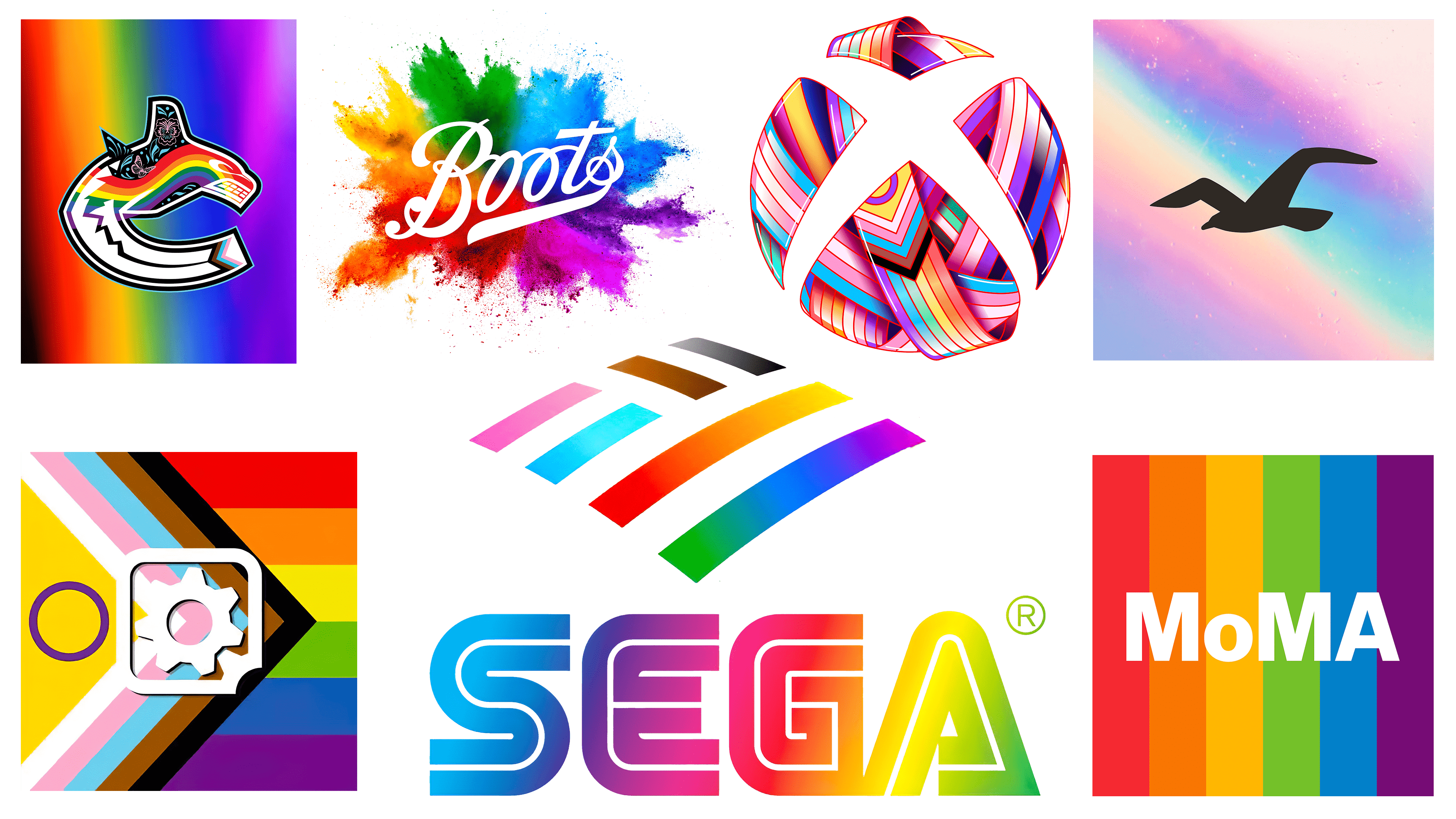
Hollister
![]()
Hollister set itself apart in June with a subtle pastel version of the Pride flag colors. Subdued white patterns beneath the colors add an abstract touch reminiscent of twinkling stars or imperfections on a vintage film reel. Rather than prominently placing its name, Hollister wisely used its recognizable bird emblem to convey brand identity.
Deepening its support for the LGBTQIA+ community, Hollister launched a unique Pride collection in partnership with GLSEN, a respected organization that advocates for a safe and welcoming educational environment for LGBTQIA+ students. To further emphasize its commitment to the cause, Hollister announced a generous $250,000 donation to GLSEN, which is not contingent on sales of the special collection. At a time when controversy surrounds the well-being of LGBTQIA+ students, Hollister’s initiative to support an education-focused organization like GLSEN speaks to its sincere commitment to the cause, a commendable move.
Bank of America
![]()
Those with logos resembling flags may have an advantage in representing the brand during Pride Month. Take Bank of America, for example, which elegantly incorporated the bright hues of the Pride flag into its logo. A particularly striking design decision is the clever use of negative space in the top left square, mirroring the white stripe of the flag. This is reminiscent of the traditional logo design, which reflects the white stripes of the American flag.
Historically, Bank of America has shown its support visually and taken tangible steps to be inclusive. For example, the bank initiated the LGBTQ+ Pride Ally Program to inspire a broad base of employees to build a culture of allyship. The bank introduced “Unconscious Bias” training to ensure a bias-free workplace as part of this initiative. The collaboration with Love Has No Labels also highlights the bank’s commitment to promoting acceptance and understanding of the LGBTQIA+ community. The bank has been recognized and praised by various organizations. For example, it ranked among the Top 100 Best Workplaces for diversity by renowned organizations such as Fortune Magazine and the Great Place to Work Institute. In addition, the National LGBT Chamber of Commerce awarded Bank of America the prestigious “Corporation of the Year” title in 2020, further enhancing its standing as an up-and-coming organization.
SEGA
![]()
SEGA, a well-known video game company, developed an original design to commemorate Pride Month. What makes this design special is SEGA’s signature cobalt blue hue, seamlessly transitioning into the various shades of the Pride rainbow, creating a harmonious visual blend.
Over the years, SEGA has become an active participant in Pride Month. It is commendable to see their continued efforts to advocate for homosexuals. In the past, their activism has translated into concrete actions such as organizing charity events. For example, a previous collaboration with Twitch raised over £18,000, which was donated to Mermaids, a charity dedicated to advocating for transgender rights. According to recent reports from SEGA’s official social media channels, the company is gearing up for another fundraiser to coincide with Pride Month. While the specific recipient of the funds – an LGBTQIA+ charity organization – has yet to be announced, SEGA’s experience suggests that the initiative will undoubtedly have a significant positive impact.
Xbox
![]()
The vibrant Xbox logo is central to the video game industry’s theme of pride. The “X” symbol, designed as a blank space, allows for a wide range of colors without losing readability.
Xbox’s commitment to LGBTQIA+ initiatives is not limited to a temporary logo change. Although the Pride-inspired design lasted only three days on the company’s social media accounts before transitioning to a Diablo IV theme, the company’s commitment to this theme is evident in other aspects as well. Xbox has announced a long-term partnership with GLAAD to increase gay representation in its upcoming first-person games. According to Pav Bhardwaj, Xbox’s head of marketing, the goal is to diversify representation, whether that means introducing more LGBTQIA+ characters, integrating LGBTQIA+ themes into storylines, or creating game worlds that resonate with LGBTQIA+ players.
Vancouver Canucks
![]()
The renowned Vancouver Canucks hockey team unveiled a colorful version of their logo. Although the static image conveys its essence, it is revealed in full in motion.
The dynamic redesign of this capital city hockey team’s logo emphasizes its continued commitment to the LGBTQIA+ community. Historically, the Canucks have shown their support through various initiatives. In particular, the team organizes an annual Pride Game. The most recent game, held in late March against the Calgary Flames, was not just about sports. Various entertainment, from drag performances to LGBTQIA+ artists, complemented the event. In addition, the Canucks made a significant financial contribution to QMUNITY, Vancouver’s recognized LGBTQIA+ center, highlighting their commitment to creating an inclusive and supportive environment.
Gearbox Entertainment
![]()
Gearbox stands out in the gaming industry as the creator of acclaimed games such as the Borderlands series, Godfall, and Tribes of Midgard. The company unveiled a distinctive Pride logo, cleverly combining elements reminiscent of the traditional gearbox emblem with a continuous circle symbolizing the intersex flag.
Gearbox, a Texas-based company, has made no secret of its concern about the controversial anti-transgender policies of the state’s leadership. In addition to an active stance on social issues, the company’s commitment to inclusivity extends to its products. For example, the Borderlands series has been recognized by organizations such as GLAAD and Gayming Awards for its worthy portrayal of LGBTQ+ characters and themes.
Boots
![]()
Boots is prominent in UK health and beauty retailing. In honor of the holiday, the company chose a vibrant paint-splatter design reminiscent of its colors and energy. This vibrant design is reminiscent of the limited edition eyeshadow palette featured in Boots’ Pride collection this year.
Historically, Boots has demonstrated its commitment to the LGBTQIA+ community. The company sponsors a local Pride parade in Nottingham, its hometown. In addition, Boots’ Pride Alliance business resource group has attracted attention and was nominated at the British Diversity Awards, highlighting its dedicated efforts to raise awareness of LGBTQIA+ issues.
MoMA: The Museum of Modern Art
![]()
While the art and design world observes countless logo variations during Pride celebrations, one stands out above the rest: MoMA. While most opt for the typical rainbow design, MoMA’s redesign adds an element of sophistication with its matte finish, evoking a vintage 1970s charm. Its subtle elegance is hard to miss.
MoMA’s connection to the LGBTQIA+ community goes much deeper than just a logo redesign for Pride Month. It houses a significant piece of gay history: the original rainbow flag, created by artist Gilbert Baker in 1978. The flag’s global resonance and journey from creation to its status as a universally recognized emblem attest to its significance and enduring message.