


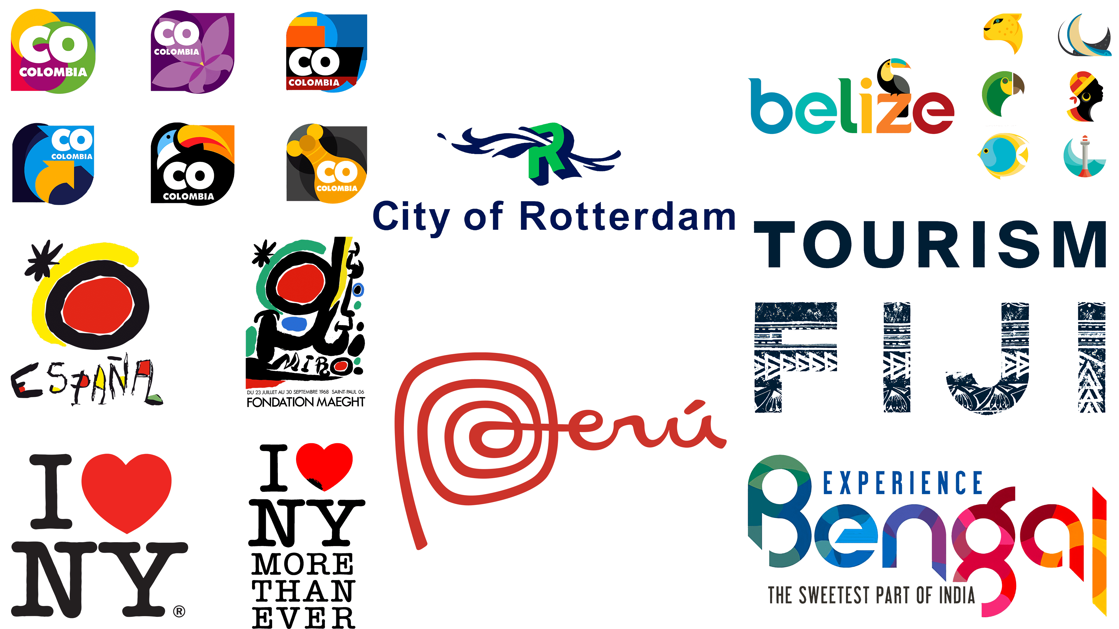
Tourist boards play an important role in attracting travelers to discover a destination. They strive to capture tourists’ attention with creative campaigns that tout the latest festivals, bars, or collaborations with famous personalities. This visual symbol should reflect the essence of the destination and be modern. Such logos can be found on a variety of promotional materials, from ordinary pens and USB drives to eye-catching T-shirts and wall posters.
Some logos capture the spirit of the era in which they were created. They may convey the atmosphere of a particular decade, such as the 1980s, and may or may not age well. Conversely, some logos have enduring appeal, such as those of New York and Rotterdam. They have stood the test of time and continue to attract tourists year after year.
The criteria for selecting successful tourist board logos are individuality, reflecting the destination’s unique qualities; originality; and design versatility. Such logos should look equally effective on both small souvenirs, such as keychains, and large billboards. Developers’ talent can vary: a logo doesn’t necessarily need to be created by top designers to be effective. A well-designed logo serves as both an invitation and a brand ambassador, setting the stage for an unforgettable travel experience.
Belize Tourist Board
![]()
Belize’s national branding, designed by Studio MPLS, presents a unique space through the creative use of color and typography. The design features a vibrant rainbow color scheme and nature-inspired details that draw tourists to this country. Of note is the unique use of curved serifs at the top of each letter, as well as the distinctive slant in the first stroke of the letter “e.” These rounded design elements are not random but reflect the natural curves often found in Belize’s wildlife and cultural elements.
This nature-inspired aesthetic is further developed by the logo’s depiction of a toucan on the letter “z.” This choice is not just decorative; it gives the word a distinctive character without affecting legibility. Like its Colombian counterpart, Belize’s logo features interchangeable icons representing different regions, each corresponding to a specific color palette. For example, the lighthouse symbolizes the central coast, and the tropical fish symbolize the reef.
The text in the logo is slightly aged, noticeable by the small veins that show through the background. This touch gives the logo a rustic, almost weather-beaten look, consistent with Belize’s fame for eco- and adventure tourism. These subtleties suggest a design philosophy that embodies the country’s natural bounty. It conveys the rugged, uncluttered beauty often associated with Belize’s diverse ecosystems, from the jungle to the rainforest.
Various aspects of Belizean culture and natural landscapes were incorporated into the corporate identity. The logo doesn’t just serve as a visual identifier but also succinctly conveys what Belize is all about: a paradise for nature lovers and adventurers.
Brand Colombia
![]()
Revamping the image of a country plagued by political problems is a challenge, but Brand Colombia seems to have solved it through design. Launched in 2012, the campaign focused on tourism and business. The logo originated from a collaboration between Colombian companies Sancho BBDO and Señor López, with JWT serving as the advertising partner.
Claudia Hoyos of Marca País Colombia says the country’s rich diversity is its main strength. This diversity encompasses regions, cultures, accents, dialects, and weather patterns, among other factors. This concept is reflected in the many color variations of the logo. For example, the color purple symbolizes Colombia’s rich flora, particularly its national flower, the orchid. Different regions and cultural themes are reflected in simple geometric shapes, such as drums, denoting the country’s musical heritage.
The decision to shorten Colombia to “CO” in the logo has a dual purpose. Not only does it save space, but it also uses the universally recognized ISO country code for Colombia. It should be noted that this choice has generated different opinions. Skift, a portal specializing in the tourism industry, expressed concern that the new style looks disjointed and unfocused.
The Brand Colombia initiative has successfully reflected the country’s versatility through design. The logo is a colorful canvas that reflects the country’s rich cultural, geographic, and environmental diversity.
City of Rotterdam (Holland)
![]()
The vivid image of a river crossing the letter “R” in Rotterdam’s logo is a striking visual embodiment of the city’s geographic and cultural connection to water. First appearing in 1999, the logo has remained unchanged despite periodic calls for its replacement, such as in 2017 when politician Sven de Langen advocated a return to the city’s original coat of arms and its motto, “Strong through struggle.” Modern design enthusiasts welcomed the choice to keep the logo.
The colors and placement of the logo visually reflect a thoughtful balance. A drop shadow, rendered in the same dark blue hue as the depicted water, is added to the lettering, adding depth to the flat, two-dimensional logo. This design decision accentuates the green color of the “R,” making it more prominent.
In addition to aesthetics, the theme of water has practical significance for Rotterdam. The city is home to Europe’s largest port, so water resources play a vital role in its economic prosperity. It is a bustling trading center, providing an exchange between different world markets.
But it’s not just about commerce. Rotterdam is part of a nation deeply committed to environmental sustainability. Among its many environmental initiatives is a self-sufficient floating farm that houses a herd of dairy cows and has attracted international press attention. The city is also the subject of the Rotterdam Water Cities exhibition, organized jointly by the Nieuwe Instituut and architecture firm NLÉ. All these endeavors emphasize the crucial role of water in the lives of the city’s citizens.
In contrast to mere artistic whimsy, placing the logo’s lettering inside the image of the river, rather than above it, sends a clear message: water is inextricably linked to the city’s economic, ecological, and social fabric.
Experience Bengal (India)
![]()
The emblem of Bengal is distinguished from other state and regional emblems, including Belize’s, by its bright splash of color. Despite their geographical distance, the two states may share some aesthetic similarities, but the Bengal emblem has special nuances that set it apart. The logo uses a multi-color palette reminiscent of a color wheel and is designed to reflect the vibrant culture and natural beauty of the Indian state. Each letter in the logo contains a spectrum of fragmented colors, which gives the design a dynamic feel.
The physical structure of the letters in the Bengal logo also demonstrates creative ingenuity. The downward arcs of the letters “n,” “a,” and “l” deviate from the baseline, adding visual interest and turning a monotonous straight line into an element of interest. This deviation adds an innovative character, elevating the overall composition.
The choice of vibrant and fragmented colors perfectly reflects the kaleidoscope of landscapes and cultural features of West Bengal. A variety of natural elements are found in this state, from the reddish soil to the striking contrast between tea plantations and the grandeur of the Himalayas. West Bengal boasts a unique weaving art, evidenced by traditional saris, and a rich art history, including the Bengal School of Art in the early 1900s and the ancient Patachitra style of painting.
The Bengal logo is more than just an eye-catching emblem; it embodies the multifaceted richness of the state’s culture, history, and natural beauty.
New York Board of Tourism (USA)
![]()
Milton Glaser’s iconic New York City design represents a unique case of a logo becoming a cultural emblem, going beyond traditional logo requirements. The design doesn’t explicitly feature the city, its skyline, or even the widely recognized nickname “The Big Apple.” Instead, it focuses on the emotional connection encapsulated in a simple red heart. The design, created in red pencil in 1976, has become so iconic that the original sketch is kept at the Museum of Modern Art in New York. The American Typewriter font, with rounded serifs, gives the logo a casual tone that is appropriate for a city known for its hustle and bustle and vitality.
After the tragic events of September 11, the logo underwent a subtle but poignant transformation. Glazer adapted the design to include the phrase “I [heart] NY more than ever,” accompanied by a subtle scorched spot on one side of the heart. This altered design serves as a powerful reminder of New York City’s resilience and is on display at the 9/11 Memorial and Museum.
After Glazer died in 2020, the logo underwent another change. This time, Graham Clifford Design took on the task. The result was the “We [heart] NY” logo, which was criticized for its 3D heart and thick sans-serif font. Many felt it was a departure from Glazer’s timeless simplicity. The update lacked the straightforward elegance and emotional resonance that made the original design a worldwide phenomenon.
PROMPERU (Peru)
![]()
This South American country, known for its rich archaeological history, is home to iconic sites such as Machu Picchu, the mysterious Nazca Lines, the circular Inca terraces of Moray, and the Temple of the Sun in Cusco. In this context, the choice of a hand-drawn wordmark as the country’s tourism logo, which has been in use since 2011, seems fitting. Created by Futurebrand, the logo focuses on both tourism and commerce. A striking design element is the circular pattern on the letter “P,” which evokes images of fossils or even the curve of a clay pot, hinting at the country’s ancient and creative spirit.
While the country also draws attention to its burgeoning culinary scene, known for dishes such as ceviche and pisco, it is understandable that these elements are missing from the logo. Such elements can cause difficulties, especially when it comes to different dietary preferences, such as veganism. Sticking to an archaeological theme provides a unified and iconic representation that aligns well with the country’s global reputation.
Emphasizing archaeology in a logo is particularly appropriate as it not only resonates with the country’s historical aura but also has universal appeal.
Tourism Fiji
![]()
Fiji’s newly updated logo is strikingly different from the 2013 version, which was characterized by an overly simple and easily forgettable design and an uninteresting tagline. The updated design, developed by Australian creative agency Host/Havas, differs significantly from the previous one, incorporating elements of Fijian culture. The traditional patterns of masi cloth, an indigenous Fijian textile, are repeated on the new logo. Each motif on the logo represents a unique aspect of Fijian social structure, whether it’s a village, a family, or an entire community.
Another distinctive feature is the color palette chosen. The deep, rich shade of Prussian blue sets the logo apart from the many blue hues commonly used in tourism branding. The color adds aesthetic value to the logo, infusing it with depth and richness, setting it apart from its many counterparts in the travel industry. The author of these visually appealing designs is Vathi Maraiwai Talavutu, a renowned artist from the Masi tribe.
In 2012, Fiji Airways, the national airline, made a similar cultural shift by dropping its former name, Air Pacific. As part of this rebranding, another Masi artist, Makereta Matmosi, was commissioned to incorporate local art into the company’s corporate identity. These endeavors go beyond mere aesthetic choices; they are a tribute to Fiji’s rich cultural fabric. Incorporating the work of local artists into national airline logos serves a dual purpose: brand differentiation and Relevance.
Turespaña (Spain)
![]()
The Turespaña logo is an intriguing example of brand identity created in a specific cultural and temporal context. Created in 1983 in Spain, the logo was inspired by the talent of the renowned artist Joan Miró. This choice highlights the country’s rich artistic heritage, which includes luminaries such as Picasso, Velázquez, and Dalí. Art tourism is a significant part of Spain’s appeal, and Miro’s involvement has added a level of prestige.
Although health problems prevented Miró from creating an entirely new design, he chose the collage method, combining elements of his previous works. The result was the 1984 Sun Microsystems design, which is still in use today. The design uses the red and yellow hues of the Spanish flag to link it to the national identity. The sun symbol echoes Spain’s Mediterranean climate, adding another layer of significance.
The sun and star elements were taken from a previous poster created for an art museum in France. This reuse of elements adds another layer of international artistic recycling to the brand story, so to speak.
While some may argue that the logo’s aesthetics are rooted in the era of its creation, its historical and artistic significance cannot be ignored. The choice of a leading artist to create a national tourism logo is a testament to Spain’s appreciation of art as part of its global image.