


Formula One teams are often overlooked as shining examples of branding. Yet these teams pay as much attention to their brand image as any other global business or non-profit organization.
Participating in a Formula 1 racing event is a testament to an automobile brand’s prowess. It demonstrates the company’s ability to build the most advanced and high-performance cars.
The Grand Prix uses a unique scoring system that qualifies car designers to compete in the prestigious Formula 1. Through this system, only the best are allowed to compete at this elite level.
Several well-known companies have changed their logos to match their status in this prestigious international racing championship. Smaller competitors often need to create their own brand identity to compete with established companies.
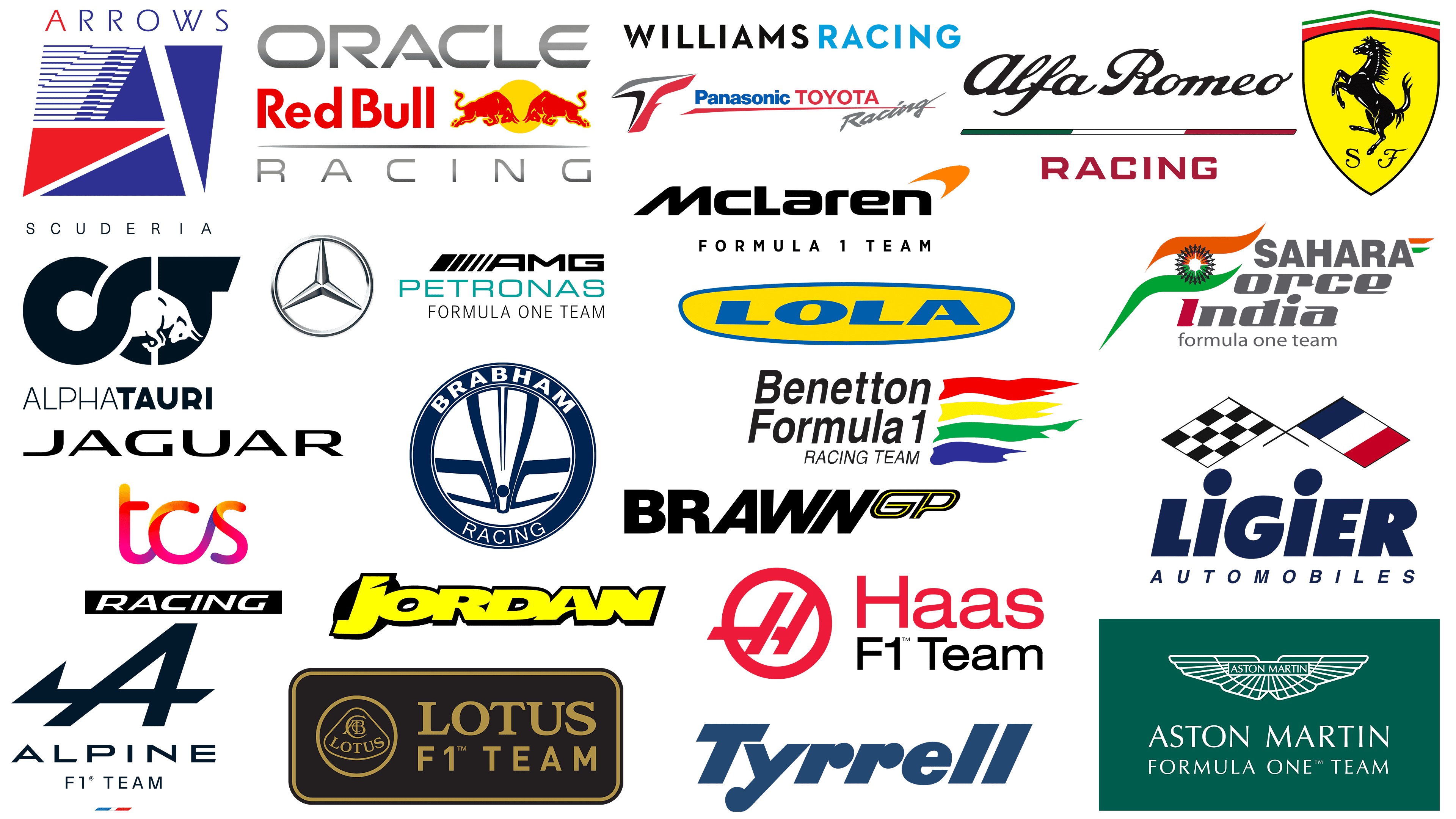
An introduction to Formula 1 team logos
Formula 1, often abbreviated as F1, is the pinnacle of international motor racing. The term “Formula” in its name refers to the set of rules that each participating car must follow.
These elite competitions attract the attention of car enthusiasts worldwide, given the unrivaled capabilities of F1 cars. These cars are famous for their unrivaled speed on the tracks due to their exceptionally high aerodynamic downforce.
Participation in Formula 1 races is not just a competition; it is a platform where automobile brands demonstrate their advanced technological achievements and mastery of car design.
The nature of Formula 1 racing emphasizes the importance of visual representation for all participants. Each Grand Prix becomes a canvas on which to display not only the overall F1 symbol but also a multitude of individual team and driver logos.
While most F1 team emblems reflect common themes such as speed, confidence, and power, they often provide insight into the ethos of the driver and the production company.
Popular F1 team logos in 2023
As we explore Formula One in 2022, a few team emblems stand out and often resonate with a global audience. These emblems, representing the respective teams, have often been glimpsed on race tracks, catching the attention of enthusiasts and casual spectators alike.
The organizations that create these emblems are not new to the world of automobiles. Many of them have already carved out a niche for themselves and boast significant, influential presences in the automotive sector. These prominent companies are leveraging their involvement in Formula One to further strengthen their brand legacies. It’s worth noting that having an emblem on a race car is not just a sign of sponsorship or branding but embodies decades of heritage, innovation, and passion for speed. Each emblem tells its own story, embodying the values of precision, determination, and excellence inherent in the brand it represents.
Alfa Romeo
![]()
Alfa Romeo, a name that resonates with car fans around the world, takes a distinctive approach to the branding of its racing division. While the automotive world is familiar with the basic Alfa Romeo emblem, the racing team has adopted a unique visual style, carving out a niche for itself in Formula 1. Throughout the sport’s history, Alfa Romeo has played different roles, from chief designer to the most important engine supplier.
The team works with outstanding representatives of the racing world, such as Zhou Guangyu and Valtteri Bottas, who have made significant contributions to the sport’s development.
The Alfa Romeo Formula One emblem gives an insight into the brand’s vision. Central to the design is an elaborate script-style word mark. A distinctive feature is the pronounced capital “R” for “Romeo,” which contrasts with the more restrained lowercase “a” for “Alfa”. This juxtaposition adds intrigue to the design.
Beneath this elaborate logo is a subtle connection to the team’s Italian heritage. The underlying, echoing the bright hues of the Italian flag – red, white, and green – is prominently featured.
Alpine
![]()
BWT Alpine, better known as Alpine, is a relatively new face in the annals of Formula 1 racing. Their journey on the race track began with the start of the 2021 World Championship. This debut was not the birth of an entirely new organization; it marked the transformation of its former name, Renault F1 Team. The large conglomerate Renault, on which Alpine emerged, is no stranger to the Formula 1 circuit: its first steps were taken back in 1981.
The central element of the emblem is a sharply stylized letter “A” tilted to the right, which intuitively conveys speed and forward motion. Its sharp contours and edges further emphasize the attributes of a powerful and precise performance characteristic of top-level motorsport.
Beneath this pronounced “A” is a subtle hint of Alpine’s origins. The hint of the tricolor blue, white, and red unobtrusively emphasizes the brand’s French roots and its proud connection to a nation with a rich motorsport tradition. This combination of contemporary design with historical and geographical recognition embodies Alpine’s essence in the world of Formula 1.
Aston Martin
![]()
Aston Martin, an iconic British automotive brand with a rich heritage of craftsmanship and innovation, has an important place in Formula One racing. With a centuries-old history, the company first made its mark on the Formula 1 circuit in the 1959 season. The debut was impressive: the team introduced the DBR4 chassis with an avant-garde engine.
Under the guidance of shrewd businessman Lawrence Stroll, the team managed to get two remarkable talents, Lance Stroll and the experienced Sebastian Vettel. Both of them demonstrate mastery on the tracks, consistently meeting the high standards set by the Aston Martin brand.
The visual style of the Aston Martin Formula One team is evident in subtle differences from the brand’s main logo. While retaining the quintessential Aston Martin emblem that many consumers will immediately recognize, the Formula One version further enhances its uniqueness by incorporating the “Formula One Team” lettering.
The logo’s color palette has also changed. Instead of the multi-faceted design typically associated with the brand, the Formula One emblem has taken on a more streamlined look. Simplified white linear elements are strategically placed on a rich, deep green background. It is this shade of green that embodies the brand’s originality and is associated with the heritage of British motor racing.
Ferrari F1
![]()
In the automotive world, Ferrari’s reputation is unrivaled. Synonymous with high-octane performance and precision engineering, this iconic brand is the most triumphant in Formula One racing. Its longevity is no less commendable; it is the longest-lived team in F1 racing.
The Ferrari F1 emblem adorns both consumer cars and racing giants. The centerpiece of the emblem is a stallion in a dynamic pose, raising its front legs to the sky. The image of a horse in mid-jump echoes the themes of unbridled power and elegance. Surrounding the stallion are vibrant shades of red, green, and white that do double duty. While red is often associated with the passion and energy that are hallmarks of the brand, the tricolor palette pays respect to Ferrari’s Italian roots.
Haas
![]()
Haas Formula LLC, commonly referred to as the Haas F1 team, is an American racing company co-founded by Gene Haas, co-owner of the NASCAR Cup Series. The team was originally scheduled to debut in 2015. However, due to logistical issues, the team made its first appearance in the 2016 season. Over the years, the team has shown impressive results in races and has gathered a large number of fans.
The Haas F1 team’s emblem is both minimalistic and spectacular. It is dominated by shades of red and black, which symbolize courage and determination. The main graphic component is a stylized letter “H” surrounded by a red border. The design of the letter “H” is an elongated line reminiscent of a race track or circuit. This design element is accompanied by a word mark bearing the company name, followed by the inscription “F1 Team”. The overall design exudes dynamism and hints at the adrenaline-fueled world of F1 racing.
McLaren F1
![]()
McLaren is one of the most outstanding teams in Formula One history. The team’s decades-long heritage demonstrates a commitment to excellence, as evidenced by 183+ race wins.
The origins of this iconic racing team go back to Bruce McLaren. The team’s skill was already evident in 1968, when it scored its first Grand Prix victory, a key to many more triumphant moments in the years that followed.
Unlike some teams that use separate logos for their racing and corporate ventures, McLaren’s logo remains the same across all its divisions.
The logo itself is a masterclass in design simplicity, yet profound meaning. The sleek sans-serif font exudes modernity and strength. The characteristic angular “M” is not just a letter but a testament to the dynamism inherent in racing. This angular design element, combined with the bright orange arrow, epitomizes the team’s relentless pursuit of progress and its unwavering spirit of innovation. McLaren’s branding reflects its rich past and promising future.
Mercedes
![]()
Mercedes-Benz made its debut in the Formula One World Championship in 1954 and 1955. During this period, the company demonstrated notable successes. However, after achieving significant success in these two seasons, the company withdrew from the racing scene. By 1994, Mercedes-Benz re-entered the arena, but no longer as a team member, but as an engine manufacturer.
The company realized the value of rebuilding its racing division. This realization led to the reform and revitalization of the team, which included well-known drivers such as Lewis Hamilton and Nico Rosberg. These men brought skill and fame to the team, which further elevated its status.
The Mercedes emblem representing the Formula 1 team resembles that of a larger corporation. However, careful observers may notice nuances of difference. For example, the “Formula 1” emblem does not feature the iconic Mercedes-Benz trademark. Instead, the space is skillfully filled with references to respected racing-related partners and sponsors. This strategic design choice shows the importance of collaboration and mutual recognition in the world of elite motorsport.
Red Bull Racing
![]()
In the diverse world of automotive branding, Red Bull does not immediately come to mind as a dominant figure. Its continued uniqueness in extreme sports, particularly motorsports, has given the company a strong foothold in the racing community. Respected automakers such as Toyota, Ferrari, and Dodge have raced Red Bull Racing Team cars, further enhancing the brand’s credibility.
The Red Bull Racing Team emblem has undergone a long evolutionary path, with its design changing over time. It has always been centered on iconic elements reminiscent of the well-known Red Bull symbol, which symbolizes energy, dynamism, and determination.
For the 2022 racing season, Red Bull has thoughtfully incorporated its sponsor, “Oracle,” into the emblem. The tech giant’s emblem took its place alongside Red Bull’s signature design, creating a powerful merger of two major brands. The addition of the word “Racing” in a polished-silver font not only emphasizes the brand’s core theme but also evokes the speed and precision required in the high-stakes world of Formula One racing.
Scuderia AlphaTauri
![]()
Scuderia AlphaTauri is a well-known Formula 1 team operating under the auspices of the globally recognized beverage giant Red Bull. Although the team has firmly established its reputation in recent times, not all fans may know its former name. Before the 2020 championship, the team was called Toro Rosso. This renaming was done with a strategic purpose: to draw attention to Red Bull’s upcoming entry into the fashion world under the AlphaTauri brand.
The Scuderia AlphaTauri emblem is characterized by symbolism and avant-garde design elements. The centerpiece of the emblem is the intertwining of the letters “A” and “T,” masterfully crafted to evoke thoughts of unity and cohesion. In between these letters is a pure white bull, an unmistakable reference to Red Bull’s parent company.
Further down, the logo text reads “AlphaTauri.” Its typography emphasizes one segment in bold. The “Tauri” part is bolded, which can be interpreted as an allusion to the “Bull” motif related to the overall brand theme. All these elements combine to create an emblem that resonates with both racing fans and the brand itself.
Williams
![]()
Based in the United Kingdom, the Williams Racing team is a big name on the Formula 1 circuit. Founded by the visionary Frank Williams, the team began its racing journey in 1977. The historic 1977 Spanish Grand Prix marked its debut, launching a distinguished legacy in motor racing. Throughout its existence, Williams has partnered with several engine manufacturers, most notably Renault.
The Williams Racing emblem stands out for its simplicity among the vast number of Formula One team logos. Abandoning pretentious design, the emblem concentrated on a direct verbal designation. The brand name, set in a bold serif font, is divided into two color sections: black and blue, which speaks to the team’s rich history in the racing realm.
Previous Formula 1 racing team logos
Formula 1, one of the leading classes of motor racing, has undergone a dynamic evolution throughout its rich history, with the rise and fall of various teams and constructors. For enthusiasts intrigued by the circuit’s changing face and the accompanying branding changes, a dive into Formula 1 history reveals much.
As racing technology has evolved and strategies have improved, teams have continually rebranded and changed their look. This applies not only to the race cars but also to their visual symbols and branding elements. Many teams’ logos have changed to reflect changing times, aspirations, and design trends.
Some brands that once dominated the tracks are no longer in operation, but their legacy and iconic logos remain in the minds of fans around the world. New teams bring a fresh take on branding, combining a modern aesthetic with a competitive spirit. Each old or new logo embodies a unique narrative, representing the ethos, ambition, and journey of the team in the world of Formula One.
Brabham
![]()
Brabham, known as Motor Racing Developments Limited, was a renowned British race car manufacturer and an iconic presence on the Formula 1 circuit. Over three decades, the Brabham team won four drivers’ championships and two coveted constructors’ titles.
During the turbulent 1960s, the company carved a niche for itself as the world’s leading manufacturer of open-wheel racing cars. Their credibility in motor racing was undeniable.
The Brabham emblem stands out among other Formula 1 team emblems for its original design. The emblem is an intriguing combination of the brand name, arranged vertically, and an elaborate cobra. The combination of the powerful cobra with the company name reinforces the idea of dominance and resilience, which are fundamental in the complex world of racing.
Brawn GP
![]()
Brawn GP made a significant splash in motorsport when it entered the Formula One spotlight in 2009. The team’s debut, entrusted to the capable hands of drivers Rubens Barrichello and Jenson Button, was simply spectacular.
The foundations for this remarkable project were laid in 2008, under the leadership of Honda. With the substantial support of a $100 million budget, the team carefully developed its first race car. They finished second in qualifying and dominated the circuit, taking victories in six of the first seven races that season.
The Brawn GP Formula One logo can be characterized as minimalistic but distinctive. Some may perceive it as a mere word mark, but a closer look reveals subtle nuances. The artful slanting of the second half of the name to the right is not just a design move. It’s a testament to how simplicity can sometimes encapsulate deep meaning.
Force India
![]()
In 2007, an alliance of investors created the ambitious Formula One team Force India. Despite high aspirations, the team initially faced many challenges and disappointments. For 29 races, there was not a single point on the scoreboard. But as a result of perseverance, the wind of luck changed direction. Under the skillful leadership of Giancarlo Fisichella, the team took the podium for the first time in the world championship of Formula 1. The wave of success was short-lived. Controversies overshadowed their achievements, leading to the brand’s sad demise.
The Force India emblem was carefully designed and inspired by the tricolors of the Indian flag. The original shape of the emblem resembles the letter “F,” indicating the name “Force.” In addition, the lowercase “i” in the word “India,” in bright red, symbolizes the drivers and team members, highlighting their key role in the organization’s development.
Jaguar
![]()
Jaguar Racing plays a key role in Jaguar Land Rover’s racing endeavors. This company participates in Formula E racing under the brand name ‘Jaguar TCS Racing’ in association with Tata Consultancy Services. Jaguar previously competed in the prestigious FIA Formula 1 World Championship as a constructor, racing on the circuit from 2000 to 2004.
As with many Formula 1 teams, Jaguar’s emblem incorporates elements of its partner and main sponsor’s emblem. The emblem harmonizes the distinctive symbols of TCS and Jaguar. Beneath the combined symbols, the word “Racing” is elegantly inscribed in an italicized font that subtly conveys the essence of speed.
Jordan
![]()
Between 1991 and 2005, the Jordan Grand Prix, under the leadership of its founder, Eddie Jordan from Ireland, was active in Formula 1 racing and became a formidable competitor. Toward the end of its run in 2005, the company changed management when the Midland Group acquired it. This transition marked an important chapter: the new owners retained the Jordan name for one more season before introducing a new name the following race year.
The Jordan emblem is a refreshing change in a world overflowing with multiple emblems. The pronounced block letters dominate, and the emblem itself is a consistent bright yellow. This choice of color and font is not just a design element; it radiates enthusiasm and optimism. The bright yellow color and bold font capture the essence of the team’s bold spirit. It serves as a beacon, emphasizing the team’s assertiveness and the boundless enthusiasm the Jordan Grand Prix has brought to Formula 1 racing.
Ligier
![]()
Equipe Ligier, or simply Ligier, has made its mark in motorsport by consistently competing in Formula 1 from 1976 to 1996. The history of this outstanding team goes back to 1968, when Guy Ligier, not only a motorsport enthusiast but also a famous French rugby union player, laid the foundation.
The Ligier emblem is characterized by elaborate symbolism. It combines the tricolors of the French flag, a testament to its origins, and the universally recognized checkered flag, synonymous with racing triumphs. Beyond these elements, the team’s logo offers an intriguing design twist. While most of the letters stand out in capital letters, the twin “I” letters break this mold. Their unique design resembles human figures, perhaps symbolizing the many passionate people – drivers, engineers, support staff, and more who together drive the F1 team to success.
Lola
![]()
British company, Lola Cars International, began its journey in motor racing from 1958 to 2012. While the company is not as easily recognizable as some of its contemporaries in Formula One, its contribution to the racing world is significant.
Lola Cars focused its efforts on building compact front-engine sports cars. Over time and with market development, the brand has expanded its horizons and entered the Formula Junior segment, demonstrating its versatility in automobile engineering.
The trajectory of Lola Cars changed markedly when Martin Birrein took the helm. The acquisition of Birrein followed an unsuccessful attempt to break into Formula 1, supported by a MasterCard sponsorship.
The Lola Cars emblem features an interesting color combination. On the yellow oval background of the emblem, the company name is written in bright blue. This bright color combination keeps the logo memorable and attracts attention. The chosen typography reflects the brand’s unwavering desire for excellence in motor racing.
Lotus
![]()
Between 2012 and 2015, the British racing team Lotus F1 competed in Formula One. This team, under the financial tutelage of Genii Capital, achieved considerable success, finishing fourth in the Formula One Constructors’ Championship in its inaugural season.
Following Renault’s acquisition, the Lotus F1 team underwent a major change. This change also meant the end of “Lotus” branding in Formula One, as Renault decided to move on without it.
If we delve deeper into the team’s visual representation, the Lotus F1 logo stands out. While it certainly draws inspiration from the quintessential Lotus design in its shapes and contours, it deviates in its color. The emblem refrains from using traditional color elements for the Lotus brand. Instead, it features a rich palette dominated by golden hues on a sophisticated brown background. This combination of colors is designed to evoke a sense of luxury, in keeping with the luxurious image of Formula 1 racing.
The design of the logo is emphasized by the descriptor “F1 Team”, a common addition to designate racing teams in the sport. In addition, a copyright mark is subtly integrated into the logo, providing brand protection and emphasizing the team’s official status in the competitive world of F1 racing.
Toyota
![]()
Toyota Racing holds a special place in the annals of Formula One, representing one of the world’s largest automakers. Owned by Toyota, the team announced its intention to compete in the championship in 1999. After thorough preparation and grueling testing, the team’s long-awaited debut on the Formula 1 circuit took place in 2002. The pinnacle of success was not reached, as the team did not win a single Grand Prix during its existence.
Toyota Racing’s branding is intriguing with its lineup. At a glance, the emblem features the official Toyota logo, albeit in a relatively limited space. Next to it is the iconic Panasonic logo, which is a nod to one of the company’s significant partners. The dominant design feature, however, is the characteristic “T” motif, executed with precision. The colors chosen for this element, gray, blue, and red, are visually appealing.
Tyrrell
![]()
In the illustrious world of Formula 1 racing, the Tyrrell racing team was born, the brainchild of Ken Tyrrell. Founded in 1958, this organization began its journey in the racing field, but it wasn’t until 1970 that it began building its own cars. This era was a golden period for the team as it racked up an impressive series of victories. The team’s honors include three drivers’ championships and one prestigious constructors’ title, primarily due to the outstanding skills of its lead driver, Jackie Stewart.
The Tyrrell logo stands out prominently in the vast world of Formula One branding. Moving away from the intricate designs that characterize many other teams, Tyrrell opted for a more minimalistic approach. The emblem is a wordmark, and the nuanced curves that emphasize the individual letters give the design a unique feel. The emblem is a rich blue, a color that embodies the team’s history.
Benetton
![]()
The Benetton emblem, famous among Formula One fans, is hard to miss. As a Formula One constructor from 1986 to 2001, the company has left an indelible mark on racing.
Owned by the famous Benetton family, this racing company emerged in 1986 with the powerful TG186 chassis. In 2002, a major transition took place. Renault saw the potential of this dynamic team and acquired it. Since then, this story has continued under the Renault F1 banner, striving for speed and precision on the racetrack.
The Benetton logo is a tapestry of vibrant hues, giving the impression of a free cascading flow of colors. This energetic flow of colors is aesthetically pleasing and symbolizes the dynamism, diversity, and fluidity of the racing world. Complementing this cascade of color is the bold wordmark “Benetton Formula 1” in a strong sans-serif font. The choice of this font speaks to the team’s authority, determination, and fearlessness in the face of adversity.
Arrows
![]()
Emerging in 1977 from a rich history of English motorsport, the Arrows Grand Prix International team was formed under the leadership of Jackie Oliver, a former racing maestro and fellow artist. From 1978 to 2002, the Arrows team carved out a niche in the annals of Formula One racing, leaving an indelible mark.
The Arrows team logo was a testament to its daring spirit. It consisted of a multitude of geometric shapes, dominated by triangles, evoking a sense of direction and purpose.
The design, incorporating hues reminiscent of the British flag, subtly hinted at the Arrows’ rich English origins. The harmonious combination of red, white, and blue is not just a visual appeal; it represents the team’s origins and deep connection to their homeland. Central to the design was the team’s motto, elegantly placed on the logo. The letter “A” was highlighted in bright red, drawing attention and perhaps signifying Arrows as the alpha in the racing arena. The rest of the team name is elegantly rendered in blue, forming a soothing contrast to the fiery red.
Exploring the Formula 1 team logo
In the fast-paced world of Formula 1 racing, where split-second decisions can change the course of a race, having a logo that sets a team apart is paramount. Carefully designed logos serve as the visual style of teams and are firmly embedded in the minds of millions of viewers worldwide.
Delving into the logo designs of Formula One teams reveals the skill and special meaning behind them. These logos are not random but imbued with meaning. They embody the team’s history, values, and ambitions while remaining visually appealing to the vast number of viewers who follow the sport.
The common theme of these symbols is boldness. This quality reflects the daring nature of the sport: high speeds, adrenaline, and an indomitable drive to win. The bright colors and dynamic shapes often used in these logos reflect the excitement and unpredictability of racing.
Beyond aesthetics, these logos have a deeper meaning. They serve as a beacon to fans around the world, creating a sense of belonging and community. When fans see these logos, they don’t just recognize the brand; they recall moments of triumph, intense competition, and the deep passion they share for the sport.
The evolution of these logos over time is also noteworthy. As teams adapt to the ever-changing dynamics of the sport, their logos often undergo a transformation, sometimes subtle, sometimes dramatic – reflecting the changing times and the team’s renewed vision.
Formula One team logos are more than just visual images. They are a fusion of art, history, and strategy, carefully crafted to convey meaning, evoke emotion, and make a lasting impression. They are a testament to the team’s heritage and aspirations, playing a key role in connecting with fans and creating a legacy in motorsport history.