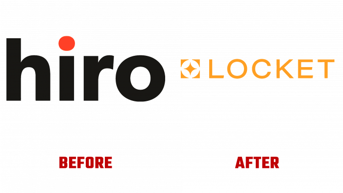
Hiro, a British company that provides technology insurance services, has recently been renamed Locket. It contributes to product development and brand expansion to distribute products and promote internationally.
From now on, the company offers improved service, including a better price for services, if customers actively protect their homes using smart technologies. There are also alternatives to complex and lengthy contracts, administration fees, and cancellation fees. This was made available through a subscription offer.
The most curious fact that the company made public is that to improve its services, it was decided to work together with a former criminal robber to help members of their association improve the safety of their homes. Just imagine how funny it sounds. On the other hand, this is a very effective solution because if we do not know our vulnerabilities, we have shortcomings in organizing the security of houses. A person who previously entered any house without problems knows, like no one else, what barriers need to be set up so that a house is a safe place.
To change the perception of the insurance industry by customers, the company put the question bluntly. How to improve the visual appearance so that consumers trust the insurance service, be proud, and not be afraid.
The medallion has become a symbol of reliability, correct association, and good memories. When people think about a medallion, pleasant moments from the past, nostalgia, comfort, sentimentality, hope, a sense of security come to their minds. This is the creation of a kind of aura of security and your beloved and dear place.
It was such deep thought that the initiators of the rebranding laid down, which surpassed all expectations.
London-based consultancy Ragged Edge has been working on a brand renewal project since early summer. Creative agents wanted to create fundamentally new, fresh, unexpected things, and they did it very well.
A qualitative new brand positioning is behind the new design.
Initially, the logo was a set of black letters with lowercase letters and the only bright accent – an orange dot above the “i.” In addition, the name Hiro is rather short, which influenced the choice of a compact graphic element.
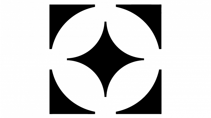
Today there is an icon and slender letters without any additions on a pale orange background. The medallion symbol looks like a four-pointed star, squeezed into a circle formed by the rounded corners of a square. The icon’s design was made by subtraction of shapes so that the spaces in the square’s space neatly connect the invisible circle and the square itself while focusing on the star.
Such a logo promises success for the brand because looking at it; you want to think about various pleasant moments and episodes from life that brought positiveness, and certainly not about insurance.
A beautifully played metaphor with color and font matching one hundred percent reflects a new look at the insurance industry.
