


In the old days, complex and detailed logos were the norm for many businesses. This era was when corporations sought to cram their logos with excessive information. The goal was clear: to stand out, resonate emotionally, and cement their identity in their audience’s minds. During this period, it was safe to experiment with intricate designs, as adapting to digital technology was not an issue. The need to provide an eye-catching design for an app icon or mobile display was not a challenge brands faced.
As the technology landscape evolved and consumer preferences changed, the trend of detailed logos began to wane. The modern era favored minimalism. The main concern now became creating an easily recognizable logo that could be adapted to various digital platforms. Most modern logos gravitate towards a straightforward design, often just shapes or word marks devoid of unnecessary embellishments.
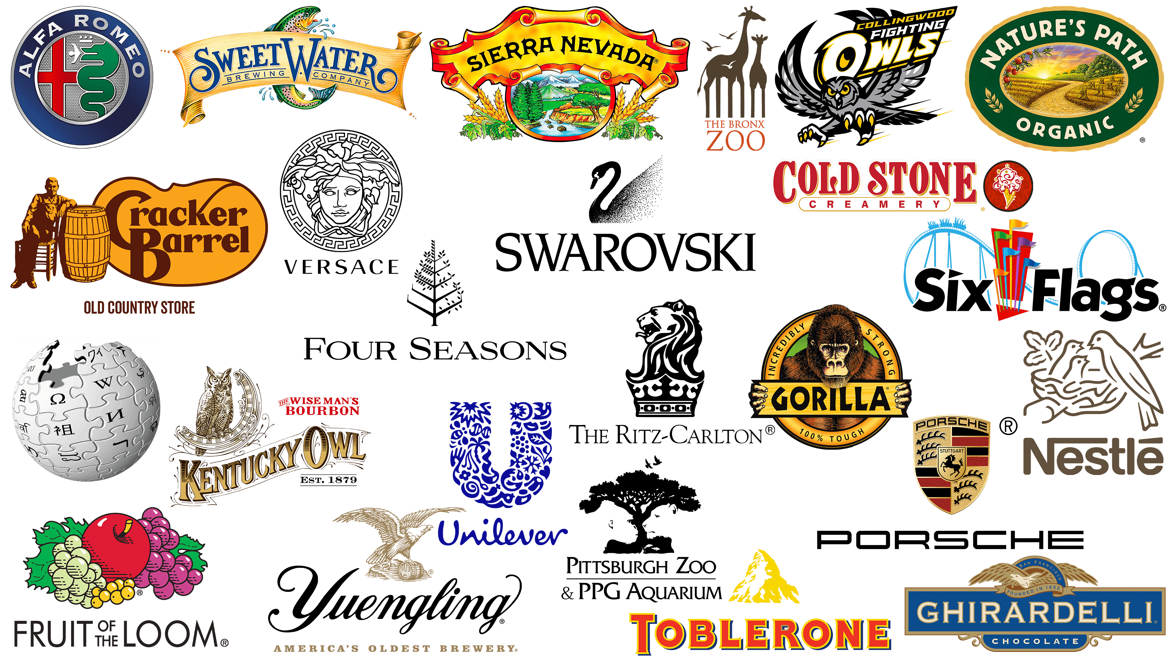
The branding world hasn’t completely said goodbye to multifaceted logos. Some brands today still retain intricate designs that testify to a bygone era or to the uniqueness of their history. When it comes to branding, you can still find examples of such detailed logos today that have survived shifts in design aesthetics.
Alfa Romeo
![]()
Alfa Romeo is a brand that has a rich heritage of automotive excellence. Founded in 1910, the Italian automaker has retained several key components of its corporate identity over the years, though these elements have been tweaked to adapt to modern requirements.
One of the most striking features of the Alfa Romeo emblem is the use of the snake Biscione, an image firmly associated with Milanese legends. This symbol, inspired by the Filarete Tower of Biscione Visconteo, emphasizes the brand’s geographic connection to Milan and features a fascinating tale of a huge snake devouring a man. Incorporating folklore and place into the brand image links historical narratives and contemporary identity, differentiating Alfa Romeo from its competitors.
The architectural reference to the Filarete Tower reinforces the brand’s cultural depth. This reference connects the emblem with a specific place, environment, or civilization that has stood the test of time.
The Alfa Romeo emblem is a sign of automotive luxury and excellence and a carefully crafted story about the brand’s heritage, place of origin, and unique position in the automotive industry.
Bronx Zoo
![]()
The Bronx Zoo emblem is an elegant, layered logo, similar to that of the Pittsburgh Zoo. Dating back to 1899, the Bronx Zoo has grown into a renowned wildlife sanctuary and one of the most extensive places in the United States to observe many animal species.
Like the Pittsburgh Zoo’s highly detailed and engaging logo, the Bronx Zoo logo features images of various animals, including birds and giraffes. However, the design becomes particularly intriguing in its nuances. Within the giraffes’ tall legs lurks a shrewd observer.
This sophistication in the emblem’s design serves two purposes. First, it reflects the zoo’s geographical location, intertwining with the nature the institution seeks to preserve. Second, it encourages viewers to look more closely, discover the emblem’s hidden elements, and explore the zoo’s wonders.
Cold Stone Creamery
![]()
Fans of frozen goodies are likely to love the Cold Stone Creamery logo. The logo is synonymous with quality and enjoyment and is considered a leader among ice cream brands, especially in the United States.
The international ice cream chain was founded in 1988, and its logo exudes vintage charm, hinting at a heritage that may seem much older than it is. The genius of the Cold Stone Creamery brand lies in its combination mark: a detailed image of an ice cream cone adorned with red dynamic swirls that seem to dance around the creamy treat. This vivid image seamlessly combines with an exquisite serif wordmark in passionate red.
The choice of colors, especially the vibrant red, and the careful detailing of the design evoke a sense of delight and excitement. This visual delight, like the brand’s delicious cocktails, is a testament to its commitment to creating memorable customer experiences.
Collingwood Fighting Owls
![]()
In sports branding, team logos are particularly intricate and stand in contrast to those in e-commerce and retail. These logos are carefully crafted to appeal to a wide range of viewers.
The Collingwood Fighting Owls, a college soccer team, strategically chose a colorful owl as the centerpiece of their branding. This choice isn’t just aesthetic: the detailed owl image symbolizes the team’s spirit and tenacity. The logo’s intricacies give the owl a dynamic feel and suggest a rapid descent towards the goal.
The lines around the bird indicate its quick movement and agility, reinforcing the sense of action. These designs make the logo visually appealing, which is characteristic of the sport.
Cracker Barrel
![]()
Cracker Barrel holds a special place in the pantheon of American culinary establishments, in part because of its intricate logo, which reflects a deep heritage. Founded in 1969, Cracker Barrel serves as both a Southern rustic gourmet restaurant and a retail boutique, offering diners a variety of gifts and accessories.
The focus on Southern traditions extends beyond the food; it permeates the establishment’s atmosphere. The interior décor echoes this Southern style, creating an atmosphere of hospitality and homeliness reminiscent of an earlier era in American history.
The logo, with an elaborate color palette dominated by brown and gold, depicts an elderly gentleman casually seated in a wooden chair, evoking ancient times. His posture, leaning on a large barrel, suggests a leisurely, less hurried time. The intricate details of his attire, from the folds of the cloth to the cut of his coat, add complexity to the emblem, making it rich in subject matter.
Next to this image is an eye-catching stylized wordmark. It uses an innovative design technique: the letters “B” and “C” are artfully combined, giving the emblem an artistic flair that contrasts with its vintage appeal.
Four Seasons
![]()
Recognized worldwide as the epitome of luxury and hospitality, Four Seasons has been a symbol of the hotel and resort industry since its founding in 1961. With over one hundred hotels worldwide, this prestigious hotel chain has become the preferred choice for many, including famous personalities and celebrities.
The brand name “Four Seasons” perfectly captures the essence of timeless hospitality. This promise of unwavering luxury and comfort guarantees guests unrivaled service in any season and weather.
A closer look at the Four Seasons logo reveals carefully crafted design details consistent with the brand. It’s an exquisite wordmark with serifs topped with an image of a tree. It’s not just any tree: carefully segmenting its leaves illustrates the cyclical nature of the four seasons. Each quadrant of leaves indicates a particular season, from spring blossoms to winter snow on the branches.
Fruit of the Loom
![]()
Fruit of the Loom is a testament to the textile industry’s consistent quality and brand recognition. The American company, founded in 1851, has been observing changes in the fashion world for over a century, staying true to its core emblem. The company offers a range of products, from casual wear to formal corporate attire.
The emblem representing Fruit of the Loom today is bright and memorable. The chosen image is simply a nod to the brand name and an artful depiction of various fruits. Each fruit is depicted with meticulous detail, with varying levels of shading that give depth and dimension to the entire design. This detailing works perfectly with the brand name placed underneath the fruit. The typography is a sleek sans-serif font, giving the ensemble a modern look.
Combining intricate artwork and a modern typeface balances traditional art and modern aesthetics. In an industry where innovation is key, the Fruit of the Loom logo is a masterclass in preserving heritage while embodying modernity.
Ghirardelli
![]()
The Ghirardelli chocolate logo is an interesting example of an intricate brand emblem, especially in the confectionery sector. Established in 1852, the brand remains a staple in American households and is part of the renowned Lindt & Sprungli portfolio.
Ghirardelli’s visual identity combines complex elements that reflect the company’s historical roots and current position. The logo features a wordmark in banner form, complemented by an ornate bird image above. This avian element adds complexity to the multifaceted design.
The logo features additional elements, including the bird and the brand name. The “San Francisco” text is prominently placed, indicating the brand’s geographical origin. The year of the brand’s founding is also noted, underscoring its long-standing presence in the confectionery market.
The Ghirardelli logo is a rich tapestry of visual cues that collectively tell the story of the brand’s history, regional connections, and continued presence in the marketplace.
Gorilla Glue
![]()
Synonymous with strong glue, Gorilla Glue is an American brand that has carved a niche in the market. Although the brand has gained fame for its flagship product, the original Gorilla Glue, launched in 1994, its offerings are not limited to a single product line. The portfolio has expanded to include a wide range of products, including epoxy formulations and specialized tapes.
At the heart of this consistent image is the Gorilla Glue logo, a detailed gorilla encased in a circular icon that reflects some of the product’s unique benefits. The depicted gorilla holds a banner with the company name in large font.
The logo’s intricacy, from the mesmerizing gorilla image to the carefully chosen fonts, is designed to capture the viewer’s attention, especially in a retail environment where on-shelf availability is key.
Kentucky Owl Bourbon
![]()
As one of the most iconic and detailed logos, the Kentucky Owl Bourbon emblem is rich in intricacy, rarely seen in modern branding. Created as a timeless bourbon brand, the emblem is imbued with a deep heritage and sense of vintage.
This venerable bourbon company showcases a carefully crafted wordmark that blends with an owl. Noteworthy is the subtlety of the owl image, the carefully crafted shading, and the nuances that bring it to life. Due to the level of detail, this design’s depth can make zooming out on smaller displays difficult.
The combination of vivid imagery and a distinctive word mark gives the brand an aura of grandeur and antiquity. This emblem pays homage to the company’s historical past.
Nature’s Path
![]()
Nature’s Path is a respected organic food company with a rich family-values pedigree. This company is best known for its flavorful breakfast cereals. The product range doesn’t end there: the company has diversified into granola bars. Since its inception in 1985, the company has taken amazing care to preserve many aspects of its logo.
Looking closely at the modern logo, you can see an ellipse-shaped badge. This symbol features a carefully crafted image of a winding trail through an unspoiled natural environment. This image fulfills a multidimensional role. It blends seamlessly with the brand name and emphasizes the organic ingredients that underpin the company’s diverse product range.
Nestle
![]()
If you delve into the world of iconic emblems, the Nestlé logo stands out not so much for its complexity but for its rich history and evolution. Since its founding in 1866, this renowned chocolate company has undergone several visual transformations while retaining the core elements that trace its roots.
Central to the logo is an image of a mother bird caring for her two chicks, symbolizing care, nourishment, and family bonds. This image was not chosen by chance; it goes back to the family coat of arms of the company’s founder, Henri Nestlé. Over the years, the emblem has been modernized to better align with modern aesthetics while retaining these fundamental components.
Combining heritage and modern design, the Nestlé logo represents the brand’s longevity and commitment to tradition. It is a beacon of how a company can visually preserve its core values while adapting to changing conditions.
Pittsburgh Zoo & Aquarium
![]()
Intricate emblems are not uncommon in zoological institutions. A prime example is the Pittsburgh Zoo and PPG Aquarium, founded in 1898. This enduringly popular institution attracts many visitors and boasts an impressive collection of more than 4,000 animals from 475 species.
The visual style of this outstanding zoo incorporates several sophisticated elements that reflect its essence. The emblem’s dominant element is a detailed image of a tree, with several birds gracefully taking flight. While these elements create an eye-catching image, the true brilliance lies in the logo’s use of negative space. The ingeniously created space subtly reveals images of a monkey and a lion frozen in an ethereal gaze. This fantasy interaction showcases the zoo’s diverse inhabitants and evokes wonder and curiosity.
The innovative design demonstrates the zoo’s commitment to conservation, education, and fostering an appreciation for the natural world. The Pittsburgh Zoo and PPG Aquarium logo blends traditional design elements with creative nuances to create a memorable logo that reflects the zoo’s mission and history.
Porsche
![]()
In the luxury automobile market, Porsche stands out from the crowd. Its brand is synonymous with engineering excellence and impeccable design and reflects a rich history. While the current emblem may seem more streamlined than previous versions, nothing about it is complicated and reminds you of Porsche’s storied past.
The emblem, comprised of various elements, indicates the key geographical locations in Porsche’s pedigree. The striking shield is rich in colors and motifs reminiscent of traditional Württemberg emblems. This design choice is no accident, but respecting a region is integral to Porsche’s history.
At the center of this exterior shield is another, more compact emblem. This interior motif draws inspiration from the Stuttgart coat of arms, further tying the brand to its roots. The Porsche logo is not just a sign of luxury; it invites you on a journey through time and place, each detail telling a chapter in the brand’s illustrious history.
Ritz-Carlton
![]()
A heavyweight on the international hospitality scene, The Ritz-Carlton has established itself as the quintessential American luxury hotel brand, offering unparalleled experiences. The creation of this renowned brand began in 1983 after a strategic acquisition. During this period, the existing owners parted ways with the coveted Ritz-Carlton name and transferred ownership of the Massachusetts hotel to new investors.
The brand is an important part of Marriott International’s extensive portfolio. The visual representation of the Ritz-Carlton sets it apart in a field often dominated by convention. The Ritz-Carlton emblem is a finely detailed lion elegantly perched on a regal crown. The significance of this intricate design cannot be overemphasized, as it serves a multifaceted function.
The lion, traditionally a symbol of courage and nobility, echoes the brand’s bold approach to redefining luxury hospitality. The crown signifies not only the majestic quality of the service but also subtly hints at the regal treatment of guests. It is a conscious design decision to express the brand’s philosophy, woven from threads of unrivaled sophistication and an unwavering desire for perfection. The Ritz-Carlton logo is more than just a visual element; it is an overarching story that tells the brand’s story.
Sierra Nevada
![]()
Many emblems in the brewing industry are rich in tradition and detail, and the Sierra Nevada is prominent among them. Founded in 1979, Sierra Nevada may be younger than other venerable craft brewing giants, but its symbol evokes a history as ancient and captivating as those of its predecessors.
At the heart of Sierra Nevada’s emblem is its resounding name, elegantly presented on a golden-yellow scroll. Directly beneath the brand’s lettering is an elaborate portrait, a vivid depiction of towering trees, majestic mountains, and a meandering creek, each element adding depth to the brand’s story. Taking center stage are whimsical motifs of hops and barley, symbolizing the basic elements behind Sierra Nevada brewing.
Six Flags
![]()
Six Flags is one of the leading theme parks in North America. Founded in 1961 in Texas, the brand has grown exponentially, expanding into various U.S. states and into neighboring countries such as Mexico and Canada.
This growth trajectory has positioned Six Flags as an enviable player in the entertainment industry. The company currently owns the most theme parks and water parks among its competitors.
The Six Flags logo captures the essence of the brand. The intricate detail, in the form of a roller coaster silhouette, in the background of the brand name, conveys the excitement and thrill inherent in theme parks. But it’s not just about the rides: the emblem symbolizes the brand’s deep connection to Texas’s rich history. Six flags, each in a unique color, are strategically placed between the brand’s name. More than just decorative elements, these flags symbolize the six nations that have flown their flags over Texas, paying homage to the state’s complex mosaic of cultures and traditions. Through this symbolism, the brand unites its exciting offerings with historical significance.
Swarovski
![]()
The Swarovski emblem may seem less intricate than some logos, presenting a modern, uncomplicated design. However, its simplicity is deceptive and, upon closer inspection, reveals deeper meanings.
Swarovski was founded in 1895 and quickly became an impeccable manufacturer of crystal, jewelry, and fashion. The brand has become a hallmark of stunning crystal gemstones and high-end accessories favored by fans worldwide.
A swan’s graceful figure takes center stage if we delve deeper into the emblem’s composition. Chosen as the company’s mascot, the swan symbolizes eternal beauty and grace, aligning fully with the brand’s ethos. But this swan is not just an ordinary image. A closer look reveals that the swan’s outline comprises many tiny dots. These dots, though subtle, are integral to the logo. They echo the brand’s renowned shimmering crystals, illustrating its meticulous attention to detail and commitment to perfection.
This emblem is a testament to Swarovski’s commitment to excellence. It reflects its history and combines artisanal craftsmanship with timeless elegance.
Sweetwater Brewing
![]()
Sweetwater Brewing holds a special place among the intricate emblems in the beer industry. Founded in 1997, the brand offers a range of unpasteurized beers.
The company’s emblem draws inspiration from Sweetwater Creek, a place that holds sentimental value for one of the company’s founders because of his fond memories of canoe rafting. This connection to the place is reflected in the emblem’s choice of symbols, infusing it with nostalgia.
The emblem departs from the current minimalist design trends, favoring a more elaborate classical layout. At the heart of the design is an old-fashioned scroll-style banner with the company name prominently displayed. Behind the banner is an intricate fish image, indicative of the aquatic activities that inspired the company’s creation. Combining these elements draws the viewer’s attention while providing insight into the brand’s unique background and values.
Toblerone
![]()
The Toblerone logo consistently stands out among its intricate symbols, grabbing attention with its masterful use of negative space. This iconic emblem belongs to the Toblerone brand, which originated in 1908 in Switzerland. The choice of the mountain in the design is not accidental: it emphasizes the brand’s Swiss origin.
Although the logo seems simplistic compared to others, it lacks the complexity of some. A closer look reveals a vertically standing polar bear nestled in the folds of a golden mountain. This is not just a design move but an allusion to Bern, Switzerland’s capital, where Toblerone took its first steps. Bears have significant cultural resonance in Bern and symbolize its history and legends.
The logo’s combination of mountain and bear emphasizes the brand’s origins. It demonstrates a brilliant ability to incorporate dual imagery into the design.
Unilever
![]()
The Unilever logo is undoubtedly one of the most complex and multifaceted in the modern corporate world. Its complexity comes from its depth and breadth of detail.
Originating from the UK, this multinational giant operates in many industries. It is not only a manufacturer of delicious ice cream and food products but also a producer of essential cleaning and coveted beauty products, demonstrating the diversity of its portfolio.
The Unilever logo has remained relevant since 2004, clearly reflecting the extensive range of products under its banner. The symbolic letter “U” is a treasure trove of embedded imagery, from the intricacies of the DNA helix to the appeal of lips to the organic touch of a leaf.
Such a logo emphasizes the brand’s broad reach in the consumer market and has an inherent magnetism that draws viewers’ attention.
Versace
![]()
Since its inception in 1978, Versace has become a leader in Italian luxury fashion. Known for its bold color palettes and luxurious patterns, Versace has never shied away from making a statement. While many fashion brands favor minimalism, Versace takes a different approach, utilizing intricate details in its branding.
The logo that serves as Versace’s face is far from ordinary and is rooted in classical mythology. Drawing inspiration from the enigmatic figure of Medusa, the logo seeks to embody a magnetic charm that can mesmerize the viewer. The image of this mythical figure is encased in an ornate circle, replete with intricate patterns, adding complexity to the emblem.
The Versace logo is undeniably eye-catching in an industry where visuals speak volumes. The detailed image of Medusa, surrounded by a skillfully crafted circle, commands attention, in line with the brand’s magnetic-attraction philosophy. The Versace emblem is a harmonious blend of complexity and brand ideals, symbolizing the brand’s heritage of luxurious boldness.
Wikipedia
![]()
Recognized by digital enthusiasts seeking knowledge across many subjects, Wikipedia is a beacon of freely accessible, multilingual knowledge. Since its inception in 2001, this online platform has become an essential source of information, carving a niche among Internet users worldwide.
Wikipedia’s emblem features an intricate design. It depicts a globe carefully assembled from individual puzzle pieces, each decorated with unique glyphs. These glyphs are more than just decoration; they play a crucial role in reflecting the platform’s essence.
This emblem reflects Wikipedia’s mission to disseminate diverse knowledge and its dynamic nature, reflecting its constant growth and the collective contributions of its vast community of users.
Yuengling
![]()
The world of beer and brewing boasts a rich tapestry of intricate logos, each a testament to the heritage and tradition of the establishments they represent. These symbols serve not only as branding but also as historical markers, recalling the past.
Yuengling and Son, founded in 1829, is a beacon of longevity in the craft beer industry. Its enduring presence is reflected in an emblem that gracefully embodies the brand’s history.
The company’s name, elegantly inscribed on a golden yellow scroll-shaped banner, is in the foreground of the emblem. This design choice creates a sense of timelessness, testifying to the brewery’s historical path.
Beneath the colorful name lies a carefully crafted visual image of trees stretching into the sky, high mountains, and a flowing, serene stream. The centerpiece is an intricate depiction of hops and barley, symbolizing the company’s brewing foundation, established nearly two centuries ago.
The enduring presence of complicated logos
In an era when minimalism is gaining momentum, the familiarity of intricate logo designs offers a unique perspective on the essence of detailed branding. Although the trend leans towards simplicity, intricate logos have an undeniable appeal that cannot be overlooked.
They may not resonate with every brand, but for some, they play an important role in telling their story. These symbols aren’t just aesthetics; they carry the brand’s core values, history, and ambition.
When embarking on logo design, a brand must determine what message it wants to convey. A thorough design process is very important. An intricate design can be an advantage for brands based on tradition or for those seeking to create an aura of grandeur and sophistication. It sets them apart, demonstrating a commitment to excellence and attention to detail.
When designing logos, brands must strike a balance. They must consider whether a detailed emblem aligns with their brand description and can withstand the test of time in an ever-evolving marketplace.