


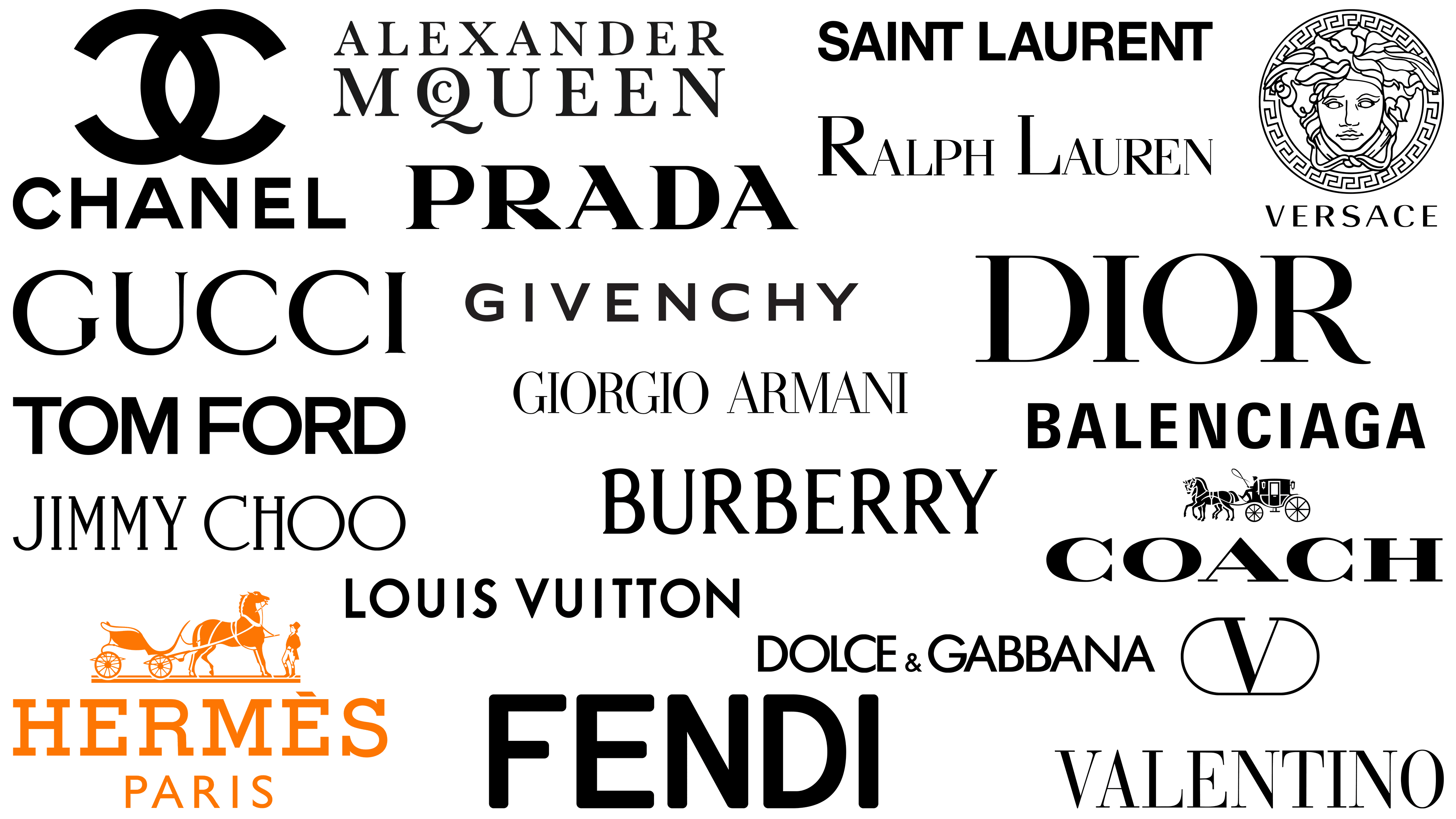
Logos of luxury and high-end fashion brands capture the attention of specific audiences, representing each brand’s unique qualities while fostering customer loyalty. These logos are essential in high fashion, where they serve as symbols of quality and exclusivity, reinforcing the brand’s reputation and standing in a competitive market.
Luxury fashion brands are dedicated to producing and offering high-end products, focusing on exceptional craftsmanship and attention to detail. They invest significantly in product development, utilizing advanced technology, meticulous craftsmanship, and premium materials to ensure that every piece meets high standards for aesthetics and comfort.
The design of these logos is carefully crafted to align with the brand’s image. Fonts are selected to evoke specific emotions or ideas, such as modernism or sophistication. At the same time, the minimalistic color palette often includes black, white, and metallic hues to convey a sense of luxury. The arrangement of lines, shapes, and space within the logo adds depth, making the design more dynamic and engaging.
These elements contribute to the logo’s effectiveness, transforming it from a simple emblem into a powerful representation of the brand’s identity. The detailed design captivates the audience, enhancing brand loyalty and solidifying the brand’s image as a leader in the luxury fashion industry.
Alexander McQueen
![]()
Founded by British fashion virtuoso Alexander McQueen, the brand’s logo represents his unique stylistic approach. Known for pushing boundaries using exaggerated shapes and advanced tailoring techniques, the brand’s visual style reflects his design ethic. One element of the logo is the intricate design of the letter “Q,” with curved lines that align with the brand’s penchant for unconventional shapes.
Another interesting aspect of the logo design is the incorporation of the letter “C” from the word “McQueen” into the outline of the letter above “Q.” This is not just an aesthetic choice but a thoughtful design decision in line with the brand’s philosophy, by combining two letter elements, the logo hints at the brand’s commitment to fusing traditional fashion principles with futuristic concepts.
This choice of logo serves as an aesthetic echo of what the Alexander McQueen brand represents: innovation rooted in a deep understanding of fashion history.
Balenciaga
![]()
Founded in 1919 in Spain, Balenciaga is a French luxury fashion house headquartered in Paris. Unlike in traditional luxury fashion, Balenciaga’s logo does not use complex serif fonts. Instead, it uses a bold sans-serif font, departing from the traditional luxury fashion aesthetic.
The logo’s simplicity is striking yet conveys a strong sense of modernism, embodying the company’s commitment to elegant, sophisticated design. The absence of serifs and capital letters gives the logo a streamlined, futuristic look. More than just a visual gimmick, it speaks to the brand’s innovative spirit and willingness to break traditional norms.
Using a bold sans-serif font, typically associated with modern design trends, underscores Balenciaga’s desire to stand out in an industry that often relies on historical and classic elements. It is a strong visual cue to consumers, indicating the company’s focus on a modern, rational aesthetic. This allows the brand to appeal to a segment of the population that values innovation and modernity in fashion.
Switching to a sans-serif font may seem insignificant, but it carries significant implications. It sets the brand apart from its competitors and follows the principles of minimalism. This choice is important for increasing brand recognition and building brand identity in a cluttered marketplace where standing out means taking risks.
Burberry
![]()
Founded in 1856 by Thomas Burberry, Burberry has become the leading luxury fashion house in the UK. The brand is constantly changing its image to remain relevant, primarily to resonate with a new, younger demographic.
The latest version of the Burberry emblem is a streamlined wordmark that features the brand’s name in capital letters. The design, characterized by clear serifs in the lettering, creates a sense of strength and modernity. This positions Burberry as a cutting-edge company in the luxury fashion sector.
The company previously operated under the old logo, which provided significant brand recognition and credibility. Despite this, the updated logo emphasizes the company’s forward-looking vision, signifying its commitment to innovation and future growth.
The logo’s modern uppercase font aligns with contemporary design aesthetics and targets younger consumers. The sharp serifs that usually characterize the traditional style create a sharp contrast that enriches the logo, making it more versatile and inclusive. The thoughtful fusion of old and new elements in the emblem design is a tacit testament to the brand’s enduring heritage, while also marking its transition to future endeavors.
Chanel
![]()
Founded by Coco Chanel in 1910, the French luxury fashion house Chanel has become a model of elegance and sophistication. Specializing in luxury women’s clothing and accessories, Chanel has also left an indelible mark on haute couture. It has significantly impacted the fashion industry’s definition of luxury and elegance.
The defining element of the Chanel logo is the two intertwined “C” letters, which serve several functions. First, the intertwined “C’s” serve as a visual reference to the brand’s founder. Secondly, the monogram radiates sophistication and stability, which aligns with the brand’s ethos. The monogram design resembles the links of a chain, adding another layer of symbolism that evokes interconnectedness and unity.
Beneath the intertwined “C” letters, the word “Chanel” is often presented in a straight sans-serif uppercase font. This choice of font is far from arbitrary. It is a deliberate decision to demonstrate authority, strength, and consistency. These visual elements reflect the brand’s unwavering commitment to quality and grandeur.
Over the years, Chanel’s influence has extended beyond France to international recognition. From iconic clothing lines to unforgettable fragrances, Chanel products are synonymous with quality and sophistication. The brand follows trends and often sets them, constantly changing the haute couture style.
Coach
![]()
Coach, often called Coach New York, is an American brand that has carved a niche in the luxury fashion industry. It specializes in leather goods and ready-to-wear collections. Originating in an upper-class aristocratic atmosphere, the brand has a long heritage in the fashion industry, as evidenced by its quality products and distinctive logo. The emblem, designed by Bonnie Cashin, serves as a historical narrative, reflecting the luxurious, personalized clothing that was once the hallmark of the upper classes.
The verbal component of the Coach emblem, a bold, broad typeface complemented by exquisite serifs, exudes an aura of perseverance and influence. This design choice reflects the brand’s commitment to continuous quality and a strong identity. The essential nature of the lettering gives the logo a sense of vitality, letting consumers know that Coach is a brand that stands the test of time.
The narrative element in the logo, evoking historical craftsmanship and elegance, fits well with the brand’s marketing and product strategies. Coach is known for producing products crafted with tradition and quality in mind, but adapted to modern requirements. All products, from bags to clothing, bear the mark of meticulous craftsmanship, which aligns with the image embedded in the logo.
Dior
![]()
Founded in 1946 by Christian Dior, the French multinational fashion house Dior is a model of minimalism in logo design. Focused on exclusivity, Dior products are sold only in specialty stores, which enhances their appeal to customers who value unique, specialized offerings. The simplicity of the Dior word mark conceals its influence and serves as an authoritative emblem in the fashion world.
The logo’s design elements are carefully chosen to blend tradition and modernity. The graceful serifs in the mark point to classic design elements, making the brand one that respects the pillars of fashion history. Conversely, the logo’s streamlined composition gives it a timeless appeal, marking Dior as a brand unconstrained by fleeting trends.
The logo’s delicate balance between old and new echoes Dior’s design philosophy. The brand has long been recognized for combining classic elements with avant-garde design in clothing and footwear. Whether it be haute couture collections or ready-to-wear lines, Dior is constantly pushing the boundaries while maintaining an air of sophistication and class. The casual yet powerful logo complements the brand’s commitment to quality and craftsmanship.
Dolce & Gabbana
![]()
Dolce & Gabbana, often abbreviated as D&G, is the quintessential Italian luxury fashion brand. Founded in 1985 by designers Stefano Gabbana and Domenico Dolce, the brand has shaped its identity through visual branding elements. The brand’s official logo doesn’t deviate drastically from industry norms but includes unique details that make it special.
The logo highlights the founders’ and brand names in bold, sans-serif type. The letters are spaced tightly together, reducing the usual space between characters. This design choice creates a sense of unity and cohesion, almost forcing the two names to merge into a single name.
A distinctive feature of the logo is the diminutive ampersand in the center of the two names. This symbol does not simply connect the names of the company’s founders but is a focal point that draws attention to the collaborative spirit of Stefano Gabbana and Domenico Dolce. The ampersand is more than just a connection; it symbolizes the partnership and shared vision that has driven the brand since its inception.
Fendi
![]()
Founded in Rome in 1925 by Adele and Eduardo Fendi, luxury fashion house Fendi has carved out a niche, primarily in the footwear, accessories, and watch markets. The brand began as a high-end store specializing in fur and leather goods. Fendi is derived from the names of its founders, reinforcing the brand’s personalized approach and heritage.
The Fendi emblem has evolved while maintaining the same essence of sophistication and sustainability. The emblem utilizes a bold sans-serif font, creating an aura of authority and determination. This strong font serves as a visual element and expresses the brand’s character and values.
The Fendi logo’s color scheme is a classic black-and-white combination. This choice is practical yet impactful, allowing the logo to remain versatile and blend easily into various products and materials. Whether embossed on leather or engraved on a watch, the emblem retains its distinctive features, emphasizing the brand’s commitment to consistency and quality.
Fendi has diversified its range from fur and leather goods to other luxury goods. Despite the expansion of the range, the core ethical principle of high-quality craftsmanship remains unchanged and deeply rooted in the company’s founders’ vision. The unwavering commitment to the highest quality is evident in every stitch, material, and, of course, in the brand’s emblem.
Giorgio Armani
![]()
Emerging from Milan in 1975, Giorgio Armani became Italy’s second-largest luxury clothing manufacturer, second only to Prada in terms of influence and consumer engagement. Characterized by stylish couture and global resonance, Armani has carved a niche beyond simple clothing, becoming an emblem of elegance and superior craftsmanship.
The brand’s identity is visually based on its text logo, characterized by graceful, sans-serif, arc-shaped symbols. These characters artfully balance thick and thin lines, creating a minimalist yet eye-catching visual identity. The simplicity of the text design creates a sense of sophistication and refinement, effectively communicating the brand’s core values without using complex details.
In addition to the text logo, Armani utilizes an updated eagle emblem in various brand materials. This secondary design element enriches the brand’s visual vocabulary, introducing variety and harmonizing with the minimalist aesthetic of the main logo. Far from being a mere add-on, the eagle emblem echoes the themes of freedom and aspiration, subtly reinforcing Armani’s image as a brand that empowers through style.
Givenchy
![]()
Originally from France, Givenchy is one of the pillars of luxury fashion, gaining recognition for its haute couture creations and ready-to-wear range. It’s not just clothing: the brand extends its luxury to accessories, reinforcing Givenchy’s sense of elegance and sophistication.
With a clean design, the logo lacks flashy embellishments and favors clarity, suggesting austerity and seriousness. A straightforward text logo suggests that the company values elegance over fleeting trends.
In addition to the main wordmark, Givenchy is also distinguished by a second element, the monogram “G.” This iconic emblem adorns many of the brand’s garments, serving as an alternative to the main logo and, at the same time, complementing it. The design is reminiscent of Celtic knots, with complex symmetry and mirroring that give depth and meaning to the brand’s persona. This representation goes beyond the visual; it speaks to the brand’s skillful craftsmanship and attention to detail.
Gucci
![]()
The Gucci brand, founded in 1921 by Gucci Gucci, is the epitome of Italian luxury fashion. Known for its superior quality and authoritative designs, the brand encompasses everything from accessories to clothing, all marked by its distinctive features. One of the key differentiators is the polished, crisp wordmark logo, which exudes minimalism by emphasizing the space between characters to create a harmonious effect.
The wordmark’s simplicity blends perfectly with the brand’s other defining element, the intertwining “G” of its monogram. This feature reflects the brand’s penchant for art and design and serves as an aesthetic anchor for many of the company’s products. These two logo elements serve not only as identifiers but also reflect a complex blend of artistic values and a commitment to high-quality craftsmanship.
The brand’s influence extends not only to Italy but also to the rest of the world. The Gucci name can be found both in boutiques in upscale neighborhoods and on red carpets. Over the decades, the brand has evolved with various product lines, including bags, shoes, fragrances, and even home décor items.
Hermès
![]()
Founded in 1837, Hermès differs from many competitors in the luxury fashion arena by its unique image and color scheme. Especially noteworthy is the use of a bright orange hue in the emblem, a departure from the usual black-and-white palette of many luxury brands’ logos. Such a bright color choice gives the brand personality.
The emblem has remained virtually unchanged since the 1950s and has a distinct design element: the Duke’s horse-drawn carriage. This image has great historical significance, as Hermès originally produced high-quality harnesses and bridles for horse-drawn carriages. Thus, this visual element reflects the brand’s roots and long-standing commitment to quality and craftsmanship.
Beneath this historic image is the company name in bold serif typeface. The inscription “Paris” below it complements it, signifying the brand’s French origins and enhancing its global appeal.
Jimmy Choo
![]()
Founded in 1996, Jimmy Choo has become a well-known British luxury brand, especially famous for its handbags and shoes. The brand’s founding was anything but ordinary: founder and shoemaker Jimmy Choo began selling through local market stalls in the UK.
The Jimmy Choo logo, noticeably different from the emblems of many other luxury brands, is characterized by a playful aesthetic. The large, round “O” letters that adorn the brand’s name are eye-catching. These large loops are visual landmarks and signals of the brand’s character.
The lettering in the logo is characterized by flowing lines that create a sense of free movement, which complements the enlarged “O” elements. This synthesis creates an impression of both creativity and sophistication, which is not often found in the luxury segment.
Louis Vuitton
![]()
Louis Vuitton, synonymous with luxury fashion, uses a deceptively simple logo with tremendous power of recognition and impact. Although the brand is best known for its iconic “LV” monogram, which is a symbolic combination of the letters “L” and “V,” its official logo is a word mark in a sans-serif font that, at first glance, appears minimalist. However, this simplicity should not be mistaken for a lack of depth or impact.
The modern Louis Vuitton logo is characterized by flowing lines and precise letter spacing, giving the design strength and understated elegance. Combined with the famous “LV” monogram, the overall brand identity takes on a striking power and makes a lasting impression on consumers. In monogram and wordmark form, the logo makes it clear that the customer is dealing with a brand that has stood the test of time and has become an innovator in the fashion industry.
Since Louis Vuitton was founded in 1854, the brand has had plenty of time to establish itself as a leader in luxury fashion. The brand’s longevity is emphasized not only by the quality of its products but also by its enduring visual identifiers. Combining the monogram and word mark creates a rich tapestry of design elements that reflect the brand’s history and contemporary relevance.
Prada
![]()
As an icon in luxury fashion, Prada represents an intriguing departure from the typical elements of luxury branding. As an industry leader, Prada uses a serif font in its logo.
But what sets Prada’s font apart is its distinctive geometric inclusions. For example, the serifs on the different letters have distinct geometric shapes: on the letter “A,” bold triangular serifs, and on the letter “R,” rectangular serifs. This combination of classic and modern design attributes is eye-catching and confirms the brand’s forward-thinking ethos.
Ralph Lauren
![]()
Since its inception in 1967, Ralph Lauren has consistently used its brand elements. This consistency in brand representation speaks to a deep-rooted sense of heritage and an unwavering ownership of its message of strength and innovation. Over the years, the limited changes to brand elements reflect its commitment to continuity and consistent quality.
The graphic image of a horse plays a key role in the brand narrative. The emblem, reminiscent of old-world charm and sophistication, transports consumers to an era of elegance and grandeur. It resonates with the equestrian lifestyle, often associated with the upper class and sophistication. It aligns organically with the brand’s positioning as an elite manufacturer of clothing and goods for outdoor activities.
The word mark and the image of a horse are harmoniously combined, creating a brand image of rich traditions and a forward-looking approach to fashion. The wordmark appeals to those who appreciate the subtlety of elegant typography.
Tom Ford
![]()
Despite being a relatively recent entrant into the luxury fashion market, Tom Ford has quickly gained notoriety and become a prominent player in the luxury apparel market. Acquired by Estee Lauder in 2022, the brand has expanded its reach while maintaining its original focus on tailored and custom clothing.
Before creating his brand, Tom Ford was associated with Gucci, where he developed a distinctive style that laid the foundation for his future brand. This experience significantly influenced the development and personality of the Tom Ford brand.
The Tom Ford logo reflects the designer’s desire to carve out his path in fashion. Despite its simplicity, the emblem uses a clean, modern wordmark that speaks volumes. The lettering is done in a confident, robust manner, relying on minimalism, making it eye-catching and unforgettable.
Valentino
![]()
Founded in 1960 by Valentino Garavani, Valentino has become a symbol of Italian elegance and sophistication. Its logo features several familiar elements often found in high-end fashion brands, including distinctive serif lettering and a simple yet elegant black-and-white color scheme.
The monogram at the top of the logo sets Valentino apart from its competitors in the luxury fashion arena. The letter “V,” enclosed in an oval shape, is a powerful symbol that conveys the brand’s core principles of innovation, discovery, and inclusivity.
The serif font in the lettering conveys timeless elegance, while the black-and-white color scheme embodies classic sophistication. These designs harmonize to create a stylish emblem reminiscent of the brand’s Italian origins.
Versace
![]()
Appearing on the haute couture scene in 1978, Versace may not boast as long a legacy as some luxury brands, but it makes up for it with the rich history encapsulated in its logo. The Versace emblem is inspired by the Greek mythological figure of Medusa, known for her beauty. This design choice is a striking metaphor for Versace’s commitment to creating captivating designs that leave a lasting impression.
This emblem not only echoes the aesthetics of Greek mythology but also aligns with the company’s commitment to artistry and transformative power. This carefully crafted iconography conveys Versace’s commitment to creating clothing and artisanal products that mesmerize and enchant. It’s a bold visual statement that perfectly complements the brand’s equally bold apparel offerings.
Versace’s clothing lines echo the logo’s boldness, often featuring sharp cuts, bright colors, and intricate patterns. From red-carpet gowns to luxury casual wear, the brand’s products embody a desire for the unusual, further enhanced by high-quality materials and meticulous craftsmanship.
Yves Saint Laurent
![]()
In 1962, Yves Saint Laurent became the pinnacle of the haute couture industry, being recognized for various brand elements. The official logo often features the name “Saint Laurent” in a modern, bold capital-letter format. Sometimes, this inscription is accompanied by the word “Paris,” which emphasizes the brand’s geographical roots and global influence.
Many people recognize the brand by the vertical YSL monogram. This emblem stands out for its length and less traditional structure. Unlike traditional monograms, which often use symmetry or geometric patterns, the YSL monogram features a playful, unconventional design.
The distinctive modern word mark and vertical monogram indicate that the brand is deeply immersed in the principles of evolution and exploration. The wordmark reflects a contemporary aesthetic, while the monogram offers a unique interpretation that reflects the brand’s commitment to pushing boundaries.
Which countries have the most high-end fashion brands?
Luxury fashion brands with signature logos are present worldwide, but the concentration of designers in this high-end sector varies by geography. In particular, cities such as Milan, Paris, and New York are often called “fashion capitals, ” serving as innovation and design centers in the luxury fashion sector.
In contrast to these fashion capitals, South Koreans are the primary consumers of luxury goods globally. This intriguing disparity between places of creation and consumption highlights the complex and multifaceted nature of the global luxury fashion market.
Various factors contribute to individual cities’ designation as luxury fashion centers. For example, Milan, Paris, and New York have long histories of artisanal production, design innovation, and strong fashion cultures. The availability of skilled labor, access to high-quality materials, and high-profile events such as Fashion Week contribute to these cities’ luxury fashion status.
Consumer behavior in South Korea reflects a cultural emphasis on prestige and social status, often associated with luxury goods consumption. High-end fashion serves as a status symbol and drives demand for these products. With increasing affluence and cultural shifts, South Koreans have become key players in the luxury market, influencing trends and consumer behavior worldwide.
Common Features of Luxury Fashion Brand Logos
When it comes to high-end fashion brands, it is common to see similarities in logo design, given the shared goal of projecting luxury and exclusivity. Typical elements often found in the logos of high-end fashion brands include:
Monograms
Personal and professional branding frequently intersect in high fashion, making monograms a prevalent trend. These stylized initials or symbols serve dual purposes: they elevate the brand’s visual appeal while imbuing it with a sense of refinement and leadership. Monograms aren’t mere decorative elements; they encapsulate a brand’s core values and ambitions.
Notable luxury brands like Gucci and Louis Vuitton employ monograms to great effect. These aren’t arbitrary design choices but deliberate marketing techniques to capture and retain consumer attention. Through these unique identifiers, brands distinguish themselves from competitors, fostering brand loyalty and encouraging repeat business.
A well-crafted monogram acts as a visual shorthand for a brand, making it instantly recognizable. This instills a sense of trust and reliability, important factors in industries as competitive as high fashion.
Emblems
Emblems frequently appear as key elements in the branding of fashion companies, particularly those that have been around for a while. These graphical symbols aren’t merely decorative; they carry connotations of prestige and time-honored tradition. When consumers see these emblems, they often associate them with quality and reliability, key elements that differentiate one brand from another in a crowded marketplace.
Symbols like crests or shields evoke a sense of authority and financial well-being. Their historical roots in heraldry and coats of arms convey lineage, adding another layer to the brand identity. These elements speak to a particular consumer base that appreciates these values, establishing an immediate emotional connection between the brand and the customer.
It’s not just about the aesthetic appeal; these branding elements serve a functional role. They work to distinguish the brand in an increasingly competitive market, where standing out means the difference between thriving and merely surviving. Long-term success and market penetration.
Minimalism
Minimalism in logo design is often associated with quality and sophistication, especially in high-end fashion brands. This design choice is not arbitrary; it conveys enduring value and class. Simplified shapes and a basic color palette become tools to convey this sense of timelessness, making the brand instantly recognizable yet understated.
Using negative or white space is not just a design whim but a purposeful goal. An open area around logo elements can amplify the design’s impact, directing the viewer’s attention to key aspects of the brand identity. In a marketplace overflowing with visual stimuli, this can prove invaluable. White space essentially acts as a visual “pause,” allowing consumers to absorb the core brand message before moving on to the next stimulus.
While fashion trends are fleeting, minimalist design defies this norm and has consistently resonated with high-end fashion brands. It can anchor a volatile market where consumer preferences change rapidly.
Line work
Regarding luxury fashion brands, you can notice that their logos, as a rule, do not contain complex graphics and intricate shapes. The main element of design is often straight lines. Such minimalism pursues several goals. First, it reinforces the brand name, making it the centerpiece of the entire design. Thus, the name becomes visible, contributing to brand recognition.
At the same time, minimalism is by no means arbitrary or endowed with hidden meanings. Lines are not just design elements. They carry principles such as stability and steadfastness. In these uncomplicated lines lies the brand promise: consistent quality. Brands use this simplicity as an aesthetic choice and a signal of unwavering values.
The use of simple lines also contributes to the timeless nature of these luxury brands. Fashion trends come and go, but the basic lines that form the foundation of these logos remain unchanged. They defy the volatility of rapidly changing consumer preferences, remaining an anchor in a sea of fleeting trends.
Strategic typography
High fashion houses often choose serif fonts and typefaces for their logos, avoiding playful and fancy fonts. Such fonts fulfill not only an aesthetic role but also a functional one. They immediately convey qualities such as elegance, sophistication, and even exclusivity. Serif fonts convey craftsmanship, like an artist’s signature on a masterpiece, emphasizing a human approach to label design. On the other hand, serif fonts exude a classic mood, conveying timelessness and reliability.
The choice of fonts and the longevity of the logo design all help build and maintain the brand image. Fonts and durable logos serve as nonverbal cues that tell a story, shape perceptions, and ultimately play an indispensable role in brand positioning.
Decoding the Visual Language of Luxury Fashion Logos
The visual identity of high-end fashion brands is often created with meticulous attention to detail to evoke a sense of sophistication, power, and luxury. While many logos share common features, such as minimalism or a limited color palette, each conveys brand values through unique features.
The choice of colors, fonts, and graphic elements is far from arbitrary. Often, these choices carry a historical or cultural meaning that resonates with the brand’s target audience. For example, using monochrome colors or gold accents is not just an aesthetic decision; it is also associated with long-standing associations with luxury and exclusivity.
Typography also plays an important role. The choice of serif or sans serif fonts, the weight of the letters, and even the spacing between them can create a certain impression of the brand. For example, bold, minimalist fonts often indicate modernity and perspective, while complex, classic fonts can indicate tradition and heritage.
The geometry of a logo – the shapes and lines used – also contributes to brand perception. Symmetrical design or abstract shapes can evoke a sense of balance, dynamism, or innovation, reinforcing the brand’s personality.