The Wombles, beloved characters created by Elisabeth Beresford in 1968, have returned with a modernized logo that celebrates their environmental message while keeping their playful essence. Known for living on Wimbledon Common and recycling human waste, these fuzzy, pointy-nosed creatures have been cherished for generations, and the refreshed logo reflects their ongoing relevance in today’s eco-conscious world.
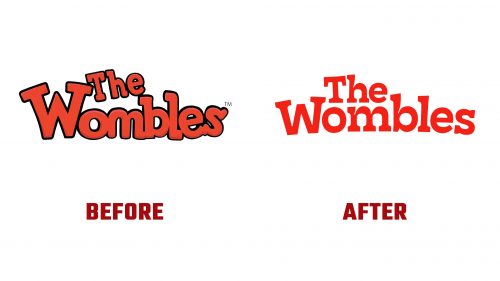
The original logo was playful and nostalgic, capturing the charm of the 1970s TV series and books that introduced the Wombles. It featured rounded letters, perfectly matching the characters’ whimsical nature and joyful adventures. The bright orange created a friendly, recognizable image, reinforcing their focus on environmental care and the mission to “make good use of bad rubbish.”
The new logo keeps that spirit but with a refined, contemporary twist. The signature orange color remains, ensuring continuity with the past, while the font has been updated to a sleeker, more structured typeface. The cleaner lines give the logo a more balanced look, with the updated typography still carrying a sense of fun but reflecting the Wombles’ growth and modern relevance.
A key change is the positioning of “The” neatly above “Wombles,” giving the design a more cohesive appearance and allowing the central name “Wombles” to stand out. Using a slab-serif font adds character, while playful details, like the broadening of the ‘l’ and asymmetry in the ‘o’ and ‘b,’ keep the logo lively.
Along with the wordmark, a simplified version of the iconic “W” has been introduced as a standalone emblem. This symbol, framed by a bold outline, acts as a seal of approval, reinforcing the Wombles’ environmental message. Its simplicity ensures it’s recognizable across different platforms, particularly in the digital space, where the original logo had scaling issues.
Inspired by the Wombles’ workshop, where they turn discarded items into treasures, the new visual identity includes illustrations, pictograms, and patterns that reflect their recycling practices. These elements highlight the brand’s ethos of transforming waste into something valuable, resonating with today’s environmentally aware audience.
The updated logo strikes a balance between honoring the past and embracing the future, positioning The Wombles as timeless icons and modern advocates for sustainability.


