The outstanding logo designs for 2023 showcase a rich variety of creative techniques and provide rich food for thought in design. Many of these iconic new emblems are part of larger rebranding campaigns. These rebrandings are often linked to the sentiments of bygone eras, elegantly utilizing design elements that evoke a sense of nostalgia.
In contrast to this trend, some of this year’s memorable logos have opted for a more futuristic approach. They use a modern palette of colors, often in harmony with a clever use of negative space. This skillful interplay allows for logos that are not only eye-catching but also long-lasting.
With the year fast-paced and approaching its final trimester, there is an extensive catalog of designs to compile a selection of the best. This selection includes not only updated logos from established companies but also innovative logos that debuted with new companies.
The logos in the spotlight are arranged in a non-hierarchical order, leaving room for individual interpretation and evaluation. For those seeking to broaden their understanding and inspiration of logo design, an introduction to the most striking logos of the entire twenty-first century offers new perspectives.
The best new logos
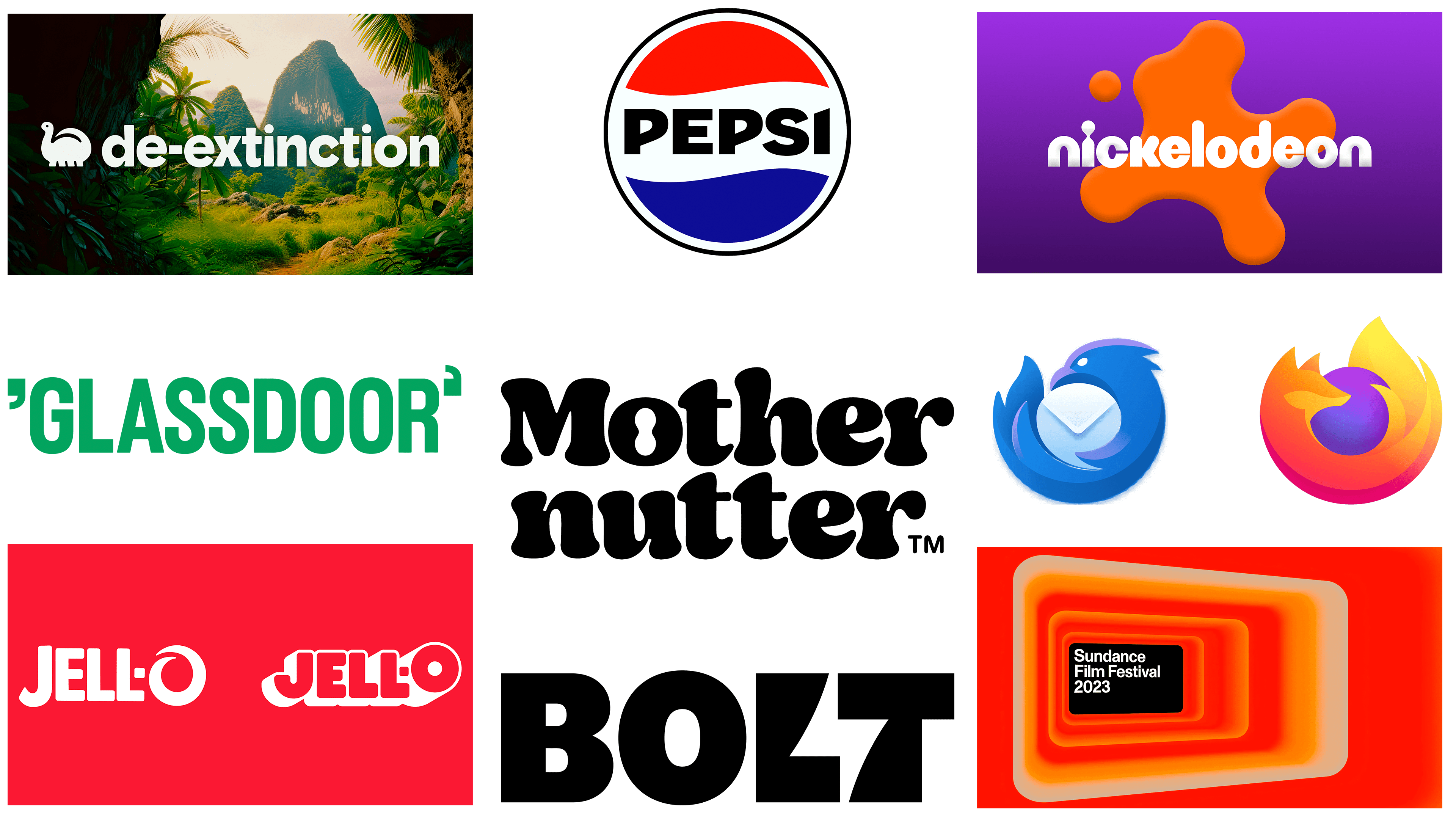
The De-extinction logo
![]()
Looking at innovative brand identities, the De-extinction logo is a notable departure from the norm, especially in the area of sustainable packaging. Created by Koto, a design agency known for its inventive approach, this logo defies conventional expectations through the use of playful elements. Rather than resorting to the oft-repeated themes and predictable green hues associated with environmental awareness, the design opts for a whimsical yet powerful symbol – a cartoon dinosaur.
Executed in a rounded, juvenile style, the dinosaur element in the logo serves several functions. On the one hand, it attracts attention with its delightful visual appeal. On the other hand, it is a powerful commentary on the dire consequences of species extinction, pointing to the importance of environmental safety. In this way, the dinosaur serves as a visual bridge between frivolous imagery and a serious problem that requires immediate action.
The design reflects a dual nature – it is irreverent yet informative. It easily makes it clear that, despite the seriousness of environmental issues, an optimistic and playful approach to them is acceptable and perhaps even necessary to sensitize the general public to the problem. The combination of joy and relevance makes the logo memorable, achieving an emotional resonance that is often lacking in environmental branding.
Complementing the visual components, the choice of typography and color scheme of the De-extinction logo further emphasizes its uniqueness. The symbols are bold but not overwhelming, and the colors chosen are different from the expected green and offer a more diverse and vibrant palette. This choice adds another layer to the overall identity of the brand, making it appealing to a general audience that is not usually involved in environmental discussions.
The Mother Nutter logo
![]()
Recently launched peanut butter brand Mothernutter has attracted attention with its eye-catching retro-inspired logo. Designed by design firm Analogue, the logo is eye-catching with its 1970s vibe that seamlessly fits into the brand’s overall visual theme. Notably, a peanut is skillfully incorporated into the negative space of the letter “o,” which serves as a delightful hidden element.
The new visual identity successfully serves several brand goals at once. First, the logo stands out in a crowded market, which is especially important for a newcomer like Mothernutter. Second, the nostalgic connotation evoked by the 70’s font adds an extra level of connection with consumers who appreciate a bygone era or find vintage design appealing. This engagement through design is a smart move to establish a direct relationship with the target audience.
The unexpected presence of peanuts in the letter “o” not only adds a quirky aspect but also subtly but directly emphasizes the core product. This solidifies the brand’s focus in the minds of consumers, which is a critical factor in maintaining interest and loyalty in a competitive food market.
Another point worth noting is the synergy achieved through the uniformity of visual elements. Everything from the choice of color scheme to the font blends harmoniously, making the logo recognizable and memorable. The logo is a key part of Mothernutter’s brand-building toolkit, acting as an effective gateway for potential consumers to familiarize themselves with its capabilities.
The Mozilla Thunderbird logo
![]()
The redesigned logo for Mozilla’s Thunderbird email client demonstrates ingenuity, finesse, and compatibility with the flagship Firefox browser. The familiar bird figure that takes center stage in the logo now adopts a dynamic pose as it embraces the envelope, differentiating it from its previous passive pose. This energetic image signals action and intent, marking a notable shift in the brand’s visual narrative.
While Mozilla has been mocked for its constant simplification of the Firefox emblem, the new Thunderbird logo has been well-received. In this update, Mozilla seems to have balanced innovation and brand recognition. The design isn’t just aesthetically pleasing; it serves as a visual cue that reflects the practicality and efficiency of the Thunderbird email client itself.
This change also brings to mind thematic elements in Mozilla’s branding. With Firefox symbolizing fire and Thunderbird symbolizing air, there is a subtle but tangible sense of the inclusiveness of the elements. To complete this conceptual quartet, Mozilla is left to introduce products symbolizing earth and water.
The new Bolt logo
![]()
Speaking of the effective use of negative space in logo design, the recent emblem of the fintech company Bolt is worth mentioning. Reminiscent of the iconic FedEx design, the space between the letters “l” and “t” originally depicts a lightning bolt. This low-key image serves two purposes: it reinforces the company’s name while symbolizing the speed and efficiency inherent in its checkout procedures.
This duality is also reflected in the color scheme chosen by the company – a bright yellow-green hue that effortlessly complements the theme of electricity and speed. It’s not just a visually appealing choice; the color palette speaks to the brand’s focus on fast and streamlined customer service.
Equally interesting is how this logo adapts to different types of media. Whether it’s digital displays or printed materials, the logo remains versatile, which further emphasizes its personality. This adaptability is crucial in today’s technologically advanced environment, where logo elements must be easily recognizable across platforms.
The new Glassdoor logo
![]()
Exploring the intricacies of logo design, the recent logo for the recruitment platform Glassdoor is an interesting case in point. The logo, created by Koto, the agency responsible for other inventive branding projects, has one subtle but intentional feature. At first glance, it appears that the opening quotation mark “Glassdoor” is pointing in the wrong direction, reminiscent of a typo. This well-calculated design choice is meant to signify the letters “g” and “d” corresponding to the brand’s initials.
This unconventional use of punctuation becomes more appropriate when viewed in the broader context of Glassdoor’s brand identity. The company is widely known for posting candid employee reviews of employers, often using quotation marks to emphasize a critical point of view. In this case, the use of inverted quotation marks ingeniously replicates this distinctive platform element, unifying both form and function in the design.
The logo is accompanied by a signature font, Glassdoor Sans, specially designed by designer Julia Boggio. The use of a customized font reinforces the uniqueness of the brand and gives greater integrity to all visual communications associated with the company.
In terms of adaptability, the logo demonstrates its capabilities. Its design structure allows it to remain impactful in both digital and print formats. This flexibility is invaluable in an era of fleeting attention spans where brand impressions need to be both immediate and lasting.
The new Jell-O logo
![]()
Jell-O’s updated logo has garnered attention as an original redesign for several good reasons, most notably for its successful blend of retro charm and modern aesthetic elements. The change comes at the most important time for the brand, which has become an increasingly less popular dessert in American households of late. The rebranding addresses this decline with a new approach designed to revitalize consumer interest and increase recognition on store shelves.
Key to this rejuvenation is the prominent, eye-catching “O” in the logo design. This symbol has been enhanced and embellished with a significant drop shadow, giving it depth and prominence. This element serves as both a focal point and a modern interpretation of the logo, ensuring that it captures the attention of shoppers in a crowded retail space.
The updated logo draws on the brand’s storied past, evoking a sense of nostalgia. Although the sharp shadow and bold “O” give the logo a modern feel, the overall aesthetic stays true to the classic style that made Jell-O an iconic American dessert. The clever blend of old and new elements is designed to resonate with consumers long familiar with the product while appealing to a younger generation looking for a modern, eye-catching design.
The redesign is an example of how a brand can adapt to new market realities without sacrificing its roots. The new Jell-O logo addresses the challenge of breathing new life into a fading brand by capitalizing on its heritage and modern design trends. It serves as a shining example in branding, demonstrating the power of design to revitalize interest in a product and rejuvenate its position in the marketplace.
The new Nickelodeon logo
![]()
Nickelodeon’s fresh logo design is a nod to the past yet modern design elements, reflecting a balanced mix of old and new. After 14 years of no major branding changes, the channel reintroduces the once-legendary “splat” element that became a hallmark of its 1990s logo. However, this is not just a repetition of the past: the “splat” is back with significant updates.
The contours of the “splat” now have softened, rounded edges, creating an attractive, friendly look. The tactile experience is enhanced with textural elements, giving the splatter a more three-dimensional and organic look. Such changes are in line with modern design principles, where user engagement and usability are at the forefront.
The artistic reconfiguration of the logo comes from Roger Design Agency, which was tasked with making the logo resonate with different age groups. On one hand, the return of the “splatter” evokes nostalgia for older viewers who grew up on Nickelodeon in the 90s. It evokes a sense of sentimental familiarity and continuity, preserving an element that made the channel a favorite for an entire generation.
On the other hand, the modernized touches allow the logo to not seem outdated or irrelevant to a new, younger audience. The modern style, characterized by texture and softened geometry, allows for a bright and eye-catching image. In this way, it has a timeless character, conveying the spirit of imagination that Nickelodeon aims to convey.
The new Pepsi logo
![]()
Pepsi’s recent logo refresh, the first major rebranding in 15 years, strikes a delicate balance between old and new. This redesign harkens back to the aesthetics of the past while at the same time giving it a new energy. At the heart of this transformation is the brand’s emblem, the ‘globe,’ whose curvature has been changed. This brought the symbol in line with a slimmer visual picture.
Another significant change was the placement of the word mark, which now takes center stage in the design, rendered in bold sans-serif uppercase font. This stylistic choice is reminiscent of Pepsi’s branding from 1962-1991. However, the redesign is not a simple reproduction of a historical precedent. What sets it apart is its modern approach: a bright black text color taken from the Zero Sugar product line.
This fusion of retro aesthetics with modern elements serves several purposes:
- It resonates with longtime fans of the brand who feel familiar with it.
- The modern features appeal to a new audience looking for freshness in branding.
- The black text adds visual prominence and ties in subtly with Pepsi’s push to diversify its product offerings, especially toward healthier options like Zero Sugar.
The redesign embodies a calculated blend of nostalgia and modernity, being both a nod to history and a step into the future.
The Sundance Film Festival logo
![]()
A deep dive into the visual branding of the Sundance Film Festival reveals a deceptive simplicity. The logo, created by New York-based creative agency Porto Rocha, embodies nuances of symbolism while looking minimalist. At first glance, it is a horizontal rectangle. However, its dimensions are deliberately harmonized with the cinematic 16:9 widescreen aspect ratio. This rectangle is not just a geometric figure; it mimics a movie screen, resonating deeply with the festival’s main theme of cinema and cinematography.
This design choice is not just an aesthetic decision; it plays a functional role in the broader branding system. The rectangle is a versatile frame that can be used for a variety of purposes, from displaying clips and photos from past festivals to being used as a background for film titles on theater marquees. It becomes an adaptable visual element that interacts with other media, reinforcing the identity of the festival at different points of contact.
In terms of typography, the logo uses the Monument Grotesk font. This choice strikes a balance between striking visual impact and neutrality, allowing the logo to be used for a variety of genres and titles without overshadowing them. The typeface is a subtle but effective tool to convey the eclectic and inclusive nature of the festival.
There are many examples in the design world that have generated strong reactions, both positive and negative. For example, Elon Musk’s Twitter rebranding of X has been the subject of intense scrutiny, raising questions about the effectiveness of the minimalist approach. Similarly, the new logos of companies such as Air India, Jaguar Land Rover, and Nokia have confused, if not outright embarrassed, audiences. The Air India logo has left many scratching their heads, unable to decipher its meaning. Jaguar Land Rover’s new logo, unfortunately, places the company in a completely unrelated industry. Nokia’s new logo brings back memories of another controversial rebranding episode and makes you question its effectiveness. The Sundance logo, on the other hand, captures the essence of the festival without falling into the traps of complexity and ambiguity.