Tokio Marine: Brand overview
In 1879, during Japan’s industrial boom, the Mitsubishi conglomerate initiated the country’s first insurance enterprise, calling it the Tokyo Marine Insurance Company. The company’s primary purpose was to meet the fire insurance needs of a rapidly modernizing Japan.
Decades later, in 1944, the company was transformed into Tokio Marine & Fire Insurance through a merger with another local insurer. The 1960s marked an important milestone in the company’s development as Tokio Marine embarked on international projects, establishing a presence in Asia, Europe, and the Americas.
The arrival of the new millennium brought with it another significant transformation. In 2002, it became a holding company for a growing family of subsidiaries and was named Tokio Marine Holdings. Over time, having maintained a strong position in Japan’s fundamental property and personal property insurance sector, the company began to expand into life insurance, reinsurance, specialty insurance, and various financial services.
2011 was a landmark year for Tokio Marine: its strategic acquisition of Philadelphia Insurance Companies for US$4.7 billion gave it a dominant position in the US insurance sector.
In today’s environment, Tokio Marine is Japan’s premier insurance titan, and its influence extends beyond the country’s borders. The company’s operations span more than 30 countries and regions around the world. Despite its global status, the company remains an integral part of the Mitsubishi conglomerate, demonstrating its heritage and functioning as a global insurance powerhouse.
Meaning and History
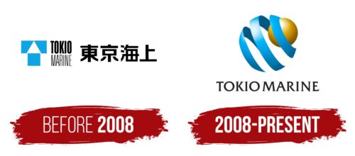
before 2008
2008 – today
The Tokio Marine logo consists of two parts. First, there are two balloon-like shapes: one is a small yellow circle, and the other is a blue ribbon that looks like a twisted spiral. The small yellow circle is inside the blue shape. The gradient gives these shapes a three-dimensional appearance. Underneath these shapes is the full company name written in bold black letters. All the letters are uppercase and have small serifs.
This logo allows you to understand what the company stands for quickly. The yellow and blue shapes look fresh and modern as if they are trying to showcase innovation. The gradient gives a hint of depth as if there is a lot to explore. Uppercase and bold letters create a sense of seriousness as if it’s about business. The small serifs on the letters are like saying, “Yes, we are formal, but we have a little twist.”
Tokio Marine color codes
| Picton Blue | Hex color: | #00b3f4 |
|---|---|---|
| RGB: | 0 179 244 | |
| CMYK: | 100 27 0 4 | |
| Pantone: | PMS 801 C |
| Sea Blue | Hex color: | #005982 |
|---|---|---|
| RGB: | 0 89 130 | |
| CMYK: | 100 32 0 49 | |
| Pantone: | PMS 7469 C |
| Meat Brown | Hex color: | #e5bc48 |
|---|---|---|
| RGB: | 229 188 72 | |
| CMYK: | 0 18 69 10 | |
| Pantone: | PMS 1225 C |
| Field Drab | Hex color: | #775500 |
|---|---|---|
| RGB: | 119 85 0 | |
| CMYK: | 0 29 100 53 | |
| Pantone: | PMS 1395 C |
| Raisin Black | Hex color: | #231f20 |
|---|---|---|
| RGB: | 35 31 32 | |
| CMYK: | 0 11 9 86 | |
| Pantone: | PMS Neutral Black C |
