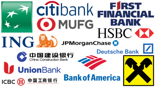
Banks are the most important financial institutions all over the world, and understandably, they need to be trusted by the public. Logos become a business card and reflect the company’s principles and position. Laconic emblems, made in basic colors for the financial sector, remain at the level of subconsciousness and become an object of association. Most often, green, red, or blue colors are used for them. The green color evokes calmness and confidence in the future; remember the color of dollar bills. Red is considered more aggressive and makes you act quickly. Blue represents courage and loyalty, thus attracting a male audience.
Deutsche Bank
This bank is one of the biggest players in the financial market. Despite the fact that it was created back in 1870, the famous logo, emphasizing its status, appeared only in 1972. Its creator was Antoni Stankowski. The emblem of the bank consists of two parts of bright blue color: a square and an oblique line inside it. Under the sign is the name of the institution. The square indicates the stability and reliability of the bank, and the diagonal indicates the constant development. The font used for writing the text is Univers.
ING Bank
ING Group is a financial conglomerate whose logo is closely related to the country in which it operates. The symbol of the Netherlands, depicted in the coat of arms, is the lion, and the national color is orange, which is historically associated with the royal family. These details are reflected in the company’s logo – an orange lion next to the name ING. It is safe to say that the company epitomizes courage and indicates its dignity and authority through its connection to the royal house of Orange-Nassau.
Industrial and Commercial Bank of China
ICBC is one of the four largest banks in China. The emblem of this financial institution attracts the attention of the population and is memorable for a long time. The inspiration for the company’s logo was the Chinese symbol 工, meaning “work” and “labor,” as well as ancient Chinese coins. The stylized symbol is enclosed in a circle, denoting infinity, harmony, and perfection. The logo was also supplemented with the bank’s name in English and using hieroglyphics.
Citi Bank
The history of creating the logo of one of the most recognizable banks in America is quite unusual. The company spent $10 million on branding and only $1.5 million on the logo. Designer Paula Scher created it in 5 minutes by drawing the logo on a napkin during a meeting with management. The logo consists of the bank’s name written in blue and a red arc above the letter t, similar to an umbrella. The details indicate a merger with Travelers Group.
BNP Paribas
The French bank expresses its dynamism with an unusual logo. The combination of green, symbolizing security and tranquility, with gray stars (association with the European Union) emphasizes the uniqueness and authority of the institution. It can be seen that the stars are in motion, indicating openness to new changes. The name of the bank is written in large, clearly spelled letters. The font used emphasizes the relevance of the logo.
Raiffeisen Bank
The bank’s emblem is often associated with old European houses that had ancestral symbols. The crossed heads of horses depicted on the emblem give the impression of reliability – exactly what people look for in financial institutions. Even the font in which the bank’s name is written plays a role. The addition of the yellow background only enhances this feeling. The font used for the text is Futura, designed by Paul Renner.
Bank of America
The bank, in the best traditions of American culture, pays homage to its country. Its logo consists of the three primary colors of the flag: blue, red, and white. The emblem is also depicted with lines creating a flag or, in another interpretation, a farmer’s field. Bank of America stands for patriotism and helping local farmers. According to one version, the red area stands for the letter A, and the blue area stands for the letter B, which is the name of the bank.
First Financial Bank
The logo of the bank without unnecessary images indicates the main advantage – reliability. The letter “I” is replaced by the number 1 and is highlighted in bright red color. All the text, or rather the name of the company, is written in a bold font with straight lines and small intervals between letters. The combination of blue and red colors speaks of trust and a call to action. A well-chosen color palette and minimalist design will keep the logo relevant for years to come.
China Construction Bank Corporation
The bank was founded in 1954 and is among the most important financial institutions in China and around the world. The company’s logo is minimalistic, with a color palette consisting of blue. The emblem is presented in the form of the letter C with a display behind it. Inside, there is a rhombus, and under the emblem is the name of the bank. The emblem symbolizes balance, harmony, and equilibrium.
UnionBank
In addition to the fact that the bank offers many services to its customers, the emblem reflects one of the unusual vectors of activity – cooperation with completely different partners and investors. The emblem of the bank consists of two parts: a drawing in the form of a blossoming flower or a blazing fire and the name of the bank itself. The text is also divided into two parts. One of them is highlighted in bold font. The colors used to create the logo are red and blue.
Mitsubishi UFJ Financial
This Japanese bank is also considered to be one of the major banks in the world. The emblem of the company only emphasizes its status. For the emblem, the bank chose an unusual combination of colors: red and gray. One part of the emblem is a pattern reminiscent of the Japanese flag. The combination of different shapes symbolizes versatility and interconnection. The name of the bank is highlighted in bold gray font.
HSBC Holdings PLC
There are many cultural notes in the logo of this British bank. Since the bank is designed for both Western and Eastern countries, the emblem should reflect the values of both cultures. The emblem is based on triangles that resemble elements of the British flag. The figure symbolizes stability and orientation towards a successful future, which is emphasized by the color red. In Eastern culture, the symbol has the same meaning. The author of the logo is Austrian artist Henry Steiner.
JPMorgan Chase
The American bank chose a minimalist logo designed by Chermayeff & Geismar in 1961. The advertising campaign helped to fix the logo in people’s minds and create an association with the institution. The main image is an octagon consisting of four elements that are not connected to each other. According to one interpretation, the logo symbolizes the four corners of the Earth or the four elements. Blue color means safety and wisdom. A square is formed inside the figure, which is a symbol of reliability and balance. The text is divided into two parts, one of which was highlighted with bold font and darker colors.
