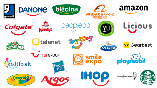
Smiling has always been associated not only with positive emotions but also with a kind attitude. Scientists have found that there are at least 50 types of smiles observed by people. Therefore, it is only natural that logos that utilize a smile are popular. These days, a good logo is not just an image that identifies a company. It is one of the tools to communicate with the target audience. The friendlier the logo is, the more likely it is to have a positive impact on the company’s image. It is not for nothing that the smile is so widely used in the compositions of modern logos.
On some logos, you can see a smile that is not immediately obvious but hidden. But if you look closely, the curved line suggests certain associations.
When designers work on creating a company logo, they consider many nuances. For example, the nature of the business and the expected image that the target audience should have.
The curved line used in many modern logos is associated with a smile. It attracts the attention of customers and forms a positive image. And this is understandable because it is the smile that often conveys those emotions that can bring even strangers together. When a company uses a smile in its visual image, it hints to customers that it strives to make them happy with its products and services. Below, we have given examples of the top famous logos in which you can see the smiling symbol.
Top-25 logos featuring a smile symbol:
Amazon
This is one of the most famous companies specializing in selling goods online. Despite the fact that Jeff Bezos founded his company relatively recently in 1994, it has long been globally popular. Being a leader in its industry and offering customers a variety of consumer goods, the company quickly gained credibility. It has become a giant in the segment in which it operates.
The Amazon logo looks very stylish. Under the characteristic black font used for the company name, you can see a yellow curved line with an arrow. On the one hand, this tells us that the customer is in the right place and will find what they want to buy. On the other hand, we see a veiled smile in this logo, which makes it stylish and original, as well as friendly towards the target audience.
The successful contrast of bright yellow and black colors makes the logo recognizable despite the fact that it is designed in a minimalist style. It looks friendly and attractive. Stylization of the smile as an arrow is a good decision. At the same time, it strongly suggests that the company brings joy to customers around the world with its goods.
Amazon’s visual style makes a lasting impression because it is thoughtfully designed.
Goodwill
This non-profit organization operates in the United States. Its mission is to help in the training and employment of those people who face obstacles on this path. It’s not for nothing that the organization’s visual image uses a smile twice. It is half of the smiling face at the top of the logo on the left side. At the bottom of the same figure is a stylized capital letter of the company name, only in a reduced size.
Despite such goodwill, the logo is made in rather cold colors. And this is not strange because the color scheme, indicating seriousness and professionalism, in this case, is quite appropriate. The combination of black, white, and blue colors speaks of the reliability of the organization. At the same time, the smile softens the semantic field of the logo and indicates benevolence.
The Goodwill organization was founded back in 1902 by Edgar J. Helms. It has religious origins and is associated with the Morgan Methodist Chapel in Boston. Previously, the centerpiece of the circular emblem was a black cross with inscriptions inside. On them were the name of the organization and the word “way.” And on the perimeter of the emblem was the inscription: “Not mercy, but a chance.” This largely reflects the specifics of the organization’s work, which helps people with employment problems learn new job skills.
Colgate
There are probably few people who have not heard of this type of toothpaste. Although the company’s product line is broader, it is a variety of products designed for dental and oral care. The brand belongs to the Colgate-Palmolive group and was founded in 1806. Probably, even among the fans of Colgate products, few people guessed about the long history of the brand. Another interesting fact is that the color palette of the logo, despite numerous redesigns, remains unchanged, taking into account the trends of different periods.
The company has chosen a successful color solution for the logo. The combination of white and red colors creates a pleasant visual contrast, stands out, and looks bright. Italics look appropriate, and the font with smooth edges of letters gives the logo a message of loyalty and friendliness. And now, actually, let’s move on to the smile. Most people associate Colgate with a beautiful, snow-white smile. Despite the fact that today, the company is represented in a variety of industries (from soap to pet food), people associate it with a healthy smile. This is reflected in the Colgate logo, which is recognizable and cute.
While it is not a literal representation of a smile, the curved white line cleverly conveys this understanding and the necessary associative line. This means that the logo designer has done a good job.
Telenet
This Belgian company operates in the telecommunications industry. It was founded in 1996. Being the largest cable TV provider in the country, the company is very confident in the market segment in which it operates. Apart from digital and analog television, it specializes in cellular and fixed-line communications. The company works with residential consumers and business customers using the Telenet Solutions brand in this interaction.
The logo uses yellow and gray colors. The name of the company is depicted using the gray color. And in front of it, there is an emblem. Inside the rectangular icon with smooth edges, you can see a smile and a wink. Something of this even remotely resembles a smiley face, but the shape of the emblem immediately returns to the associations associated with television.
Experts pay attention to how successfully the color scheme of the logo balances between boldness and modesty. The former is evident in the cheerful and a bit daring logo, and the latter in the font color and its soft lettering. Altogether, it looks attractive and harmonious.
Danone
The French dairy products company is known all over the world and is associated with healthy food. The Danone logo is known to millions of people in different countries, as it is regularly seen on supermarket shelves. The name of the company is depicted using a font colored in blue with a gradient. Below it, there is a curved red line symbolizing a hidden smile. This color solution looks like a symbol of care, love, and warmth invested by the manufacturer in the creation of its product.
Danone is one of those companies that can boast a solid history. It has been operating since 1919. Its founder was Isaac Carasso. By the way, the name of the company has an interesting origin – it was named in honor of the son of the founder, whose name was Daniel. The father took as a basis a shortened version of the name of his heir. This is very touching, considering that there are a lot of children among Danone consumers.
Today, the scale of the company is staggering. Ten years ago, the company employed about 100,000 people.
Bledina
The smile in this logo is not accidental and is quite conceptually justified, as Bledina is a sub-brand of Danone. Many children love this baby food. And the smile on the logo looks elegant and gentle.
If we talk about the color scheme, it combines green, white and yellow colors. Arc-shaped contours in the design of the badge stylishly harmonize with the “warm” yellow line, symbolizing a smile. Above the letter “e” is a stylized accent badge in the shape of a grain. This hints at the high-quality organic composition of the products, which is pleasant and healthy for children.
TUI Group
This company, which has offices all over the world, was originally registered in Hannover (in Lower Saxony). The German tour operator reached heights in its field that many competing companies could not.
From 1923 to 2002, the company was called Preussag AG. It operates in the industrial transportation and logistics market segments. Since then, the company has sold many of its industrial assets, converted its operations, and acquired several companies in the tourism sector.
The company is not only successful but also has a stylish red-colored logo. In front of the company name, there is a stylized smile formed by connecting and transitioning all the letters of the word “TUI” into each other, which resembles a winking smile. This visual technique is very successful. It conveys an intriguing emotion and calls to join the company’s travels to modern tourists.
A simple sans-serif font is suitable for this logo. It looks laconic and does not distract attention from the visual reception mentioned above. By the way, capital letters were chosen for the font.
Kraft Foods
The company specializes in the production and sale of packaged food products. It has achieved great success in its field, becoming the second-largest company in the world in this industry.
James Kraft founded the company in 1903. From 1909 to 1953, he was its president. The headquarters of this American giant of the food industry is located in Northfield, Illinois.
The company logo looks very stylish and interesting. A blue font is used for the name. Opposite it, there is an original multicolored visual element reminiscent of a flower or fireworks. Regardless of the interpretation, such a composition causes positive emotions. This visual technique carries a message of friendliness and a lot of attention, which the company does not spare in order to please its multi-million audience.
Below the first word in the company’s name is a curved line in a blue shade with a gradient. It resembles a smile, which further enhances the good emotions conveyed through the logo. Not for nothing; the composition as a whole looks modern, relevant, and successful.
Smile-Expo
This company specializes in organizing large-scale business events. For almost 15 years of its existence, the company has held more than 270 events in 14 countries.
It is worth noting that the smile is present not only in the logo but also in the name of the company. Analysts in the field of visual brand identification consider this logo successful for two reasons at once. First, it is simple and clear, which is important for the business industry. Secondly, it is competently designed, so it is an effective tool for communicating the company with the target audience.
There are no hidden meanings and hard-to-analyze elements in the logo. This can be interpreted as the company’s ability to conduct business transparently and provide clients with a truly professional approach to business, which is important in its industry.
The orange and white color palette is a successful solution, conveying friendliness and concreteness at the same time. The gradient smiley face with an open and pleasant smile disposes to cooperation and friendliness, bringing thoughts of good prospects for the events organized by Smile-Expo.
The visual technique, in which the smile line resembles a whirlpool, is quite interesting. It can be interpreted as the constancy of good mood and dynamism in the development of the company itself. At the same time, the message about the company’s readiness to provide customers with excellent emotions from the organized events speaks of responsibility.
A smiley in a square frame with sharp corners balances the composition as if reminding that the company organizes events in the business sphere.
Yummy United
This brand does not contain a veiled smile in its logo for nothing. Producing children’s goods, the company strives to evoke positive emotions in the audience and is associated with benevolence and reliability.
Here, we see a combination of green, black, and white colors. Soft contours of the emblem smooth out the contrast of the color scheme. A smile can be seen under the letter “Y.” Here, a bold line of the white color is used. By the way, this contour acts as an element that softens the vertical strip of the mentioned letter. Thus, it carries a positive meaning and functional significance for the harmony of the composition.
The combination of colors in this logo speaks about the company’s fidelity to its principles and traditions and its reliability. By the way, the management of this international company has a unique feature – the presence of a so-called children’s board of directors. Its task is to approve the best flavors of products that go into production. This idea was implemented in Italy for the first time in 2019; now, it is used by the company’s representative offices in other countries.
JoyToy
This is another famous children’s brand. But here we are no longer talking about food products, but about toys, which is quite clear from the name. The combination of different colors in the logo makes it fun and interesting. And the smile adds even more excitement, reminding of the main emotion of joy, which accompanies all children’s games.
Another important point worth noting is the diagonal arrangement of elements. It indicates the playfulness and lightness that the company wants to bring to the life of the users of its toys.
Creative notes in this logo are combined with a serious and thoughtful approach, which indicates an emphasis on high-quality products.
PeoplePC
This company is a well-known American Internet service provider. Although its logo is one of the simplest on this list, it conveys everything it needs to. The thin blue lines of the sans-serif font look elegant. Below the letters “O” and “P” is an arc-shaped line that resembles a smile. The composition looks elegant and stylish. And if you look closely, you can see not only a veiled smile but the whole smiling face. It is formed with the help of the already mentioned two letters. Not for nothing, this part of the logo composition is even highlighted with a lighter color.
The designers of the logo managed to achieve balance and creativity. Also, this logo is perceived as a realization of a complex intellectual concept, which is valuable and appropriate for the high-tech industry in which the company operates.
By the way, the company was founded in 1999. Its headquarters are located in Atlanta. It is considered to be one of the low-cost providers that are in demand by customers.
Argos
Argos is a chain of stores that specializes in catalog sales. Before the logo of this company acquired its current look, it went through 2 modifications. But, despite this, the color scheme remained the same. The first logo of this company saw the light in 1972. Then, a non-standard and complex font was used, and the first and last letters in the word were combined. This combination of letters at the bottom of the logo could have symbolized a veiled smile, but it did not look clear enough.
Over time, the complex logo became more and more minimalistic. The font became simpler, but this did not make the logo primitive. On the contrary, it became more expressive and recognizable. The same red and white color palette was retained, which looks contrasting and confident. But the colors have changed places. It’s the white font of the brand name on a red background. The arc-shaped line below the text resembles a smile, which makes the logo even cuter.
Hasbro
The history of this American company begins with the distant 1923. The company specializes in the production of toys. It is considered the largest producer of children’s toys and board games in the world. The logo of this manufacturing giant changed seven times until its current version was approved. Since 2009 until today, the logo has remained unchanged.
By the way, in different periods of the company’s development, both its logo and name changed. Originally, the company was called Hassenfeld Brothers. Starting in 1968, there were several transformations in naming, until in 1985, there was an extensive and effective abbreviation, Hasbro.
The modern version of the logo reflects both visual brilliance and semantic capacity. This logo can hardly be called minimalist. First of all, it is worth paying attention to the smooth font without serifs. It conveys the loyalty and goodwill of the company. Under the company name, there is an abstract image of a smile. Thin white lines are in harmony with the font color.
The whole composition is inside a blue and turquoise square with a gradient fill located diagonally. It looks stylish, bright, playful, and interesting. The logo fully conveys the fact that the company values traditions produces quality products, and strives to give joy to the little users of its products.
Crayola
This American company produces art supplies. Customers appreciate its products, and for good reason – the company has been successfully working in its industry for more than a hundred years. The company was founded in 1885. The logo has changed repeatedly – exactly ten times. The first version had a rather intricate design and a lot of small elements. The modern version was developed in 2006. It looks bright and stylish, so it does not lose its relevance today.
The logo is located diagonally, which speaks of dynamics and creative impulse. It is optimistic and friendly. Over time, the yellow color in the company logo became more and more saturated, and now it looks especially bright.
For the name of the company, green color was chosen, which is very harmonious with yellow. And, of course, there is a smile on the logo. It is drawn in the form of a rainbow, which is symbolic of this company. It can be interpreted as a boundless creative impulse. Thus, the logo, which was approved in 2006 and is used today, corresponds to the sphere of activity of the company, producing goods for creativity as best as possible.
Playmobil
This German company specializes in the production of toys. Its logo has changed only twice. The current version of the design dates back to 1976. The brand itself was founded in 1974. To date, the specialization of the company is quite wide. It is not only toys but also collectibles. As for toys, their main part is construction sets and small figures of people.
The visual style of the brand is relevant despite the fact that the logo is already several decades old. Nevertheless, the logo is cute and interesting. It looks stylish and attractive.
The wordmark is located horizontally. For it, a bright blue color is chosen. Despite the fact that the font itself is quite simple, it has one interesting feature – slightly flattened edges of the letters. We didn’t even need serifs to make the letters interesting and visually appealing. Another feature is the elongated and beveled point on the left above the letter “I.”
Above the lettering is an image of a child’s smiling face. A darker blue shade is chosen for it, which creates a visual contrast.
The logo looks so friendly that it immediately evokes a feeling of trust. Different tones of the blue palette speak about the seriousness and professionalism of the company. And the good-natured smile is a reminder of the field in which it operates.
Gear Best
This company is based in China and works in the e-commerce segment. The large online store specializes in the sale of gadgets, as well as clothing and accessories. Today, the company has grown so much that it has warehouses on all continents. Shipping from Gear Best is known for its speed and security.
The brand’s visual style is quite simple. Nevertheless, it is bright and recognizable. Next to the brand name, typed in black font, there is an emblem. It is a yellow square with beveled edges. Inside it, stylizing the lower part of the letter “G,” a symbolic smile is formed.
The combination of black and yellow colors is quite common in the visual identity of large e-commerce platforms. This contrast looks modern and relevant. It helps to convey to the target audience the idea that the company is energetic and progressive. If we deeply analyze the symbolism of the color palette of the logo, we can note the emphasis on the safety of purchases and the high quality of goods offered. These are the values of the company’s positioning.
Licious
This Indian company was founded in 2015. It specializes in the trade of meat products. The company operates in the retail segment. The company’s founders are Vivek Gupta and Abhay Khanjura. The company has a website and a delivery service that operates across India. Meat and seafood are delivered to customers within 2 hours of ordering. The company even has its own mobile app.
The visual style of the Indian company looks very progressive. Black is combined with red – such a color solution looks contrasting, bright, and interesting. Above the letters “I,” you can see red dots, and below them – a red arc-shaped line reminiscent of a smile.
Although the inscription itself looks quite strict, the smile balances it and gives a more joyful emotion, which makes the logo balanced.
Thanks to a successful logo, the company conveys the idea of modernity, reliability, respectability, and a serious approach to its business. This is important for such a responsible sphere as food sales.
IHOP
The visual image of this American company has undergone a huge evolution. Since 1958, the logo has changed four times. If many companies try to keep some elements associated with the history of the company in the updated logo, in this case, everything has changed dramatically. The logo has changed beyond recognition, and nothing reminds me of the original logo, looking elegant and vintage. At the same time, it would be unfounded to say that the logo has changed for the worse. It just became different. The company chose the path of minimalism in transforming its logo.
The original IHOP logo resembled a wooden entrance to a restaurant with a lantern on top. It was adorned with the words “International House of Pancakes.” By the way, this was the original name of the company.
The current logo consists of the current company name, for which the color blue was chosen, and an arcing red line at the bottom of the second half of the logo. This unambiguous line suggests a smile, which is quite appropriate for a restaurant chain. Despite its current simplicity, the logo seems to remind us, “You are always welcome here.”
Alibaba
This Chinese e-commerce company is a real giant. This is not an exaggeration because the company Alibaba operates in more than 200 countries around the world. For comparison, the profit of this company is more than all the combined American companies of the same sphere.
The conglomerate was founded in 1999. It consists of 18 co-founders, including the world-famous Jack Ma. By the way, he also came up with the name.
In the logo of the company, in addition to its direct name, you can see a happy, smiling human face inside the letter “A.” If we talk about the semantic load of the logo, it is quite clear – the company works to make its customers happy and broadcasts it to the whole world.
However, the logo has many critics. They agree that the literal metaphor of a happy face is very predictable. Some suggest that this is the first version of the logo. Thus, they hint at the imperfection and lack of thoughtfulness of the concept.
Nevertheless, the logo does not prevent the company from being an industry leader and pleasing many customers. Therefore, its composition is quite appropriate.
This was the selection of logos of famous companies that use a smile in their visual identity. Somewhere, this smile is more explicit, somewhere hidden, but all of them are interesting as objects to consider and analyze.
