The modern world offers many opportunities for business development. A product’s positioning and visual identity can make a company stand out. Today, a brand’s logo has long ceased to be “just a badge.” It is an emblem that carries key messages about the company and is another way to stand out from the competition.
Indeed, the company logo is almost always the first thing that catches the eye of a potential customer. It should be noted that different companies use some universal symbols and elements in their promotion. But everyone plays with them in their way. Consider a symbol like a star. This symbol has been created and interpreted in each of the logos below.
TOP Logos featuring a star symbol:
Chrysler
This company’s logo is one of the most recognizable star emblems in the world. The star inside the pentagon is an additional symbol rather than the main one. It serves to give more lightness and volume to the main element. At the same time, the star in this context is one of the visual accents of the logo. Thanks to this detail, the logo has acquired elegance, lightness, clarity, and versatility, making it timeless.
Additionally, it is worth paying attention to the star’s features itself. Its thin rays speak about movement and progress, the company’s professionalism, and producing good cars. The emblem uses a gradient and contrast of black and white colors, which gives it a volumetric appearance. This emblem looks stylish and sophisticated, and its color scheme is perfect for the car brand.
The American company Chrysler was founded in 1925 and is known for many famous car models. At this stage of its development, the company has been under the control of the Italian concern Fiat since 2014.
Paramount
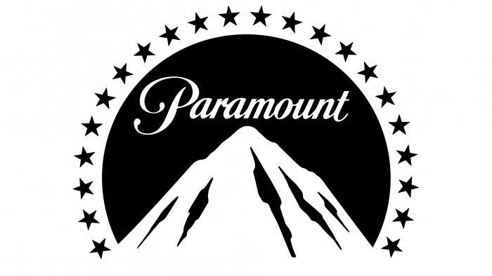
Paramount is not just a company that uses stars in its logo. It can be safely called the record holder for the number of this symbol among other companies in this rating. The American giant of the movie industry is known throughout the world.
The legendary company’s image has always been associated with a mountain, not with a star since the mountain is the main element of the emblem. However, 21 five-pointed stars adorn the logo as a frame. The movie company used this idea for its famous logo. For a large and ambitious enterprise in the field of cinema, such a logo idea is quite understandable.
If you look a little deeper into the company’s history, you will find that it was founded in 1912 and is located in Hollywood (California).
In the first stage of its existence, the company gained huge momentum. Thus, during the 20s of the last century, the founder managed to develop Paramount into two studios engaged in producing films and more than 200 theaters. Partners with whom the brand’s founder conducted business periodically changed, but the main vector of the company’s development remained unchanged.
JAC Motors
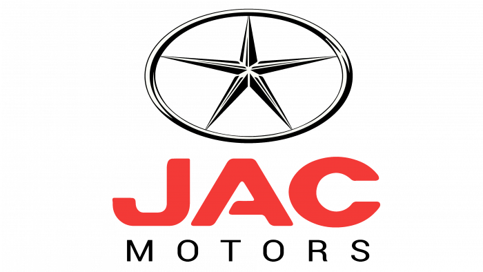
This is a powerful Chinese state-owned enterprise in the automobile industry. The company was founded in 1964. It produces buses and passenger cars. The star on this logo is very similar to the one that Chrysler uses in its logo. However, the logo itself is significantly different. The star is located inside an ellipsoid on a transparent background.
If we analyze the execution of this element itself, we can see that the star is thin and sharp. This visual solution was chosen for a reason. It can be associated with progressiveness and excitement, which is logical for the automotive industry. In this case, the sharp edges of the star are balanced by the round contour of the symbol, inside which it is located.
Attention should also be paid to this logo’s color scheme. A light-silver palette of shades characterizes this sphere. The red color of the bold font used for the word JAC makes the logo contrasting and recognizable. At the same time, the word Motors, written in thin black letters, balances the accents and makes the logo look balanced. Overall, the logo looks original and confident. It hints that JAC Motors is a professional in its business.
Subaru
Another automobile brand that uses stars in its logo is Subaru. The company was founded in July 1953. The automotive company also uses gray and silver shades in its logo. However, the silver gradient used for the stars and the logo frame is combined with the blue gradient used for the background. As in the previous case, an ellipse-shaped figure is used for the Subaru emblem. However, here, it is more elongated in width.
Six four-pointed stars visually form an interesting composition, distinguishing this logo from many others and making it so recognizable that it is impossible to confuse. To the right of one enlarged star, the other four are used. Their visual stylization is quite an interesting solution. The creative form with rays stretched out to the sides looks original.
Even in this idea, it looks interesting that the stars are combined in pairs through their rays. In meaning, the emblem’s stars represent the Seven Sisters’ constellation, with the seventh star remaining invisible. By the way, the company’s name in Japanese coincides with the constellation’s name. Therefore, there is nothing strange in the fact that the stars are located exactly on the blue gradient background.
Mercedes Benz
Mercedes-Benz recently celebrated its 100th anniversary. The company’s emblem is a three-pointed star located inside a circular frame. Although the emblem was periodically transformed at different stages of the company’s development, its essence remained unchanged.
As in the previous case, this logo’s important feature is the metallic color in the gradient. This visual solution proved very successful, as the logo allowed it to emphasize this company’s premium class of cars. Another important feature of this logo is the 3D effect of the star itself. Thanks to this visual solution, the logo looks prestigious and expensive.
To date, the company produces a wide range of cars. These are both cars, and trucks, and even buses. But despite this diversity, there is one thing that unites all these product positions. It is about premium quality.
The Mercedes Benz emblem has quite an interesting history, as it was formed due to the merger of the Benz and Daimler logos. The resulting image resembled a steering wheel with three spokes. This logo said that the company would specialize in automobile transport. And if earlier the emphasis was also on engines for ships and airplanes, now the logo has acquired a deeper meaning. At the same time, the other two directions remained, so the three-pointed star can also stand for the three elements – earth, water, and air.
Heineken
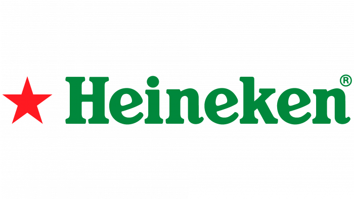
Many people have a mixed reaction to the symbol of a red star in combination with the green font used in the emblem of Heineken. But first, a few words about the company itself. This Dutch company is the largest producer of beer in its home country. And if you look at the global scale, it takes second place because it is behind another giant of the industry – Anheuser-Busch InBev. But its scale is still impressive, isn’t it?
The star on the Heineken logo appeared in the 1880s, and then it was monochromatic. In the 1930s, the symbol became red and white, supplemented by a black outline, and the letters became red. It is worth noting that only after the collapse of the Soviet Union did the star become completely red. The collapse of the communist regime allowed the symbol to be used in a way that was not associated with communism.
Rockstar Games
This company specializes in developing computer games. Its logo is minimalistic but contrasting and interesting. The big black letter R, written in italics, is complemented in the lower part by a five-pointed white star with a black outline.
This composition in the logo is located on a dark yellow background. It is successful from several points of view. Firstly, it looks very effective and attracts attention, which is important for the Rockstar Games logo. Secondly, the symbols blend well with the color palette associated with strength, energy, happiness, and rapid development. At the same time, the logo is like a puzzle, in which the first part of the company’s name is encrypted.
This company has existed since 1998. It is a subsidiary company owned by Take-Two Interactive.
Texaco
This company is one of the largest in the United States and works in the energy industry. It is also large-scale, not only in its home country—it is one of the largest corporations in its industry, even if you analyze it globally.
Texaco’s logo is done in the tradition of minimalism, yet it is quite powerful. To analyze this logo, it is necessary to delve a little into the history of Texas, often called the Lone Star State. This nickname for this territory was received in honor of the flag used in the 1830s. The red and white color scheme associated with strength and passion fits well with this logo.
Inside the red circle is a white star, and within it is the capital letter of the company name, for which the color red is used. Next to the logo is the company name, which is also written in red. This visual solution makes the logo recognizable and memorable. And even if its design is somewhat different from the latest trends in logo design, it conveys the traditions of the company and its homeland. It carries a powerful message about the company’s confident position in its market segment.
Starbucks
Founded in 1971, this American coffee shop chain quickly spread worldwide. Now, there are more than 23 thousand points of this network worldwide. If we talk about the logo, then, according to its designer, Steve Murray, the emblem depicts a siren. This creature is known from mythological stories. The siren, according to mythology, lured sailors into shipwrecks. The star in this logo is used on Siren’s crown, the image of which is inside the circular emblem made in white and green colors.
If you analyze the logo, relying on the official version of the company’s representatives and criticism, then opinions about it vary. People critical of Zionist movements believe that the logo may depict Queen Esther. Those who remember the original Starbucks logo, which began the company’s history, believe that it depicts the head of a goat used by the Illuminati in an inverted form.
Those who analyze the current logo solely in terms of common interpretations of shapes and colors believe that the white and green palette can be associated with development and growth.
Poker Stars
If we consider the logo of a major online poker resource, Poker Stars, then, as analysts note, nothing is surprising or unexpected for its sphere. The Poker Stars logo shows the name of the portal. A five-pointed star is inside red spikes. For those who interact with the gambling industry, this logo is understandable. It is predictable for a company to offer customers the opportunity to play for money.
The brand’s history includes Isaiah and Mark Scheinberg’s founding of Poker Stars, a family business.
The company has been quite young since its foundation in 2001. However, its functioning is not unhindered in all countries. For example, in 2014, the controlling body Roskomnadzor blocked this service in the Russian Federation.
By the way, since 2014, Poker Stars has belonged to Amaya Inc., to which it was sold for $4.1 billion.
Converse
This American company has a solid history, as it has been producing its shoes since the early twentieth century. In particular, consumers like the sneakers of this brand, which are popularly known as “Converse.” The company’s logo is well-known and recognizable. It is a five-pointed star located inside a round frame. It appeared on the emblem in 1928 and has not left since then.
Even if the inscription was no longer there, the emblem would be associated with the favorite shoes worn by millions worldwide. The chosen graphic symbol looks good and carries the desired connotation of quality, success, and fame.
The Converse logo’s color scheme is important. Deep, calm blue shades speak of the quality and reliability of the products sold under this brand.
Carl’s Jr.
Carl’s Jr. logo is not only cute but also very friendly. The examples above are examples of many companies using strong and ambitious stars, and some even entire constellations. But if we talk about Carl’s Jr., it is impossible not to recognize this star among others. At least because he is smiling – this is the visual solution that its managers and designers decided to apply to the identity of this American company. It must be said that the network of fast food restaurants with such a friendly logo is very suitable.
A warm color scheme combining red and orange shades was chosen for the star. Tilting this element to the right further enhances its emotional tone, giving the impression that the smiling star is also dancing. The slanted font used for the company name further down the text of the logo looks harmonious in the overall composition. The contrast of warm shades and black color creates a pleasant visual balance.
If we analyze the brand logo from the point of view of its history, the star appeared back in 1941. And the company itself, offering customers delicious and affordable food, is known even today as it firmly holds its position in the niche in which it operates.
NFL
The United States Professional Soccer League logo features four five-pointed stars. These stars resemble the American flag, which is very successful in this context. They visually emphasize the league’s affiliation with the state it represents.
In addition, in the semantic context, the stars indicate the high professionalism and skill of the players. Thus, the NFL emblem carries several important meanings.
Another vector in the meaning of the stars on this emblem is timelessness and the organization’s commitment to its unchanging values. This emblem conveys respect for roots and traditions and concern for its reputation. This is not strange, as the league was founded in August 1920. From then until now, there have been enough victories that the organization is proud of.
The logo’s shape resembles a coat of arms, which is appropriate in this situation. The image of the ball indicates the direction in which the professional league works, and the abbreviation with its name is important in informational terms, increasing recognizability.
Benelli
Benelli is a legendary motorcycle manufacturer from Italy. The company was founded back in 1911. Notably, the company started as a small workshop, and today, it is one of the most popular motorcycle manufacturers worldwide. The star first appeared on the Benelli logo in 1925.
The redesign of the Benelli logo, which took place in 1932, presented a new composition where the stars were already 3. Further logo transformations, which took place in 1951 and 1972, removed these elements, and the logo was simplified to the company name. In 1951, italics and white and black lettering were used. In 1972, the logo looked more interesting, using straight letters and a font with a noble golden hue, but it was still far from the refined visual composition that had gone before. Not for nothing, in 1995, the company returned to the 1932 version of the logo, but it received a new stylization and a more modern design.
The logo is a round silver emblem. Inside is an image of a lion, three five-pointed stars, and the company name in the center. A laurel wreath decorates the perimeter of the emblem.
It is worth noting that the lion was chosen as its symbol from the first years of the company’s existence. This animal, associated with strength and power, is quite appropriate for a famous manufacturer of motorcycles.
San Pellegrino
It is the brand of one of the best-selling mineral waters in the world. Currently, this brand is part of the Nestle group. However, the brand’s history goes back to the century before last – the Italian company was founded in 1899.
Despite the apparent modesty characteristic of San Pellegrino’s visual style, the logo looks powerful and interesting. The composition of the San Pellegrino logo consists of a word mark with a star-shaped coat of arms above it. For the inscription S.Pellegrino, capital letters are fully used, which already speaks about the company’s confidence in its market segment.
The font’s dark blue color was chosen, with a white shadow with blue lettering. This combination looks very artistic and solid. It will appeal to those who know how to enjoy details. At the same time, the font acquires a geometric structure and looks voluminous. Fine, thin crochets on the font look original and complement it.
If you look closely at the font, you will notice that the edges of some letters are cut diagonally. In the letter E, the horizontal stripes have different lengths. The modesty of this logo is only apparent. It is complex and thought out to the smallest detail.
A red star complements the white contour, followed by another red contour. This edging gives it sophistication. The star adds meaning to the composition, indicating the high quality of the product sold under the San Pellegrino brand.
The San Pellegrino logo is an example of a brand emblem that can be called “timeless.” It conveys tradition and classics but does not look old-fashioned.
Estrella
This is the name of the oldest Spanish beer brand. And since the Estrella logo was also included in this selection, it was not without a star. The brand appeared in the 70s of the century before last. It is currently owned by the Catalan brewing company Damm.
Since 1997, this beer has used a contrasting red and white color palette. The same applies to the italicized text denoting the company name in the logo. In 1999, a star with curved rays appeared in the logo. It is located on the first three letters of the company name. This visual technique looks like an embrace. In principle, it is quite logical, given the company’s niche. Sitting with friends or relatives over a glass of beer is associated with a good, friendly atmosphere.
If we return to the color solution of the emblem, it looks very confident. The combination of white and red colors looks contrasting and stylish. It is associated with passion, strength, and success. By the way, the updated version of the emblem, developed in 1999, marked the company’s transition into the new millennium. In principle, it is quite a strong move – to show that the company has a solid history and understanding of the vector of the future.
Chuck Taylor All-Star
Converse produces a well-known brand of casual shoes. There is a reason why the emblems of these brands are so similar. The model first appeared in the 20s of the last century, soon gaining worldwide fame. Since 2003, it has belonged to another giant known for its high-quality shoes and clothing—Nike.
The logo, bright and memorable, is hugely famous and recognized. Inside the round frame are the word mark and a graphic symbol.
You can see a blue star in the center of the white circle. And the words denoting the brand are made in two different styles, which creates a very interesting contrast effect. On the perimeter of the emblem, you can see the inscription “Converse All-Star.” All capital letters are used for it. This inscription looks refined and confident, effectively decorating the emblem’s inside. The classic straight font and red color are very appropriate here.
The “Chuck Taylor” lettering on both sides of the star uses a handwritten font style and blue color, contrasting with the clarity of the “Converse All Star” lettering.
Another stylish detail on the Chuck Taylor All-Star logo is the image of double stitching all around the frame, which speaks about the high quality of the shoes produced and the attention of the company’s technologists to all details.
Everything together looks thoughtful and harmonious, and the star as a compositional center of the emblem looks appropriate and stylish.
Macy’s
This company is a world-famous chain of department stores. Its logo is quite simple from a visual point of view but has enough recognizability. The logo starts with a big red star. Then follows the name of the company, depicted using all lowercase letters. Instead of an apostrophe, a small black star is used. This looks very original and creates a stylish contrast with the red star used at the beginning of the logo.
Another detail worth paying attention to is the font used in the logo. It is very thin, but this was not always the case. This stylistic decision was part of a successful redesign of the logo. By the way, if you trace the history of the logo, the font has been thinner since 1978.
The star in the Macy’s logo has appeared and disappeared. The first logo was designed in 1920; it did not exist then. The star replaced the apostrophe and was first used in the 1948 logo. It remained in the 1960 redesign as well. However, the star was missing in the logo’s 1970, 1978, and 1982 versions. But in 2004, it returned to its former place instead of the apostrophe and took its place at the beginning of the logo. The modern version of the company’s logo also starts with a big red star.
Bank of India
This government institution also uses a star in its logo. The Bank of India is headquartered in Mumbai. The logo is interesting because of the symbolism used in it. But let’s take a look at it step by step. The first thing that catches your eye is the large rectangle, the base for the other logo elements. The color of the Bank of India logo is blue. It is saturated but not overwhelming. It looks stylish.
On the blue background, we see the company’s name written in white letters. Considering the requirements of grammar, capital, and small letters will appeal to those who like designers to adhere to the norms of literary writing in corporate style. This option looks very appealing with the current trend of simplifying and creating logos consisting of capital letters. In addition, this technique can indicate a commitment to tradition. This is an excellent technique for the bank’s reputation, which should be associated with a reliable institution.
Next, a dark orange shade is used after the name – a five-pointed star. Now, let’s move on to the most interesting part of the logo – the image of a man inside the star. The man holds a trident in his hands, and next to him lies a lion. The way the figure of the man is depicted is very curious. It is clear from the composition that he is controlling the wild animal, resting his hand on its mane. In the context of the bank’s activities, this technique may indicate that its management has the necessary resources to manage its position in the market and protect its clients’ investments.
Aardman
This is the name of a famous animation studio, famous for many animated films and TV series and successful examples of advertising with animation elements. It was founded in 1972 in England. Today, its structure includes eight divisions working in various animation art niches.
When analyzing the development of company logos in their dynamics, it is necessary to dwell on the tendency to simplify visual elements. Companies try to be more understandable and convincingly convey the meaning of their logos. Therefore, while the first Aardman logo depicted a movie set with several stars flying out of it, the current logo has undergone significant changes. Only the company name and a single star are above it in the upper left corner.
True, one visual effect distinguishes this logo from many others; it is also made in a minimalist style. It is the raw edge effect. It gives the impression that the logo is in motion. This reflects the drive with which the animation studio works, releasing new works designed to delight the viewer.
Captain America
If we had talked about real-life companies earlier, now we would have dwelled on the famous character of Marvel Comics. For the first time, this character appeared in the 40s of the last century; the writer Joe Simon and artist Jack Kirby worked on creating his image.
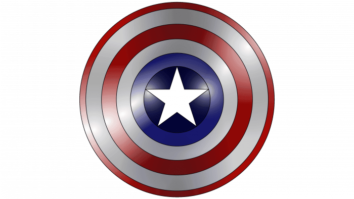
The main artifact that is associated with this character is his shield. The impenetrable shield, which serves as the hero’s main weapon, can, to some extent, be considered his emblem. Inside the shield is a silver star set against a blue background. In principle, the blue background for the star is natural. Further, the disk is decorated with stripes running along the perimeter. Closer to the center and the edge are red stripes with a glow, and between them is a metallic strip.
Overall, Captain America’s logo palette resembles the colors of the US flag, which makes sense for this character. And now, from the brand of the comic book hero, let’s move on to the logo of another similar project.
Steven Universe
This is the name of the American animated series about a boy named Steven who lives with magical aliens and humanoids. The series’ author is Rebecca Sugar. The logo had several variants, each associated with the name of the main character of the animated series.
The latest redesign of the Steven Universe logo features a multi-colored, three-dimensional cartoon name. Since the logo was included in this selection, it also features a star.
The illusion of negative space inside the first letter of the word Universe forms the first little star. And the second one is in the logo after Stephen’s name. Its style follows the font style used for the animated series’ name.
Coldwell Banker
This company is one of the most popular franchises in the US real estate niche. Thanks to a successful combination of fonts and colors, the logo conveys all the key ideas related to the company’s activities.
It is worth noting that this network’s offices are represented in 49 states today. Therefore, recognizability is very important for it.
The inscription with the company name is located in two lines on a rectangular field. By the way, the font was designed specifically for this company by its order. This might seem unnecessary to some, but in practice, such decisions are quite justified because the easier it is to recognize the Coldwell Banker logo, the better it remains in people’s memory. A rather soft font has been chosen, which can be associated with the company’s loyalty to customer service.
It is also important to pay attention to another part of the composition. It is a small square located on the left. It crosses the two capital letters of the words that form the company’s name.
In addition to the word “Banker,” several other details indicate that the logo belongs to a company working in the financial sphere. These include:
- The type of logo. Word logos are quite popular, as practice shows their success in this business niche.
- Color palette. Combining gradient blue and white colors and imitating volumetric elements speak of prestige and seriousness. Blue color, in principle, is associated with maturity, seriousness, and responsibility for the result.
Thus, the company successfully communicates to its customers that its brand is reliable, stable, and understandable.
Energy Star
This is the name of the US government program aimed at energy-efficient consumption. The program was launched in the early 1990s of the last century and operates in North America and some Asian countries today.
The program’s visual style is characterized by stability. The first logo appeared in 1992, so its key idea has remained unchanged. However, the color palette has undergone some transformations.
The Energy Star logo plays off the name of the company very successfully. The italicized word “Energy” is followed by the image of a star. An elegant arch covers this part of the composition. In the previous version of the logo, all these elements were made in black and located on a white background. The subsequent redesign has slightly changed the appearance of the logo. The composition was made of white and placed on a blue background. This made it look fresher and brighter.
Toys “R” Us
Toys “R” Us is known for its bright logo, which reflects its activity. The company’s direction is the production of toys. The company was founded in 1948 and had a different name. The current name appeared in 1957, and the star on the logo—in 1998.
The logo is very interesting and funny. It looks attractive and friendly.
In addition, the Toys “R” Us logo has an interesting history of its transformation. While previously the letter “R” was located inside a star, now, on the contrary, the white star is inside a blue letter. This stylization has turned it into a functional piece, occupying space inside the letter.
Such was the selection of interesting logos that utilize the star. And despite the similarities in some details, they are all different and convey the specifics of their companies.
DC Shoes
DC Shoes was founded in 1994 and owned by Boardriders, Inc. Despite its name, it produces shoes, accessories, hats, bags, and apparel. Its badge is known for being similar to the Chanel symbol, but here, the “D” and “C” are combined. The “D” is missing a fragment of the vertical stripe, and in the gap between the two ends of the “C” is a seven-pointed star.
Air Force
The United States Air Force is part of the United States Armed Forces. The star in the USAF emblem is formed by the negative space between the blue stripes representing the wings and tail of the bird. At the bottom, in the same blue color, the name of the armed forces is written.
Houston Astros
The Houston Astros are a professional baseball team that has played in the American League since 2013. It came into existence in 1962 as a National League franchise. The large five-pointed star on its logo commemorates the fact that the city of Houston is home to many space industry businesses. The celestial body is the base for the large white letter “H” inside a blue circle with orange rings.
Star Gold
Star Gold is one of India’s largest TV channels, and it entertains viewers with Bollywood blockbusters. Over the years, the channel’s logo has featured a five-pointed star, but it wasn’t until 2020 that it became red-white-white-blue. The use of different shades makes the design three-dimensional.
Matchstick Alliance
Matchstick Alliance provides branding, marketing, financial forecasting, and legal advice to Wichita entrepreneurs. The matchstick in the company’s name symbolizes the idea that it should catch fire. This is also reflected in the logo, where it is an integral part of the gray five-pointed star.
Starter
The American company Starter started as a manufacturer of uniforms for sports teams. Now, it produces a wide range of casual wear and is owned by Iconix Brand Group. The designers used the Starter name in the logo, featuring a white star that fits into the recess of the black “S” on the right side.
Western Star
Western Star is the flagship brand of the American company Western Star Trucks. Heavy trucks, including long-haul tractors, are produced under this brand. The creators of the logo introduced a red five-pointed star in the center of a large letter “W” of dark emerald color. Both elements are outlined with silver gradient contours.
Dallas Cowboys
The Dallas Cowboys are a soccer team based in Arlington. Their emblem has nothing extra, not even lettering. It is only a dark blue five-pointed star circled with a double outline.
Dallas Mavericks
The Dallas Mavericks basketball club has existed since 1980 and plays in the Western Conference (NBA). Its name is often shortened to Mavs, but the emblem reflects the full version. The two words are separated by an image of a horse’s head against a blue basketball, with a small white star below it.
Dallas Stars
The Dallas Stars hockey club was formerly known as the Minnesota North Stars. It moved to Dallas in 1993 and has since won several cups and championships. Its emblem features a white and gray letter “D” set against a five-pointed star of the same color, and the center of the letter is black. Because of this design, it gives the impression that the designers depicted the letter “D” with sharp spikes.
Star Studios
Star Studios is an Indian film company formerly known as Fox Star Studios, a joint venture between Disney Star Private Limited and 20th Century Fox. Its logo presumably does not exist without a star. This graphic element replaces the letter “A” in the word “STAR,” illuminated on both sides by spotlights.
Star+
Star+ is a Latin American service that allows users to view media content from Disney subsidiaries as streaming video. In its logo, the star also replaces the letter “A,” but only here is it pink and orange with a gradient. All other glyphs are capitalized, bold, and dark blue.
Star Life
Star Life is a television channel that hails from Latin America. Its logo looks similar to the Star+ logo, except that the first line is missing the “+,” and the second line contains the smaller word “LIFE.” The letters and the star replacing the letter “A” have a purple tint.
