


Visual identification is the primary tool for achieving success in modern economic conditions. Taking into account the pace of development and expansion of enterprises, as well as the growth of income of the population, with a huge turnover of goods, which leads to a sharp decline in the ability of the consumer to easily and simply make the right choice, there is a search for a variety of ways to ensure the recognizability and visibility of products, goods, and services. This problem is solved using various visualization methods. One of its important elements is the corporate identity and logo, which help identify the product as coming from the right manufacturer amid the general mass of goods on the market. These elements help the client remember the company or firm not only on a conscious level but also on a subconscious, emotional level.
For this purpose, each logo is created as a unique, non-repeating visual composition. They are completely different, not only in graphic design but also in the way they present information. Depending on the brand’s characteristics and the goals it pursues, emblems can be highly informative, providing necessary and accurate information about the brand. Others, by contrast, are created with an emphasis on visual appeal, forming abstract visual systems that make the visualization effective and easy to remember.
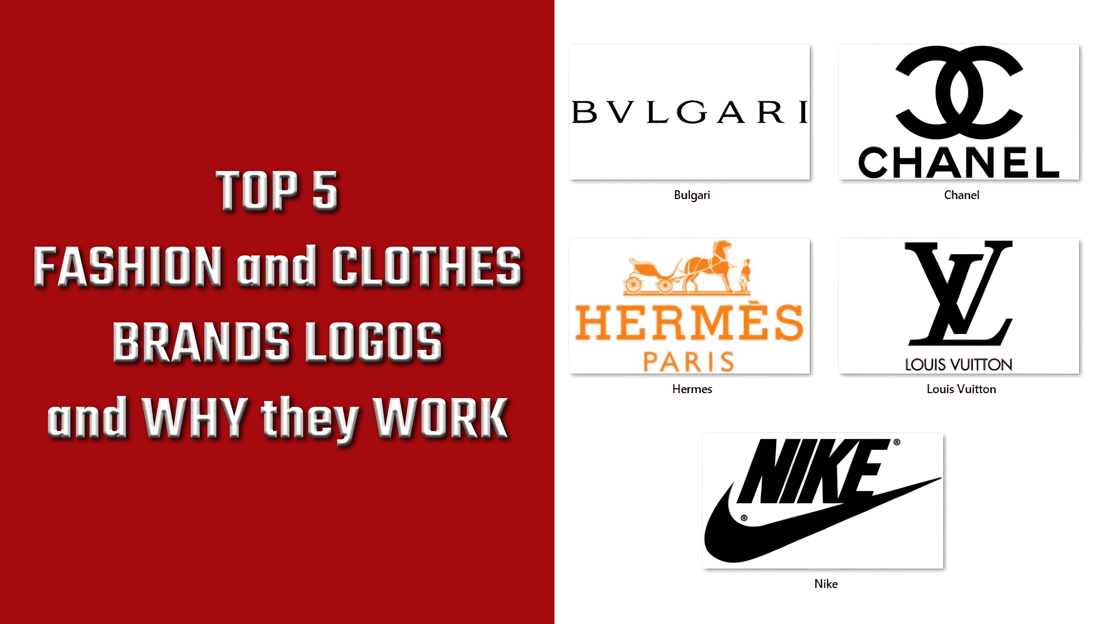
Hermes
![]()
Hermes International S.A. is another example of how visualization works effectively and usefully for your brand. As a French luxury fashion house with a 185-year history, this brand remains a global leader in its field. This is facilitated, among other things, by the original, memorable visual representation of its logo, which pays tribute to the company’s honored past. By deliberately avoiding simplifications, regular geometric shapes, and simple fonts, and by ensuring the scalability and adaptability of its visualization, the brand has ensured its uniqueness and recognizability. The company’s logo seems to proclaim that it “knows everything about luxury, sophistication and quality,” completely ignoring and dismissing everything as simple, primitive, and “unworthy” of the attention of such an elitist brand and its customers. The company’s emblem refers not to the products’ features but to its history, which began with the production of elite, sought-after carriage accessories for the aristocracy and shaped the direction of all future products the company would manufacture.
Chanel
![]()
The world-renowned perfume company Chanel built its logo in a modern minimalist style. Throughout its years of existence, the brand has consistently demonstrated the simplicity and unobtrusiveness of its visual identity, even when intricate, highly detailed patterns were popular. The brand has been looking to the future for a long time now, so it hasn’t had to make radical changes to its identity, unlike most companies that have been shifting toward a minimalist style lately. The company’s logo, an intertwining of the letters “C”, is fully in line with current design trends. At the same time, the brand is considered a pioneer in using such a graphic combination, symmetrical interlacing of letters.
Bulgari
![]()
It would seem that the Italian luxury-goods manufacturer Bulgari S.p.A., founded in 1884, does not need special advertising. However, even such a well-developed business with a deep history and unique products requires an update to incorporate modern features and changes. In addition, every long-established brand needs to periodically reaffirm its market position by strengthening its presence. When forming its own identity, the company used a visual “bait”: the letters U and V, Greek consonants, in its name. In this way, the company’s founder (a Greek national) managed to reflect his national identity while also finding a particularly attractive logo.
Louis Vuitton
![]()
One of the prime examples of how a well-constructed, beautifully executed logo effectively serves its brand is the Louis Vuitton logo. Today, the world-famous French fashion house began producing travel bags and suitcases designed by the future founder, Louis Vuitton. He gave his enterprise a name. Today, the brand, founded in 1854, is the largest manufacturer of luxury goods, including accessories, clothing, perfumes, and suitcases. A rare execution style distinguishes its logo: minimalist yet luxurious. The image’s graphics are somewhat intricate. The use of serifs and a complex pattern of intertwining letters gives the logo an elegant, high-class feel. Despite such a classic execution, it always looks modern. This is due to the absence of unnecessary graphic elements, which ensures visual purity and makes perception and memorization easier. All of this works in favor of constant recognizability.
Nike
![]()
The global sportswear manufacturer Nike has such wide popularity that it allowed the brand to name its emblem Swoosh. This visual embodiment has become the most successful of all modern brand designs. It is characterized by dynamism, simplicity, an unmistakable transfer of necessary information, and a reflection of the brand’s important characteristics. In line with modern requirements, the company removed its name, Nike, from the logo image, thereby ensuring compliance with the minimalist style. This variant became a vivid example of how graphics, initially rejected, became significant and especially popular in advertising within a few years.