


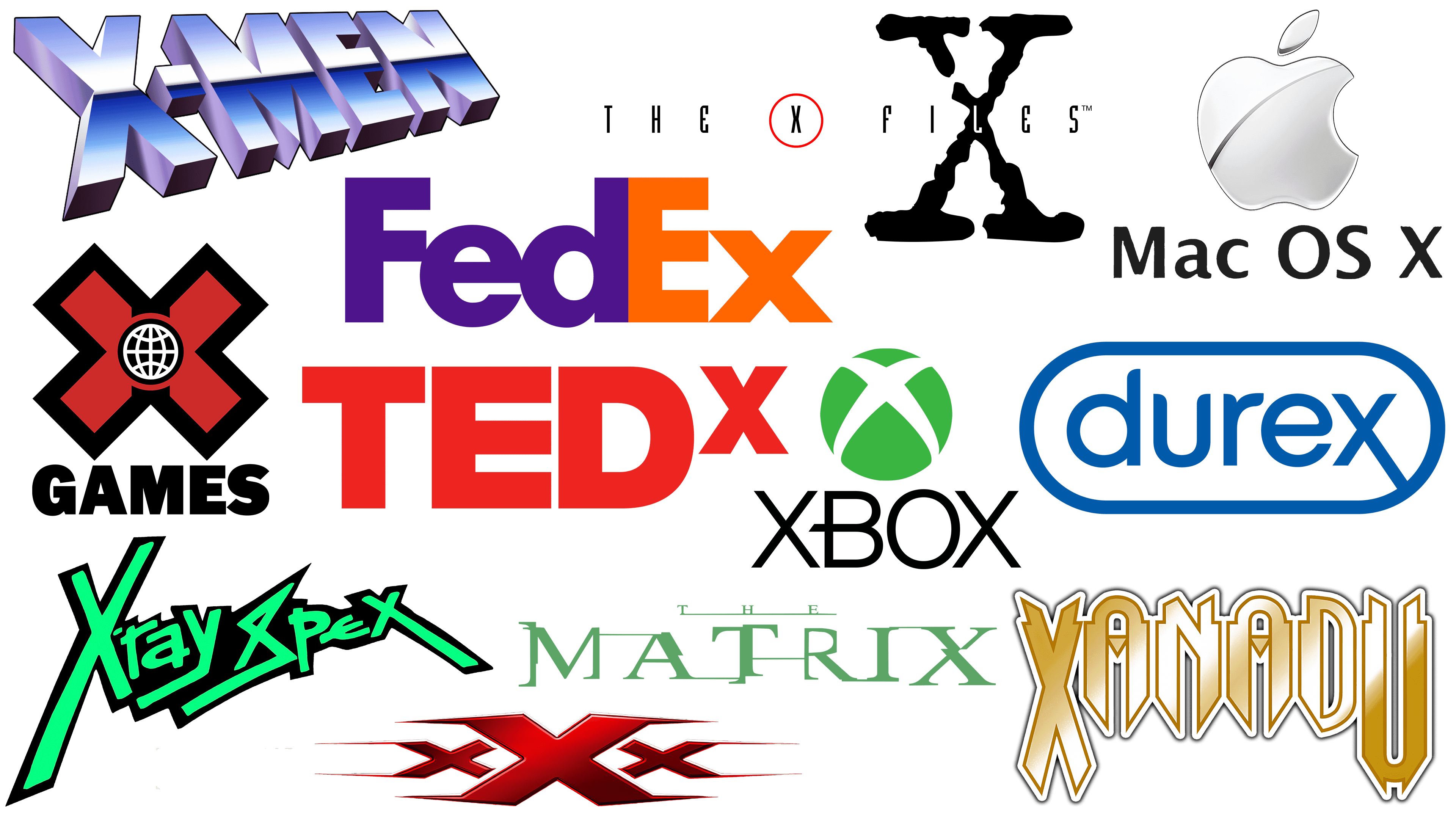
The recent branding antics of tech titan Elon Musk have sparked considerable controversy. His decision to rebrand the famous social network Twitter with the letter “𝕏,” a Unicode character, then quickly replace it with another letter, “X,” with slightly thicker lines, and then revert to the original “X” is a really interesting branding experiment.
While its playful approach may be a departure from conventional branding rules, it emphasizes the creative potential of the letter “X.” Far from being just a letter, the “X” has a unique visual appeal that has been effectively utilized in several logos and branding initiatives.
Durex
![]()
The brand identity of Durex, a well-known company in the personal care products industry, presents an interesting study in logo design, particularly in its use of the letter “X.” Although the Durex logo has undergone several modifications over the years, one element has remained constant: the letter “X” and its unique elongated descending ring.
Unlike traditional typography, where the letter “X” typically has a balanced structure, the “X” in the Durex logo features an elongated descending end. This design decision sets the logo apart from others and creates a visually appealing element that grabs the viewer’s attention.
If it weren’t for the elongated descending end of the letter “X,” the Durex logo wouldn’t stand out as much as it does. The unique structure of the letter “X” adds a distinctive feature that greatly enhances the logo’s overall appeal. It adds a unique, creative element to the logo, preventing it from being perceived as just another trite design.
In this case, the symbol “X” not only completes the brand name but also serves as a key design element, elevating the entire logo. By using the unconventional shape of the letter “X,” the designers have effectively turned an ordinary letter into a distinctive logo element.
FedEx
![]()
One of the most notable examples of the original use of the letter “X” in branding is FedEx, a world-renowned courier delivery service. This company’s logo not only incorporates the letter “X” in its name but also intelligently leverages the letter’s design potential and the surrounding space to convey its core values.
The FedEx logo is a masterpiece of subtlety and visual expression. Neatly hidden between the letters “E” and “X” is an arrow created through clever manipulation of negative space. This design element may not be immediately noticeable, but it leaves a lasting impression and helps the viewer appreciate the logo’s cleverness.
The arrow embedded in the logo is a powerful symbol indicating the company’s commitment to fast, accurate, and expeditious delivery of goods. It epitomizes the company’s commitment to staying on the move and to achieving the goal accurately and efficiently.
Mac OS X
![]()
The “X” symbol in Apple’s Mac OS X operating system is a prime example of product-name symbolism. In this case, the “X” has a dual function. First, it represents the Roman numeral “10,” which denotes the operating system’s version. However, the choice of the “X” symbol carries a deeper connotation, reflecting the brand’s commitment to innovation and forward-thinking.
In many scientific fields, including math, the “X” symbol often denotes an unknown or an as-yet-undiscovered variable. This association brings a layer of future symbolism to the Mac OS X name, subtly hinting at Apple’s commitment to discovering new technological frontiers. The letter “X” signifies that this operating system is an incremental upgrade and a leap into the future, incorporating innovations that redefine the user experience.
Matrix
![]()
When exploring the use of the letter “X” in branding and design, an exceptional example is the iconic logo of the Matrix movie franchise. In this context, the letter “X” is not a central figure, as in “The X-Files”; however, its presence remains important to the design’s overall perception.
The font in the Matrix logo has a characteristically jagged and glitchy aesthetic, reminiscent of the digital errors that can occur in a computer reality like The Matrix. The intentional font style emphasizes the film’s plot, in which characters navigate a simulated reality rife with anomalies and distortions.
In this design, the letter “X” does not dominate; rather, it reinforces the logo’s edgy appeal. Its subtle yet distinct presence in the word “Matrix” lends impetus to the overall design, reinforcing the movie’s theme of cybernetic dystopia.TEDx
The X-Files
![]()
The emblem of the cult television series The X-Files features two “X” symbols, each with a distinct style and shape. One “X” is graceful and neatly enclosed in a circle, its shape repeating the clean, modern typography of the series’ main text. The other “X” is noticeably larger and has a rough, shabby look, in stark contrast to its counterpart’s understated aesthetic.
This larger “X” draws attention with its striking visual boldness. Its assertive, rough-hewn style creates a compelling visual dynamic when combined with the word “files.” The combination works harmoniously, effectively communicating the brand without losing its impact.
The choice of a large distress-style “X” goes beyond simple visual appeal; it echoes the series’ chilling meaning. It creates a sense of creepiness and intrigue, mirroring the series’ exploration of the macabre and the unknown. This aesthetic choice is a fitting tribute to the series’s content, embodying its essence in the visuals.
TEDx
![]()
The TEDx logo is an interesting example of using the “X” symbol to distinguish a sub-brand within a larger and more established brand. In this logo, the “X” symbolizes an independently organized TED event, giving it a distinct identity while maintaining a connection to the TED parent brand.
The letter “X” serves as a subtle marker of differentiation, indicating that these events are independently organized and localized yet share the core principles and format of the TED brand. This allows TEDx events to incorporate diverse perspectives and content while maintaining the ethos of the original TED: spreading ideas worth sharing.
Positioning directly next to “TED” provides an unambiguous connection to the parent brand, which leverages TED’s established reputation and brand recognition.
The simple, minimalist design of the letter “X” blends seamlessly with the rest of the logo, maintaining visual integrity and emphasizing the synergy between TED and TEDx.
X Games
![]()
X Games, known for hosting a variety of extreme sports competitions, uses the letter “X” in its logo. The letter “X” stands out stylistically, lending the logo boldness and power that suit the game’s daring, high-energy nature well.
A small globe at the center of the letter “X” adds an extra element to the design. This globe symbolizes the X Games’ global reach, recognizing the participating athletes’ worldwide audience and diverse nationalities. This seemingly small addition conveys a deep understanding of the event’s scale and scope.
The logo’s overall aesthetic is somewhat reminiscent of designs from a previous era, giving it an old-school look. However, this is not a flaw and only adds to the logo’s charm. The retro-inspired design evokes nostalgia and creates a unique identity that sets X-Games apart in a market saturated with modern, minimalist logos.
Xanadu
![]()
Xanadu’s branding is a prime example of the retro aesthetic. Their logo is a striking combination of retro fonts and fearless design decisions, particularly exemplified by the bold letter “X” that opens the brand name.
The letter “X” in the Xanadu logo is big, assertive, and unequivocally occupies space. Due to its size and boldness, it immediately catches the eye, grabs the viewer’s attention, and significantly shapes the logo’s overall visual impact. This feature reflects a brand’s confident and distinctive identity, one that is not afraid to set its own trends.
Along with the pronounced “X,” the “U” in the Xanadu logo is admirable. It perfectly balances the bold “X,” harmoniously completing the word. The letter “U” is uniquely styled, giving the logo a retro feel while maintaining sophistication without appearing outdated.
Xbox
![]()
The Xbox logo, Microsoft’s renowned gaming console brand, is an interesting example of using the letter “X” as a design element. The logo features not one but three variations of the letter “X,” each playing a different role in the overall composition.
The Xbox brand name naturally contains two variants of the letter “X” in bold. These “X’s” are simple in design, giving the name a sense of balance and symmetry.
The most intriguing use of the letter “X” in the Xbox logo is in the globe that accompanies the brand name. This “X” is stylized and visually integrated into the globe, creating a memorable design element that transforms the logo from a simple word mark into a distinctive emblem.
The clever design of the “X” within the globe sets the Xbox logo apart. Its unique global interpretation makes the logo dynamic, reinforcing the brand’s association with innovation and creativity in the gaming industry. The stylized “X” has become synonymous with Xbox, a recognizable symbol gamers worldwide immediately associate with the brand.
X-Men
![]()
The use of the “X” symbol in the X-Men franchise logo is a prime example of how typography reinforces the brand narrative. The “X” is prominently featured in the logo, asserting that it is not just a letter in the brand name.
The “X” is often used as a standalone symbol, detached from the rest of the logo. Its highlighting is a distinctive emblem that powerfully represents the franchise’s characters. The “X” symbol represents these characters’ unusual abilities, setting them apart from the rest of the people in the storyline.
The bold, prominent “X” symbol in the X-Men logo reflects the franchise’s central theme of celebrating the extraordinary. By giving the “X” such visual significance, the design reinforces this theme and creates a strong, immediately recognizable symbol for the franchise.
X-Ray Spex
![]()
Many logos contain the letter “X” in their design. Examples include XX and X. The use of the “X” in the logo of the 1970s punk band X-Ray Spex has a special charm that sets it apart.
The letter “X” in the X-Ray Spex logo is not just a letter; it is a dynamic design element that embodies the band’s spirit. It is creatively positioned below the rest of the text, crossing it at an offset angle, which gives the logo a sense of movement and energy. This design reflects the band’s punk roots, embodying the genre’s rebellious spirit and lively vibe.
An intriguing aspect of the band’s name is that it is marked at both the beginning and the end with an “X.” The chosen typography emphasizes this symmetry, giving the logo a distinctive visual appeal. This detail frames the name, creating an eye-catching, memorable, and instantly recognizable pattern.
XXX
![]()
When representing an action-packed movie franchise, the choice of typography is crucial for conveying the brand’s essence. This concept is clearly illustrated by the XXX movie series logo, which features three bold, bright red “X” letters that embody the series’ spirit.
Each “X” in the logo is tall, determined, and undeniably powerful, representing the film series’ exciting action and high stakes. The choice of red heightens the intensity, evoking the danger, excitement, and passion at the heart of any action movie.
The subtle flick at the end of each “X ” gives the logo an intriguing visual effect. This seemingly insignificant detail serves a dual purpose. First, it diverges from the standard image of the letter “X,” lending the logo a distinctive feel. Second, the “clicks” imply movement, echoing the relentless action and constant movement that are hallmarks of the series.
The above examples show that using the “X” symbol in branding is no new concept. Whether it symbolizes mystery, the unknown, forward motion, or independence, the “X” symbol is powerful in visual communication. While Musk’s rebranding antics on Twitter may have seemed whimsical, they underscore the importance of visual elements in branding and the appeal of the “X.” So, yes, Elon, please take note!