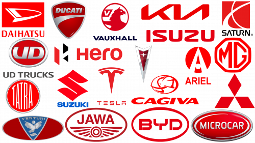
Red is a powerful emblem of passion, vigor, and resilience, representing confidence in the present and aspiration for the future. It is a shade that reflects the essence of love and a deep sense of caring for others. For commercial companies, this color symbolizes attentiveness to their customers.
Red conveys an atmosphere of authority and dominance, so it is preferred by well-known companies that want to emphasize their solidity and uncompromising product quality. In today’s study, we have gathered a selection of significant automotive brands that have artfully incorporated red into their logos, which subsequently hints at the confidence inherent in their corporate DNA.
These brands use the color red to varying degrees in their visual identity. Some of them use this vibrant hue boldly and expansively, while others prefer a more subtle approach, adding just a hint of this eye-catching color to their logo. Let’s take a look at twenty of the most recognizable automotive logos in which red takes center stage.
Ariel
Ariel, a long-standing British brand, incorporated small red elements into its logo as early as 1901. Initially, the red hue adorned the capital letter “A” in the logo and later became the backdrop for the gold-colored grille. By the 1950s, the logo changed to red letters on a yellow background.
However, when the logo was updated in 2001, the emblem changed dramatically. The entire emblem was recreated in bright red, accented by bold geometric shapes. The inclusion of the vibrant red color in the Ariel logo is not just an aesthetic decision but a strategic one as well. Traditionally associated with passion, strength, and vitality, red now serves as a testament to Ariel’s long-standing commitment to innovation and excellence.
BYD
BYD, a Chinese car manufacturer that has recently been focusing on the electric vehicle market, began using red as its logo in 2005, just two years after its founding.
The modern BYD logo is in a deep, evocative shade of red, giving its simple design professionalism and power. In this context, red becomes not just a color but a visual embodiment of BYD’s mission to move forward into the future, unafraid to break norms and break new ground in the electric vehicle industry.
Cagiva
For the Cagiva brand, the switch to red is a relatively recent development. For decades, the company’s elephant logo was depicted in gray or black and white. However, since 2000, the company’s logo has undergone a transformation, receiving a fresh red and white color scheme.
In the updated emblem, the elephant’s head is neatly encased in an oval frame, giving it a modern look. This updated symbol sits on top of the capital letters in the same bright red color. This change signifies a shift in color palette and a move towards a more modern and energetic brand image. The color change is not just a visual update; it is a symbol of Cagiva’s evolution, reflecting its bold, dynamic spirit and willingness to move into the future.
Daihatsu
When it comes to color accuracy, Daihatsu leads the way. This car manufacturer began using red in its logos in the early 1950s, and since then, no emblem has deviated from this color scheme.
The brand’s latest logo is one of the most colorful. It radiates vigor and kinetic energy. The use of red in Daihatsu logos over the decades underscores the brand’s unwavering commitment to maintaining its identity while demonstrating its ability to adapt.
The brand’s current logo, with its vibrant red hue, not only stands out visually but also reflects Daihatsu’s dynamism and enthusiasm in the automotive industry. By adhering to the color red, Daihatsu demonstrates its commitment to quality, innovation, and enthusiasm in the automotive industry.
Ducati
Ducati, an Italian sports motorcycle manufacturer, has gone through many evolutions in its visual identity. Red became the primary color in the company’s logo in 1995 and was retained after the redesign in 2009. This fiery hue serves as a striking backdrop for the elegant Ducati badge in a muted silver tone.
The boldness of this color reflects the dynamic and exciting character of Ducati motorcycles. The combination of the bright red background and the refined silver contours of the Ducati crest creates a convincing visual contrast, enhancing the brand’s recognition and appeal.
Hero
Hero, Honda’s Indian subsidiary, uses a simple yet robust logo that showcases vibrant red and black colors on a flawless white background. Red dominates the composition, while black is used only for one of the two vertical stripes that make up the emblem.
This restrained yet bold color palette gives the logo a stylish and modern look, effectively conveying the spirit of the brand. Despite its minimalistic design, the Hero logo vividly expresses the company’s personality. The use of red color not only attracts attention but also speaks about the assertiveness and progressiveness of the brand. The black stripe adds solidity and stability, further reinforcing the brand’s image of reliability. All these elements together form a visually appealing logo that remains true to the essence of the brand.
Isuzu
Since the company’s inception, the main color of the Isuzu emblem has been red. Over the years, the brand has changed the red hue, making it richer and more vibrant, giving the simple badge, consisting only of capitalized lettering, a sense of confidence and stability. Isuzu’s bold, fiery red color contributes to brand visibility and recognition. In a simple yet impactful Isuzu logo design, the red color stands out confidently, effectively demonstrating the brand’s ethics.
Which automobile brand logo has the color red?
In the world of automobiles, the color red is often associated with speed, passion, and courage. Many car manufacturers embody these qualities in their brands by using red logos.
Take Tesla, for example, a company that has revolutionized the world with its electric cars. Although its logo is usually presented in gray or white, it sometimes glows red, representing the company’s energy and innovation. Similarly, South Korean multinational corporation KIA often places its logo on vehicles in red, emphasizing the brand’s commitment to global leadership.
Japanese truck manufacturer Isuzu uses two vertical red pillars in its logo, signifying constant growth and progress. Similarly, Mitsubishi’s logo of three red diamonds reflects its name, which means “three diamonds” in English.
Not limited to car manufacturers, the red color is also loved by motorcycle manufacturers. The Italian brand Ducati highlights its white emblem and black letters in red, expressing power and Italian spirit. To the east is India’s Hero Motocorp, which uses a red and black logo symbolizing dynamism and innovation.
From Europe, the defunct Saturn brand, which once had a silver emblem of the planet Saturn on a red square. Vauxhall, another European brand from the UK, has a red griffin in its logo, linking its history to the future.
The red logo of the Chinese company BYD reflects its commitment to environmental protection and technological innovation. Meanwhile, French manufacturer Microcar uses a red and blue logo to emphasize its focus on producing compact and efficient cars.
Despite their different product lines and geographic locations, each of these brands uses red in their logos, representing passion, energy, and forward motion in their vehicles. These common qualities unite them with each other, and each contributes to the ongoing development of the automotive industry.
Jawa
Jawa, a time-honored motorcycle manufacturer, uses the color red in its logo as a symbolic reference to tradition and stability. Jawa’s corporate identity is based on rich heritage and reliability – these qualities are best reflected in the red color of the logo.
In the spectrum of color symbolism, red carries a dual message. It can be a harbinger of radical change and bold action, but it also encapsulates elements of history, elegance, and confidence. For Jawa, red is a reflection of these latter qualities. When combined with white, red takes on a fresh and invigorating aura, helping to create a striking and distinctive image that resonates with Jawa’s long-standing uniqueness to quality and time-honored practices.
KIA
KIA, a respected Asian automobile manufacturer, proudly wears the red logo that has been part of its corporate identity for over two decades. The logo originally had a calm, deep red hue. However, in 2012, it was changed to a brighter and more vibrant hue. Even after a major revamp of KIA’s visual style in 2020, the red logo has retained its important place in the company’s image.
As one of Asia’s most respected automakers, KIA’s red logo is a bold statement of its long-standing reputation and desire to continue pushing the boundaries of the automotive industry.
MG (United Kingdom)
The bright red hue of the British automaker’s minimalist logo is a beacon of rejuvenation and progress. The red monogram encased in a geometric frame radiates a modern and powerful aesthetic. The slight softening of the hexagon’s corners adds elegance to the design.
The use of a white background brings an element of light to the MG logo. It creates a harmonious balance with the powerful red color, making the logo aesthetically pleasing and reflecting the essence of the brand. This color scheme is a strong reflection of MG’s journey, emphasizing continuous development while paying homage to its historical past.
Microcar
Known for its simplicity, the logo of French automaker Microcar uses a strict red-and-white color scheme that is the foundation of the entire design. On a bright red background (which sometimes has a glossy coating), the brand name is written in white.
This color combination of the brand name on a fiery red background creates a sharp contrast that contributes to readability and visual impact. The logo does not utilize complex design elements or unconventional typography, instead opting for a minimalistic approach that reflects the brand’s ethos.
The text and background are enclosed in a thin silver frame that gives the minimalism of the logo a sophisticated feel. With no additional embellishments or complex fonts, this logo design perfectly embodies the brand’s philosophy of simplicity and functionality.
Mitsubishi
The Mitsubishi logo is a timeless example of automotive branding. The symbolic emblem Diamond, painted in bright red color, embodies the brand’s unwavering uniqueness to quality and its firm belief in the present and future. In this shade, the geometric symbol takes on a new dimension, creating a unique visual effect in keeping with the essence of the company.
The inscribed emblem adds substance and tangibility to the entire design. The lettering is the anchor that gives the logo solidity and substantiates the corporate identity. In this combination, Mitsubishi has found a color palette that achieves the perfect balance: the power and passion of red, reliability, and practicality reflected in the written logo. This combination creates a cohesive image of Mitsubishi’s heritage, emphasizing its reputation as a reliable automaker with a futuristic outlook.
Pontiac
The emblem of American automaker Pontiac incorporates shades of red in a gradient pattern. The reflective red background of Pontiac’s sharp triangular emblem embodies a sense of luxury and grandeur, creating a brand image. Combined with the silver color, the red hue radiates calmness and confidence. This combination manifests Pontiac’s desire for the highest quality and fundamental approach to automobile manufacturing.
In subsequent iterations, the emblem changed to a flat red color, giving the brand’s image a modern twist. This color transition speaks to Pontiac’s ability to adapt and evolve while at the same time staying true to its roots. By integrating red into its emblem, Pontiac continues to make bold statements, representing its rich heritage and readiness for future endeavors.
Saturn
Saturn is another car manufacturer that has chosen the dynamism of the color red in its emblem. Here, the red color plays a dominant role in the overall design. Saturn emblem is characterized by simplicity and minimalism of white graphics on the background of deep red color. This combination makes the emblem both striking and memorable.
The emblem consists of two white lines set against a bright red background. This concise and clean design flawlessly demonstrates Saturn’s uniqueness as an automobile manufacturer. It reflects the brand’s position in the international market, where it is recognized as a major player.
Suzuki
The iconic red letter “S” on the Suzuki emblem is probably one of the most recognizable symbols in the automotive industry. Combined with Suzuki’s blue lettering, the red hue looks vibrant and rich. The complex shape of the letter “S” perfectly balances the sharp geometric lines of the accompanying letters, making the logo attractive.
In this case, the red logo is not just an eye-catcher. It symbolizes Suzuki’s Asian roots and philosophical views. The choice of red, a color deeply rooted in Asian culture, serves as a nod to Suzuki’s heritage and reflects the values on which the company was built. This combination of modern design elements captures the essence of Suzuki, making the emblem unique and memorable.
Tatra
Tatra, recognized as one of the world’s longest-lived automakers, has traditionally used red as the central color in its emblem since the 1920s. Initially, the chosen red color was dark and created an air of aristocratic sophistication. Over time, however, the red hue in the Tatra emblem has evolved, becoming increasingly bright and modern.
Today, the Czech automaker’s emblem is a gradient of red hues, which gives the design a certain depth. In the center of this colorful background is a painted glossy round medallion. The medallion contains the brand name in white, which creates a striking contrast to the bright red color. The combination of modern design elements and colors associated with Tatra’s history creates a visually appealing logo with a distinct brand identity.
Tesla
Tesla is at the forefront of innovation, embodying a brand that is inextricably linked to the future. It pioneered the large-scale introduction of electric vehicles to the global market and never ceased to amaze us with its revolutionary technologies.
Considering the futuristic orientation of the brand, the use of red color in the Tesla logo is quite appropriate. This powerful hue emphasizes Tesla’s relentless pursuit of progress, symbolizing the endless path of evolution and improvement. The use of red in the company’s visual identity sends a clear message: Tesla does not want to stand still. It is a company that is in constant motion and constantly pushing the boundaries of what is possible.
UD Trucks
The UD Trucks brand logo is dominated by red and silver hues, often complemented by a simple black font. In this logo, the red hue serves as the background for an oval emblem encased in a gradient three-dimensional frame.
The red background is overlaid with the abbreviation “UD,” typed in a bold sans-serif font. The letters are in silver color, which gives the design volume and depth.
This color scheme combines the fiery brightness of red and the cold metallic sophistication of silver. The result is a logo that exudes an aura of reliability and energy, perfectly reflecting the brand’s reputation as a reliable truck manufacturer.
Vauxhall
Since the early 1980s, the Vauxhall brand has consistently used red in its logo, making it one of the two main colors in the design palette. The particular shade of red used by the brand is deep and vibrant, giving the logo a delightful hue. At the same time, it creates an image of stability and strength, radiating an almost masculine aura.
The Vauxhall logo features a mythological creature rendered in this shade of red. This choice of color not only enhances the creature’s aesthetic appeal but also complements the overall brand image. The red logo paints an image of an energetic and powerful automaker taking its rightful place in the automotive competition.
Venturi
Venturi features one of the most modern and chic logos in the modern automotive industry. The main element is the elegant red letter “V,” which shows confidence in its subtle yet assertive lines. Each stripe of the letter “V” is finished with sharp cuts and gracefully rounded ends, adding sophistication to the design.
Accompanying the centerpiece is the brand name in capital letters in a clean and modern sans-serif font that complements the elegant “V.” The letters are in strict black, which creates a convincing contrast to the passionate red color.
This dynamic ensemble is in stark contrast to the brand’s previous logo, which used red as an accent rather than as the main color. This transformation shows Venturi’s desire for reinvention, modernity, and a forward-thinking vision for the automotive industry.
What car company has a red logo?
In the world of automobiles, many companies use the color red in their logos. Here are some of them:
- Ferrari: perhaps the most famous car brand with a red logo. The Ferrari logo shows a galloping horse on a yellow background with the letters “S F” – Scuderia Ferrari enclosed in a red rectangle.
- Mitsubishi: The logo of this brand consists of three red diamonds joined together.
- Toyota: The Toyota logo is often depicted in red, although its color may vary depending on the context.
- MG (Morris Garages): The emblem of MG, a British car brand now owned by a Chinese company, is a red octagon with the white letters MG inside.
- Pontiac: Despite ceasing production in 2010, Pontiac used the red arrowhead logo.
- Alfa Romeo: The logo of Alfa Romeo, a premium brand with more than a century of history, features a red cross on a white background, which is a symbol of the city of Milan, where the company was founded.
- KIA: Although the official KIA logo is usually black, it is often seen in red on the brand’s vehicles.
- Peterbilt: The logo of Peterbilt, an American truck company, is a red oval with the brand name inside.
It is important to note that the color of the logo can change depending on the context and finish of the vehicle. Some brands use different colors for different models or product lines.
