


![]() Toronto FC Logo PNG
Toronto FC Logo PNG
The sports history of Toronto, Ontario, Canada, was shaped by the football club “Toronto,” whose emblem reflects the city’s cosmopolitanism. Its name, incorporated into the emblem, is a tribute to European sports traditions.
Toronto FC was awarded an FC MLS franchise in 2005, when Maple Leaf Sports & Entertainment paid $10 million to bring a team to Toronto. The club became the league’s first Canadian entry and joined MLS in 2007 as its 13th member.
From the start, the project focused on building infrastructure, including a stadium at Exhibition Place, scheduled to debut in the debut season. Ownership remained with MLSE, a major sports and real estate group.
The naming process involved AmoebaCorp, which presented several options in 2006. While Toronto Northmen gained support in public voting, the owners initially leaned toward Inter Toronto to reflect the city’s diverse communities.
After negative reactions to the leaked name, the plan was dropped. On May 11, 2006, chairman Larry Tanenbaum announced the final name, Toronto FC, referencing European football traditions and the use of “FC.”
At the same time, the club introduced its identity, including the motto “All for One” and a red-based color scheme, which led to the nickname “Reds.”
Toronto FC entered the FCS in 2007, marking the league’s structural expansion beyond the United States.
Ownership remained within MLSE, with stakes held by Kilmer Sports, BCE, and Rogers Communications, shaping the club’s corporate structure from the outset.
Meaning and History
![]()
Paul Beirne, Vice President of Business Operations, was responsible for launching and managing Toronto FC, overseeing brand development and positioning. He takes pride in the fact that the club’s logo avoided typical Canadian imagery. Under his guidance, Major League Soccer designers developed the Toronto FC logo concept and created preliminary sketches. The final version of the logo was done by the design firm AmoebaCorp.
2007 – today
![]()
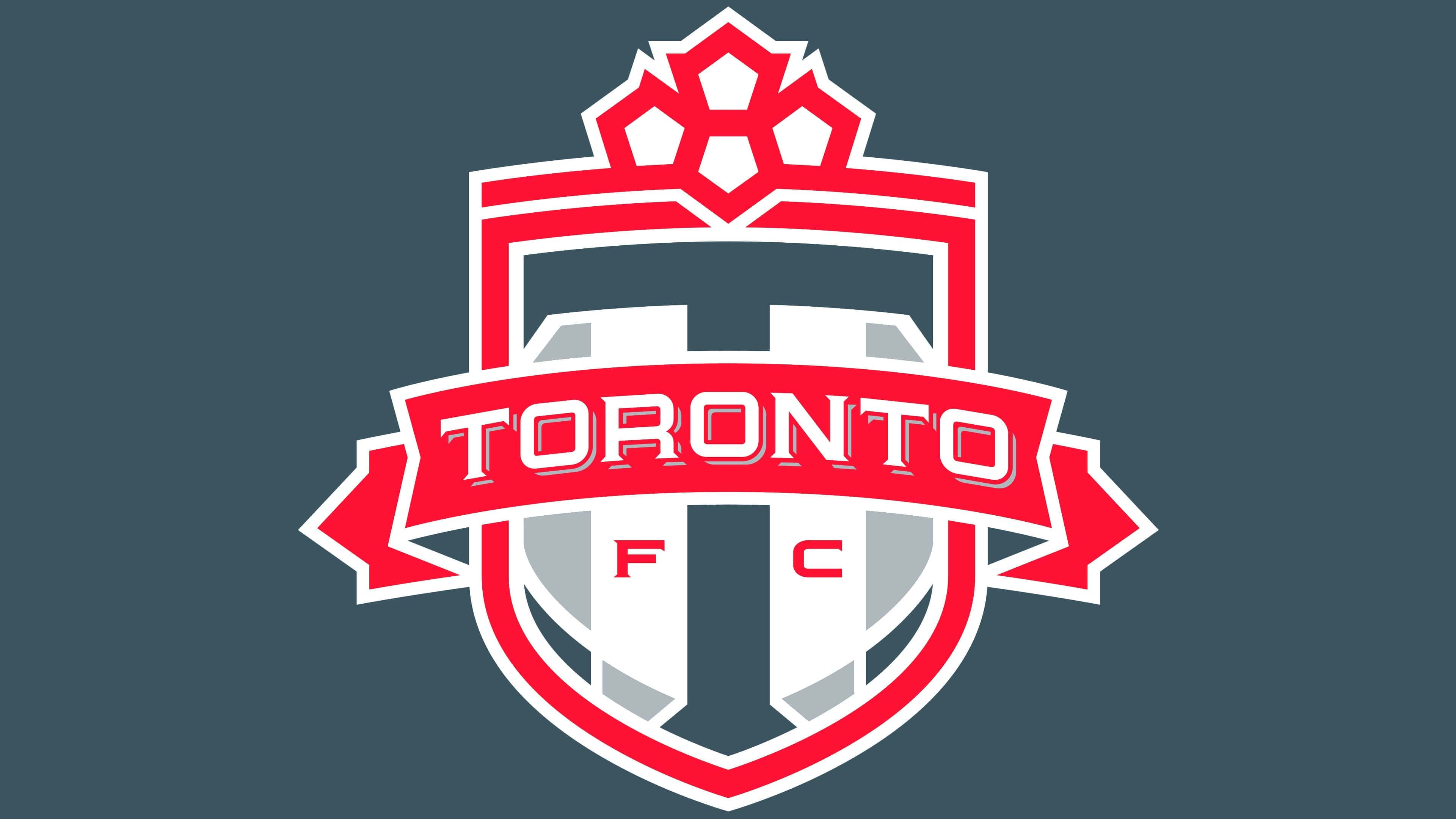
The main logo of Toronto FC depicts a heraldic shield. Above it runs a polygonal line, and a stylized maple leaf crowns the line. The leaf consists of 4 white pentagons outlined in red: 1 in the center and 3 on each side.
What is Toronto FC?
Toronto FC (shortened to TFC) is a Canadian professional football team that competes in MLS and represents the Eastern Conference. Founded in 2005, the team plays its matches at BMO Field. The club joined Major League Soccer in 2007, becoming the first Canadian franchise. It is owned by Maple Leaf Sports & Entertainment.
A large dark gray letter “T” occupies most of the Toronto FC emblem. On both sides of it are the letters “F” and “C”. Also, a wide ribbon inscribed “Toronto” runs through the entire emblem. The font is large, with abbreviations and shadows. White symbols contrast with the red background. The main contours of the elements in the Toronto logo are also red. Geometric patterns inside the shield are dark gray, white, and light gray.
Font and Colors
The logo of the Toronto football club is far from classic, though it features a traditional Canadian symbol: the maple leaf. However, it is depicted in a modern style and represents a composite figure composed of four pentagons, rather than the usual crown-shaped leaf. This was done specifically to move away from clichéd images and present something new that aligns with modern trends.
Thus, the designers managed to maintain the archetype characteristic of Canadian culture while avoiding simple copying. They offered a fresh interpretation of classic heraldic symbolism, which became the basis for the club’s visual identity.
The font for the “TORONTO” inscription was developed by the same people who created the emblem’s graphic elements. Major League Soccer’s designers formulated the concept, and AmoebaCorp handled the embodiment. Through their joint creativity, they developed an unusual font with serifs and distinctly geometric shapes. It was also used for the large letter “T” and the small “FC.”
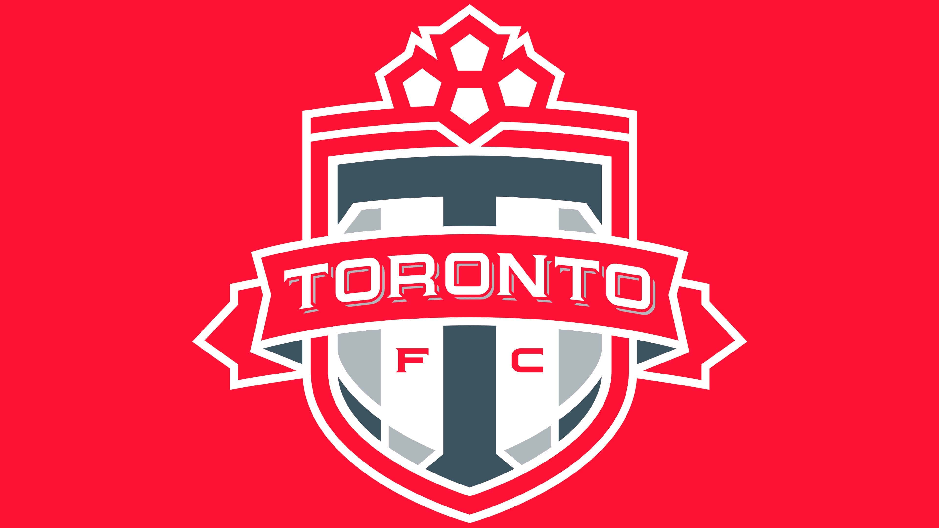
The unity of all elements of Toronto Football Club’s visual identity is emphasized by the team’s colors, represented in the logo: white, red (#AB1E2D), dark gray (#3F4743), and gray (#A3AAAD). This demonstrates the style’s conceptual nature and an attempt to present the football club as a brand.