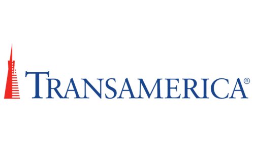
The Transamerica logo exudes stability and reliability. The emblem represents a major company that has made a significant mark in America’s financial realm. The logo’s central symbol is a testament to years of trustworthy work.
Transamerica: Brand overview
| Founded: | 1928 |
| Founder: | Aegon |
| Headquarters: | Baltimore, Maryland, U.S. |
| Website: | transamerica.com |
Meaning and History
Visual symbols of the conglomerate have always emphasized the diversity of Transamerica’s operations, implying that every subsidiary is part of the giant for a shared purpose. Whether it’s a map of America or a towering skyscraper spire, each logo conveys the grandeur and scale of the holding company. Rebranding initiatives coincide with leadership changes, with each leader eager to infuse new attributes into the conglomerate’s image.
What is Transamerica?
A major American financial and insurance conglomerate, it employs 15,000 insurance agents in California. The company has a workforce of 25,000 employees. Over the years, Transamerica has owned subsidiaries in manufacturing, transportation equipment, leasing, banking services, car rentals, and film production. Currently, its primary services revolve around life insurance and retirement plans.
1900s – 1961
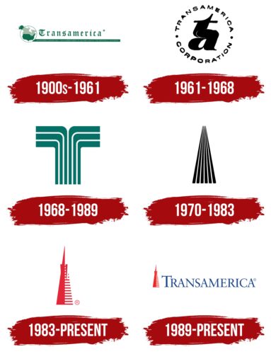
The company was founded by the son of Italian immigrants, Amadeo Pietro Giannini, in 1928. It merged a series of banks and companies under the name Trans-America Corporation. The main objective of the conglomerate was to gain control over financial services provided in the US. Thus, the initial logo was quite ambitious.
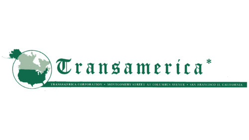
It featured a map of North America. The US territory was highlighted in dark green, representing the areas where the corporation intended to operate and expand. The image was encircled, resembling a magnifying glass. Alaska was excluded from the magnified area, while Canada was given a pale color. This approach focused attention on the desired region.
Following the image was the corporation’s name, written in Old English Gothic font. This choice signified the organization’s traditionality and conservatism, reflecting a careful approach to business and entrusted investments.
Beneath the magnifying glass image was a green strip displaying the company’s address in San Francisco, California.
1961 – 1968
Horace W. Brower took the company’s helm, aiming to expand its financial services. He initiated a rebranding to present a fresh image of the holding.
The logo had the corporation’s name written in thin letters around the circumference. At the center were the lowercase initials of Trans-America – “t” and “a.” The end of the “T” and the beginning of the “A” were connected, forming a shape in the middle of the emblem that resembled an elongated hyphen.
The use of lowercase indicated a decrease in the company’s assets since its banks were sold due to a new US law prohibiting banking corporations from owning industries. Trans-America focused on Occidental Life insurance and investments.
The circular shape of the logo emphasizes harmonious management. It represented the successful collaboration of various firms within the conglomerate. The shape embodied Brower’s new concept of a financial department store where people could address their financial concerns. Hence, the circle symbolizes an “all-inclusive” system.
1968 – 1989
John R. Beckett became the chairman. The corporation was growing vigorously, branching out into various business sectors. This market consolidation was marked with a new emblem. The rebranding was done by the New York design firm Sandgren & Murtha.
The artist Don Erwin aimed to reflect the corporation’s global plans in the emblem. The emblem resembles a schematic tree, its canopy spreading in various directions. The company’s business is moving in two directions. One pertains to finance, the other to ancillary services. Beckett acquired the film company United Artists to entertain clients.
The thick lines represent individual firms that make up the corporation’s tree. The green color emphasized themes of life, growth, and development.
1970 – 1983
The company is actively expanding in the transportation and car leasing sectors. The next phase is embodied in the emblem designed by Jerry Berman. The symbol consists of black stripes that, starting in front of the viewer, recede into the distance, narrowing towards the horizon. The image represented:
- A road. Transportation became a new line of work. The company bought Budget Rent-a-Car.
- A runway. 1968, the corporation acquired Trans International Airlines, entering the aviation industry.
Each stripe showcased the firm’s business direction, which involved banking, the film industry, transportation, insurance, etc. All lines move parallel because, in Director Beckett’s vision, the company should offer a full spectrum of financial services, including leisure. Moving forward symbolizes development and the company’s long journey with its clients.
1983 – today
The corporation focused on providing financial services and selling its subsidiaries in other sectors. The change in strategy was linked to the new director, James R. Harvey, who took office in 1981. A rebranding marked this shift in goals.
The company turned again to the Sandgren & Murtha agency. This time, the logo was designed by Thomas Bond. He decided to use the corporation’s office building as the primary symbol. Since 1972, Transamerica has been headquartered in San Francisco in the specially constructed Transamerica Pyramid.
The towering Transamerica Pyramid with its spire represented:
- The corporation’s long journey.
- Building a business step by step.
- Greatness dominance over competitors.
- A wide range of services.
- Reliability, confidence, and protection are crucial for an insurer.
- The achievements and wealth of the corporation.
The slender tip reaching for the sky symbolized ambitious plans to lead in providing financial services.
The red color of the logo was filled with energy and a drive towards the future. The pyramid became a symbol of the corporation and is used both with and without the name.
1989 – today
In 1989, the Transamerica tower was placed on the left side of the logo in a smaller size. The main element of the emblem is a large blue font with the company’s name. The placement indicates that the visual symbol belongs to the past. The corporation is constantly evolving, and this is its main feature. The fine, elegant letters move towards the future and are ready to transform depending on the financial market situation.
Font and Colors
Red, black, and green are the primary colors of the conglomerate’s logos.
- Black – strength and power. A longstanding presence in the market. Leadership positions.
- Red – energy, force, and activity. The company aims to move forward and achieve consistent profits.
- Green – growth and development, a profound life force.
The addition of blue shades in the latest logo indicates modernization: computerization and modern technological innovations.
The font Classical Garamond Std Roman emphasizes the giant’s ability to conduct business gracefully and effortlessly, thanks to a century of experience.
Transamerica color codes
| Pigment Red | Hex color: | #ee2922 |
|---|---|---|
| RGB: | 238 41 34 | |
| CMYK: | 0 83 86 7 | |
| Pantone: | PMS Bright Red C |
| Safety Blue | Hex color: | #19458f |
|---|---|---|
| RGB: | 25 69 143 | |
| CMYK: | 83 52 0 44 | |
| Pantone: | PMS 7687 C |
