More than a century ago, in 1913, the founder of Entergy, Harvey Couch, found himself in a new type of business at that time, based on the idea of creating safe, reliable, and affordable electricity for everyone. It was obtained from sawdust and waste from Foster forestry at a minimal financial cost. With the latest generators, Arkansas Power and Light span the Middle South, opening all doors to a new world of communities and people of today. Today, this idea works and power more than 3 million consumers in Arkansas, Louisiana, Mississippi, and Texas. Low-carbon and carbon-free energy sources provide the cleanest and most sustainable electricity at the lowest prices, making it especially relevant today. The brand is constantly striving towards zero emissions through continuous innovation, the addition of renewable energy sources, and the use of the latest storage methods. This year, the company is making significant changes to its corporate identity, creating a new visualization and logo, which focuses on a promising future.
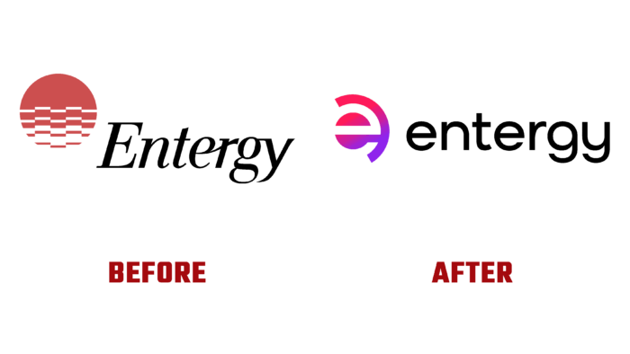
The upgrade became part of the overall program to increase the company’s utility and environmental safety. At the same time, the new identity has become a strong statement of the desire to take a leading position through innovation. The main focus of the visual changes is to demonstrate the construction of an integrated client-oriented structure. The update helped reflect all stages of the brand’s transformation into a modern and first-class utility. The new identity has become the most accurate reflection of all the company’s aspirations as an effective modern brand. Considering that the change in appearance has not happened for 30 years, this process has become especially necessary to ensure that the visualization is fully in line with modern trends. The changes are reflected in the corporate identity and color palette, which reflects new bright colors that symbolize new innovative thinking and create an attractive backdrop for viewers. The change of palette became the main reflection of the changes in the guidelines, which are now aimed primarily at caring for the client.
In a new interpretation, the brand has acquired rich textures typical of the southern region in the Persian Gulf, which are formed in unity with human warmth, filled with honesty and respect. His visualization aims to create conditions that empower everyone, demonstrating the desire to bring their proposals to people where they are while becoming a catalyst for future perspectives and changes. A complete visual transformation is designed for six months. And it should cover all outdoor signs, advertising on transport, towers, wherever there is information about the company and its offers.
