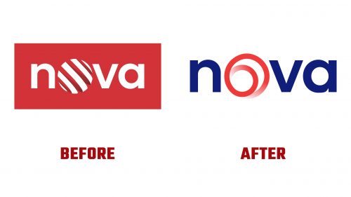
TV Nova has introduced a new visual identity, marking a shift in its branding strategy. The redesign blends original design elements with modern updates to strengthen its connection with viewers. Officially launched on August 9, the new visual system includes a revamped logo and an updated platform design, emphasizing simplicity and consistency.
The centerpiece of the rebranding is the introduction of an endless loop motif, replacing the spiral design used since 2015. The loop resembles a Möbius strip, symbolizing continuity and the network’s strong bond with its viewers. Its smooth, flowing shape reflects movement, representing the dynamic nature of its content.
A key redesign aspect is the updated color scheme, balancing blue and red. While the previous logo was predominantly red, adding blue adds depth. It aligns the channel more closely with its sister networks, like Markíza in Slovakia and Pro TV in Romania. This red and blue combination distinguishes the station while maintaining visual consistency within the network. The sleek, minimalistic logo, centered on the endless loop with smooth, rounded edges, ensures adaptability across different formats, from television to digital platforms.
The new logo’s typeface complements the loop’s design. It uses a modern sans-serif font that is bold yet simple. The clean, evenly-spaced letters enhance legibility without overshadowing the graphic element.
The loop is central to the station’s visual identity and is integrated into on-screen graphics and promotional materials to ensure consistency. Its dynamic nature allows for creative flexibility, enabling it to be animated or adapted in various contexts, adding versatility to the brand’s storytelling.
Motion graphics are important in the rebranding, with the endless loop animated to create a sense of flow and continuity. This use of motion, especially on digital platforms, strengthens the brand’s connection with its audience and enhances its modern appeal.
The new logo embraces minimalism, focusing on simplicity. The use of red and blue balances energy and stability, with red representing movement and innovation, while dark blue conveys confidence and reliability. The white sans-serif font emphasizes clarity and modernity, making the brand feel accessible.
The overall visual system is designed for flexibility, with proportions and dimensions suited for various formats. The rounded shapes and geometric precision convey modernity and approachability, while the updated visual identity adds motion and energy, appealing to a modern audience in today’s digital world.


