


The 21st century has ushered in a seismic shift in how people consume television content. The rigidity of scheduled programming has been replaced by an array of streaming platforms that provide unprecedented control over what, when, and where to watch. These platforms are technical marvels and branding phenomena, instantly recognizable through their unique logos.
Netflix, characterized by its distinctive red “N,” remains a dominant force in this digital revolution. Netflix has not merely been a repository for TV shows and movies but has also upped the ante by becoming a major producer of original content. This platform has deftly leveraged its brand to signify more than convenience; it symbolizes a new form of cinematic and televisual storytelling.
Apple TV+ has entered this dynamic market with a flourish. This service, adorned with the universally recognized Apple symbol, implicitly promises quality and innovation. The company has entered exclusive partnerships to stream live events and has funded the production of original series and films, often involving prestigious Hollywood figures. In the streaming space, Apple TV+ is a natural extension of the company’s broader ecosystem, consolidating its hold on the user experience.
Then there’s Amazon Prime Video, backed by the online retail giant Amazon. Its logo features the company’s signature ‘smile,’ which doubles as an arrow pointing from A to Z, reflecting Amazon’s aim for comprehensiveness. Prime Video boasts a formidable content library and offers added perks for Amazon Prime members, seamlessly integrating into the broader suite of Amazon services.
Other notable streaming services include HBO Max, Disney+, and Hulu. With its iconic abbreviation encased in a black box, HBO Max has extended its brand far beyond its cable origins, featuring HBO originals and a wide range of blockbuster movies and documentaries. Disney+ benefits from one of the most iconic logos in media history, capitalizing on a brand that has long symbolized family entertainment. Hulu, known for its green logo, serves a dual role by offering both on-demand content and live TV, thus appealing to a broader demographic.
Subscribing to these services isn’t just about accessing content; it’s about participating in a media ecosystem with its own unique style and appeal. Lesser-known platforms, such as Peacock, Vudu, and Crackle, contribute to the field with specialized content and branding, offering audiences even more options.
Logos play a significant role here, serving as identifiers and ambassadors for the content experience a user is likely to have. The visual symbols of Netflix, Apple TV+, Amazon Prime Video, HBO Max, Disney+, and Hulu have become part of the cultural lexicon, representing the ongoing transformation of how people relate to and consume media in this digital age.
Amazon Prime Video
![]()
Since its launch in 2006, Amazon Prime Video has become a formidable player in the streaming space, with over 200 million users. Prime Video is a global platform that adapts its pricing structure to different regions, making it accessible to various audiences worldwide. Among its wide range of offerings is unique content, such as the documentary series All or Nothing, which features sports teams worldwide.
Visually, Amazon Prime Video’s branding is designed for instant recognition, especially for those already familiar with Amazon’s brand identity. The iconic arrow from the main Amazon Prime logo is incorporated into the new logo, alongside the word “video.” In this case, the Amazon Prime part of the logo has a light blue hue, while the word “video” is in black. This color differentiation sets the service apart in the Amazon ecosystem, emphasizing its focus on video content.
The decision to keep the recognizable arrow from the original Amazon Prime logo is strategically important. It unifies Amazon’s diverse services, reinforcing brand authority and consumer trust. At the same time, the word “video” in black font serves as a visual reference to the service’s nature, differentiating it from other Amazon offerings, such as Prime Music or Prime Reading. It reflects the service’s mission to provide a wide range of viewing options, from popular movies and TV shows to original content, including documentaries and series.
Apple TV Plus
![]()
Apple, known for its iconic overbitten Apple logo, has entered the streaming services arena with Apple TV+. While the tech giant is best known for products like the iPhone and MacBook, Apple TV+ marks the company’s strategic entry into the streaming content market. Launched in November 2019, the service is available in many countries worldwide. It has a subscriber base of over 30 million, although it has yet to match the reach of competitors like Disney+ and Netflix.
Apple TV+’s visual style features the classic Apple logo and lowercase text “tv+.” This text uses the same font in various sections of Apple’s website, including product descriptions and press releases. The logo is set against a transparent background, allowing flexibility across platforms and promotional materials.
The Apple TV Plus branding utilizes the signature minimalist aesthetic that Apple is known for to maintain consistency. Using the same font and simple color scheme, the streaming service seamlessly integrates into the broader Apple ecosystem, providing a unified experience for consumers already familiar with the brand’s other offerings.
The logo’s transparent background provides versatility, making it easy to display across various interfaces, including Apple’s website, mobile apps, and physical media promotional materials. This design choice supports the idea that Apple TV Plus is an integral part of the Apple family of products and services, while also differentiating it through its focus on streaming content.
Incorporating a recognizable company logo into the streaming service’s brand identity also enhances brand recognition and fosters consumer trust. The minimalistic text “tv+” indicates that this is not just another Apple product but a specialized service for watching TV and movie content.
BBC iPlayer
![]()
BBC iPlayer is at the forefront of the UK’s digital entertainment system. Free for UK residents, this streaming service offers a diverse selection of content from the BBC’s extensive channel lineup. In addition to programs from mainland UK, it allows you to watch programs from other regions of the British Isles, such as Wales and Scotland.
iPlayer programs are generally available for a limited time, creating a sense of urgency to watch them before they expire. Notable programs, such as Match of the Day, regularly air on the platform and attract large audiences.
In 2022, BBC iPlayer underwent a significant visual identity change. The service stopped using the BBC logo in its branding for the first time. The new visual elements are represented by different shades of pink and an icon that resembles a play button. This is in stark contrast to previous versions. From 2020 to 2021, the logo was monochrome, with a pink color palette and a play button integrated into the letter “I.”
Before 2020, the logo had a more traditional look, with a black-and-white BBC icon and the rest of the text in pink. This color scheme was distinctive for many years and instantly recognizable to viewers familiar with the BBC.
The evolution of the branding reflects iPlayer’s ongoing efforts to modernize its identity and appeal to a wider audience. New shades and updated icons resonate with younger viewers while maintaining its reputation as a quality and reliable platform.
From a technical perspective, BBC iPlayer offers extensive streaming capabilities, supporting both standard and high-definition viewing. The user interface is designed to be easy to navigate, allowing viewers to easily find their favorite shows or discover new content.
Curiosity Stream
![]()
Documentaries have long been valuable media for education and entertainment. Since its inception in 2015, Curiosity Stream has carved out a significant niche among documentary-oriented platforms. The platform, which operates primarily in English and German, has attracted attention and user interest, reaching 20 million subscribers across its markets.
The versatility of Curiosity Stream content is one of its defining characteristics. The platform offers an extensive catalog of documentaries on various topics, catering to diverse interests and tastes. Subscribers can choose between different viewing resolutions, including Standard High Definition (HD) and 4K Ultra High Definition.
The Curiosity Stream logo utilizes an intriguing design strategy. The font is retained for all letters except “Y,” which is rendered in yellow and has a dot below its top. The remaining letters of the logo change between black and white depending on the background on which they are displayed.
Curiosity Stream’s growth trajectory is a testament to the platform’s ability to cater to a discerning audience that values quality documentaries.
Disney+
![]()
Disney, which has significantly impacted the entertainment world for decades, is launching its Disney+ streaming service in November 2019. Known for its rich legacy of iconic characters and stories from Mickey Mouse to The Lion King, Disney+ has become a natural extension of the brand in the digital realm. With a catalog that includes nostalgic films and popular TV shows such as The Simpsons, the service has resonated with audiences in Europe, the Americas, and several other countries worldwide.
The visual appearance of Disney+ is simple: the classic Disney logo, a font, and the “plus” symbol. A unique design feature is that the curved line that traditionally runs above the Disney name extends to the “+” symbol, giving it a whimsical feel and ensuring brand unity. This integrated design choice is noticeable across all Disney+ platforms, including the website and app.
Disney+ has maintained this unified logo, unchanged since its inception. Since the core Disney logo has remained unchanged since 1956, a change seems unlikely. The Disney+ logo communicates its identity subtly but effectively. By incorporating the recognizable Disney font and adding the “+” symbol, the service emphasizes its newness and expanding product offerings without losing its connection to the core brand.
This branding approach recognizes Disney’s storied past and underscores its commitment to providing a modern entertainment experience through Disney+.
ESPN+
![]()
ESPN is a colossal force in sports broadcasting, especially in the United States. It is a one-stop destination for sports fans, covering a wide range of sports, from American soccer (NFL) to basketball (NBA) and baseball (MLB). The platform is not limited to American territory; it has expanded into international markets, particularly the UK.
ESPN offers two different geography-specific streaming services. ESPN+ is the primary platform for US residents to watch live and on-demand sports content. Launched in 2018, ESPN+ has quickly amassed more than 20 million subscribers. The service provides seamless cross-platform access, allowing subscribers to follow sporting events on multiple devices. For European audiences, the alternative is ESPN Player, which offers a comparable selection of sports content.
The ESPN+ logo follows the basic design elements of the main ESPN logo. A distinctive feature is the inclusion of a gold-colored “plus” symbol at the bottom of the logo. This symbolic addition signifies the enhanced features and content library available to ESPN+ subscribers.
From a technical perspective, ESPN+ delivers high-quality streaming with minimal latency, aiming to replicate the immersive, immediate experience of watching live sporting events. This utilizes state-of-the-art streaming technology to provide a seamless user experience for casual fans and sports enthusiasts. ESPN and its digital extensions, including ESPN+ and ESPN Player, have effectively capitalized on the growing demand for affordable, high-quality sports content across markets.
HBO Max
![]()
HBO Max is a significant expansion of the iconic US television network HBO, whose acronym is Home Box Office. Launched in May 2020, it coincided with the COVID-19 pandemic: the service was originally scheduled to debut in 2019. Despite the late launch, HBO Max gathered over 75 million paid subscribers in a relatively short period.
The visual identity of HBO Max is based on the well-known HBO logo, now accompanied by the word “max” in lowercase. The “max” part creates an interesting visual dynamic that utilizes a gradient of purple hues and a glow effect.
This is not the original HBO Max logo design. Preliminary versions used a different color scheme, including cyan, magenta, and red. The HBO part was originally smaller and on a separate line from the word “Max.” The change in the logo’s color scheme from the previous version serves a specific purpose. Purple hues are often associated with creativity and imagination, qualities that align with the diverse, innovative content library on HBO Max. The luminescent effect in the “max” lettering is intended to create a sense of excitement and draw attention to the expanded service beyond traditional HBO programming.
HBO Max chose to retain the core HBO logo, a strategic move to capitalize on the strong HBO brand built over the years in television entertainment. In this way, HBO Max gains immediate brand recognition, and the change signals that it is an expanded service with a broader range of content.
Hulu
![]()
Established in 2007, Hulu has carved a significant niche among streaming services, amassing over 45 million subscribers. Although the platform mainly targets audiences in the US and Japan, its vast content library makes it a significant player in the entertainment industry. The Walt Disney Company largely owns the platform, strengthening its influence and resources.
Hulu offers a wide variety of programs. The service is not limited to specific genres and styles, offering programs to suit all tastes and preferences. Hulu’s library is vast, featuring classic animated series such as “Rick and Morty” and “Family Guy,” as well as the iconic “The Simpsons.” Some plans include subscriptions to other popular platforms, such as ESPN+ and Disney+, adding value to the service.
The Hulu logo has undergone several changes over the years, though its essence remains largely unchanged. Since its inception, the logo has utilized a specific font that has become synonymous with the brand. The current logo, in use since 2018, features a lighter, brighter shade of green, making it more appealing than its predecessors.
Before settling on the current design, Hulu underwent several iterations of its logo. The original version was the platform’s primary logo from 2007 to 2014. A second version was used from 2014 to 2017. The third version wasn’t long; it was introduced just one year before the current design.
These changes in visual branding reflect Hulu’s growth and adaptation in the ever-evolving entertainment sector.
Nebula
![]()
Nebula occupies a unique niche in the streaming platform industry. Founded by YouTubers, including Ali Abdaal, the service stands out for its creative-driven model. Unlike conventional streaming platforms, which large corporations often run, Nebula is owned by independent content creators. This approach fosters a symbiotic environment in which creators can freely express their ideas and audiences can enjoy diverse, creative content.
The platform offers an eclectic range of video content, including entertaining content and tutorials to develop various skills. This variety of content is designed to satisfy the audience’s intellectual and leisure interests.
Visually, the Nebula logo features restrained yet effective design elements. It employs a straightforward typographic approach, where each letter is capitalized and spaced evenly. This clean, minimalist style is complemented by a star at the beginning of the word, giving the logo a celestial feel that aligns with the platform’s name and mission. The star is more than just a decorative element; it symbolizes the platform’s commitment to being a shining beacon for both creators and viewers.
Nebula has successfully differentiated itself in a crowded market through unique content and simple branding. The creativity-driven platform brings authenticity and diversity to its offerings, setting it apart from commercialized competitors.
Netflix
![]()
Netflix dominates the streaming television service industry. Founded in 1997 by former coworkers Reed Hastings and Mark Randolph, the company’s initial business model was movie rentals. However, the company recognized the untapped potential of the digital sphere and switched to Internet streaming.
Netflix’s visual branding is one of the most easily recognizable worldwide. The company has two main versions of its logo. One features the company’s full name in bright red font on a white background, while the other features the initial “N” in red on a black background.
From 2000 to 2014, Netflix used a significantly different color scheme and design. The text was white with a black outline and set against a red background. The original logo bore little resemblance to the modern logo, which features black, purple, and white colors.
The transition from a physical movie rental service to an online streaming giant is reflected in the branding. The logo’s transformation from its original intricate design to its current minimalist version evidences this.
This branding conveys the company’s focus on simplicity and usability and is an instantly recognizable symbol in a market flooded with competitors. Netflix’s color choices, particularly red, evoke a sense of urgency and excitement consistent with its entertainment content.
Paramount Plus
![]()
Paramount is well-known in the entertainment industry, particularly in film and television production. In 2014, it debuted in the streaming sector under the CBS All Access brand. A 2021 rebrand led to the name change to Paramount+.
This rebranding was not limited to the United States. Australia also transitioned from the former 10 All Access service to the new Paramount Plus brand. The streaming platform’s global presence is expanding. It offers its services in various countries, not only in the US and Australia but also in Austria and the German-speaking regions of Switzerland. In some territories, the service operates under different names to accommodate local brand preferences or comply with license terms.
The Paramount Plus logo remains straightforward and uncluttered. Typography similar to Paramount’s main logo ensures brand consistency. Some logo variations include elements such as mountain and star symbols, which are associated with Paramount’s heritage in film and television.
The content offered by Paramount+ is a rich mix of elements from movies, contemporary television series, and classic films from the archives. However, the platform offers not only pre-recorded content but also live programs. This includes instant access to live news and sports events, distinguishing it from many competitors in the streaming market.
Paramount Plus prioritizes high-quality streaming to ensure a smooth and lag-free viewing experience. Streaming quality adapts to the available bandwidth, minimizing interruptions.
Peacock
![]()
Since its launch in July 2020, Peacock has experienced a meteoric rise, gaining a significant subscriber base of around 20 million users. The company has established its presence primarily in the US and, starting in February 2023, will expand into select European markets, including Switzerland, Austria, the UK, Germany, and Italy.
Peacock offers an eclectic range of programming that appeals to viewers with diverse tastes. From British period dramas like Downton Abbey to classic American TV shows like Saved by the Bell, the platform can sustain audience interest.
The Peacock logo consists of lowercase letters adorned with a cascade of multicolored circles at the end. This color scheme features shades of yellow, orange, red, blue, aqua, and green, progressing from top to bottom. The variety of color schemes reflects the service’s commitment to becoming a one-stop source for a wide range of entertainment.
Peacock chose a simple, aesthetically pleasing, and easily recognizable design that aligns with current branding trends. The lowercase typography lends the brand a modern, casual feel, while the riot of colors adds a dynamic quality. The balance between simplicity and vibrancy embodies what Peacock strives to offer: a user-friendly platform with multiple viewing options.
Peacock’s growing subscriber base, extensive content catalog, and innovative branding strategies make it a competitive player in the streaming sector.
Pluto TV
![]()
Founded in 2013, Pluto TV has established a strong foothold in the streaming space, with an estimated 72 million monthly active users. Headquartered in Los Angeles and Berlin, the service has a broad geographic footprint, serving an international user base.
Pluto TV’s logo is a testament to an effective design that combines simplicity and striking visuals. In it, the name of the service is written in lowercase letters, and the word “tv” is reduced and placed in a black circle. Complementing the colors yellow, orange, purple, and violet, the text is decorated, giving the logo a playful yet refined look. This color scheme serves more than just aesthetic purposes. For example, bright hues symbolize the platform’s dynamism and desire to provide diverse and interesting content.
The lowercase font chosen for the branding evokes a sense of modernity and accessibility. The design strikes a balance by using a smaller font for the “TV” part, enclosed in a black circle, which emphasizes the brand name “Pluto” and indicates its affiliation with television platforms.
A large part of Pluto TV’s appeal lies in its wide selection of content. Viewers can watch programs and movies streaming and follow broadcasts as they air. Content is categorized by genre, such as crime or science fiction, making it easy to navigate.
Sky
![]()
Having become the leading television operator in the UK, Sky has successfully expanded its reach to other European countries, including Italy and Germany, as well as other international markets. Known for its attractive range of programs and packages, Sky continues to dominate viewer preferences in the UK and beyond. The company has maintained its leadership in traditional broadcasting and seamlessly integrated streaming services into its offerings, enabling it to cater to today’s changing viewing habits.
Sky News and Sky Sports are among the content available on the service, which can be viewed on both traditional TV and streaming platforms. This dual approach allows Sky to maintain a steady user base while adapting to new technologies and content consumption preferences.
Visually, the Sky logo has undergone several changes over its history, though some key elements have remained consistent, particularly the choice of wording. The latest version, unveiled in 2020, features a vibrant mix of purple, orange, and shades of pink. Previously, Sky’s logos used the same font but varied in color. The company has been experimenting extensively with logo design: previously, they used elements such as swooshes and ovals.
Sky’s history of emblem changes symbolizes the company’s flexibility and adaptability. Each design iteration, whether a change in fonts or the color palette, aligns with visual branding trends, ensuring both familiarity and novelty for audiences.
Tubi
![]()
Since its launch in 2014, Tubi has made significant strides in the streaming industry. Acquired by Fox Corporation in 2020, the company has significantly grown its user base to over 50 million users worldwide, mainly in the Americas, Australia, and New Zealand. Although it was unavailable in Europe in February 2023, it plans to enter various regional markets.
Tubi offers a predominantly ad-supported model, distinct from subscription-based services, allowing users to view content in streaming mode without requiring a paid subscription. This opens up many opportunities to watch movies and TV shows across various genres. Tubi caters to a wide range of tastes and preferences, from action and drama movies to documentaries, making it popular among diverse audiences.
The Tubi logo consists of lowercase letters in a relatively wide font, colored black. This unassuming design enables the platform to convey a sense of accessibility and usability that aligns with its free, no-cost service model. The logo’s simplicity focuses on the core offering, an extensive catalog of movies and television series.
Fox Corporation’s ownership adds another layer of intrigue to Tubi’s journey. The media conglomerate’s affiliation provides Tubi with the resources and network capabilities to expand and further enhance its content.
YouTube TV
![]()
Since its inception in 2005, YouTube has become a global phenomenon, amassing over 2.5 billion monthly active users. What began as a platform for creating user-generated videos has expanded its reach and diversified its services exponentially. One of the brand’s significant growth areas is YouTube TV, which debuted in 2017. This service offers live TV streaming and includes several well-known channels, including ESPN, Food Network, and Nickelodeon. While the platform is currently limited to a US audience, it generates interest in expanding to other countries.
In terms of branding, YouTube TV takes a minimalist approach. The logo features the ubiquitous YouTube play button in the standard red-and-white color scheme. The only change is the addition of the letter “TV” in black font next to the original logo. This simple yet effective design emphasizes the platform’s focus on TV content while aligning with the parent brand’s iconic imagery.
By sticking to the original YouTube logo, YouTube can leverage the parent brand’s reputation and extensive user base. This allows YouTube TV to immediately reach a market already familiar with YouTube’s interface and user experience, reducing the learning curve for new users.
Regarding the platform, YouTube TV aims to be a complete alternative to traditional cable and satellite TV. It offers numerous channels covering a wide range of interests, from sports and cooking to children’s programs. The platform also offers cloud DVR storage and simultaneous streaming across multiple devices, making it a versatile option for today’s viewing habits.
Another aspect to look out for is YouTube Music, which underscores the platform’s strategy of embracing diverse forms of entertainment. Like YouTube TV, YouTube Music aims to provide specialized services while leveraging the parent brand’s prominence and infrastructure. These services represent YouTube’s strategic expansion into different areas of digital entertainment.
How to watch your favorite streaming services from anywhere
Many streaming platforms operate in geographically limited regions, usually due to restrictions imposed by content licensing agreements. Despite these restrictions, some platforms extend their services globally, albeit with varying catalogs tailored to different regions.
One popular way to circumvent geographic restrictions is to use a virtual private network (VPN). This technology redirects your Internet connection through a server in a selected country, allowing you to access content exclusive to that region. However, some platforms impose residency requirements, making it difficult to use a VPN to access their content.
A VPN is not just about bypassing geographical restrictions; it also provides an additional layer of security that allows you to hide your identity. This feature helps to protect the user from surveillance and maintain privacy. The encrypted connection ensures the privacy of online activities, effectively protecting from unwanted attention.
Several VPN services are available, each with its own features and advantages. One of the most effective options is NordVPN, characterized by its reliable security protocols and extensive server network. Strong competitors are ExpressVPN and SurfShark, each offering a unique combination of speed, security, and server capabilities. These platforms offer various pricing models, enabling potential users to select an option that suits their budget and specific needs.
When selecting a VPN service, it is crucial to consider connection speeds, server locations, and the service’s privacy policies. Users often weigh these parameters according to their needs, whether it’s streaming content from another country or maintaining online anonymity.
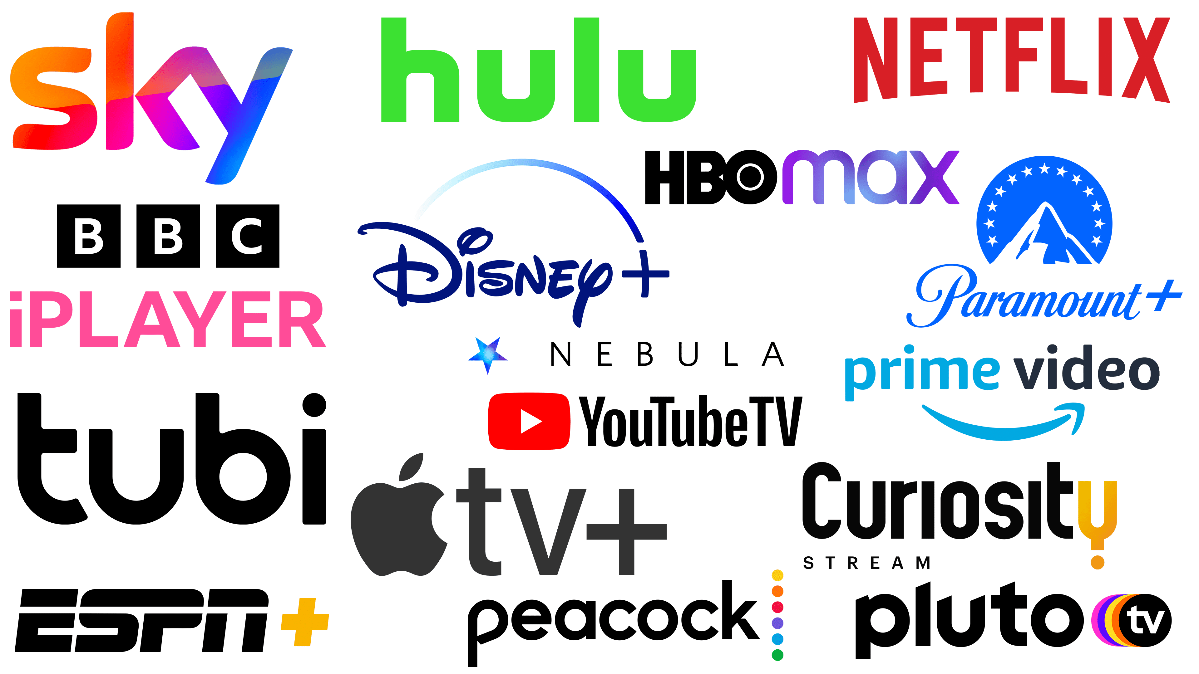
All the best streaming service logos in one place
Logos in the streaming services industry come in various designs, each telling a unique story. These visual identifiers evolve dramatically to reflect a company’s ever-changing ethos or strategic goals. While giants like Netflix and Disney+ have achieved global recognition, newer platforms, such as Pluto TV and Tubi, have emerged as viable alternatives.
Conceptualizing and finalizing a logo for a streaming service requires careful thought. Market demographics, brand values, and aesthetic considerations must be carefully analyzed. This level of detail is not specific to streaming services but rather reflects the dynamics of logo creation across various industries. The principles of an attractive color scheme, minimalist yet meaningful design, and effective market positioning remain the same.
In the rapidly evolving streaming industry, a well-designed logo serves as a beacon of brand identity and a powerful marketing tool. The balance between modernity and timeless elements often plays a key role in design. The choice of font, color palette, and even the placement of elements on a logo can evoke certain emotions and thoughts, ultimately influencing consumer behavior.
Like companies devote resources to market research, technology, and content acquisition, logo design is equally important. The challenge is to create a visual emblem that resonates with potential and existing users. The emblem should be versatile enough to adapt to different platforms and formats yet memorable enough to be instantly recognizable.
Streaming platform logos may seem simple, but a closer look often reveals their complexity. These logos are not just aesthetic choices but strategic decisions to increase brand recognition, convey a company’s ethos, and make it stand out in a highly competitive market.