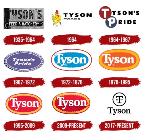
The Tyson Foods logo represents the company’s long history of innovation and quality in agriculture and food production. This emblem highlights Tyson’s role as a leader in the food industry, following trends setting them by continually expanding its product range and implementing advanced technologies to improve both the quality of its products and their production conditions. This logo underscores Tyson’s commitment to excellence and leadership in the food sector.
Tyson Foods: Brand overview
In 1931, John W. Tyson started his journey with a truck full of chickens in Springdale, Arkansas. This small beginning was the seed for what would become Tyson Foods, a giant in the global food industry. The company’s foundation was built on innovation and tradition, starting from these humble roots.
By 1935, Tyson achieved a significant milestone by becoming the supplier of broiler chickens to the Chicago Black Hawks hockey team. This partnership marked Tyson’s entry into the larger food supply world. Following this success, in 1947, Tyson opened its first processing plant in Springdale, enabling the company to offer a wider range of chicken products and setting the stage for rapid growth.
Over the next few decades, Tyson Foods expanded by acquiring other poultry companies and entering the beef and pork markets. The company went public in 1977, listing on the New York Stock Exchange, which solidified its presence in the American food industry. During this period, Tyson adapted to changing consumer preferences by introducing new products like chicken nuggets and sandwiches.
The 1990s were pivotal for Tyson, strengthening its position in the meat production industry through strategic acquisitions, including Holly Farms in 1989 and Hudson Foods in 1998. These acquisitions allowed Tyson to grow and achieve economies of scale.
Entering the 21st century, Tyson ventured into international markets and diversified its product line to include Mexican cuisine and sandwiches. The company faced and addressed various challenges, such as business practices, labor relations, and food safety, showing its commitment to improvement and transparency.
The 2010s highlighted Tyson’s dedication to its core operations while exploring new product categories and markets. In 2014, Tyson acquired The Hillshire Brands Company, adding well-known brands like Jimmy Dean and Ball Park to its portfolio. Recognizing the trend towards plant-based diets, Tyson invested in alternative protein startups and launched its plant-based and blended protein products, Raised & Rooted.
Today, Tyson Foods offers a broad array of food products, constantly adapting to consumer demands with a focus on sustainability, animal welfare, and supply chain transparency. Tyson’s story is continuous innovation, strategic growth, and adaptation to the evolving market and consumer tastes. From its modest start to becoming a leader in the food industry, Tyson’s journey reflects the dynamic nature of the American food sector and its ability to navigate through challenges while staying true to its mission of feeding the world.
Meaning and History
What is Tyson Foods?
Tyson Foods is a major American company that produces and distributes meat products, including chicken, beef, and pork. It supplies retailers and restaurants nationwide with everything from fresh meat to frozen items and ready-to-eat meals.
1935 – 1964
Tyson Foods was founded in 1935 and quickly became well-known in the food industry. The company’s first logo symbolized quality and reliability, featuring an elegant, classic black-and-white design that showed strength and trustworthiness.
The logo’s lettering was three-dimensional, with white lines down the middle, making each letter appear strong and stable. This design reflected the company’s focus on poultry feed, emphasizing the importance of durability for healthy poultry development. The black background was shaped like an elegant blade of grass, adding to the design’s beauty and meaning. It represented the natural quality of Tyson Foods’ products, underscoring its commitment to natural ingredients. The original logo effectively communicated Tyson Foods’ mission and innovative approach to feed production.
1964
When Tyson Foods expanded to include poultry meat, they updated their brand with a new symbol—a cartoon rooster wearing a red top hat, tie, and cane. This fun and lively image symbolized the company’s new direction. For the first time, the logo included the full name, “Tyson’s Foods,” to emphasize the company’s serious and expansive approach.
The design reflected Tyson’s commitment to quality, innovation, and a playful engagement with customers. The rooster portrayed humor and optimism, highlighting Tyson’s unique marketing strategy.
1964 – 1967
In 1964, Tyson Foods introduced a significant new logo. This design, featuring the phrase “Tyson Pride” on two levels, was a modern concept at the time. The logo was straightforward yet full of deep symbolism, reflecting the company’s accomplishments and future goals.
The ‘T’ from Tyson and ‘P’ from Pride were each enclosed in maroon and gray circles. These colors and shapes symbolized perfection and precision, underlining Tyson’s commitment to the highest standards. The circles also represented the company’s dedication to excellence.
These design elements indicated important areas of development for Tyson, such as poultry meat sales and the start of a feed processing plant. By controlling the entire production cycle, from raising poultry to processing feed and meat, Tyson enhanced product quality and production efficiency.
1967 – 1972
When Don Tyson took over Tyson Foods, the company his father founded, he introduced a new logo that symbolized a fresh start and new management. The logo featured an oval shape with images of eggs in incubators around the edge, representing new life and growth—key aspects of the company’s products and strategic direction. These images highlighted Tyson Foods’ focus on innovative poultry production and breeding.
The emblem was colored lilac, a choice conveying dreams, inspiration, and high aspirations, qualities Don Tyson prioritized. Lilac also represents creativity, generosity, and ambition, reflecting the company’s goals for leadership and global impact in agriculture. This emblem symbolized Tyson Foods’ effort to unify its various productions and branches under one vision.
1972 – 1978
When Tyson Foods changed its name from Tyson’s Pride, it also updated its corporate logo. This new emblem, the Tyson® oval, visually captures the brand’s evolution and aspirations. Each logo element is designed with meaningful symbolism and reflects the company’s values and goals.
The logo features a red oval outline that symbolizes dynamism, energy, and unity among the Tyson Foods team. Red is also linked with leadership, passion, and determination, underlining the company’s goal to lead the industry and secure a prominent market position.
A blue cloud at the logo’s center represents ongoing development and ambitious future planning. The color blue conveys harmony, stability, and trust. It reminds us of the importance of dreaming big, pursuing global ambitions, and continuously seeking new opportunities for growth and brand prosperity.
1978 – 1995
To connect with the community and support social development, the company updated its logo to feature bright orange and red colors representing its core values. These colors represent the brand’s dedication to communication, enhancing community spirit, and fostering a society supporting mutual aid.
Orange in the logo represents energy, warmth, and optimism, aligning with the company’s goals to engage actively in community life and support significant social projects. This color highlights the company’s willingness to embrace new ideas and respond to community needs.
Red symbolizes strength, passion, and action, reflecting the company’s commitment to actively contributing to social welfare. It points to the significance of charity work and initiatives that aim to improve societal living standards.
Additionally, these vibrant colors mark the company’s international expansion, including new divisions in Mexico and Japan, signifying growth and a commitment to building a global community through intercultural exchange. Orange and red emphasize the need for international interaction and cooperation to achieve common goals and create a unified global community based on mutual support and understanding.
1995 – 2009
In 1995, Tyson Foods opened an office in Russia, marking a major expansion. This step is reflected in the corporate logo through red, linking visually to Russia and representing new opportunities. Red also communicates strength, energy, and a celebratory feel.
That year was notable for Tyson Foods because it doubled its production through team effort and effective management. The company also transitioned to the third generation of the Tyson family, demonstrating the family business’s resilience and ability to evolve.
The logo features an image resembling a winner’s medal, which celebrates the company’s achievements. A red and gold sun in the emblem symbolizes vitality and a fresh start, appropriate for a company looking to enter new markets.
Another logo element resembles a beef or pork leg cross-section, indicating Tyson Foods’ expanded product range. Originally focused on chicken, the company now offers a variety of meats, highlighting its commitment to innovation and serving the diverse needs of its customers.
2009 – today
Tyson Foods’ relocation to a new headquarters in Springdale was a pivotal moment, marking the start of a new era focused on achieving higher goals. This significant change was captured in its updated logo design, which now includes sun flares at the top, symbolizing the company’s ambitious plans for the future.
The flares, resembling the sun’s reflection, represent the company’s success and courage. This design emphasizes Tyson Foods’ achievements and its ongoing commitment to progress and overcome challenges on its journey toward peak success and innovation.
2017 – today
The acquisition of AdvancePierre Foods was a key event for Tyson Foods, greatly enlarging its range of products, particularly in the protein area. This move began a new phase focused on acquiring competitors and expanding globally. The 2017 redesign of Tyson’s logo, which included an upward-pointing arrow in the letter “T,” symbolized the company’s high ambitions and goal to lead globally.
During this time, Tom Hayes became president, maintaining the Tyson family’s strategic vision while introducing new growth and brand expansion methods. His leadership helped the company advance further in the industry, a theme also reflected in the logo.
The 2017 logo update featured the letter “T” inside a circle, highlighting Tyson Foods’ significant achievements in the agricultural sector and its prominence in the meat products market. The circle around the letter “T” symbolized completeness and perfection, establishing Tyson Foods as a leading force in the industry.
Font and Colors
The Tyson logo uses a serif font, which conveys tradition and reliability, adding a timeless charm. Its clean, modern lines suggest refinement and exclusivity, likely resulting from a custom design for the brand.
The logo’s dark blue lettering expresses sophistication and elegance. This color is favored in branding for its classic appeal and ability to stand out against lighter backgrounds, making it easy to read in various settings.
The logo’s text is arranged straight, with even spacing between letters, promoting uniformity and a tidy appearance. This careful layout improves readability and gives the logo a professional look.
The Tyson logo’s combination of font and color portrays a balance of modern and traditional values. The use of dark blue highlights the brand’s commitment to quality and trust, which is important for a food company.
FAQ
What is the Tyson Foods mascot?
Tyson Foods stands out from other companies because it now doesn’t use a mascot. But from 1964 to 1972, it did have a chicken mascot named Big Red. This wasn’t an ordinary chicken character; Big Red had a unique look with a red cane and top hat and appeared on the company’s logo, symbolizing Tyson’s connection to poultry.
In 1972, Tyson stopped using Big Red in its logo, a big change in how the company presented itself. That year was also the last time the full “Tyson Foods” name was used in the logo, showing a shift towards a simpler look. Since then, Tyson has focused more on the quality and variety of its products instead of using a character for branding.
Even without a mascot, Tyson Foods is a well-known name worldwide. The company updated its corporate look by introducing a new logo to its 139,000 employees worldwide. This was part of Tyson’s effort to refresh its image and better connect with today’s consumers and employees.
What is the Tyson Foods font?
For its branding and communication, Tyson Foods uses two American-made fonts, Sentinel and Proxima Nova. These fonts are designed to look good on everything from printed materials and websites to official documents, ensuring that Tyson Foods’ messages are clear and professional across all mediums.
Sentinel is the main font Tyson Foods uses. It’s a serif font, meaning it has those small lines at the ends of letters, created by Hoefler&Co. It has a classic yet modern style that works well for official and more relaxed messages. Choosing Sentinel shows Tyson Foods’ focus on high quality and its rich history, giving off an impression of trustworthiness and authority that fits the brand perfectly.
Proxima Nova, the secondary font, is a sans-serif font designed by Mark Simonson. This means it doesn’t have small lines like Sentinel on the letters. It mixes a modern look with simple shapes, making it easy to read on a screen or paper. Its sleek and modern style offers a nice balance to the more classic Sentinel, bringing a modern vibe to Tyson’s branding.
This careful choice of fonts highlights Tyson Foods’ attention to every detail and its commitment to showing its brand as both respectful of its past and ready for the future.
What is the tagline of Tyson Foods?
Tyson Foods’ slogan, “We feed the world like family,” captures the essence of its mission and values. It shows its dedication to offering top-quality food to everyone and treating each customer as part of its own family.
The slogan also illuminates how Tyson Foods does business, stressing the significance of doing things right, maintaining high standards, and caring for the environment in everything they do. By saying they feed the world like family, Tyson Foods expresses a deep sense of care and responsibility, aiming to change food systems worldwide and improve people’s lives positively.
Did Tyson Foods change its logo?
Tyson Foods updated its logo twice to represent its growing brand and commitment to progress. In 2005, they made the logo easier to read and more recognizable, aiming to help customers quickly identify the Tyson brand amidst many others. This change kept the brand relevant and connected to its audience.
The most significant update occurred in 2017 when Tyson introduced a new logo for a fresher and more contemporary appearance. This logo features a weathervane, symbolizing Tyson’s goal of always looking forward and striving for improved quality, innovation, and sustainability. This change demonstrated Tyson’s commitment to leading in the food industry. It aimed to address consumers’ evolving needs and contribute positively to the worldwide food system. The new logo reflects Tyson’s progress and ambitions, aligning with the company’s identity and objectives.

