The modern style of the Spanish university demonstrates its social status, autonomy, and high trust rating. In the latest version of the emblem, the UAM logo appeared, symbolizing the transition to a new level while preserving important elements of the past identity.
UAM: Brand overview
| Founded: | 6 June 1968 |
| Headquarters: | Madrid, Spain |
| Website: | uam.es |
Meaning and History
The university has had only three names from its foundation to the present day.
What is UAM?
UAM is an abbreviation for Universidad Autónoma de Madrid. This university was founded in 1968 in Spain and has since become a center for scientific research in the fields of ecology and biomedicine. It is considered one of the most prestigious educational institutions in the world and ranks high in international rankings.
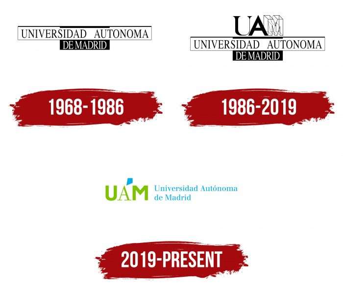
1968 – 1986
The first logo dates back to 1968, the year the university opened. For a long time, it remained an unchanged monochrome. It’s a modest version with a minimum of visual information, where all attention is focused on the name.
The “Universidad Autonoma de Madrid” inscription is in black and white or muted gray tones. The words are divided into two parts and arranged in tiers: the first consists of “Universidad Autonoma,” and the second is “De Madrid.” The upper part is on a light background, and the lower is on a dark background. This design supports the idea of diversity and autonomy of the university, where each faculty is a separate structure with an independent worldview.
1986 – 2019
In 1986, the emblem was slightly updated. It now included the abbreviation “UAM.” In this version, the letter “M” became the focal element. It looks like an abstract architectural form made with geometrically precise proportions. Originality is emphasized by monumentality and closeness to the “golden ratio,” as evidenced by the dotted line.
At the same time, the logo indicates a well-developed mathematics faculty, which was the most popular at the time. The university acquired a high status and entered the top fifteen European leaders thanks to it. So, the “M” sign is more of a tribute. Thanks to its schematic construction, it looks voluminous.
2019 – today
In 2019, the management decided to radically change the corporate style, symbol, and logo as the educational institution crossed the 50-year threshold. But the basis remained the same: the name “Autonomous University of Madrid.” In the abbreviated version “UAM,” the symbols “U” and “M” are highlighted in bold font, and “A” in italics. In addition, the abbreviation has been removed from the top and placed to the right of the expanded university name.
The updated look of the emblem repeats some features of the previous sample – for example, the differentiation of fonts in the initials. The emblem left the frames where the title fragments and monochromaticity were located. Openness and color appeared. Although the two-tier arrangement of lines has been preserved, they have received a new look – in accordance with the orthography with capital “U,” “A,” and “M.” The rest of the letters are lowercase and classic. The entire phrase is in blue.
At the top is the abbreviation, where attention has shifted from “M” to “A.” It is much thinner than neighboring characters and has a wide underline. The palette has also changed and has become olive.
The graphic element has also been revised. The number 50 was introduced into it – as an indication of the anniversary date. Two circles and a polygon surround it. The inscription “1968 – 2019” also emphasizes the anniversary. But the most interesting part is the polygon, which completes the figure’s composition. It unites the elements, makes the image whole, and even points to the location of the Cantoblanco campus in the northeastern part of the capital.
UAM: Interesting Facts
The Universidad Autónoma de Madrid, or UAM for short, is a well-known university in Spain that’s especially good at science, caring for the environment, and medicine.
- Why It Started: UAM opened in 1968 to help make Spain a better place through education and research. It was all about coming up with new ideas and solving problems.
- A Great Place to Learn: The main part of UAM is in the north of Madrid and has lots of green areas, cool buildings, and spaces where students and teachers can work together. This makes learning and researching there nice.
- Science Stars: UAM is famous worldwide for studying plants, animals, and medicine. It collaborates closely with a major research organization in Spain to make discoveries.
- Medicine and Health: UAM collaborates with a major hospital in Madrid to conduct important medical research. This gives students a chance to learn by doing real work in healthcare.
- Green University: UAM works hard to be good to the environment. It tries to pollute less, recycle more, and make its campus green and lovely.
- Friends All Over: UAM works with universities and research projects from different countries. This means students and teachers get to meet people from all over the world and share ideas.
- Famous People: Some smart and important people have studied or worked at UAM, including winners of big prizes like the Nobel Prize.
- Learning by Doing: UAM thinks learning from real experiences is important, not just from books. So, its courses help students prepare for their future jobs by giving them practical skills.
- More Than Just Studies: UAM cares about arts and community involvement. It has many events and activities that make campus life fun and interesting.
- Top of the Class: UAM is known as one of the best universities in Spain and is also respected worldwide. It’s celebrated for its research, teaching, and how it helps society.
In short, UAM is a big deal in Spain for its amazing work in science, its commitment to making the world a better place, and how it brings people from around the globe together.
Font and Colors
The university has another important identifying mark – a coat of arms. It’s a shield of classic shape, divided into two halves. On the left – a blazing torch with a long handle. On the right is a bear collecting fruits from a tall tree. Above them – a large crown covering the shield’s top part. It is detailed – with the highlighting of tines and precious inlaid stones.
On the sides, everything is surrounded by a laurel or olive wreath of leaves, apparently torn from the tree located on one of the fragments. Below is the inscription “QUID VLTRA FACIAM?” on a narrow ribbon. The color palette of the graphic sign is built on a combination of green, white, red, brown, black, and yellow colors.
The text uses the Berthold Walbaum Book font. It is colored in blue and light green or olive colors.
UAM color codes
| Apple Green | Hex color: | #7fc200 |
|---|---|---|
| RGB: | 172 194 0 | |
| CMYK: | 35 0 100 24 | |
| Pantone: | PMS 802 C |
| UNICEF Blue | Hex color: | #00ade7 |
|---|---|---|
| RGB: | 0 173 231 | |
| CMYK: | 100 25 0 9 | |
| Pantone: | PMS 801 C |


