


![]() UConn (University of Connecticut) Logo PNG
UConn (University of Connecticut) Logo PNG
Balance and grace have turned the UConn logo into the most harmonious and pleasant sight. Within the institution’s walls, science, sports, and the educational process are ideally combined. As a result, the university releases young people who have been comprehensively developed into society.
The University of Connecticut began in 1881 as Storrs Agricultural School, a practical agricultural school funded with land and money from brothers Charles and Augustus Storrs. Its model stood apart from the classical education of elite private institutions such as Yale, Wesleyan, and Trinity.
Women were first admitted as auditors in 1891 and officially accepted in 1893, after the school became a land-grant college and changed its name to Storrs Agricultural College. Yale’s local supporters reacted sharply. The New Haven Register called the new public institution a “farce and deception” and claimed its degree would never represent serious education. The college kept expanding, becoming Connecticut Agricultural College in 1899, Connecticut State College in 1933, and the University of Connecticut in 1939.
In 1940, UConn reorganized into separate schools and colleges. Social work, nursing, law, pharmacy, and graduate education expanded, with the first PhD degrees awarded in 1949. In the 1960s, the UConn Health Center was founded in Farmington, followed by the opening of John Dempsey Hospital in 1975.
UConn’s national profile changed after joining the Big East in 1979. Geno Auriemma took over women’s basketball in 1985, and Jim Calhoun led the men’s team from 1986. NCAA titles followed in field hockey, men’s soccer, and basketball. The women went unbeaten in 1995, while the men won their first NCAA title in 1999 against Duke. In 2004 and 2014, UConn became the only Division I school to win both the men’s and women’s national basketball titles in the same season. Infrastructure programs UConn 2000 and Next Generation Connecticut later funded campus growth, while the men’s team added NCAA titles in 2023 and 2024.
Meaning and History
The first name of this educational institution is Storrs Agricultural School. In this status, he was established by the Storrs brothers, Charles and Augustus, who provided him with land and money. Gradually, the school evolved, becoming a college, and then a university. This event took place in 1939.
Until 1933, UConn sports teams were called the Aggies, but after the institution’s renaming and the transition to state funding, they became known as the Statesmen. However, they were renamed Husky almost immediately. Usually, dogs of this breed in Connecticut are called Jonathan. And this is the name of the politician and statesman Jonathan Trumbull, in whose honor the university was built. In 1995, a statue was even installed on one of the campuses. According to local belief, students must rub their noses to lure luck.
What is UConn?
This is a prestigious public research institution in New England, with its main campus in Storrs, known for its strong programs in business, engineering, and education. Over 100 programs are offered through the university’s 14 schools and colleges, including the School of Business, the College of Engineering, and the School of Agriculture. An outstanding basketball program is one of the institution’s defining features, with the men’s and women’s Huskies teams regarded as some of the most successful in college sports history. The institution is a hub of dynamic student life with more than 600 student organizations, a vibrant cultural program at the Jorgensen Center for the Performing Arts, and a strong academic legacy supported by the Honors Program.
The university’s overall logo, unlike the academic seal, is more straightforward. It is minimalist, consisting only of the institution’s name, abbreviated and expanded. The former is typed in large monolithic letters, the latter in small capitals. The characters of the word “UCONN” have a curved shape. The upper and lower sides of the “C” and “O” look arc-shaped, while the “U” has only the lower side. Their vertical bars are columnar and flat. The two “N’s” are also massive but barren.
On the other hand, the word “University of Connecticut” is written in fine print in a classic design. The letters are grotesque, smooth, printed, and colored gray. This palette, which looks faded compared to the dark blue, draws all the attention to the top line.
Seal
![]()
The academic seal resembles a classic rondel, a round element with a central accent and several concentric rings. At the very center is a branch of the famous Charter Oak, which has played a significant role in the state’s folklore. The giant oak grew in Hartford and was 33 feet in circumference. It was the main attraction for a long time until the hurricane of 1855 brought it down. The logo features three dark blue leaves (one straight, two sideways) with two acorns on the right and left. The veins are marked in white for excellent contrast.
This is followed by a double circle consisting of blue and white lines. Behind them is a wide strip bearing the full name of the University of Connecticut. It is executed in capital letters with bold serifs and almost completely covers the central part. At the bottom, the year the university was established is indicated. There is a double blue-and-white edging along the outer edge.
UConn Huskies Logos
![]()
In fact, the UConn sports department is not named after the dog breed but is dedicated to the famous political and statesman of the state, Jonathan Trumbull. The fact is that in this part of America, almost all huskies are called Jonathan. Hence the unusual nickname. The teams have made great strides in basketball, winning 21 championships. Women are particularly successful, winning 11 NCAA Division I national championships and over 40 other conference and tournament events. The branch’s logos are fully consistent with its name. There are seven of them in total.
1959 – 1960
![]()
The debut emblem featured a contour image of a dog (presumably a husky). Blue lines, blotches, and long and short strokes effectively make it stand out from the negative space. The animal’s gaze is attentive and focused, its ears raised as if it is ready to rush to help at any moment.
1960 – 1970
![]()
In 1960, a transition to an anthropomorphic image took place, combining the local nickname for the husky (Jonathan) with the name of a real person, Jonathan Trumbull, a historical figure, a significant political figure, and a statesman. To demonstrate the decisive attitude of, in fact, the kindest dog, the artists added firearms, a bandolier, and a military cocked hat to it. She has boots on her legs, and a fluffy tail is visible from behind her back.
1970 – 1981
![]()
UConn’s sports department has moved to a realistic image of a dog. The husky is depicted in a half-turn, looking ahead with concentration. It is evident that her ears are raised and her neck is extended, as if she is about to run to help. The main style of the drawing is stroke-like, contour.
1981 – 2002
![]()
An emblem featuring a detailed blue-and-white husky image was used during this period. The dog’s head was set against a blue circle to make it easier to outline, since it is still drawn using the negative space technique. At the top, in a semicircle, is the word “Connecticut”; at the bottom, “Huskies.” The dog’s mouth is slightly open, and its tongue protrudes. The look is friendly yet intent, as if to say, “I’m watching everything carefully.”
2002 – 2010
![]()
After the redesign, the background circle disappeared from the emblem; the lines became smooth and soft, and the strokes became long and confident. The developers painted the tongue red and the nose and eyes gray. They also added a light outline around the head, repeating the animal’s outlines. The surrounding lettering is arched. The tops and bottoms of some letters are also curved, echoing the university-wide logo. The characters in the word “Huskies” are very wide apart.
2010 – 2012
![]()
The emblem underwent a small change during this period: the designers adjusted the color scheme, making it slightly darker.
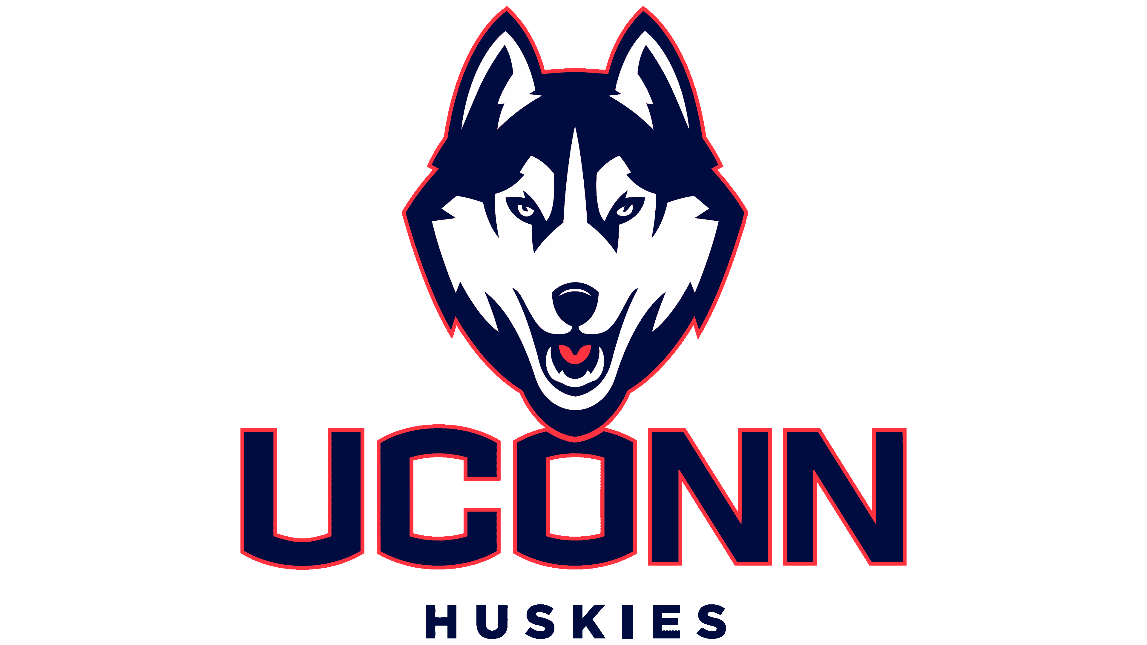
2013 – today
![]()
Now, the logo uses a more decisive, aggressive image of the dog. For this, the designers used a lot of dark blue and placed the head in a full-face, enhancing the effect of a hypnotic gaze. Only the central part of the muzzle and some areas on the raised ears remained white. The husky’s mouth is open, and now not only the tongue but also the fangs are visible in it. The eyes are colored blue. A gray line runs along the entire contour of the animal.
Font and Colors

The modern logo for the sports department was created by the Nike design team led by Clint Shaner, a senior graphic artist. The inscription from the 2002 version matches the style of the university-wide logo. The academic seal is linked to the region’s historical roots and features an iconic element: an ancient oak leaf with a girth of 33 feet.
The UConn University logo uses a solid sans-serif typeface. The letters “U,” “C,” and “O” are curved at the top and bottom. The text on the seal is in a classic typeface with sharp serifs. The university’s official colors are blue, white, and a minimum of red accents.