 Ultimate Fighting Championship (UFC) Logo PNG
UFC logo equals competition. The emblem is a prototype of exciting duels of equal rivals. Behind the symbols lies effort, pressure, and the will to win. Step by step, there is an ascent to new heights with the help of a promoter.
UFC: Brand overview
| Founded: | 1993 |
| Founder: | Art Davie, Bob Meyrowitz, Campbell McLaren, David Isaacs, John Milius, Rorion Gracie |
| Headquarters: | Las Vegas, Nevada, U.S. |
| Website: | ufc.com |
Meaning and History
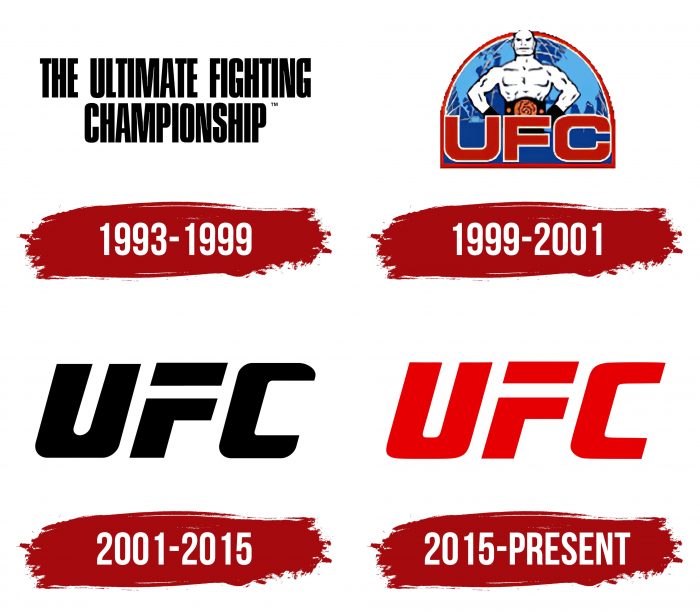
The UFC emblem appeared in the year it was founded because the advertising firm needed a simple and understandable sign to start organizing events right away. It is an abbreviation for the phrase “Ultimate Fighting Championship,” indicating the type of activity. Over the years, the company has undertaken redesigns three times – two cardinal and one corrective.
What is UFC?
UFC is the abbreviation for the Ultimate Fighting Championship. It is a sports organization that specializes in mixed martial arts. The organization holds competitions between fighters of different weight categories, with strict safety rules being mandatory. The matches are broadcasted live and attract a large audience.
1993 – 1999
The debut version of the emblem is a laconic inscription. It consists of the complete phrase “The Ultimate Fighting Championship,” placed horizontally in two rows. The top line includes the first three words; the bottom line contains one final word. The final part is specially separated into a separate fragment: it demonstrates the format of sports competitions. All letters are simple, smooth, black, and slightly elongated. They are executed in straight lines in a strict design, which emphasizes the seriousness of the organization.
1999 – 2001
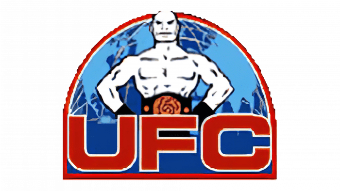
After the adjustments were made, the logo began to look much more diverse. He got graphic elements, lots of details, and color. During this period, it was perceived as a colorful icon. As a basis, the designers took the company name’s abbreviated form, placing it in the center in the foreground. Behind it was a combatant, whose image had been used in an alternative logo until that period. The muscular athlete is girded with a premium belt and stands confidently, demonstrating readiness for battle. The background is a map of one of the Earth’s hemispheres. All components are taken in an arched semicircle surrounded by a thin red line.
2001 – 2015
In 2001, the management approved a new logo – the most minimalistic of all. Only one element remained of the text and graphics – the abbreviation. It was turned into a personal icon, where an inscription and a picture are combined. Each letter has a clear structure. The lines are straight, straight, reminiscent of geometric shapes. Serifs removed. The inter-letter space is identical to the width of the internal gaps of the characters themselves. “F” lacks a connecting leg, so the top fragment seems to hang over it, forming a separate rectangle.
2015 – today
The current version of the logo almost completely repeats the previous one. The only difference is in the trimmed ends of the “C” (they are chopped off) and in color (now used red).
UFC: Interesting Facts
The Ultimate Fighting Championship (UFC) has grown from a raw, no-rules fight competition to a leading mixed martial arts (MMA) organization globally.
- Early Days: Founded in 1993 to find the most effective martial art, early UFC fights had minimal rules and no weight classes, attracting fighters from various disciplines.
- Adding Rules: Facing criticism for its violence, the UFC introduced weight classes, time limits, and safety rules, making it more legitimate and widely accepted.
- Going Global: What started in the US has gone worldwide, with events on every inhabited continent, showing its broad appeal.
- New Ownership: In 2001, Zuffa, LLC, bought the UFC, bringing better promotion, fighter pay, and official approvals, leading to a new growth phase.
- Welcoming Women: In 2012, the UFC opened its doors to women fighters like Ronda Rousey, adding women’s divisions and boosting the profile of women’s MMA.
- The Ultimate Fighter: Launched in 2005, this reality show helped popularize MMA and discover new talents, producing many champions.
- Breaking Records: Featuring stars like Conor McGregor and Ronda Rousey, the UFC has set pay-per-view records, making MMA more mainstream.
- Big Sale: Sold to Endeavor in 2016 for $4 billion, this move highlighted the UFC’s massive growth and potential as a global sports brand.
- Fight Island: To keep events going during the COVID-19 pandemic, the UFC hosted bouts on Abu Dhabi’s Yas Island, showcasing its flexibility and commitment to safety.
- Supporting Fighters: The Performance Institute, opened in 2017 in Las Vegas, provides fighters with training, nutrition, and rehab support, emphasizing the UFC’s focus on athlete well-being.
This journey shows the UFC’s transformation from a niche event to a major sports entity known for exciting matches, global stars, and its influence on MMA’s evolution.
Font and Colors
The UFC symbol has always been abbreviated for “Ultimate Fighting Championship,” except the debut version. Therefore, its evolution is a gradual redesign of the lettering. At first, it was complete; then, it was abbreviated. The winning version turned out to be a simple version, without details and graphic frills, which resonates with the represented sport. The letters are grotesque, in upper case, with a slight slope to the right.
The logo is made by a personal typeface, designed to order. It combines the features of an informative text and a visual identification icon. The word “UFC” is in Sans Serif font. Its characteristics are smooth lines, sharp corners, sharp transitions, and no serifs. The color palette is monochrome and consists of the classic combination of white with red or black.
UFC color codes
| Venetian Red | Hex color: | #c5000c |
|---|---|---|
| RGB: | 197 0 12 | |
| CMYK: | 0 100 94 23 | |
| Pantone: | PMS 485 C |
