


![]() Under Armour Logo PNG
Under Armour Logo PNG
To ensure recognition of Under Armour’s sports products, the company’s logo reflected the monogram’s stylized treatment. Because it was the result of a mistake, the name was liked by all. The bright and noticeable emblem brought success.
Under Armour was founded in 1996 by Kevin Plank, a former University of Maryland football player who was frustrated with heavy, sweat-soaked cotton shirts. He developed a tight synthetic T-shirt that wicks moisture and began selling it from his grandmother’s basement, using about $17,000 in savings.
Early sales came directly from athletes. A key order arrived from the University of Georgia, followed by contracts with NFL teams by 1999, which increased visibility in professional sports. Product placement in the film “Any Given Sunday” that same year drew unexpected attention.
By the early 2000s, the company focused on compression apparel, then expanded in 2003 with HeatGear and ColdGear to cover different training conditions. This shift allowed growth beyond a narrow product niche.
In 2005, Under Armour went public on the New York Stock Exchange, with shares rising sharply on the first day. In 2006, it entered the footwear market, competing directly with Nike and Adidas.
A major step came in 2013 with the signing of Stephen Curry from the Golden State Warriors. By 2015, after his MVP season, the Curry line became central to the brand’s basketball segment.
In 2015, the company invested about $710 million in digital platforms such as MapMyFitness, MyFitnessPal, and Endomondo, aiming to combine apparel with data-driven training, though these assets were later sold.
Meaning and History
![]()
The phrase “Under Armor” was originally embossed on the emblem. It appeared entirely by chance. Kevin Plank wanted to name his brand “Body Armor,” which he mentioned to his brother Bill. However, Bill misunderstood and thought it was Under Armor. They both liked this version, and they decided to keep it. The only change was the spelling: the abbreviated American suffix -or was replaced with the British -our in the second word. This was because the chosen name included a toll-free number.
The company owes its success to its bright, distinctive logo. In 1996, Jeff George, a defensive end for the Oakland Raiders, appeared on the front page of USA Today in a trademark turtleneck bearing the Under Armour logo. The emblem was immediately noticed. After that, Kevin Plank’s football equipment began to be ordered in large numbers. Of course, the aesthetic component is also significant, but the trademark is a specific design feature.
The logo’s design has changed several times.
What is Under Armour?
This brand creates sportswear, footwear, and accessories using modern technologies. Its products include compression clothing, thermal underwear, training shoes, and specialized lines for different weather conditions. Notable developments include clothing for hot and cold weather and innovative running shoes. The brand is focused on athletes and active-lifestyle enthusiasts, offering gear that helps them achieve better results.
1996 – 1997
![]()
In 1996, the lines in the logo became smoother and more elongated.
1997 – 1998
![]()
In 1997, the lines were shortened because the logo was placed inside an ellipse.
1998 – 1999
![]()
In 1998, the central parts of the semicircles narrowed, and the edges thickened noticeably.
1999 – 2005
![]()
In 1999, the brand symbol was shown without the borders that had previously surrounded it. Under the symbol appeared the inscription “UNDER ARMOR,” and below it, a second inscription, “Performance Apparel.”
2005 – today
![]()
In 2005, the inscription “Performance Apparel” was removed. The trademark has remained in this form to this day.
Font and Colors
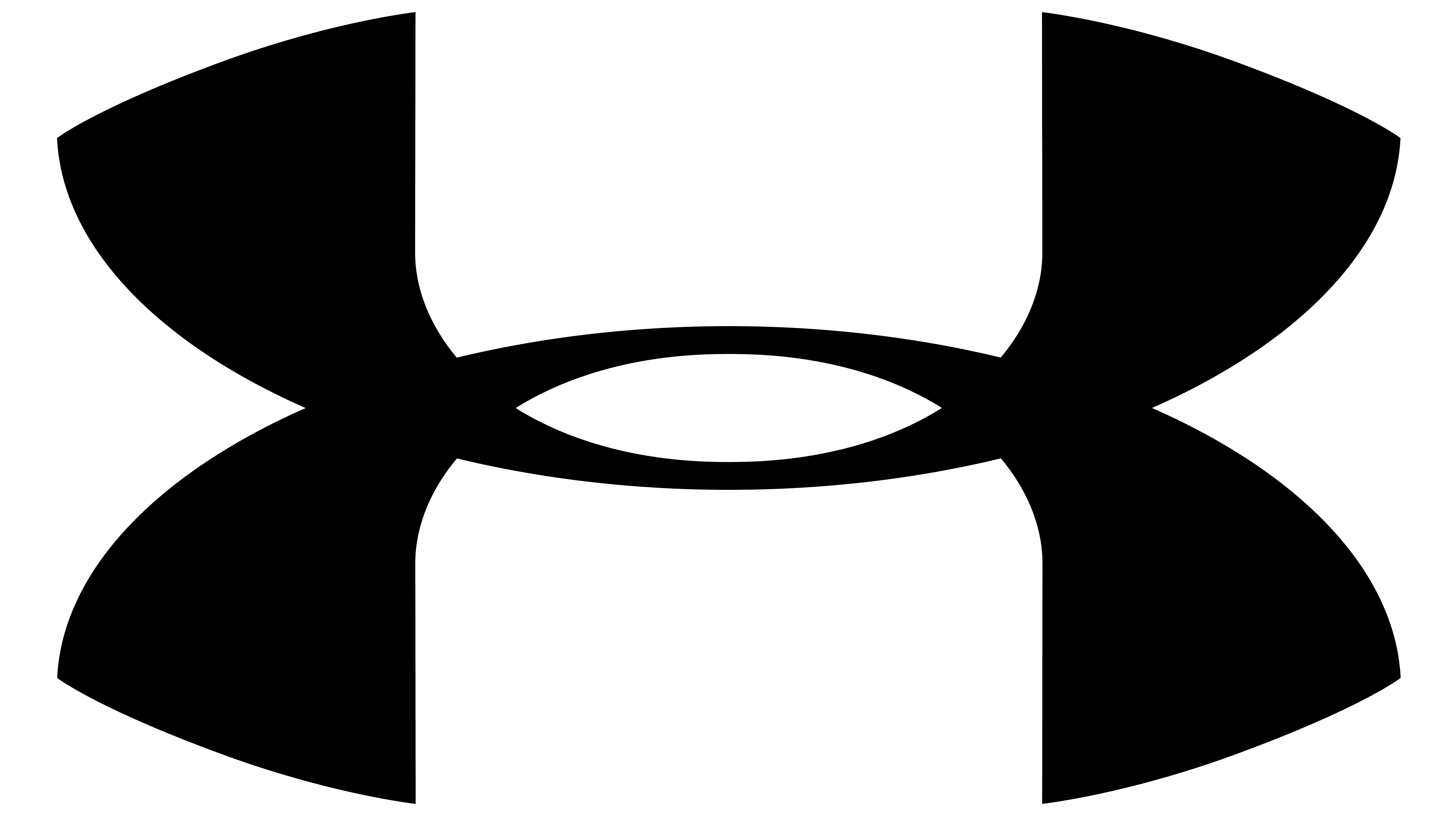
The brand’s graphic symbol consists of two semicircles. They are mirror-reflected and intersect at two points. The first figure points upward and denotes the letter “U.” The second looks down and shows the letter “A.” Both elements form a unique monogram, somewhat reminiscent of the inverted Chanel logo.
The font, specially designed for the company, has been used since 1997. The inscription “Under Armor” was made with this font. The inscription is located under the original brand symbol. All letters in the words are uppercase, strict, sans-serif. The typography combines both sharp angles and smoothed edges. This hints that the clothing can look aggressive, but it is comfortable to wear. The horizontal strokes of “D,” “E,” “R,” and “A” are short: on the left side, they do not reach the vertical lines.
FAQ
What is the meaning of the Under Armour logo?
The Under Armour logo is a monogram of the letters “U” and “A.” It represents the company and has no additional meaning.
Is the Under Armour logo copyrighted?
The Under Armour logo is copyrighted. The company even sued Tingfeilong Sporting Goods Co., Ltd. and won the case.
Why is Under Armour spelled with AU?
The word “Armor” in the company’s name is spelled in the British manner (with the letter “U”) because its creator decided the phone number 888-4ARMOR looked better than 888-44ARMOR. It was merely an attempt to obtain a nice toll-free number.
Has Under Armour changed its logo?
Under Armour changed its logo several times until it adopted its modern look in 2005.