


 University of Kansas Logo PNG
The University of Kansas’s logo has changed over the years, but its latest version possesses all the qualities that will remain relevant for a long time. When developing the new identity, designers focused on three key aspects: recognizability, informativeness, and visual appeal. These goals were successfully achieved, and the University of Kansas’s modern logo looks presentable and meaningful.
The logo consists of two superscript letters on the left side and four words placed next to them. Using a mirror effect to present the information proved effective, helping with better memorization of the university’s name. Thanks to this logo, the university with five campuses has become even more recognizable.
The University of Kansas was founded in 1865, after earlier plans for a state university had been delayed by the Civil War and political conflict in Kansas Territory. Lawrence was selected in 1864, and classes began on September 12, 1866, with three teachers and 55 students.
The first years were marked by weak enrollment and financial pressure. Still, local support and the work of Chancellor Robert W. Oliver kept the institution alive. North College, the original building on Mount Oread, became the starting point of the campus. In the 1870s, KU began adding professional education, opening the School of Law in 1872 and the School of Pharmacy in 1876. The first master’s degrees followed in 1878.
The medical school was founded in 1889 and first operated in Kansas City. Campus growth continued with Spooner Library in 1894 and Dyche Hall, home of the Natural History Museum, in 1902. By 1909, enrollment had passed 2,000 students. World War I and World War II affected staffing, student life, and campus use, while returning veterans later helped expand enrollment.
KU added Journalism in 1924, Business in 1938, research centers in the 1950s through 1980s, and new institutes in the 1990s and 2000s. From 2004 to 2021, major projects included KU First, new pharmacy and business buildings, engineering facilities, health services, and research centers. The university is represented in sports by the Kansas Jayhawks, competing in Division I of the NCAA, with basketball as its most recognized program.
Meaning and History
What is University of Kansas?
It is a public research university offering a wide range of undergraduate and graduate programs in several academic fields, including engineering, education, medicine, and humanities; it is the largest university in the state. Known for its stunning campus and distinctive limestone buildings, it is home to several nationally recognized academic programs in pharmacy, urban management, and special education. The university is renowned for its rich basketball heritage, and the Jayhawks are among the most successful teams in NCAA history.
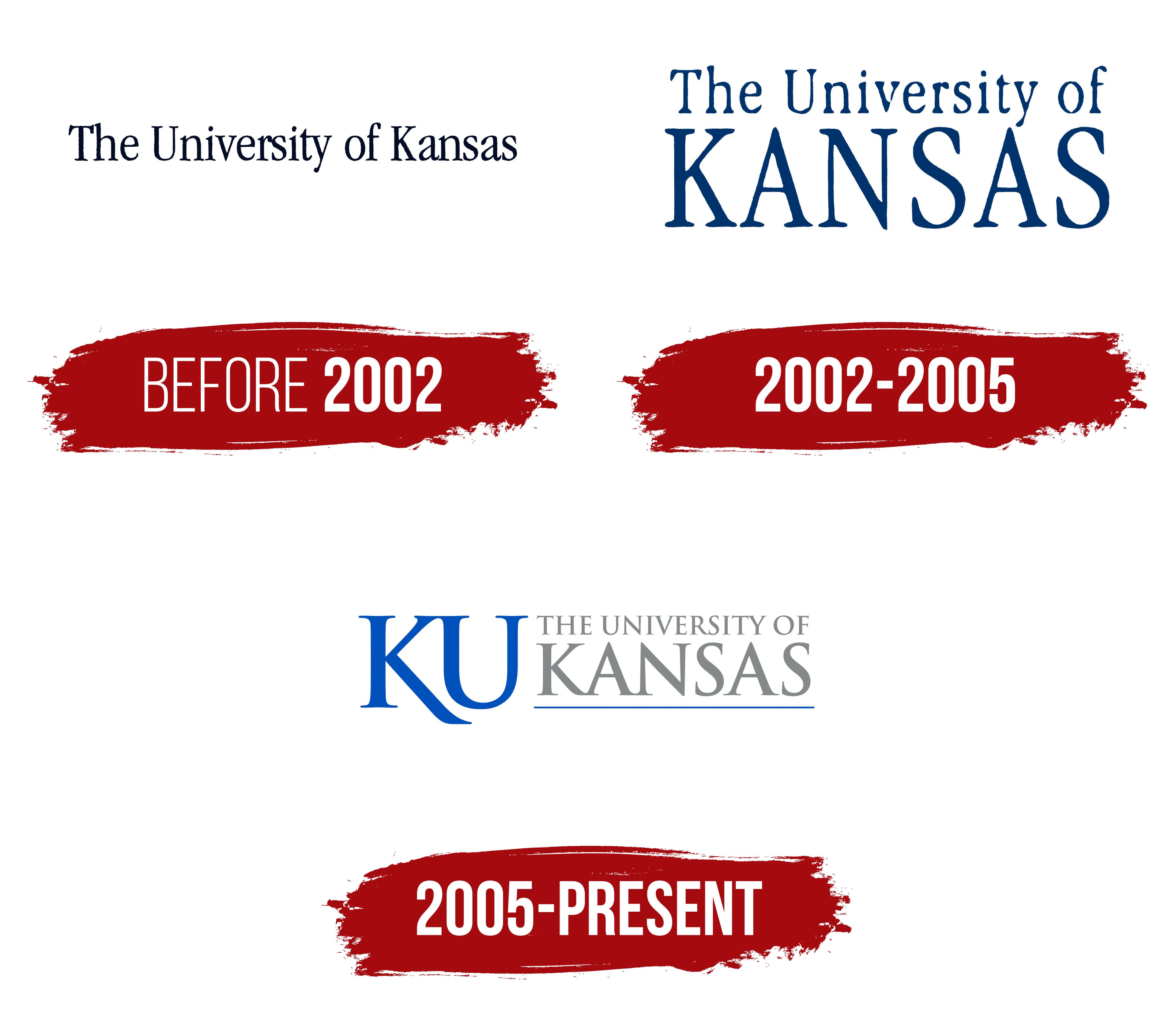
Before 2002

The university’s first logo elegantly reflected its name. The text was placed on a white background and rendered in dark letters in a single line. The spacing between the words was twice as wide as between the letters. The only exception to the spelling rules was the preposition “of,” which was written in lowercase.
The font was not strictly formal; it featured serifs, rounded elements, and other decorative details that gave the logo a modern look. Special attention was drawn to the unconventional shapes of the letters “a” and “s,” which added dynamism and emphasized the research organization’s ongoing development.
2002 – 2005

In 2002, a new logo for the University of Kansas was introduced, becoming brighter, more contrasting, and more dynamic than its predecessor. It contained a single textual element, the university’s name.
Light blue letters stood out on a white background, centered in two rows. The word “Kansas” was written in bold, uppercase letters without italics. Above it, three words were neatly placed, two of which began with large capital letters.
The logo appeared presentable and stylish, reflecting the individuality its creators aimed to achieve.
2005 – today

The modern logo positions the educational and research organization as one of the most attractive for prospective students, graduate students, and anyone seeking a quality education. The identity, created in 2005, possesses unique elegance and detail. The accents are well-placed, and the color scheme is chosen with particular taste.
The capital letters “K” and “U” are placed close together on the left. Their blue color gives the logo elegance and emphasizes the organization’s high status. The thin lines of the upper parts of the letters create a sense of depth, while the lower part of the letter “K” elegantly highlights the letter “U.”
To the right, the university’s name is written in gray and arranged in two rows using two different fonts. The word “Kansas” is emphasized and significantly larger than the other text elements.
At the bottom, below the university’s name, a wide blue line stands out clearly against a white background, emphasizing the logo’s main content and adding to its visual appeal.
The Seal

The seal of the University of Kansas is a multi-layered symbol that reflects the status of a public organization engaged in scientific and research activities since 1865. This emblem represents the institution’s focus areas and communicates its high status, pursuit of knowledge, and fundamental educational approach. As one of the state’s leading research institutions, the University of Kansas ensures that its seal upholds its distinguished reputation and remains highly informative.
The university seal includes three informational sections, each highlighted at its level using frames, outlines, and borders. Together, these elements create a unified image in which clarity and graphic design make the information easy to perceive and interpret.
The first outer level is a textual element. The name of the university and the year of its founding are printed in large letters in a circular form. The background remains white, and the text is rendered soft blue. The text is framed by lines of varying widths, emphasizing its importance.
The second informational section contains a significant phrase: “Video visionem hanc magnam quare non comburatur rubus.” This phrase, well-known to students, carries deep meaning. The serif font and superscript letters give it a serious tone, and bold dots between the words draw attention to each one. The phrase symbolizes students’ ability to see what others may overlook.
The central section of the seal features a realistic depiction of a landscape. At the center of the composition is a figure kneeling in prayer before a bush. This scene reflects a deep connection with nature and complements the symbolism of the phrase, “Video visionem hanc magnam quare non comburatur rubus.”